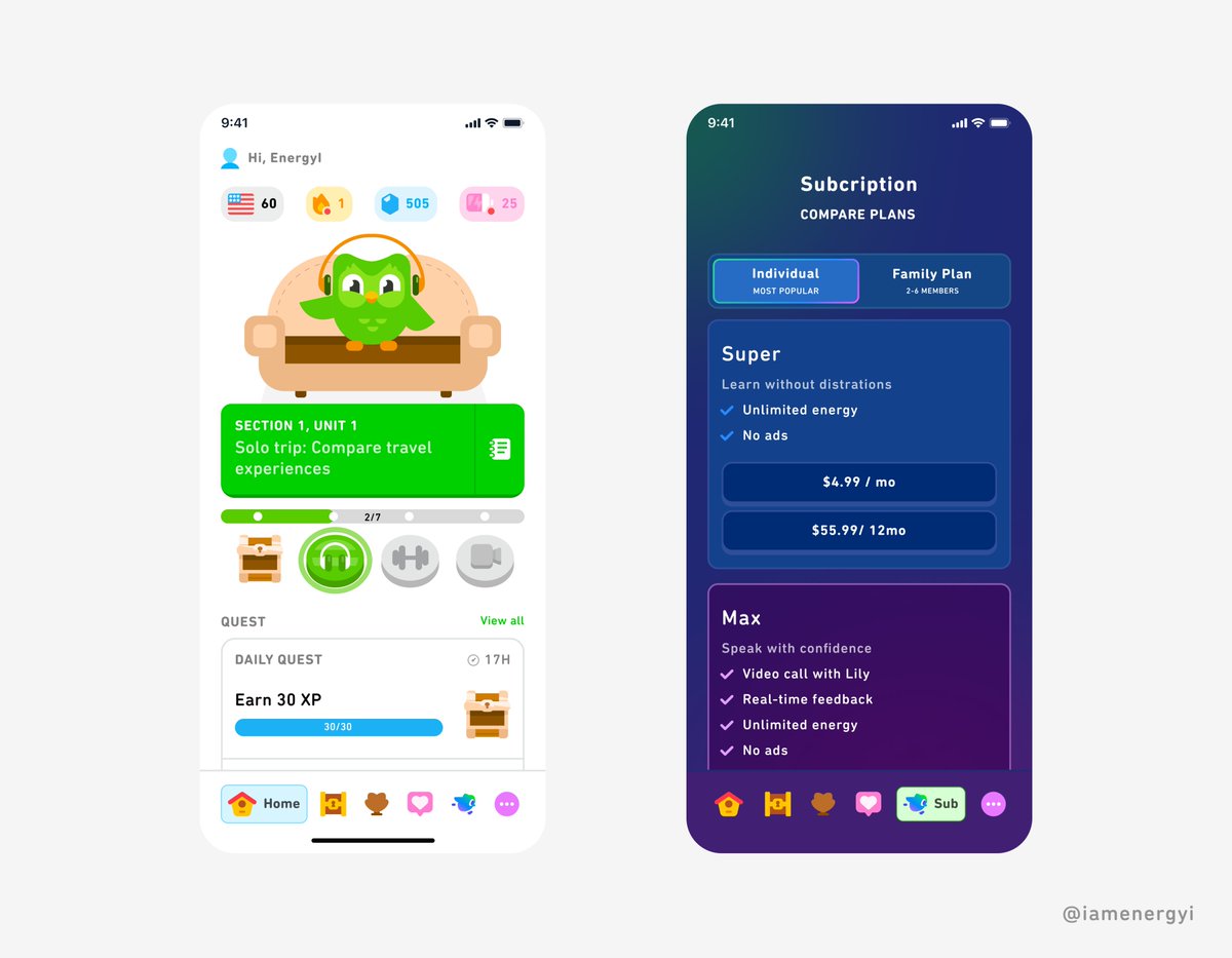
Redesigned the @duolingo subscription and learning experience for improved usability and conversion…
Few things I improved on:
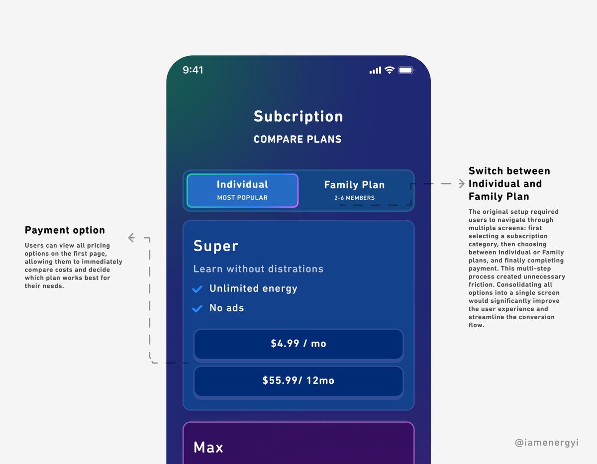
▪️ Consolidated subscription flow; Reduced multi-step process to single screen
▪️Transparent pricing; All plan options and costs visible upfront for faster decisions
▪️ Progressive content disclosure; Restructured lessons to prevent overwhelm and reduce early abandonment
▪️Streamlined user journey; Eliminated unnecessary navigation between category, plan type, and payment screens
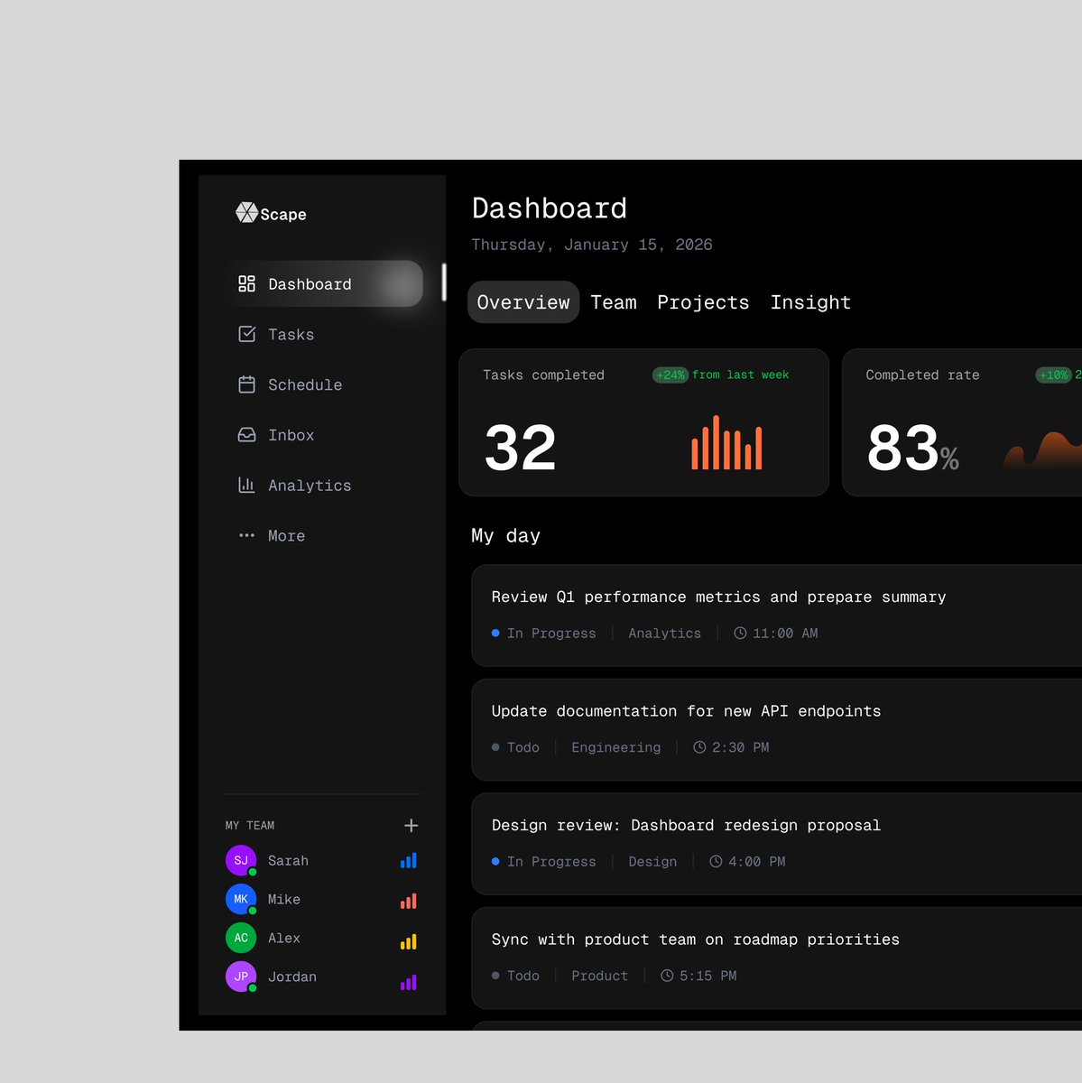
Dashboards aren’t about making data look pretty.
They’re about clarity. Speed. And better decisions.
If someone can’t understand a dashboard in seconds, it’s not doing its job.
Dashboards aren’t about making data look pretty.
They’re about clarity. Speed. And better decisions.
If someone can’t understand a dashboard in seconds, it’s not doing its job.
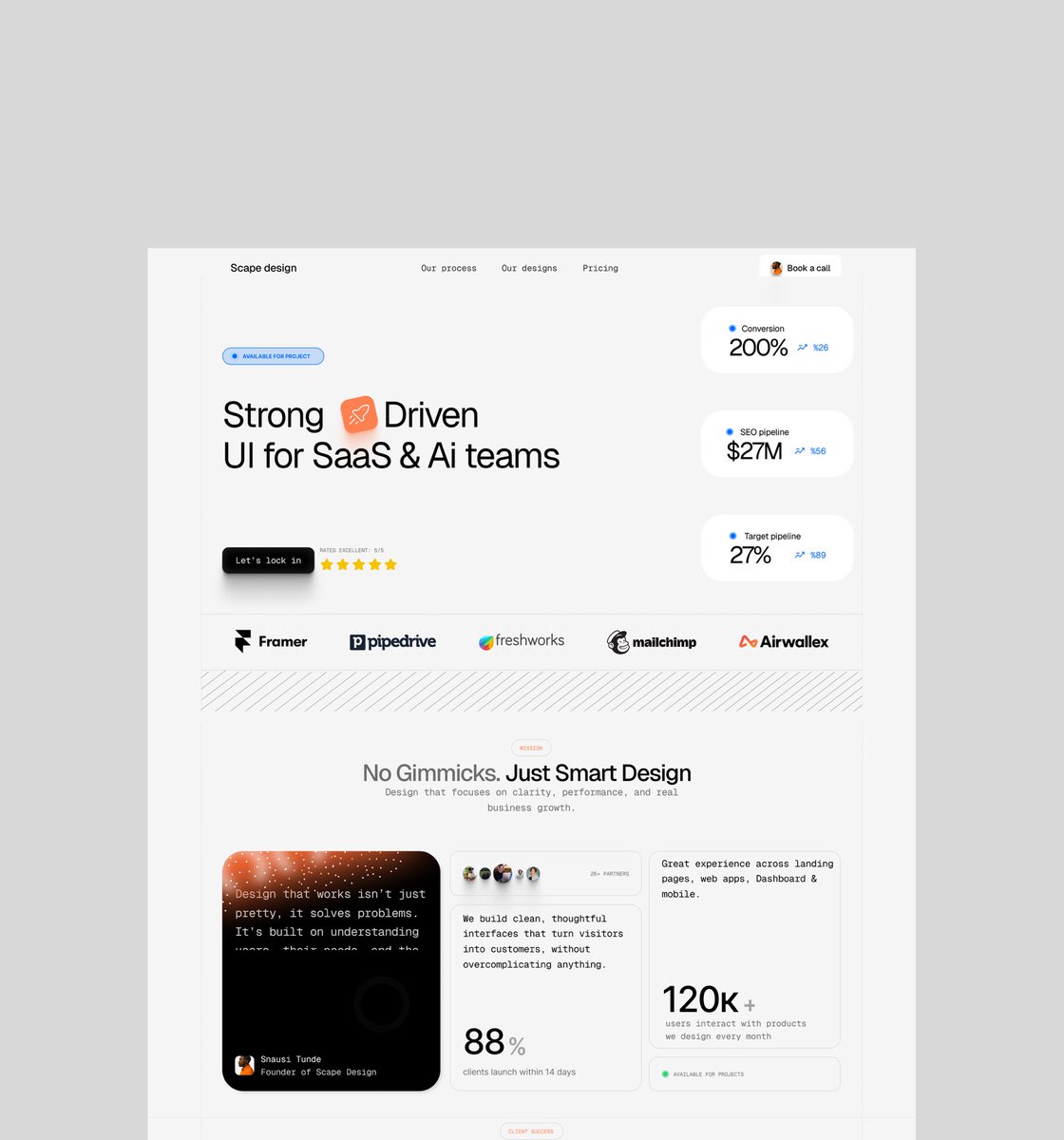
Landing pages shouldn’t just look good.
They should sell.
Strategy → Copy → Design → Development
One flow. One message. One goal: conversions.
If your page isn’t doing the heavy lifting, it’s just decoration.
Landing pages shouldn’t just look good.
They should sell.
Strategy → Copy → Design → Development
One flow. One message. One goal: conversions.
If your page isn’t doing the heavy lifting, it’s just decoration.