Time is running out to become a Founding Member!
InfoDev Insiders is a safe place for information developers to network, commiserate, laugh, and learn.
Learn More: https://t.co/uZEq01tMxZ
The InfoDev Academy's community for content professionals is now open! Sign up before October 1, 2022 to become a Founding Member. (It's free!)
https://t.co/uZEq01teIr
@ContentWrangler @scottabel
Join @scottabel and @tmkister for an open-house peek into the InfoDev Academy, an online community and learning platform for content professionals.
Date: Wednesday, August 17, 2022
Time: 11:00 am EDT
Register on BrightTalk: https://t.co/LfJAGgpo3Q
@nozurbina Isn't this the way that the algorithms work for all major online venues? One reason I'm not in love with the whole idea of "personalization."
Join us for our first workshop "How to Choose Fonts" on August 23, 2002 at 1pm EST.
We'll be taking a science-based approach and following a clear, step-by-step process not found anywhere else!
https://t.co/8ReOLMaalT
Come Join Us!
The InfoDev Academy's online community for content professionals is now open!
InfoDev Insiders is a safe space for content professionals to network, share resources, teach, and learn.
https://t.co/uZEq01teIr
I agree that the key lies in saliency, which is closely related to what others have said about figure-ground, area, squinting, etc. The entire human perception system is designed to perceive and assign meaning to DEGREES OF DIFFERENCE between stimuli.
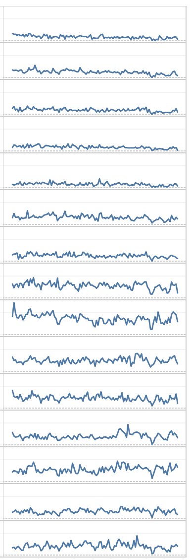
What explains that area charts are easier to read than line charts in a configuration like the one below? Or maybe it's just my impression? (cc @SteveFranconeri @sharoz)
The filled-in charts create a greater degree of difference between "what is" (below the line) and "what isn't" (above the line). In the line charts, we have to use more cognitive resources to assign meaning to the area below the line.
...line-only chart forces our perceptual systems to: 1) Perceive the line, 2) Assign differential meaning to the areas above and below the line, 3) Focus our attention on the area below the line, 4) Imagine the quantity represented by...
The line is present in both types, but the filled-in chart allows us to immediately perceive and assign and categorize the area below the line as "what is," while the...
Woohoo! So excited to see the release of Intercom magazine's special issue on Science-Based Content Design, guest edited by @scottabel and me!
https://t.co/eCRQmdH3yA
When applying science-based design to complex content, it's important to make design choices that direct the user’s attention quickly and naturally in order to minimize perceptual load so that users can process information quickly and accurately.
Perceptual load is measured by how quickly and how accurately users can identify specific visual stimuli, as well as by the degree of brain activation. In the example on the left, you don’t even need to be given a task in order for the salient letter to attract your attention.
This is really cool, and happening right here in central Florida! A DNA-sequencing company has developed high-volume COVID-19 testing that doesn't require specialized equipment, and allows people to stay at home.
https://t.co/qoHi7PAUGn
I just thought I'd share in case you have been looking for an affordable, versatile, and easy way to enhance your content.
If you'd like to see a list of tools that I recommend (with affiliate links), you can check out my Tools of the Trade list:
https://t.co/5SkE6ZQgjK
Free Trial for Snagit
Snagit is an amazing tool, especially given its price (a one-time fee of $49.99). It's designed specifically to make it super easy to create how-to and instructional content.
https://t.co/sfpSDCb1Xu
#informationdesign#technicalcommunication#nanatoo
NOTE: While a do have an affiliate relationship with Snagit and TechSmith is one of my consulting clients, this offer isn't related in any way – I don't get any affiliate commission for it.