keep ที่ไม่ได้แปลว่า เก็บ
keep going สู้ต่อไป
keep in touch ติดต่ออยู่เรื่อยๆ
keep on trying พยายามต่อไป
keep it up ทำดีแบบนี้ต่อไป
keep your chin up เชิดหน้าไว้
keep a secret รักษาความลับ
keep your word รักษาคำพูด
keep an appointment ไปตามที่นัด
keep up the good work ทำดีแล้ว
Scientists Record Bat Killing Robin in Flight
New study confirms that Greater Noctule Bats intercept and eat migrating songbirds in mid-flight. https://t.co/agt3R7pAPH
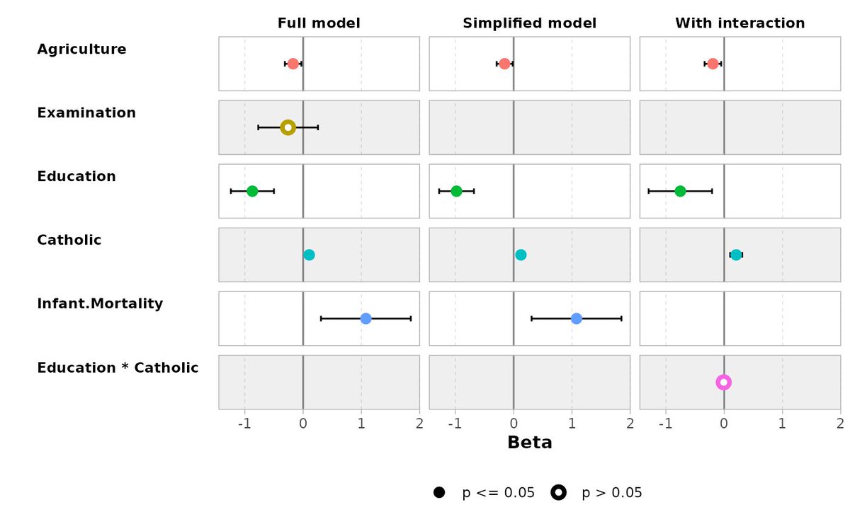
Compare multiple statistical models effortlessly with ggstats, a versatile extension package for ggplot2 that simplifies data visualization tasks. The ggcoef_compare() function allows you to compare the coefficients of several models side by side, providing an intuitive way to analyze and present differences between them.
Why use ggcoef_compare()?
✔️ Clear comparisons: Visualize the coefficients of multiple models in a single, cohesive plot to identify patterns and differences at a glance.
✔️ Customizable outputs: Adjust the appearance of the plot to meet your presentation or analysis needs.
✔️ Easy to use: Integrates seamlessly with ggplot2, making it straightforward to add model comparison capabilities to your workflow.
The example visualization showcasing this functionality originates from the ggstats documentation and demonstrates how it can enhance your model comparison tasks: https://t.co/AITQvg3t7G
Explore more ways to elevate your data visualization skills in R and learn about ggplot2 extensions in my online course, "Data Visualization in R Using ggplot2 & Friends!"
Check out this link for more details: https://t.co/ztlEzoEDWv
#StatisticalAnalysis #DataAnalytics #ggplot2 #datavis #tidyverse #database #RStats #Statistics #DataViz #rstudioglobal
The Kruskal-Wallis test is a non-parametric method used to determine if there are statistically significant differences in the distributions of three or more independent groups based on ranks. Unlike ANOVA, it does not assume that residuals are normally distributed, making it more flexible for analyzing data sets that do not meet this assumption.
Advantages of Proper Use:
✔️ Suitable for ordinal data or data sets where the normality assumption in residuals is not met.
✔️ Does not assume homogeneity of variance, offering more flexibility.
✔️ Can be used with small sample sizes, increasing its applicability in various research settings.
Challenges If Not Handled Correctly:
❌ Interpretation can be complex, especially if the test is mistaken for a direct comparison of medians when specific conditions aren't met (e.g., independent samples, symmetric distributions).
❌ Less powerful than ANOVA when residuals are normally distributed and variances are equal.
❌ May require post-hoc tests to pinpoint specific group differences, adding complexity to the analysis.
How to Apply in Practice:
🔹 R: Use the kruskal.test() function from the base package to perform the Kruskal-Wallis test.
🔹 Python: Utilize the kruskal() function from the scipy.stats module for the analysis.
Visualization Explanation:
The visualization accompanying this post compares ANOVA and the Kruskal-Wallis test by ranks. This visualization is adapted from a Wikipedia source: https://t.co/1hRzGEFOjY
For those interested in learning more, consider joining my online course on Statistical Methods in R, where we explore this topic and related methods in greater detail.
More information: https://t.co/7YQCRDKSPO
#RStudio #statisticsclass #RStats #database #Rpackage
People often ask how to visualize multiple biplots, each showing different combinations of principal components, on a single graph. Here's a straightforward code snippet for achieving that:
---------------------------------------------------
library("factoextra")
library("patchwork")
data(iris)
pca_result <- prcomp(iris[ , -5],
scale = TRUE)
bipl1 <- fviz_pca_biplot(pca_result,
axes = c(1, 2),
label="var",
habillage = iris$Species)
bipl2 <- fviz_pca_biplot(pca_result,
axes = c(1, 3),
label="var",
habillage = iris$Species)
bipl3 <- fviz_pca_biplot(pca_result,
axes = c(2, 3),
label="var",
habillage = iris$Species)
bipl1 / bipl2 / bipl3
---------------------------------------------------
Biplots are useful for simultaneously showing the scores of observations and the loadings of variables on principal components. This dual display helps in visualizing both the data structure and the variable contributions within the same plot.
For more comprehensive guidance, including step-by-step instructions and code examples, consider exploring my online course dedicated to PCA in R.
See this link for additional information: https://t.co/DUfoAHv5nb
#RStats #rstudioglobal #DataAnalytics #coding #DataAnalytics
Combining layers effectively is key to creating compelling plots in R. The ggblend package for ggplot2 allows you to blend layers seamlessly, making it easier to highlight important details and enhance your data visualizations.
Here’s why ggblend is worth exploring:
✔️ Layer Blending: Combine multiple layers with different blending modes to create more informative plots.
✔️ Customizable Transparency: Control opacity to emphasize key information without clutter.
✔️ Enhanced Visual Hierarchy: Use blending techniques to guide the viewer’s focus to important parts of the plot.
✔️ Creative Freedom: Experiment with various blending effects to make your plots visually appealing and insightful.
✔️ Efficient Workflow: Integrates smoothly with ggplot2 and the tidyverse for a streamlined plotting process.
The visualizations shown below are sourced from the package website: https://t.co/qdU00VL9Oy
If you’re interested in mastering data visualization in R with ggplot2 and its extensions, you might want to explore my online course on "Data Visualization in R Using ggplot2 & Friends"! Take a look here for more details: https://t.co/ztlEzoEDWv
#Rpackage #ggplot2 #VisualAnalytics #Data #tidyverse #RStats #R #datascienceenthusiast #DataViz #programmer #database
Understanding the z-score can significantly enhance your data analysis skills. Here’s a quick guide to what z-scores are and why they matter:
🔍 What is a z-score?
A z-score, or standard score, indicates how many standard deviations an element is from the mean. A z-score of 0 means the value is exactly average, while a z-score of +1.5 indicates a value 1.5 standard deviations above the average.
📊 Why use z-scores?
- Comparability: It allows comparison between different data sets with various means and standard deviations.
- Outlier Detection: High or low z-scores may help identify potential outliers in a data set.
- Standardization: Z-scores help standardize data, preparing it for techniques that assume normal distribution.
🚧 Limitations of z-scores:
- Assumption of Normality: Z-scores are most effective when data follows a normal distribution. Their reliability decreases with heavily skewed data or extreme outliers. For example, the data in this post's graph does not appear normally distributed. While z-scores can still be calculated, they must be applied cautiously.
- Context Dependent: The interpretation of a z-score can vary by context; a z-score considered high in one field might be average in another.
- Oversimplification: Relying solely on z-scores might oversimplify the analysis, potentially overlooking important nuances in the data.
💡 Z-scores transform your data, facilitating complex analyses and potentially leading to more consistent conclusions. Whether you're examining student test results or assessing stock market fluctuations, z-scores can offer a clear picture of how each data point relates to the whole.
I've created a tutorial on how to compute z-scores in the R programming language: https://t.co/d6dkiIKxfu
Interested in mastering statistics and R? Check out my online course on Statistical Methods in R.
Further details: https://t.co/7YQCRDKSPO
#RStats #statisticsclass #rstudioglobal #DataScience #Data #DataAnalytics
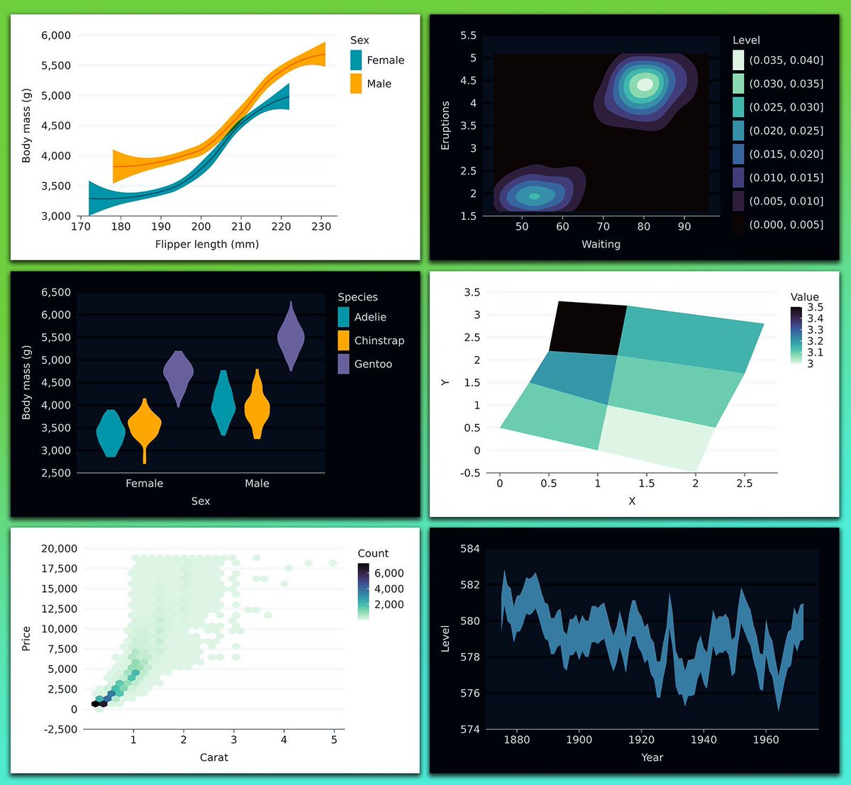
The ggblanket package is an extension for ggplot2 that simplifies the process of creating clean and consistent plots in R. It offers user-friendly functions that reduce the amount of code needed, making it easier to produce high-quality visualizations quickly.
✔️ Streamlines Plotting: Simplifies code by handling common ggplot2 tasks, allowing you to focus on analysis rather than syntax.
✔️ Consistent Styles: Ensures that plots have a uniform appearance, making it easier to produce publication-ready graphics.
✔️ Reduces Code Complexity: Minimizes the need for repetitive code, making scripts shorter and easier to manage.
✔️ Broad Compatibility: Works seamlessly with other ggplot2 extensions, allowing you to layer additional features effortlessly.
The visualizations below demonstrate how ggblanket can streamline the creation of professional-looking plots with minimal code. The visualizations are sourced from the package website: https://t.co/oAxMRat3Vf
Interested in learning more about data visualization in R using ggplot2 and its extensions? Check out my online course on "Data Visualization in R Using ggplot2 & Friends"!
For more information, visit this link: https://t.co/ztlEzoEDWv
#DataViz #DataVisualization #Rpackage #tidyverse #DataAnalytics #DataAnalytics #DataScience






![JoachimSchork's tweet photo. People often ask how to visualize multiple biplots, each showing different combinations of principal components, on a single graph. Here's a straightforward code snippet for achieving that:
---------------------------------------------------
library("factoextra")
library("patchwork")
data(iris)
pca_result <- prcomp(iris[ , -5],
scale = TRUE)
bipl1 <- fviz_pca_biplot(pca_result,
axes = c(1, 2),
label="var",
habillage = iris$Species)
bipl2 <- fviz_pca_biplot(pca_result,
axes = c(1, 3),
label="var",
habillage = iris$Species)
bipl3 <- fviz_pca_biplot(pca_result,
axes = c(2, 3),
label="var",
habillage = iris$Species)
bipl1 / bipl2 / bipl3
---------------------------------------------------
Biplots are useful for simultaneously showing the scores of observations and the loadings of variables on principal components. This dual display helps in visualizing both the data structure and the variable contributions within the same plot.
For more comprehensive guidance, including step-by-step instructions and code examples, consider exploring my online course dedicated to PCA in R.
See this link for additional information: https://t.co/DUfoAHv5nb
#RStats #rstudioglobal #DataAnalytics #coding #DataAnalytics](https://pbs.twimg.com/media/GmScGsmWUAE0bIT.jpg)