Most brands don’t have a traffic problem. They have a conversion problem.
I designed this bundle section to make the buying decision easier and increase AOV with clear savings, price anchoring, a “Most Popular” option, benefits, trust signals, and a strong CTA.
Good design gets attention. Good conversion design drives action.
I build conversion-focused landing pages and Shopify experiences for DTC brands and agencies.
DM me if you have a project in mind.
A first-time visitor doesn't care how passionate your brand story is. They care about one thing: Can I trust you with my credit card?
Most DTC brands waste prime real estate on their landing pages talking about themselves, while leaving the buyer's skepticism completely unaddressed.
Building instant credibility requires a deliberate layout strategy:
Radical Transparency Up Front: Place real delivery timeframes, return policies, and shipping guarantees right where the eye lands first.
Verifiable Proof over Claims: Swap out generic marketing fluff for explicit customer review counts, star ratings, and real user feedback.
Risk Reversal: Make the decision feel effortless by removing ambiguity around guarantees and customer support right at the point of action.
If a stranger lands on your site and can't figure out why they should trust you within five seconds, your ad spend is walking out the door.
A high-converting buying box is more than just an “Add to Cart” button.
It combines a clear value proposition, compelling offer, savings, trust signals, shipping and guarantee reassurance, fast checkout options, product details, objection-handling FAQs, and social proof all working together to reduce friction and give customers the confidence to buy.
A high-converting landing page should take customers on a journey from grabbing attention with a strong hero section to building desire through benefits, social proof, comparisons, and education, then removing objections with guarantees and FAQs before presenting a clear offer and CTA.
Every section has a purpose: build trust, communicate value, reduce friction, and move the customer one step closer to purchasing.
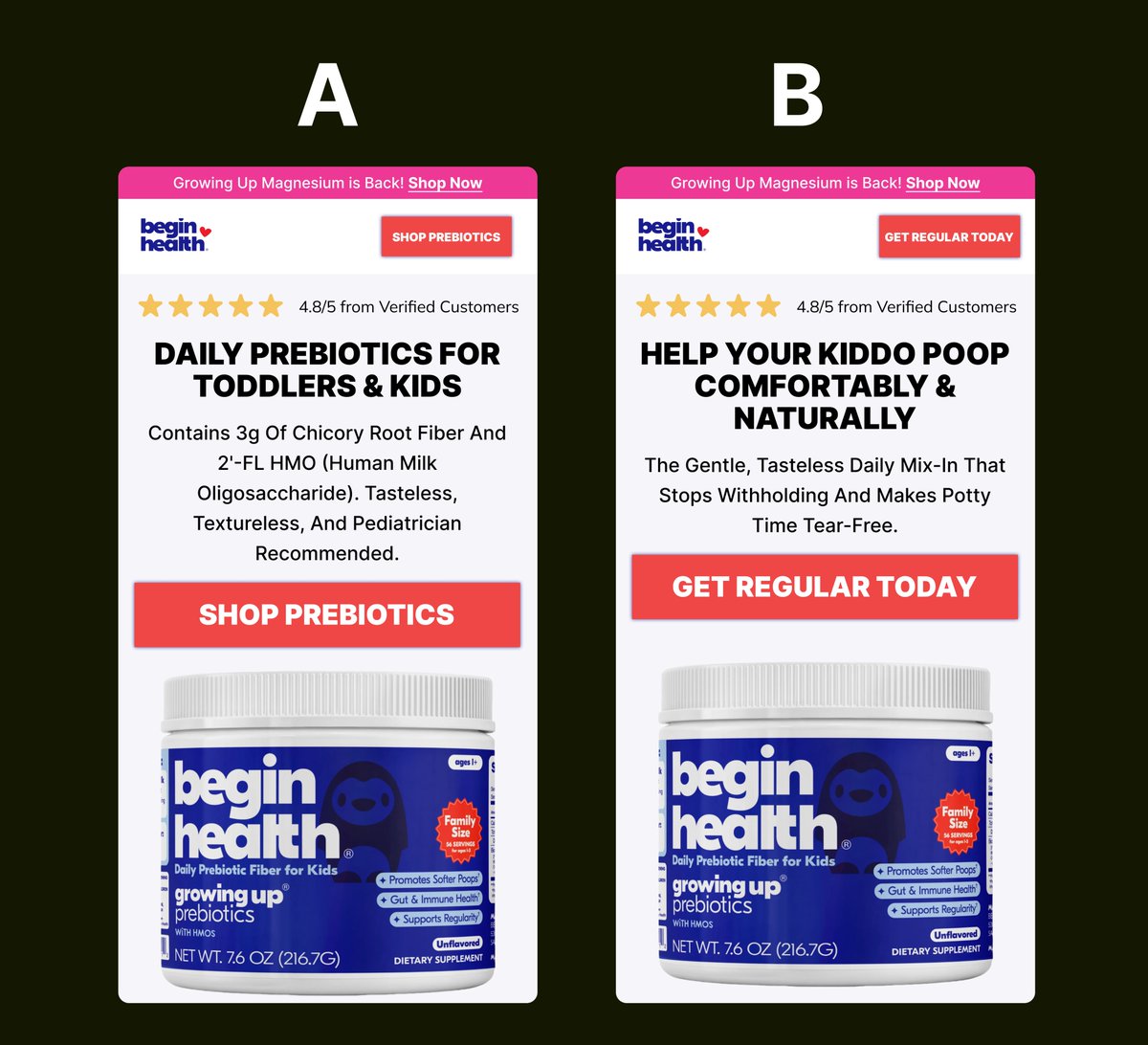
If you sell a health supplement, stop making your customers read a science textbook. 🛑
I just built this A/B test mock-up for a kids' prebiotic brand. We are testing Features (Version A) vs. Emotional Benefits (Version B).
Which one do you think converts tired parents faster? Drop your guess below
Advertorial Page Design in @figma
Need high-converting landing pages, product pages, advertorials, listicles, or a full eCommerce website? I handle both design and development.
Send me a DM.
let’s bring your vision to life.
Advertorial pages shouldn’t push people to buy they should guide them there. Educate the reader, build trust, answer small objection, and remove friction at every step. Break things down simply, show proof, and make the next action obvious. When the flow is clear conversion chase
Clean design, clear message, and a flow that actually converts. Every section is intentional from the first hook to the final CTA. Built to turn attention into action without the noise.
A landing page should do one thing well: convert.
Clear headline. Strong visuals. Trust signals. One focused CTA.
No distractions just a smooth path to “Buy Now.”
#LandingPage#WebDesign#Conversion#UIUX
Most advertorial pages don’t convert because they’re built like blogs not sales systems.
Here’s how I design mine:
Auto layout.
Pixel-perfect spacing.
Clear flow: Hook → Story → Proof → CTA.
Mobile-first.
Design isn’t decoration it’s conversion.
#WebDesign#Ecommerce
Before: just a product.
After: a story that sells.
Stronger visuals, clear messaging, real trust signalsand a CTA that converts.
Same product. Different results.
#BeforeAndAfter#LandingPage#ConversionDesign#UIUX
This isn’t just a landing page… it’s a conversion machine.
Every section has a purpose: hook attention, build trust, and drive action.
No clutter. No confusion. Just results.
#LandingPage#WebDesign#ConversionRate#UIUX
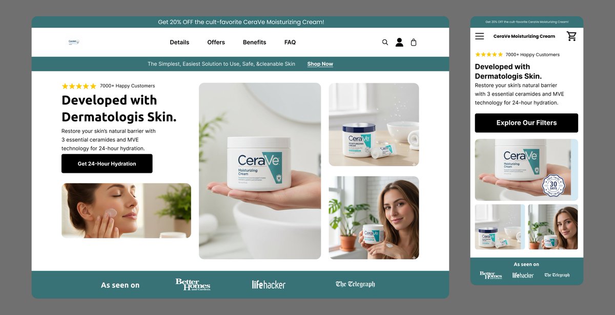
Your hero section isn’t just design… it’s your first impression.
Clear message.
Strong visual.
One goal: grab attention and make them stay.
If they don’t understand it in 3 seconds, you’ve already lost them.
#WebDesign#LandingPage#ConversionDesign#UIUX
Your product page on mobile should sell, not just scroll
Clear images.
Fast load.
Easy checkout.
That’s how you turn clicks into customers.
#Ecommerce#MobileDesign#ConversionOptimization