I had a really lovely time at #SatRdaysLondon2023 yesterday speaking about our work handling air quality data and hearing what the rest of the #rstats community is up to. Learned a lot of useful stuff and met some great people - already looking forward to next year!
I find bits of #ObservableFramework & #ObservablePlot really exciting, but I'm struggling a bit on text formatting in Plot - e.g., if I wanted to add a sub/superscript or Greek letter to the axis label. Any guides out there? Thinking about chem (NOx) & units (ug/m3) formatting
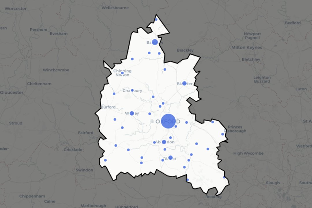
It's time for the #DuBoisChallenge2024. I've done static recreations, and even tabular recreations, but this year I'm keen to use #rstats interactive #DataViz packages. Here's a #leaflet map for Challenge 1 - see https://t.co/xcEYR6Bxjd for the map/code/original plate.
Week 2 of the #DuBoisChallenge2024. I recreated the chart with #plotly for #rstats. The original has a "torn" effect as the x-axis range is so wide compared to most of the data. I use a "rangeslider" so readers can actually scan to see/feel how big the difference is!
Obviously it's quite a big departure from the way the original plate is laid out - I want to be creative with the medium, as I tried to be in https://t.co/afnSypSUGI. DuBois didn't have JavaScript, so we can only guess as to what he might have done with it!
It's time for the #DuBoisChallenge2024. I've done static recreations, and even tabular recreations, but this year I'm keen to use #rstats interactive #DataViz packages. Here's a #leaflet map for Challenge 1 - see https://t.co/xcEYR6Bxjd for the map/code/original plate.
@zoowalk Thanks - that's an interesting read! I've just tried the prettifying step but it hasn't seemed to fix it. We're using Outlook rather than Gmail, so it's possible it's a different but related problem
Question - if you use #quarto & #rstats/#pydata to author self contained HTML reports for clients, what's your approach for actually sending them? Increasingly finding HTML files are caught in email filters (for good reason, I suppose!) so I'm wondering if I'm missing a trick.
I have a real love for the #rstats#leaflet 📦, so was thinking of writing up some tips and tricks I've picked up as I've used it professionally over the last few years. First one; "shading out" de-emphasised regions. Give it a read if you're interested! https://t.co/G1Vgp9jJY6
I've written another #rstats#leaflet post - this time how to use plots (e.g., ggplots) as markers on a leaflet map in a tidy way. Give it a read if interested! https://t.co/ZM79VLpBdl
I have a real love for the #rstats#leaflet 📦, so was thinking of writing up some tips and tricks I've picked up as I've used it professionally over the last few years. First one; "shading out" de-emphasised regions. Give it a read if you're interested! https://t.co/G1Vgp9jJY6
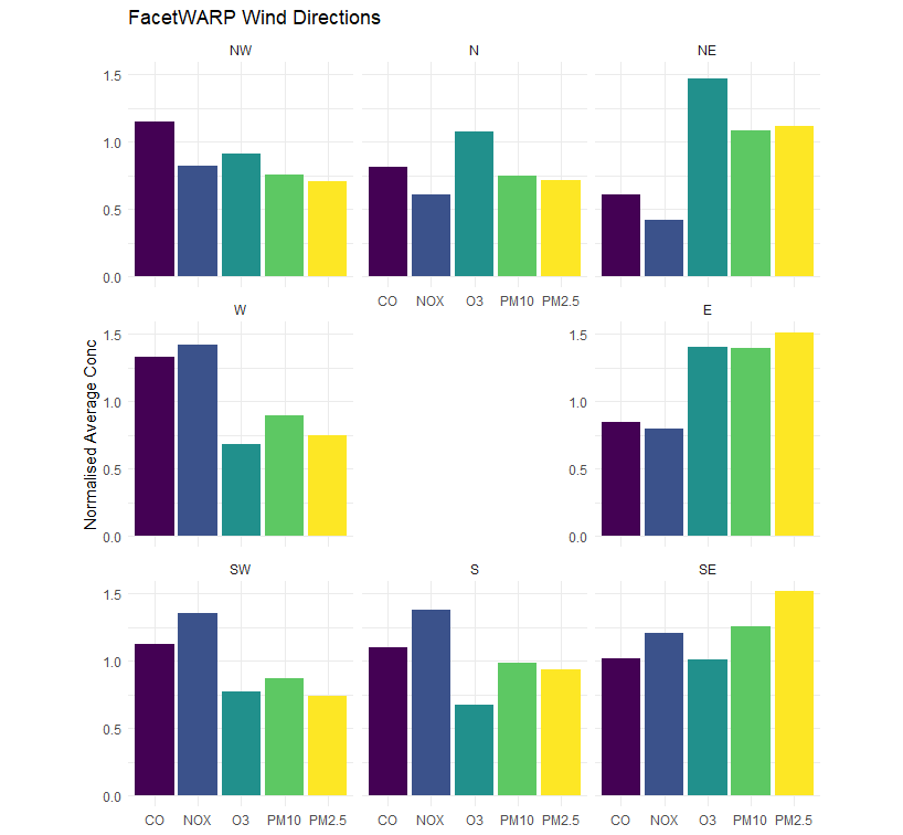
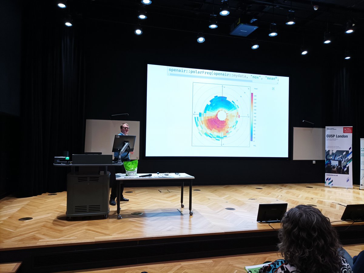
@MattDzugan@posit_pbc That is so cool! Could be really useful for atmospheric composition/meteorological data to facet by wind direction/speed - e.g., "when wind is blowing from the North, which pollutants are elevated?" - found it really easy to mock this up, nice work on the package!
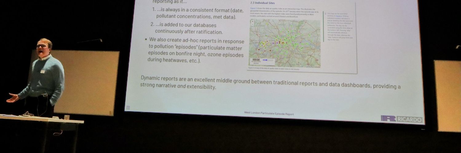
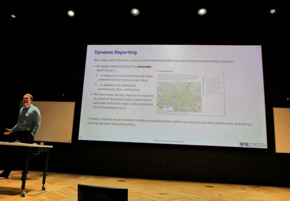
I'm talking at OxfordR on Monday about air quality, dynamic reports, interactive maps, interesting data sources, package development, custom leaflet markers, nested data frames, and more! And there'll be pizza, so what's not to like? 🍕
Very excited that on Monday (27th March), we will have @JDavison_ giving a talk on Air Quality data analysis and the {openairmaps} #rstats package. Looking forward to it!
Come and join us! Sign up here: https://t.co/qVBgPzqSRA
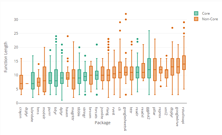
#tidyr deprecated `separate()` in favour of, e.g., `separate_longer_position()` - but do #tidyverse#rstats functions always get replaced by longer/wordier alternatives? I wrote a silly blogpost analysing `{tidyverse}` function names to find out.
👉 https://t.co/EpXyAlcO4r