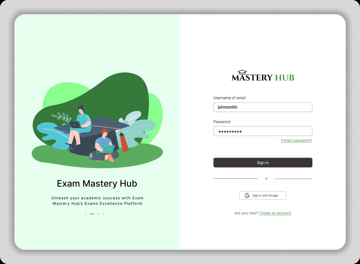
Just finished this portfolio hero section based on typography lessons from @Meedayyy this week!
The goal: Instant Visual Hierarchy.
Design isn't just decoration; it's guidance.
#UIUX#Typography#Design
Introducing Sentra — a smart home app concept I designed to make home automation feel less like managing settings and more like living in a space that just gets you.
Full case study here → https://t.co/9YAfhTTm30
#UIDesign#UXDesign#ProductDesign#SmartHome#Figma
Built Someday — a cinematic AI vision board app that turns your photos into a glimpse of your future life.
A prototype exploring Figma Make × Figma Weave
Check it out on @figma: https://t.co/ygJZFrgOHT
🔗https://t.co/Y7xIIAJ88C
#ConfigMakeathon#FigmaMake#FigmaWeave
@victorious_eth Great Job man. The redesign closely matches the original design. You can consider adding drop shadow to the cards to give it more depth.
@ptdtoluwa98@Meedayyy Wow, I love this. This is similar to what I had in mind to design today. I wanted to design a mobile app for gadgets, and now I'm seeing this. I'll be drawing inspiration from this😀
@Tundex910@nysc360 Bro I go through this same thoughts every single day. I finished registration on the first day with ease, got call up number early momo as well😂
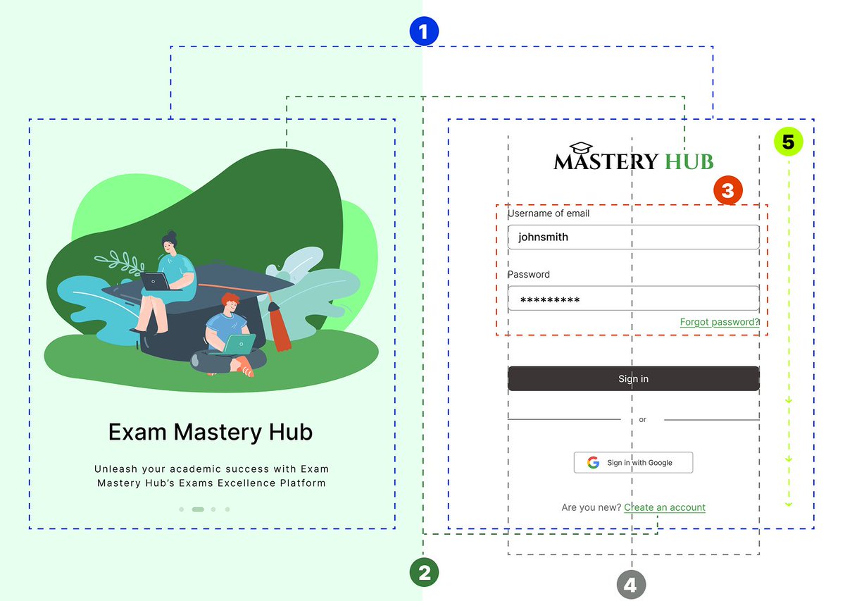
5. Hierarchy: Guide the user's eye to the most important action. The bold "Sign in" button is the priority. The secondary "Sign in with Google" button and "Create an account" link are deliberately less prominent.
Which principle do you think is hardest to get right?
I spent some time this week reinforcing my knowledge of Design Principles through a fantastic class from @TechCrushHQ. Huge thanks to @Meedayyy for the great insights.
Check out the thread below for a breakdown of 5 principles in action!
#UXDesign#DesignPrinciples#TechCrush
4. Alignment: Look at the form fields. Everything is cleanly aligned.
Good alignment makes text readable and the overall design look organized and professional. Messy alignment is a red flag for poor UX!