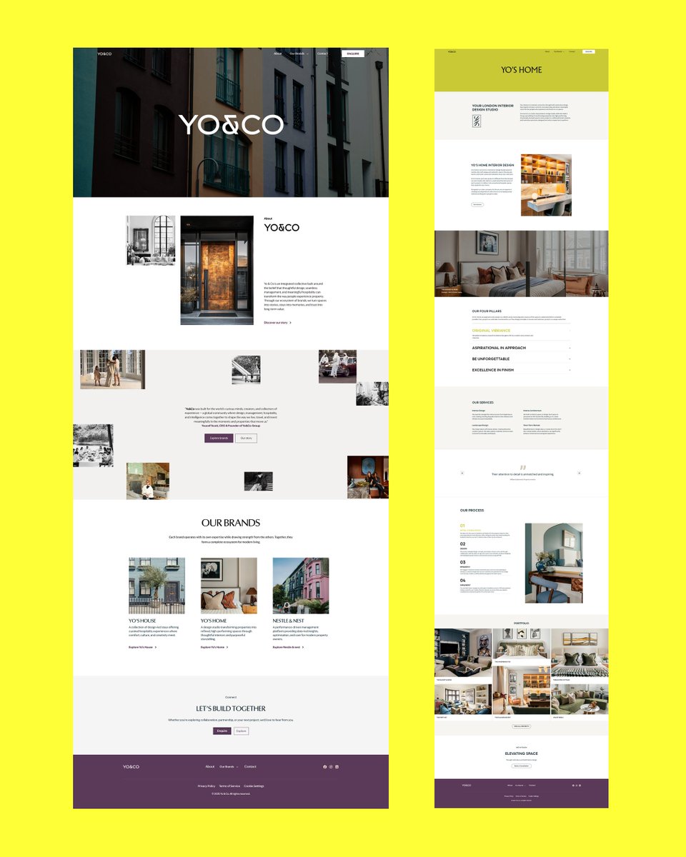
YO&CO From Design to Pixel-Perfect Webflow Development
I recently worked on the end-to-end development of the YO&CO website, bringing the designer’s vision to life in Webflow.
The goal was simple: 100% design-accurate development.
#Webflow#WebflowDevelopment
A brand isn’t just a logo it’s a complete identity.
We’ve crafted something we’re proud of, and we can’t wait to share the story behind it. Our latest logo and visual identity case study is dropping soon.
Stay tuned. 👀
#LogoDesign#BrandIdentity#VisualIdentity#CaseStudy
Day 5 — Direction presentation.
Client sees both paths, gives feedback, we lock in direction together.
No random concepts. No guessing. No "I don't know what I want but this isn't it."
This is why our revision rounds stay low and our clients stay satisfied.
Day 4 — Direction, not design.
We put together a moodboard and a creative direction. Not final work — a sense of where we're headed. Two possible paths.
Day 1 — The onboarding call.
We ask a lot of questions. Not about deliverables — about the business. What does success look like in 6 months? Who is this actually for? What do competitors do that you hate? What do they do that you wish you'd done first?
A better website isn’t the one with the most pages.
It’s the one that makes decisions easy.
Too many pages = confusion.
Too much information = fatigue.
Keep it short. Keep it clear. Keep what matters.
Simplicity scales.
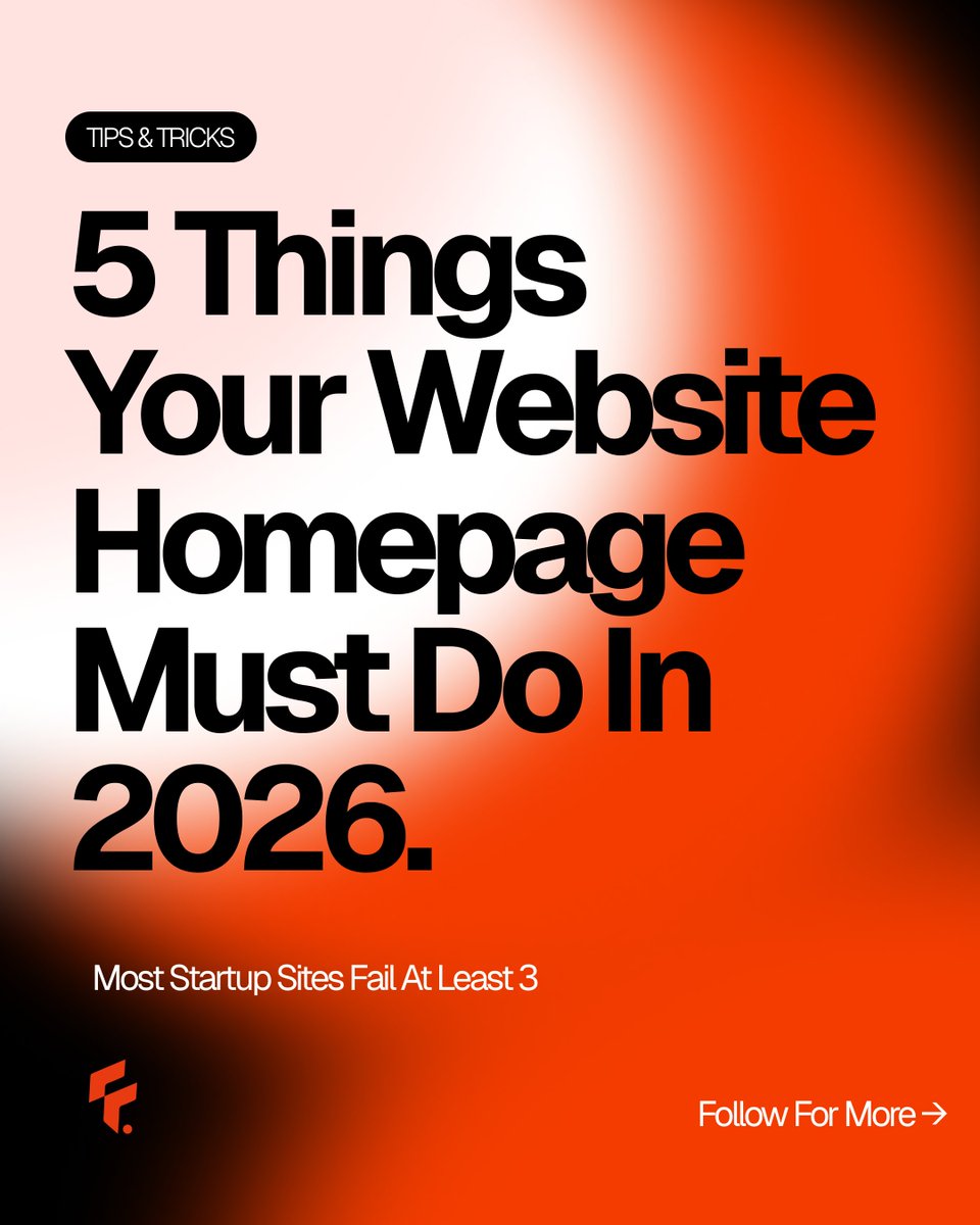
We audit a lot of websites. These five are the most common failure points.
Which one does your site struggle with most? Drop it in the comments — genuinely curious.
3. One primary CTA. Not three.
"Book a call / Sign up / Download / Learn more" — pick one. Every extra button reduces conversion. One clear next step, always.
1. Pass the 5-second test.
A visitor should know what you do, who it's for, and why it matters — in 5 seconds. If they have to read three paragraphs to figure it out, you've already lost them.
If your brand sounds like everyone else, design won’t save you.
Safe brands use the same words, tone, and style. Being average is the real risk.
Stand out—your voice, message, or approach. Uncomfortable? Yes. Effective? Absolutely.
#brand#UIUX#UI#UX#Branding
Beautiful design means nothing if users don’t understand your business in seconds.
Good UX is not about fancy animations, it’s about clarity, simplicity, and guiding users fast. If users get confused, they leave.
#UXDesign#WebDesign#UIUX#Design
Unpopular opinion: Minimal design is everywhere, but now every site looks the same—same fonts, layout, white space.
Simple is good, but too simple = forgettable.
Stand out with something memorable: color, layout, style, or message. Otherwise, you’ll be ignored.
#Design#UX