Soulless branding may not be ugly. But it is forgettable. Healthcare has perfected forgettable.
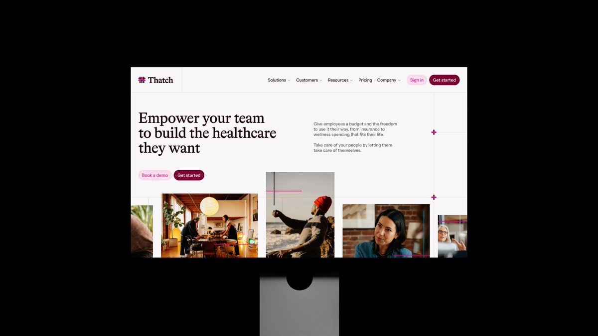
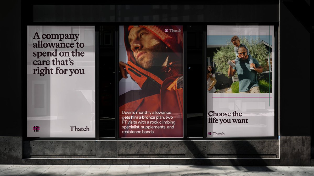
Thatch, however, is a different kind of healthcare company. One actually innovating structurally and technologically. Building a system that saves employers money while giving employees greater choice.
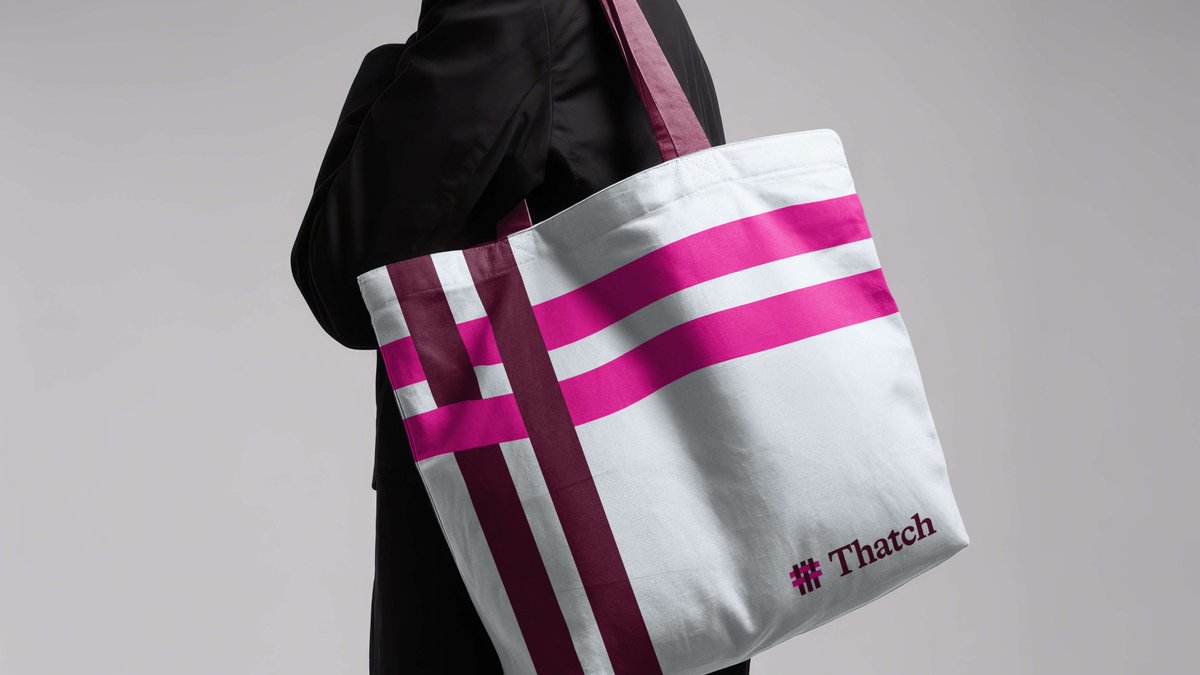
Although this direction was scrapped, I thought it was clever. The mark, clearly a woven T shape. On-the-nose thatched. But also a metaphor for the idea that you stitch together your ideal healthcare across insurance plans and a curated marketplace. Technology holding human decisions together.
This concept ditched the expected blues for a robust serif (the lovely Bradford from Lineto) over the usual geometric sans. Subversive for healthcare, but still inviting and trustworthy. Authentic, active lifestyle photography brings more of that human touch. The thatching motif gets remixed in ways that can lean expressive or structural depending on the application.
Familiar enough to trust. Fresh enough to notice.
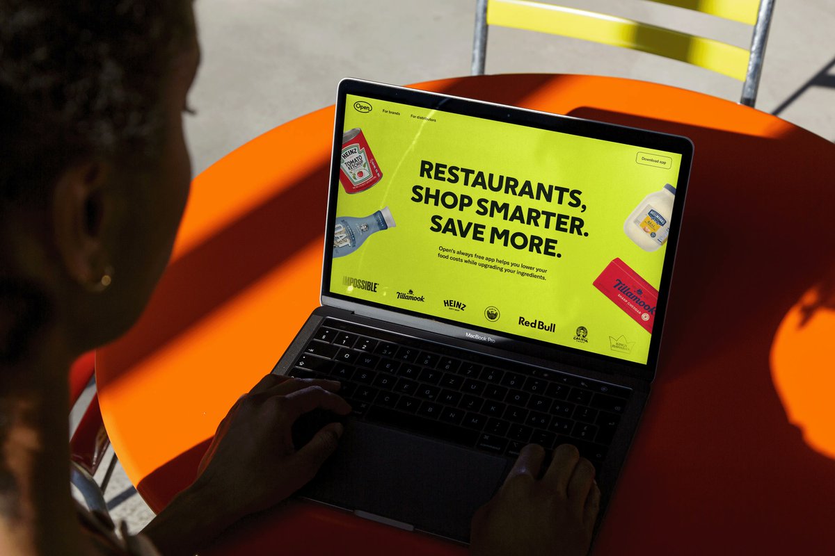
Open helps small, local restaurants stay open.
So the brand pays homage, both visually and metaphorically.
Especially that feeling of coming home to the third place of your favorite local spot, often distinguished by its charming, nostalgic, neon 'open' sign.
Collab with the homie @arjmahesh for his previous co, a creative microblogging platform for Gen Z
The creative north star:
Verse is a place to come and be YOU.
Every part of you is welcome here. Be loud, be fun, be your freest, most creative version of yourself. Reach for the skies. Smile. We smile back.
The logo symbolism:
First, you see the 'V'. Adding “eyes” morphs it into a playful smiley face, with subtle, futuristic metaball shapes nodding to Y2K aesthetics.
A closer look reveals a pair of friends embracing, adding depth to the playful design.
@zoop_design Thank you kind sir! I was so pleasantly surprised with these results, though it took a ton of patience and iteration and reference-smashing in Midjourney
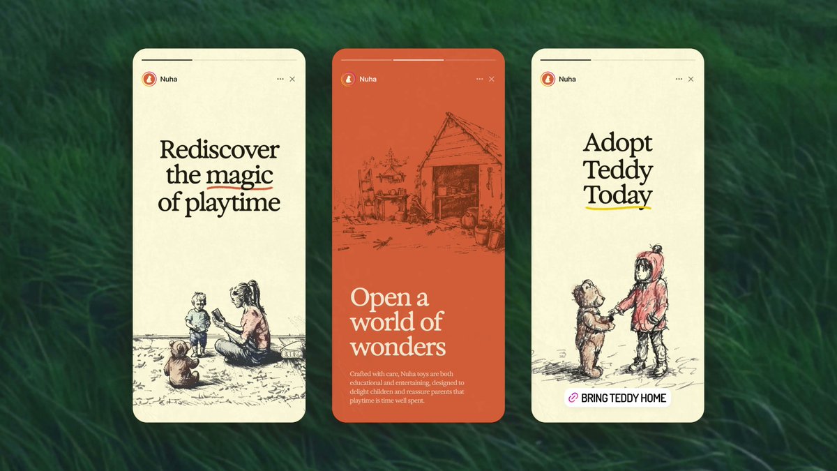
Robot teddy bears that make playtime more magical.
A brand that evokes nostalgia, wonder, soul, and sagacity. One that speaks to modern parents and discerning adults who believe technology can still kindle curiosity and create connection.
For the creative direction, I experimented extensively with Midjourney to achieve a unique illustration style. It needed to be playful, nostalgic, warm...and a bit luxurious. Like a sketchbook you might find on a charming little bistro table in a French coastal town.
After establishing a consistent style and characters, I added hand-drawn details with a stylus to capture that magical moment when a coloring book starts coming to life.
This versatile artwork brings warmth to everything from the website, to investor materials, to packaging, books, and much more.
For @nuha_inc
If you’re gonna make another card reader, you might as well make it nice.
Clean lines, soft curves, and color when it counts.
Creative direction and experience design for Stripe Hardware.