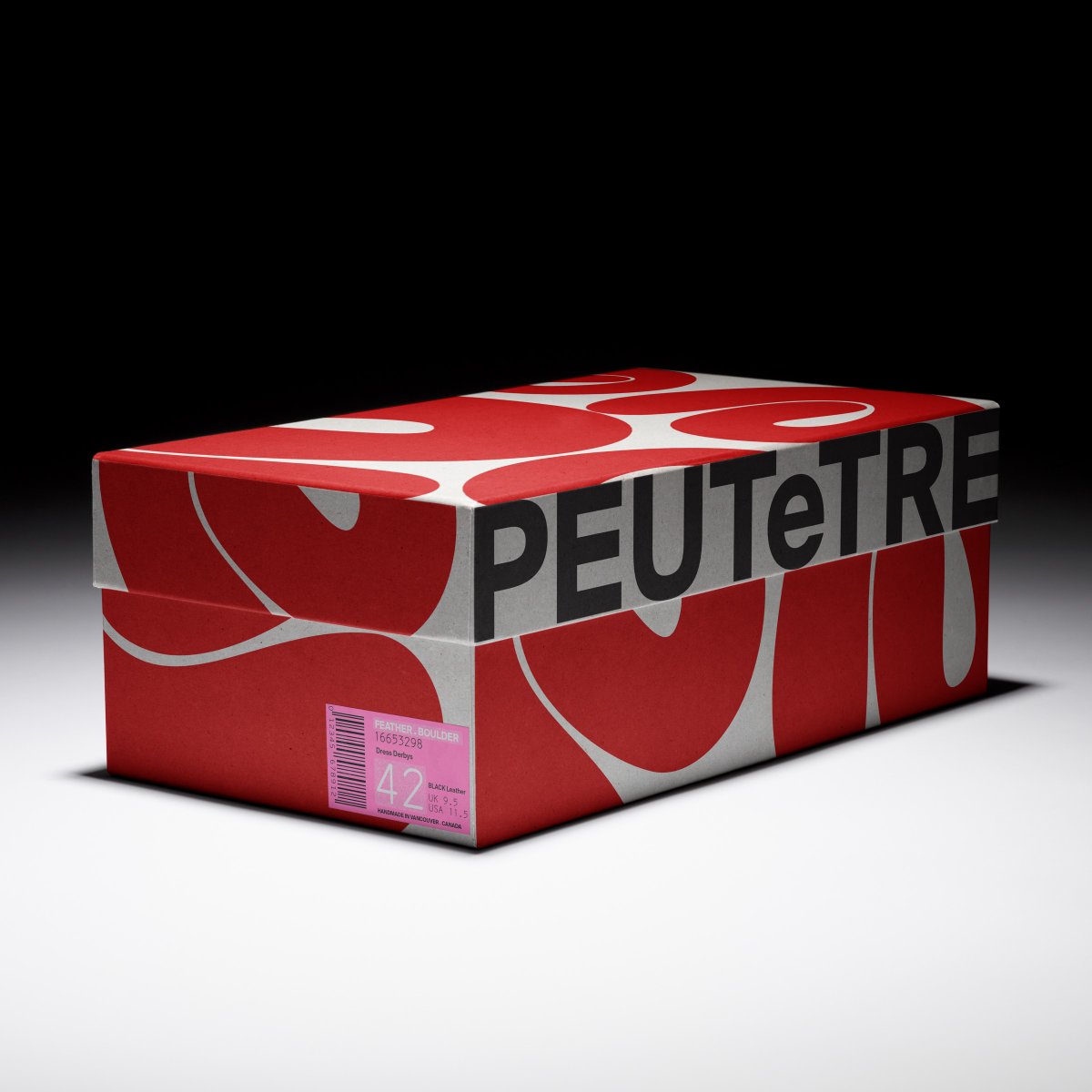
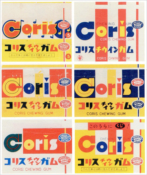
‘Frutik’ is a love letter to fruit and graphic excess, it traces a personal design language rooted in Colombian street markets, improvised flyers, and everyday abundance. https://t.co/ibxPozmpB1
“This is it, this is happening”
Tickets on sale this Saturday 31st August (🇮🇪8AM IST / 🇬🇧9AM BST)
Dates:
Cardiff Principality Stadium - 4th/5th July
Manchester Heaton Park - 11th/12th/19th/20th July
London Wembley Stadium - 25th/26th July & 2nd/3rd August
Edinburgh Scottish Gas Murrayfield Stadium - 8th/9th August
Dublin Croke Park - 16th/17th August
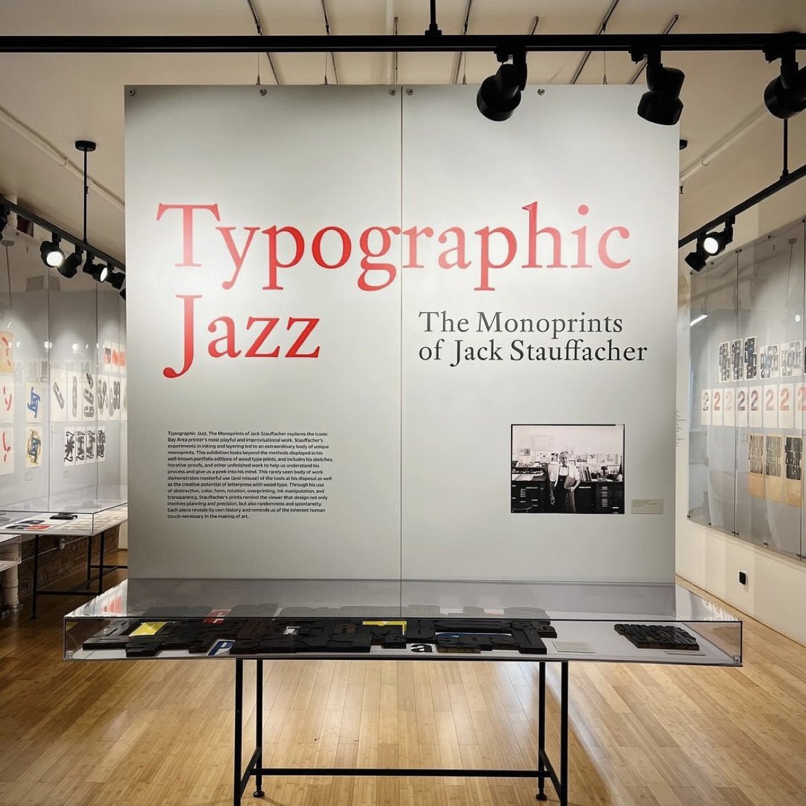
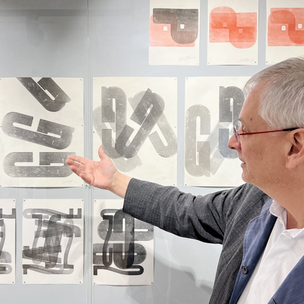
Sat, 4/20! Join us for an in-person tour of our current exhibition with curator Rob Saunders. A collector of graphic design for 40+ years, Saunders offers a deep dive into wood type, letterpress printing, and the freedom of experimentation. Register here: https://t.co/LqHK4G7mpw
https://t.co/1OiwGiT3oQ — Pier-Alexandre Gagné is a grunge designer with a print heart but what got me was that Bird On the Wire brand. Letters than dance up and down. Graceful and gentle.
Transport Logos by Kenneth Hollick
Greater Manchester Passenger Transport(1974)
British Tissues (paper tissues) (1977)
London Borough of Havering (town council) (1975)
G. Priestner Ltd. (transport and storage) (1964)
European Trademarks & Logotypes, 1979
https://t.co/ujkmvmi8et
A thread of commercials by Kunio Kato. He's among Japan's best animators -- and the only one with an Oscar-winning short (The House of Small Cubes, 2008).
Since then he's worked on a number of ads, like this one for Lawson convenience stores, done with Studio Ghibli in 2020:
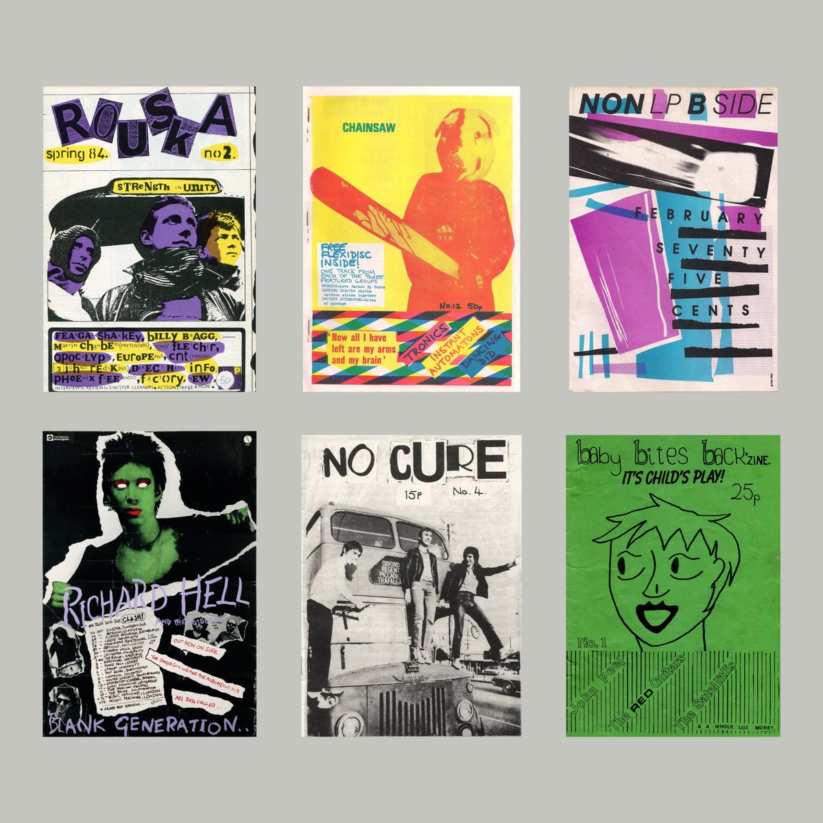
1980s fanzines • DIY magazines that gave passionate fans a platform for alternative voices and fostered communities in subcultures like Punk, New Wave, and Science Fiction.


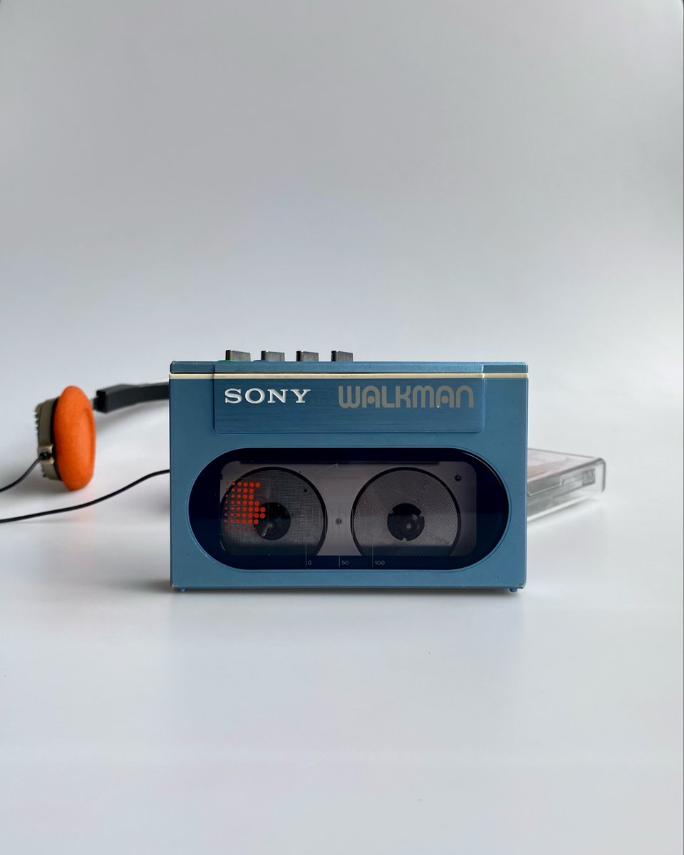











![searchsystem_'s tweet photo. Kunel Gaur / Obsidian 7K / Sculpture / 2026 [https://t.co/9uLjaJwcA1]
—
Bookmark for later https://t.co/K4FoUOGVMI](https://pbs.twimg.com/media/HLaHq1DWgAAGRfd.png)