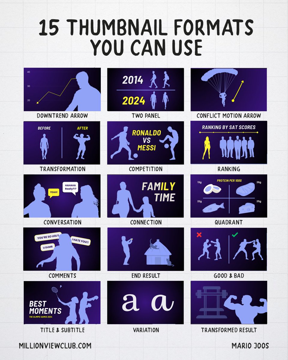
Here are 15 YouTube thumbnail formats you can use this year.
Thumbnails are so important for grabbing someone’s attention. They can create a promise, set a tone, or even give additional context that the title cannot provide. So my team and I analyzed thousands of thumbnails, grouping them by similarity.
1. Downtrend Arrow
This composition uses a downward arrow to clearly signal loss, decline, or failure. The viewer instantly understands that something went wrong without needing additional context. It works because people are sensitive to negative outcomes, so it creates curiosity around what caused the drop or how it can be avoided.
2. Two Panel (Vertical)
This composition shows two states side by side, usually to highlight a difference or comparison. It can be before vs after, past vs present, or two different options. The viewer immediately starts comparing the two, which reduces thinking effort and makes the message easy to process.
3. Conflict Motion Arrow
In this composition, we combine movement with tension. The arrow shows one direction, but the setup suggests another. The viewer understands what is happening, but not the outcome, which creates curiosity around the result.
4. Transformation
This composition shows a clear before-and-after change. The left side represents the starting point, while the right side shows the improved or altered version. It works because it promises progress, and viewers are naturally drawn to visible improvement or results.
5. Competition
This thumbnail places two subjects against each other, often with a clear “vs” dynamic. The viewer instantly understands that there will be a comparison or winner. It works because it creates tension and encourages the viewer to pick a side.
6. Ranking
This composition organizes subjects into a hierarchy, such as tiers, scores, or levels. The viewer quickly understands that something is being evaluated. It works because people are naturally curious about status, placement, and which option performs best.
7. Conversation
In this composition, two people are interacting, often with a short statement or reaction. Unlike a question-based format, this focuses more on opinion or exchange. It works because it mirrors real-life interactions and makes the viewer feel like they are observing a conversation.
8. Connection
This composition highlights a relationship between people, objects, or ideas. The focus is on how things are linked rather than opposed. It works because viewers are naturally curious about how different elements connect or influence each other.
9. Quadrant
This composition divides the frame into four sections, each showing a different variation or category. The viewer can quickly scan multiple options at once. It works because it organizes information into a simple system, making complex ideas easier to understand.
10. Comments
This thumbnail uses comments or reactions as the main focus. The text usually represents opinions, criticism, or feedback. It works because viewers are curious about what others are saying, especially when the comments are emotional or extreme.
11. End Result
This composition shows only the final outcome without revealing how it was achieved. The viewer sees the result but not the process behind it. It works because it creates a gap between outcome and method.
12. Good & Bad
This composition clearly separates what is right and what is wrong. One side is presented as correct, while the other is shown as incorrect. It works because it removes ambiguity and promises a clear answer or guidance.
13. Title & Subtitle
This composition relies more heavily on text, with a main statement supported by a secondary line. It works because it allows more precise communication while still using visuals to grab attention.
14. Variation
This composition shows small differences between similar elements. The changes are often subtle. It works because the brain is naturally drawn to spotting differences.
15. Transformed Result
This composition focuses on the final upgraded version of something, often showing an extreme or impressive result. Unlike a standard transformation, the emphasis is more on the outcome than the process. It works because it highlights the reward, which then attracts viewers interested in achieving a similar result.
There are many types of thumbnails, and categorizing them into simple compositions or formats isn’t easy. Still, this framework gives us a starting point to understand what we can experiment with during thumbnail A-B testing.
Stop wasting time making backgrounds just drag & drop them into your editing software.🥳❗️
I’ve collected 50+ Animated backgrounds🎉.
Want them?🤑
Comment “Background”
Follow + Repost ♻️
I’ll send it instantly 📥
YOUTUBERS! We spent an entire week building a blueprint so you can come up with the perfect video idea for your next upload.
This is the actual process we've used to generate BILLIONS of views for our clients and we're giving it away for FREE!
This will be the most valuable YouTube document you'll ever read - just retweet this post, use the link in our bio to sign up to 1of10 and comment IDEA below to get access (make sure to follow to receive the DM)
I'M OFFICIALLY A $BTC BILLIONAIRE!
As I promised, I want to change someone's life—giving away 1 #Bitcoin (~$106,000) to one lucky winner by tomorrow!
Like, RT, follow
and comment 'DONE' to enter.
Winner announced in 48h!
Get Paid $3,598/Week by Copying & Pasting Text.
You just need:
Internet
Mobile
1 hour a day
I'll show you how. Grab my free guide now!
Like & Retweet
Comment "Need"
Ensure to Follow me
So that I can DM you FREE
Advertisers spend billions every year on social media trying to stop people scrolling...
The 21 best scroll-stopping ads (last one should be illegal)
1. Meshki
Tiktok Organic + Glitchy = Easiest way to make $9k a day
I found a new glitch that is making teens thousands a day using TikTok slideshows and i'm teaching y'all
for FREE
rt/comment "glitch" and ill send it over