Design is location-specific (and we keep getting it wrong)
I've noticed something after working with clients across Asia, Africa, Europe, and North America.
The same design principle that gets praised in New York gets criticized in Tokyo, Seoul, or Shanghai.
Here's what I mean:
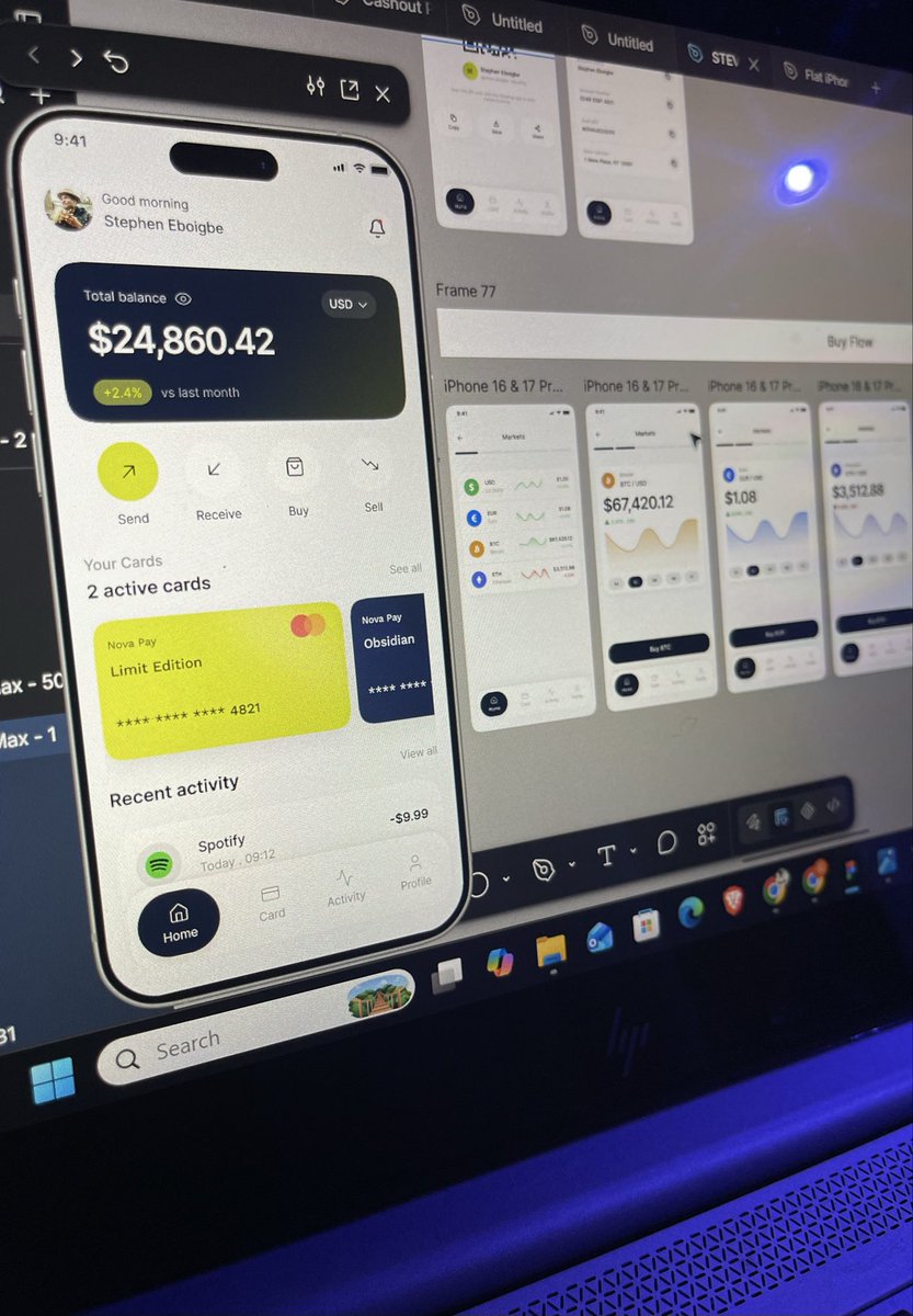
Western apps are obsessed with minimalism. Clean. Spacious. One action per screen. The philosophy is: "Less is more."
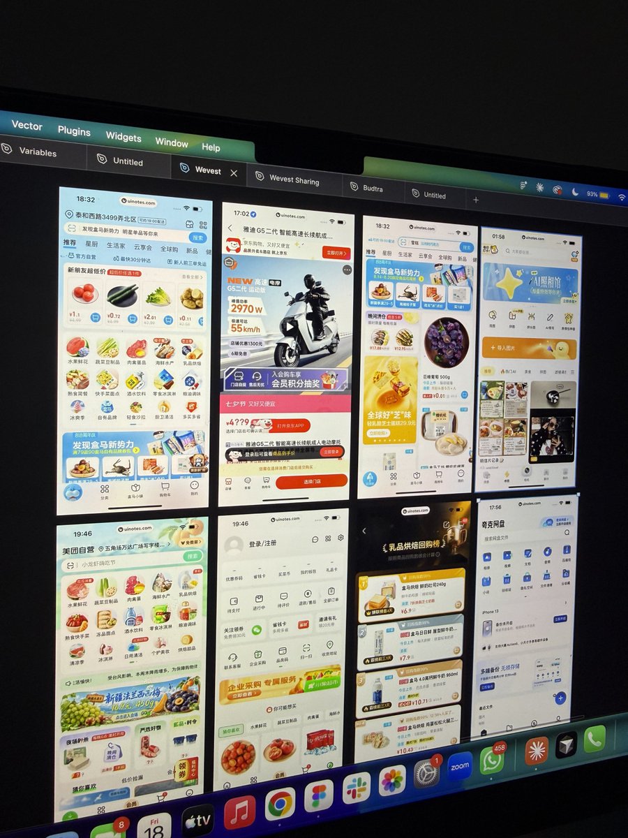
But look at any successful Asian app. They're packed with information. Features. Options. Users see density and think: "This company has everything I need."
It's not a bug. It's a feature.
Why the difference?
It's cultural.
In Asian markets, information density signals value and capability. Users want to see options, features, and possibilities upfront. A minimal interface can feel empty, unfinished, like the company is hiding functionality.
In Western markets, users are overwhelmed by choice. Minimalism feels premium. Thoughtful. It signals confidence and restraint.
The problem:
Too many designers export Western design principles to Asia without understanding local preferences. They see WeChat, Alipay, or Japanese banking apps and call them "cluttered."
But those designs are working. Users love them. Engagement is massive.
The real lesson:
Great design isn't universal. It's contextual.
I've designed minimal apps for Western clients and dense, feature-rich dashboards for Asian users. Both succeeded because they respected the market.
Stop copying San Francisco for Tokyo.
Design for where your users actually are.
I designed Lumio, a saving app built to help users develop better financial habits through personalized goals, smart insights, saving streaks and Ai powered recommendations.
I designed a modern US digital banking platform that combines everyday banking, instant money transfers, cryptocurrency trading, and virtual cards into one seamless mobile experience
@mindinpanic Great point FlowSync Ai stills concept, but the vision is an AI workspace, not just another project management tool. the Ai is designed to proactively prioritize tasks, predict risks, automate workflows, and provide actionable insights
Been exploring the idea of designing a modern AI powered SaaS platform that helps businesses manage projects, organize tasks, collaborate with teams, track productivity, and automate workflows all from one workspace.
Meet FlowSync AI 🤖✨ A clean enterprise dashboard
I recently designed this landing page concept for an AIpowered defense technology platform, focusing on creating a bold first impression while maintaining clarity and usability.
The goal was to balance a premium visual aesthetic.
#UIUX#Figma#ProductDesign#WebDesign
Been exploring the idea of designing a modern AI powered SaaS platform that helps businesses manage projects, organize tasks, collaborate with teams, track productivity, and automate workflows all from one workspace.
Meet FlowSync AI 🤖✨ A clean enterprise dashboard