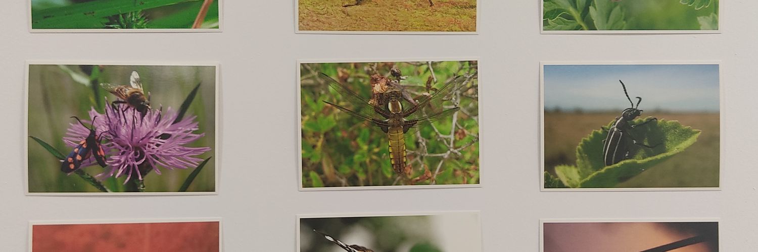
Looking for a hands-on way to teach PCR? Here are four case studies using DNA barcoding:
🌿 Teach lab + bioinformatics
🌿 Insects, fungi, and algae
🌿 Formats from 3 days to full courses
🔗Read it here: https://t.co/lMZvQayX8L
In a study involving 23 labs, researchers tested various sequencing/bioinformatic approaches for taxonomic profiling of DNA reference reagents consisting of 20 common gut bacteria, revealing the reality of technical bias in the microbiome field. #mSystems: https://t.co/W6zFtW9b3S
How do you show multivariate information in a simple 2D plot? Scatterplots work for two variables, maybe three with color, but what if you want to show even more?
The PieGlyph package provides an elegant solution. It lets you place mini pie charts directly on a plot, so each point can display the distribution of several variables at once. This makes it possible to show complex data in a compact and intuitive way.
Some highlights of PieGlyph:
🔹 Overlay pie-glyphs on scatterplots, maps, or grids
🔹 Display proportions for multiple variables per observation
🔹 Control colors, sizes, and legends for clear interpretation
🔹 Combine with ggplot2 for polished and publication-ready visuals
🔹 Create both static and interactive graphics for deeper exploration
The example visualization below (from the package website) is interactive and shows how PieGlyph enriches a scatterplot with pie-glyphs, turning each data point into a multivariate summary that can be explored dynamically. Package website: https://t.co/9ojCWhbUnA
Want to improve your data visualization skills in R? Check out my course "Data Visualization in R Using ggplot2 & Friends."
For more information, visit this link: https://t.co/ztlEzoEDWv
#Statistical #Rpackage #rstudioglobal #VisualAnalytics #DataScientist #RStats #Data
Working with high-dimensional categorical data is often overwhelming. Tables and bar plots quickly become cluttered, making it hard to spot meaningful patterns.
The DicePlot package (available in R and Python) offers a clever alternative: it visualizes categories as “dice faces” arranged in a compact grid, so complex relationships become easy to see. It’s especially useful for survey data, biomedical research, or any dataset with many categorical variables.
With DicePlot you can:
🔹 Explore large sets of categorical variables in one view
🔹 Detect rare or unusual category combinations
🔹 Communicate complex patterns in a clear, visual way
🔹 Compare multiple datasets side by side
🔹 Produce visuals that are compact, intuitive, and publication-ready
The figure below (from the package website) shows biological processes on the y-axis and cell types on the x-axis. Each square is a “dice face” representing categorical combinations, with colors highlighting different functional groups. This compact view makes it much easier to compare categories and uncover hidden structure in the data.
GitHub page: https://t.co/uZujEJapND
If you’d like more tips and resources on R, Python, statistics, and data science, you might enjoy my newsletter. Take a look here for more details: https://t.co/X93SeCe0rb
#datavis #RStats #datasciencetraining #Python #Rpackage
Struggling with smears or strange bands in your PCR? Our troubleshooting guide helps you identify and fix non-specific amplification:
⭐ Common PCR artefacts
⭐ Potential causes
⭐ Practical troubleshooting steps
🔗 Read more: https://t.co/i4I9PeE7k4
📢New study: Aphid populations attacking lettuce fields in England show surprising east-west geographical split that could complicate control efforts...🪲🥬
Full story 👇
https://t.co/Va0B9qHHZi
It’s interesting that abandoning p-values and false discovery rates for 2nd generation p-values results in major reductions in decision errors: https://t.co/D0xcsJZalW
Curious how PCR can be used to study insect diet and parasites directly in the field? Researchers at Newcastle University have published a new open-access protocol for investigating ecological interactions of invertebrates using Bento Lab.
Developed for field-based ecology courses, the protocol describes:
🕷️ A detailed workflow for beginners that can be adapted for many ecological investigations by changing the primers and PCR program
🕷️ Practical steps suitable for fieldwork settings
🕷️ Insights from testing during two field-ecology courses in 2023/2024 and 2024/2025
🔗 Find out more here: https://t.co/traY4Ohnpf
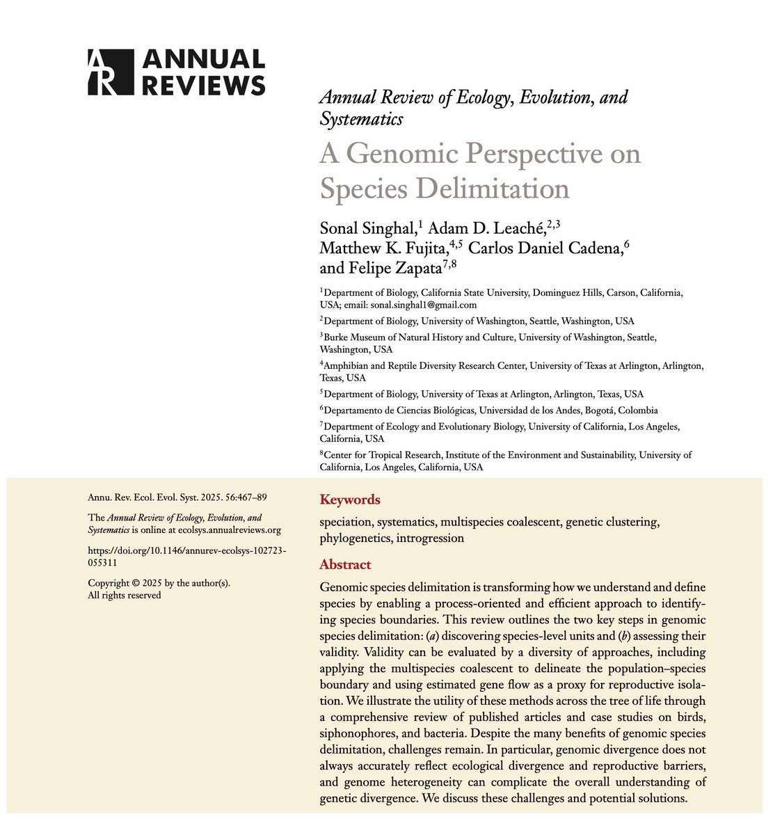
A Genomic Perspective on Species Delimitation | happy to share results of this collaboration with an awesome team! #cienciacriolla https://t.co/HaEodY9Fbo
Want to monitor antimicrobial resistance on-site?
Vargas-Reyes et al. show a versatile detection toolbox:
🔹 Adapts to high, medium & low-equipped labs
🔹 High sensitivity for low DNA concentrations
🔹 Bento Lab enables on-site & lateral flow testing
🔗 Read more: https://t.co/fjH7ET85Qw
If you’re having difficulty making your PCRs both specific and high-yielding, have you heard about touchdown and stepdown PCR?
Both are PCR cycling strategies that prioritise specificity at the beginning of the PCR, and then yield later on.
In our article, find out:
⭐ How touchdown PCR works
⭐ How stepdown PCR can approximate touchdown on basic thermocyclers
⭐ Why these methods are useful when the optimal annealing temperature is unknown
🔗 Read more here: https://t.co/Fy5hRWLW5z
Finished updating syllabus and lecture slides for my intro undergrad course on applied stats and R.
See them here: https://t.co/YzNH7dSj94
Are you an instructor using DSS as your primary textbook? Email me for updated source files #rstats#AcademicTwitter
Looking for a hands-on way to teach PCR? Here are four case studies using DNA barcoding.
🌿 Teach lab + bioinformatics
🌿 Insects, fungi, and algae
🌿 Formats from 3 days to full courses
🔗 Read here: https://t.co/sWULxks7fq
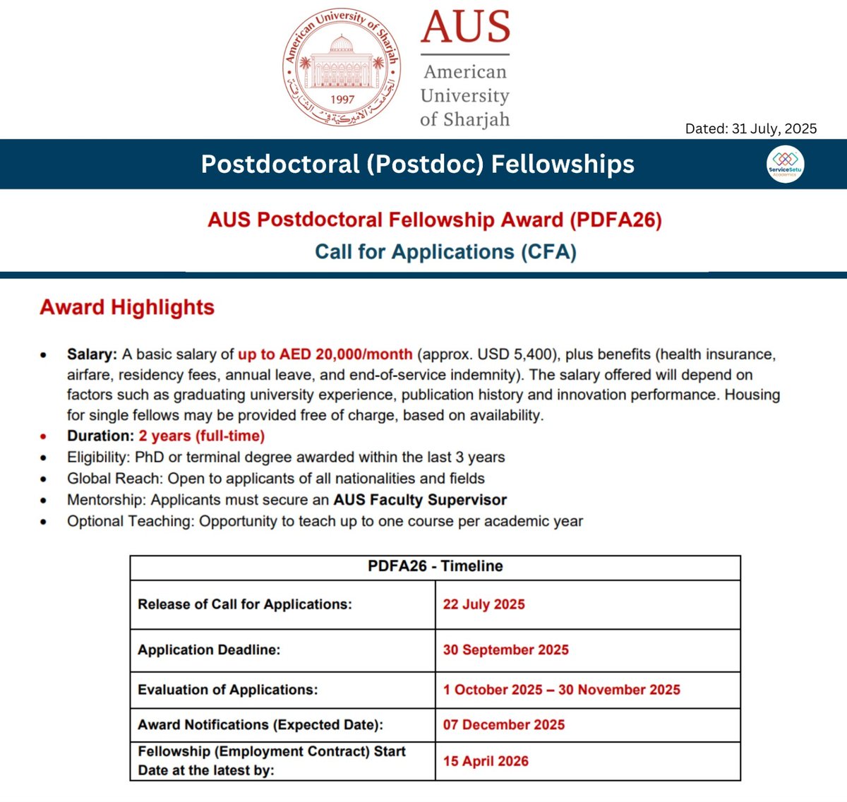
Post Doctoral Fellowship at @AUSharjah#PDF
Duration 2 years
Stipend: Up to AED 20,000/month (approx. USD 5,400), plus benefits
PhD awarded within the last 3 years
Applicants must secure an AUS faculty supervisor
Details at https://t.co/kQ4TnXYjsi
Apply by 30th September 2025
Struggling with smears or strange bands in your PCR? Our troubleshooting guide helps you identify and fix non-specific amplification:
⭐ Common PCR artefacts
⭐ Potential causes
⭐ Practical troubleshooting steps
🔗 Read more: https://t.co/i4I9PeE7k4
The Plot Builder in #JASP 0.95.0 is now powered by #tidyplots 🚀
Kudos to @matyasbukva
JASP is an open-source statistical software suite with a graphical user interface for conducting classical and Bayesian analyses.
https://t.co/qDIHpBTvRh
#rstats#dataviz#phd