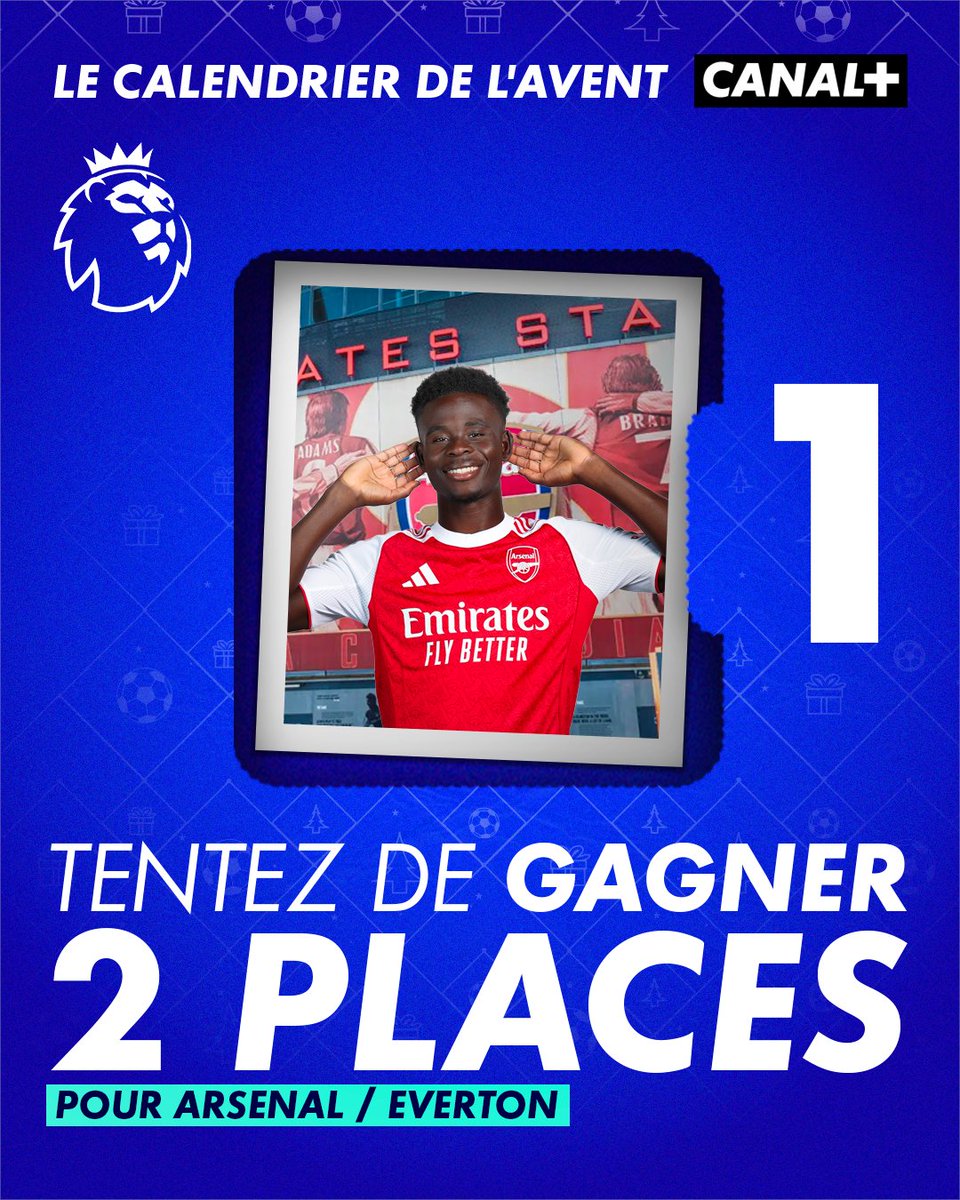
🎄 ON OUVRE LA PREMIÈRE CASE DU CALENDRIER DE L'AVENT CANAL+ 👀
🎁 On vous offre 2 places pour Arsenal / Everton le 14 mars 2026 en Premier League 🤩
Pour participer :
- Abonnez-vous à @CanalplusFoot ✅
- RT ce post ✅
(Doublez vos chances sur notre compte Insta 👀)
Tirage au sort le 8/12 🍀
Règlement en bio.
🧵 BIG NEWS 🚨GSAP (@greensock) is now free for everyone (and even more updates!) 🎉
Webflow acquired GSAP in the fall of 2024, and today, we’re excited to share some major updates. Check out the thread for more!
Here are the teams that have qualified for the #EURO2024 quarter-finals! Who will advance to the semi-finals?
Vote for the best kit of the competition and try to win it.
https://t.co/qBpZWAMI00
After a surprise victory against Belgium, Slovakia can secure their qualification by facing Ukraine, who must win after their heavy defeat in the first match. #EURo2024#SVKUKR
The competition continues on FCDA
🇸🇰 ➝ https://t.co/DPjEGTvz1T
🇺🇦 ➝ https://t.co/OfJO0DZA8S
🚨🚨 Jersey Giveaway
Follow us: @fcdesignawardLike
Like and repost
-> Select and vote for your favourite kit for a chance to win it on https://t.co/fDO7RU8v4G Link here https://t.co/qBpZWAMaas
#contestgiveaway#euro2024#football
Switzerland 🇨🇭 can qualify tonight. Scotland 🏴 must win to stay in the competition. Exciting game!
#EURo2024
Keep voting to choose the best jersey of the competition ➝ https://t.co/eUngEccoQe
Ready for the second game Hungary vs Switzerland ?
Vote for your favorite kit of this game and try to win it !
🇭🇺 ➝ https://t.co/iJX9lXAliR
🇨🇭 ➝ https://t.co/sGsQLu4z7u
#EURo2024 // #HUNSWI
Euro 2024 starts tonight!
Celebrate football kit design with FCDA!
Vote for your favorite kit and get a chance to win it.
Vote for 🇩🇪 ➝ https://t.co/1Aic5E0cFD
Vote for 🏴 ➝ https://t.co/x6e38IULHR
#GERSCO // #euro2024
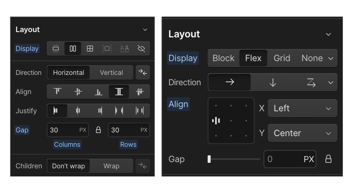
Hello @webflow, I'm sorry, but after trying this for a whole day, the new panel just doesn't work.
The layout panel and the style panel itself are actually really good, offering a great balance between abstraction and control, which the new UI lacks.
I understand it's aimed at simplifying the UI, but I don't think the old UI was that hard to understand.
The old UI tells you exactly what style has been added at a glance. I didn't know how valuable this was until it was gone.
The new UI abstracts everything and hides many elements behind a dropdown, making it hard to know what's actually happening.
The old UI also displays a lot more than the new UI, which I understand is a design choice, but why was that considered a bad thing? Who actually complained?
While I acknowledge the new UI reduces the clicks needed for the most common layouts, for anything else, it's just way too complicated.
We'll probably all get used to this, but I'd love it if you would consult users about UI changes before implementing them.