Nothing wrong with this sign. Except, I’m confused as to why the mountain on the sign is not camels hump. Is that not Vermont’s most recognizable mountain??
8.5/10 @RT4VT - although I’ll add a point back if you can explain why you didn’t pick camels hump.
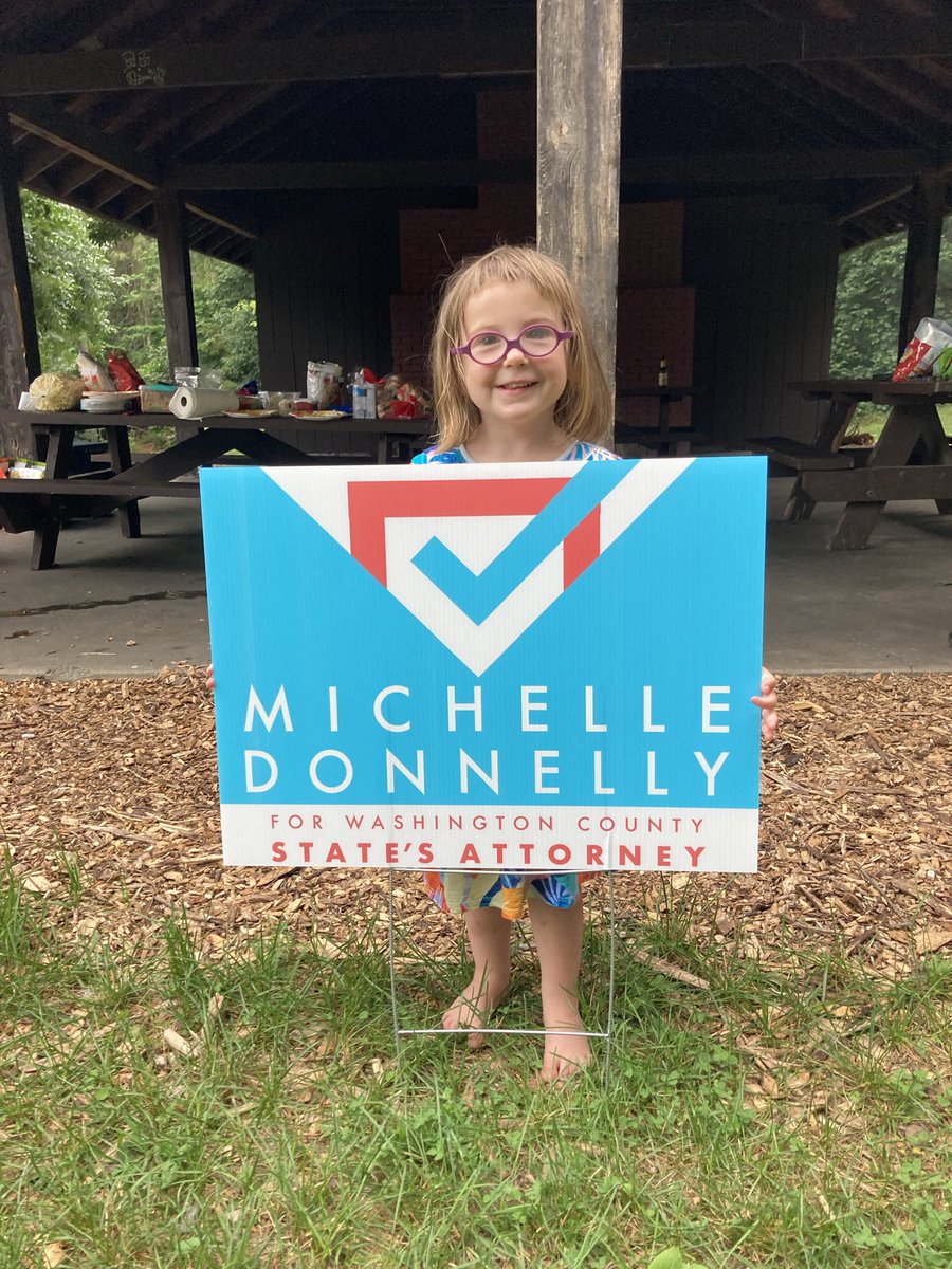
Now this one stands out. Nice red white and blue contrast, big fan of check marks (they’re just so satisfying?).
Only note: wish the name was in a bolder font.
9/10 @MSDonnelly
We’ve looked into Chris’ candidacy and determined that he’s a good guy with a good platform.
While his sign has no technical deficiencies (it looks good), we can’t help but wonder, is this like a stock template from vista print?
8.5/10 @WintersVermont
Usually not a fan of green but paired with that orange it’s not bad. Unique design and a very clear last name.
-1 points because I’m pretty sure the trees are supposed to be green, not orange.
9/10 @pbeanVT
Simple design 👍
Name is big and legible!👍
Really great blue👍
Also Ted is. Great candidate running to actually help people and change Kentucky’s justice system for the better.
11/10 @ShouseforJudge
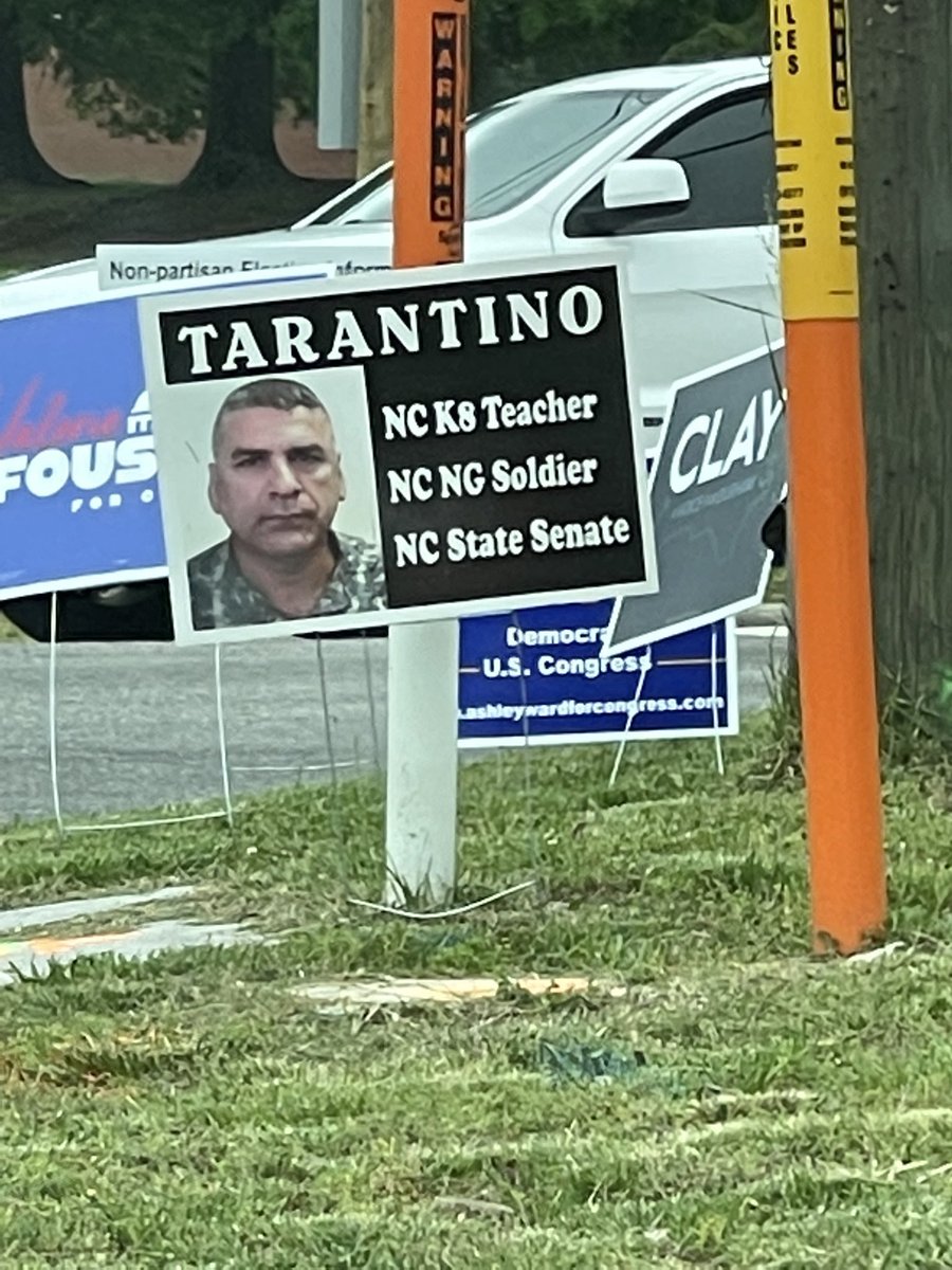
Not really sure what to say here.
First of all, your “headshot” is not needed. Secondly, the message here is that he’s a teacher soldier who wants to be your senator? Is that a winning message in NC?
We feel bad for the printshop that had to print this.
0/10