When designing digital experiences, I like to borrow from the architecture and industrial design process: what’s the material that will be used? What’s the production process? Super helpful when thinking about technical constraints and decide how to involve devs in my process.
me in 2023: cool, seems like AI will finally be good enough to help me do creative work by naming my layers and doing the boring stuff so I can do the fun creative work
ai companies in 2024: we didn’t make it do any of that, but it does the fun creative work now
me: …
Why does the climate change solutionist discourse always fail to talk about the need to change our behaviour? Failing to educate people and help them change their behaviour is as bad as failing to deliver the technological solution to the problem.
NJ banned plastic bags. Usage went down.
People chose alternative bags. Those bags have a larger carbon footprint.
Emissions rose 500%
Congrats everyone!
"This ought to be the motto of the climate lobby: We don’t help the environment, but we feel good about it anyway."
You can make great music, whether you're a shower singer or a charting artist. No instrument needed, just imagination.
Make your song today at https://t.co/HG7qM2Jhr5 🎧
Always find it funny that the opening night of opera season in Milan is still so cultural relevant that Italian papers feature this as breaking news with a minutecast report of it https://t.co/Ypp8R623t8
@heyirfanaziz@MKBHD I think the lack of contrast and tiny touch target sizes (see the video of the user tapping three times on the screen) should be by now regulated as it’s clearly a potential cause for accidents. Crazy to me that these designs end up in production 🤯
I wish @Spotify dropped the whole IG story shebang and just showed straight away my data. Why do I have to wait 5 seconds to know which are my fav artists lol
Fair points BUT I know more than one person that doesn’t use Google maps as a map (believe it or not). They search and browse using the list view UI. Not all users have strong spatial awareness nor are comfortable using maps. For them this “visual clutter” ain’t bad at all.
15 years ago, I helped design Google Maps.
I still use it everyday.
Last week, the team dramatically changed the map’s visual design.
I don’t love it.
It feels colder, less accurate and less human.
But more importantly, they missed a key opportunity to simplify and scale.
–––
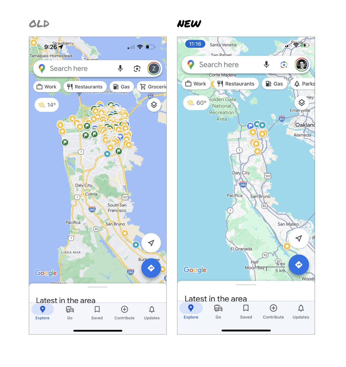
Google Maps has started to widely roll out updated map colors:
- All roads are now gray
- Water changed from blue to teal
- Parks and open spaces are now mint green
It seems the goal was to improve usability and make the maps more readable.
Admittedly, I do think major roads, traffic, and trails stand out more now.
But the colors of water and parks/open spaces blend together.
And to me, the palette feels colder and more computer generated.
But color choices aside…
If the goal was better usability, the team missed a big opportunity:
Google Maps should have cleaned up the crud overlaying the map.
–––
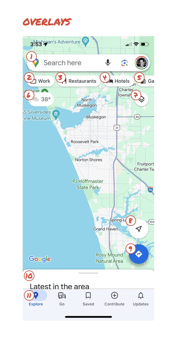
So much stuff has accumulated on top of the map.
Currently there are ~11 different elements obscuring it:
- Search box
- 8 pills overlayed in 4 rows
- A peeking card for “latest in the area”
- A bottom nav bar
(Personally, I would LOVE to see usage metrics for all these overlays.)
The map should be sacred real estate.
Only things that are highly useful to many people should obscure it.
There should be a very limited number of features that can cover the map view.
And there are multiple ways to add new features without overlaying them directly on the map.
–––
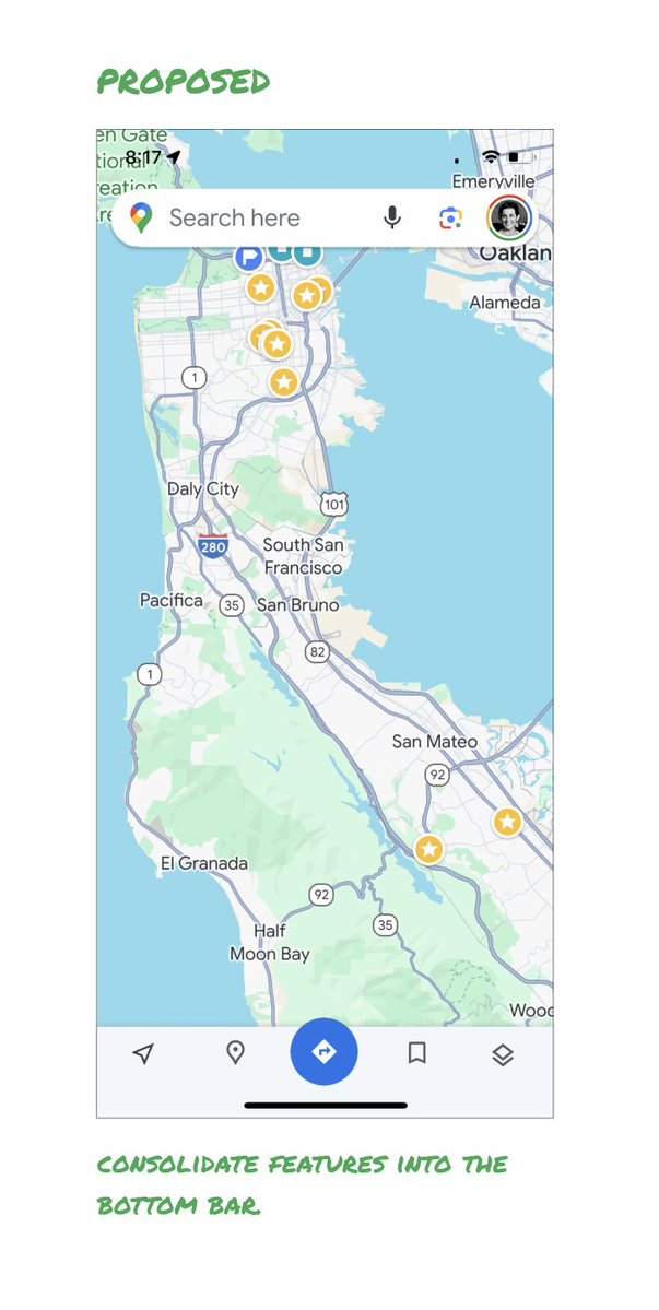
Here’s how it could look:
- Keep the search box
- Keep the bottom bar
- Remove everything else from the map
- Roll the most used features into the bottom bar
- Bury the less used features elsewhere in the app
I assume the search box and directions are top priority and should remain prominent.
My Location and map layers (satellite, traffic, etc.) could move to the bottom bar.
The explore overlays (restaurants, gas, etc.) could live in the bottom bar in “Explore” and open as cards.
The additional space in the bottom bar could be used for Saved, as a “More” option, or could be removed entirely.
There are many variations of how features could be arranged.
But the key points are:
- Dramatically simplify
- Strongly prioritize map visibility
- Bury legacy and low use features
–––
It’s normal for products to accumulate features over time.
But it’s also super important to stay vigilant and continually clean them up.
In many ways, it’s interesting to see history repeating itself.
In 2007, I was 1 of 2 designers on Google Maps.
At that time, Maps had already become a cluttered mess.
We were wedging new features into any space we could find in the UI.
The user experience was suffering and the product was growing increasingly complicated.
We had to rethink the app to be simple and scale for the future.
It seems like it’s time for Google Maps to do this again…
–––
For more on design + tips for early stage founders, follow me on X: @elizlaraki
Breaking news: The OpenAI drama is real.
We checked our data and last night, SF saw a spike in low-quality sleep. There was a 27% increase in people getting under 5 hours of sleep. We need to fix this.
Source: @eightsleep data
@mchgli Genuinely curious what type of design work you can deliver with 5 clients in parallel? Is it mostly visual design, UI design - without user research or testing? I would think one can’t really parallelise that much when going deep.