Doubly-thrilled to win another 2021 American Graphic Design Award!
The identity is an open circle, representing a pledge to make room at the table for people with differing abilities. The colors represent serving people no matter of race, religion, gender + sexual orientation.
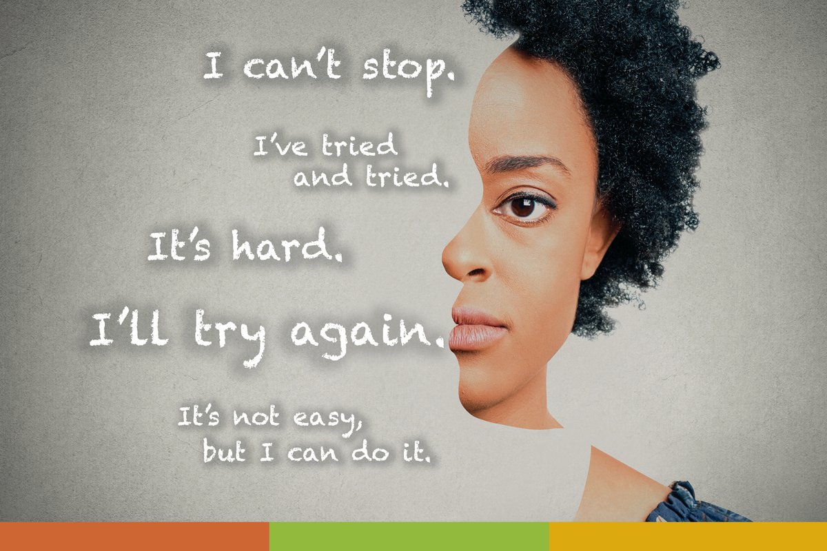
Thrilled to announce my collaboration with @RuddResources has earned us a 2021 American Graphic Design Award for the ad campaign, See Yourself Differently. The project was a lot of fun and I hope we made a positive impact on someone’s life. #publichhealth#awardwinningdesign
2021 was great, and for that I’m grateful for all of the wonderful opportunities to work with some awesome organizations. I’m truly humbled that my work has made, in some small way, positive impacts in people’s lives.
Here’s to a happy, healthy and prosperous 2022!
Does timeless design really exist? I think it could. I created the American Society of Liposuction Surgery logo in 2001 and over 20 years later it is still being utilized. The simple lines, shapes, color and font have stood the test of time. #FlashBackFriday#TimelessDesign
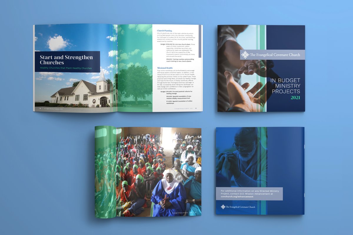
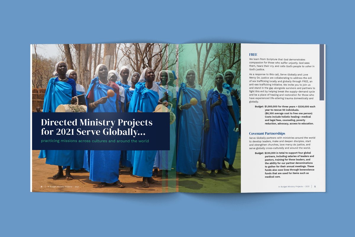
I'm all about interesting shapes and my fav brochure size is square. I designed this brochure for the Evangelical Covenant Church. The square format compliments the denomination's beautiful photography and color palette which is dominant throughout the layout. #graphicdesigner
I care about children and families in Illinois. That why I'm proud to support A Night To Shine 2020! Learn about the most important fundraiser of 2020 for Illinois children and families: https://t.co/EdWwZXbqS8
I am so honored to announce that the brand identity design I created for Tax Squad, has been chosen for an International Gold Muse Creative Award! #awardwinning#graphicdesigner