The Japan Railways (JR) Group logo, introduced in 1987 following the privatization of Japan National Railways, was created through a collaborative design effort led by the Nippon Design Center. Yusuke Kaji served as Creative Director, guiding the overall visual identity strategy, while Yoji Yamamoto acted as Art Director and principal designer of the distinctive “JR” letterform. The project was further supported by Kazumasa Nagai, who functioned as Supervising Editor and provided senior creative oversight, and Ikuo Kenmori, who worked as Producer, coordinating the development and implementation of the identity system. Together, this team designed a bold, connected logotype intended to remain legible at high speeds and across varied applications such as trains, signage, and printed materials. The resulting design allowed each regional JR company to adopt its own color variation while maintaining a unified national symbol, helping establish one of the most recognizable transportation brands in the world.
#logodecks
Yūsaku Kamekura (1915–1997) was a pioneering Japanese graphic designer, dubbed the "Boss" of post-WWII design for blending modernism with national motifs. Born in Niigata Prefecture, he studied at Tokyo's Institute of New Architecture and Industrial Arts, launching his career with book covers and posters in the 1930s. His corporate logos for Nikon, TDK, and Japan Airlines elevated Japanese visual identity globally.
Kamekura's masterpiece is the 1964 Tokyo Olympics emblem, unveiled in 1961. Amid a competition with designers like Ikko Tanaka, his minimalist design, a bold red sun disk (evoking the Hinomaru flag) atop the five golden Olympic rings on white, paired with sans-serif "Tokyo 1964" text, won unanimously. Created hours before the deadline, it symbolized Japan's post-war renewal as Asia's first host Games.
#logodecks
Scott Baker, a Microsoft in-house graphic designer, created the company’s iconic “Pac-Man” logo in 1987, which endured with minor tweaks until 2012, one of the longest-running logos in tech history. Replacing the quirky 1980–1982 “Blibbet” design (so beloved that employees launched a “Save the Blibbet” campaign and the cafeteria served a commemorative burger), Baker crafted a bold, italicised Helvetica Black wordmark with a distinctive diagonal slash through the “o.” The slash separated “Micro” from “soft,” emphasised the “soft” part of the name, and conveyed motion and speed, perfectly capturing Microsoft’s ambitious rise during the Windows era. Internally nicknamed the Pac-Man logo for the notched “o,” it became a global symbol of the company’s dominance through the 1990s and 2000s on countless Windows and Office products. Baker has remained largely out of the public eye since leaving Microsoft, with little documented about his later career. The logo was retired in 2012 for the modern four-square tile and Segoe UI identity tied to Windows 8, but Baker’s clean, dynamic design is still celebrated as a masterclass in longevity and brand recognition.
#logodecks
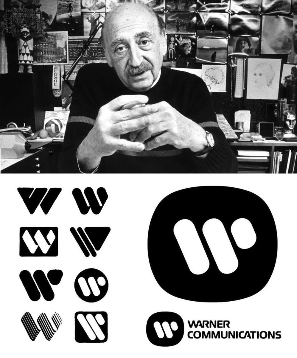
Saul Bass, a legendary graphic designer celebrated for his groundbreaking work in film titles and corporate branding, created the iconic Warner Communications logo in 1972 in collaboration with Herb Yager & Associates.
Officially known as the "Big W," the design featured a bold, stylized, cable-like letter W that symbolized connectivity and unity. This modern mark successfully brought together Warner’s diverse array of film, music, and publishing divisions under one cohesive identity, replacing the traditional Warner Bros. shield that had defined the company for decades.
Paired with a modified version of the Handel Gothic typeface, the logo emphasized Warner’s forward-looking focus on communication and media innovation. The enduring design remained in active use until the company’s major 1990 merger with Time Inc., highlighting Bass’s remarkable talent for crafting simple yet timeless visual identities that resonate across generations
#logodecks
Yusaku Kamekura (1915–1997), Japan’s foremost postwar graphic designer, created TDK’s enduring geometrical logo in 1967 as the centerpiece of a complete corporate-identity overhaul for Tokyo Denki Kagaku Kogyo (now TDK Corporation). The emblem is an irregular black-and-white hexagon formed by interlocking triangles and squares, officially described by TDK as symbolizing “the connection of electronic components and magnetic materials that support the industry.” Introduced one year after Kamekura’s overlapping-letter wordmark variant in a red circle, the 1967 hexagon quickly became the primary symbol and has remained virtually unchanged for nearly six decades, one of the longest-lived corporate marks in electronics history.
Trained in Bauhaus-influenced modernism and celebrated for his 1964 Tokyo Olympics posters, Kamekura fused geometric precision with profound symbolic clarity, producing a logo that feels both timeless and unmistakably Japanese. The hexagon, often paired with bold “TDK” lettering (also refined under his direction), perfectly captured the company’s pivot from industrial chemicals to magnetic tapes and consumer electronics. Kamekura himself ranked the TDK identity among his proudest achievements, and it continues to be studied worldwide as a masterclass in minimalist, meaningful design.
#logodecks
Walter Landor (1913–1995), a pioneering brand designer born in Munich as Walter Landauer, founded Landor Associates in 1941 and revolutionized corporate identity with his consumer-focused approach. After moving to San Francisco in 1939, he worked with diverse brands, including Levi Strauss & Co., where he left a lasting mark. In 1967, Landor was hired to modernize Levi’s branding, resulting in the iconic “Batwing” logo. This design featured a bold, all-caps sans-serif wordmark with a curved top border, mirroring the Arcuate stitching on Levi’s back pockets, symbolizing strength and durability. Unlike previous logos, which used all capitals, Landor suggested a lowercase “e” in later iterations, giving the brand a youthful, timeless feel.
The Batwing, introduced to unify Levi’s identity, became a global emblem, though it evolved with color and style tweaks over time. Landor’s work extended beyond Levi’s to brands like Coca-Cola and Bank of America, emphasizing emotional connections through design. His legacy, built on research and adaptability, continues to influence branding, though some critique his designs as overly commercial. Specific details of the Levi’s update process remain tied to his firm’s collaborative efforts.
#logodecks
Seiichi Horiuchi (1932–1987), a renowned Japanese art director and illustrator, designed the iconic Brutus magazine logo in 1980 for Magazine House. The bold, red logo features letterforms with broken, jagged edges, inspired by the spiked beard of Popeye’s nemesis Brutus, reflecting a rugged masculinity. Horiuchi’s design contrasted with the softer Popeye logo, targeting trend-conscious men aged 20–50. Known for his work on anan and picture books like Gurunpa’s Kindergarten, his Brutus logo remains a cultural symbol, recently celebrated with a design blueprint T-shirt for subscribers, showcasing his lasting influence on Japanese editorial design.
#logodecks
The 1979 update to the LOT Polish Airlines logo was crafted by Polish designers Roman Duszek and Andrzej Zbrożek. They developed a comprehensive visual identity system, modernizing the iconic crane logo originally designed by Tadeusz Gronowski in 1929. The updated design retained the stylized crane, a symbol of elegance and tradition, while introducing a fresh livery for the airline’s fleet. The new look featured a predominantly white fuselage with a bold, italicized “LOT” inscription and a distinctive navy-blue stripe running along the aircraft. The crane was prominently displayed on the tail, preserving its role as a core element of the brand. This redesign aimed to blend modernity with LOT’s heritage, ensuring the logo and livery reflected the airline’s forward-looking vision while honoring its historical roots. Duszek and Zbrożek’s work created a cohesive and recognizable identity that strengthened LOT’s presence in the aviation industry.
#logodecks
Manabu Sakamoto, born March 9, 1968, is a Japanese graphic designer and visual communication expert who graduated from Tsukuba University's Special Arts Group with a major in Visual Transmission Design. He joined Sony in the early 1990s, working in the Creative Development Department at Sony Creative Center as a senior producer until 2011. There, he contributed to branding for products like VAIO and became renowned for conceptualizing the iconic PlayStation logo in 1994, ahead of the console's Japanese launch on December 3 that year.
The original PlayStation logomark features interlocking "P" and "S" letters in a dynamic, perspective-distorted form, evoking a 3D shadow illusion to symbolize the era's shift to immersive 3D gaming. Sakamoto developed about 20 prototypes, blending 70% concept ideation (inspired by keywords like "inspiration" and "logic") with 30% refined design. Colors, red for passion, yellow for happiness, green for excellence, and blue for patience, added emotional depth, targeting a youthful, diverse audience.
This simple yet bold emblem, with its custom clean typeface, has endured across generations, evolving subtly (e.g., desaturated for PS5) while retaining core unity. Sakamoto's work not only defined PlayStation's identity but also influenced Sony's global branding success, turning a gaming console into a cultural powerhouse.
#logodecks
Kashiwa Sato, born in Tokyo in 1965, is a renowned Japanese creative director and graphic designer. He graduated from Tama Art University’s Graphic Design program and worked for 11 years at Hakuhodo, a leading Japanese advertising agency, before founding his own studio, Samurai, in 2000. Known for his minimalist and iconic design approach, Sato draws inspiration from Japanese culture and traditions, emphasizing simplicity and clarity. His work spans branding, logo design, product development, and architecture, with notable clients including Uniqlo, Honda, and Seven Eleven.Sato designed Uniqlo’s current logo, introduced in 2006, to reflect the brand’s Japanese identity and global ambitions. The logo features the word "UNIQLO" in a custom typeface, stacked vertically, against a bright red square background, echoing the colors of the Japanese flag. A second version incorporates the Katakana script "ユニクロ" (yunikuro), creating a dual-language design intended to appeal to both Japanese and international audiences. This redesign debuted at Uniqlo’s flagship store in New York’s SoHo district and became the official logo in Japan by 2009. Sato’s intention was to make the logo simple, memorable, and evocative of Japanese pop culture, aligning with Uniqlo’s global branding strategy under CEO Tadashi Yanai. He has also overseen broader branding efforts, including store designs and the UT T-shirt line, reinforcing Uniqlo’s identity as a functional yet culturally rooted fashion brand.
#logodecks
In 1965, Saul Bass redesigned the corporate identity for Celanese Corporation, a global chemical and materials giant. The original 1920s script logo failed to unify the company’s diverse portfolio, spanning fashion textiles to industrial products. Bass’s solution was a stylized “C” logo, a versatile, abstract spiral that bridged these worlds. Designed for adaptability, it worked across signage, storage tanks, clothing labels, and TV animations. The logo’s vertical and horizontal lock-ups ensured clarity at any scale, paired with a custom sans-serif typeface for uniformity and a warm reddish-orange palette for consistency. This design symbolized Celanese’s progressive identity, replacing fragmented divisional symbols with a unified voice. Used until the 1987 Hoechst acquisition, the logo exemplified Bass’s genius for creating timeless, functional corporate identities that endured for decades.
#logodecks
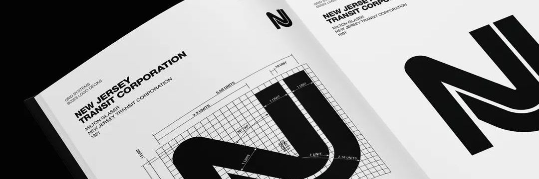
The Logo That Turned New Jersey’s Transit System Into an Icon.
Milton Glaser, famed for the “I❤️NY” logo, designed the NJ Transit logo in the late 1970s through his firm, Milton Glaser, Inc. The logo, featuring a stylized “N” and “J” that form a road or railway, embodies simplicity and clarity, reflecting New Jersey’s transportation network. Its sleek, modern design uses bold lines to convey connectivity and movement. Glaser’s team crafted it to be instantly recognizable, balancing functionality with aesthetic appeal. The logo remains a lasting symbol of NJ Transit’s identity, widely praised for its minimalist yet effective representation of the state’s transit system.
#logodecks
Commodore's Chicken Lips Logo: From Typewriters to 17 Million C64s
Chris Yaneff, a Canadian graphic designer, crafted the iconic Commodore logo in 1965, originally for the company’s typewriters and calculators. This stylized "C" with a swallow-tailed flag, affectionately nicknamed "chicken lips," featured red and blue colors symbolizing innovation and nostalgia. Its geometrically simple design, with a slight ellipticity, scaled effortlessly across products. The logo gained legendary status with the Commodore 64, launched in 1982, which sold over 17 million units. Early "silver label" C64 models showcased a silver version, while later iterations adopted the classic red-and-blue scheme, becoming a hallmark of 1980s computing culture. Despite Commodore’s bankruptcy in 1994, the logo’s legacy endures, preserved by trademark holders and recreated by retro enthusiasts. Yaneff’s other works remain largely undocumented, making this design his enduring contribution to tech history.
Photo Credit: Commodore International Historical Society
#logodecks #C64
How 700+ Minimalist Pictograms Changed the Olympics Forever
Otl Aicher led the groundbreaking design of the 1972 Munich Olympics pictograms, collaborating with a talented team including Gerhard Joksch, Rolf Müller, Wolfgang Hillinger, Hans Roericht, Herbert W. Kapitzki, Ian McLaren, Elena Winschermann, Max Lindner, Manfred Pflüger, and Peter Croy. Together, they created over 700 icons covering 21 sports and comprehensive wayfinding systems. These designs employed a strict minimalist style based on a 45° and 90° grid, delivering exceptional universal clarity that transcended language and cultural barriers.
Drawing inspiration from the vibrant yet serene colors of the Bavarian Alps, the team deliberately rejected hues associated with the Nazi era, instead projecting a fresh image of a democratic, forward-looking West Germany. Building upon the innovative work from Tokyo 1964, Munich’s pictograms established a new global standard for visual communication. Their influence extended to the Montreal 1976 Games and continues to shape modern design in digital interfaces, signage, and branding worldwide.
#logodecks
How Rune Monö Created One of Sweden’s Most Recognizable Brands.
Rune Monö, a pioneering Swedish graphic designer, created the iconic ICA logo in 1963, officially introduced across Sweden in 1964. At the time, ICA operated through several regional organizations with differing visual identities, creating inconsistency in stores and marketing. Monö was commissioned to develop a unified brand image that could represent the entire ICA organization with clarity and modernity. His solution was a bold red logotype featuring a soft, rounded “C” paired with a sharp, dynamic “A,” crafted from modified grotesque typography. The contrast gave the logo both warmth and energy, helping it stand out in Swedish retail culture. Beyond the logo itself, Monö’s design firm developed ICA’s broader visual identity system, including storefront signage, packaging, and printed materials. Remarkably unchanged for decades, the ICA logo became a symbol of trust, unity, and recognition, cementing Monö’s influence on Scandinavian graphic design history worldwide.
#logodecks
The Brilliant Simplicity of WWF’s Timeless Logo.
The World Wide Fund for Nature (WWF), founded in 1961, is a leading global conservation organization dedicated to protecting endangered species and habitats. Its iconic panda logo, inspired by Chi-Chi, a panda at London Zoo, was introduced the same year to create a universal, recognizable symbol. British environmentalist Gerald Watterson provided initial sketches, which WWF founder Sir Peter Scott refined into the first logo, emphasizing simplicity and impact in black-and-white for cost-effective printing. In 1986, Landor Associates’ San Francisco office, with Tom Suiter as creative director, Jerry Kuyper as design director, and Jenny Leibundgut as primary designer, modernized the logo, introducing a bolder, abstract panda and adding the “WWF” wordmark. The logo’s minimalist design and emotional appeal have made it a timeless emblem of conservation, symbolizing WWF’s mission to preserve biodiversity and promote sustainable practices worldwide.
#logodecks
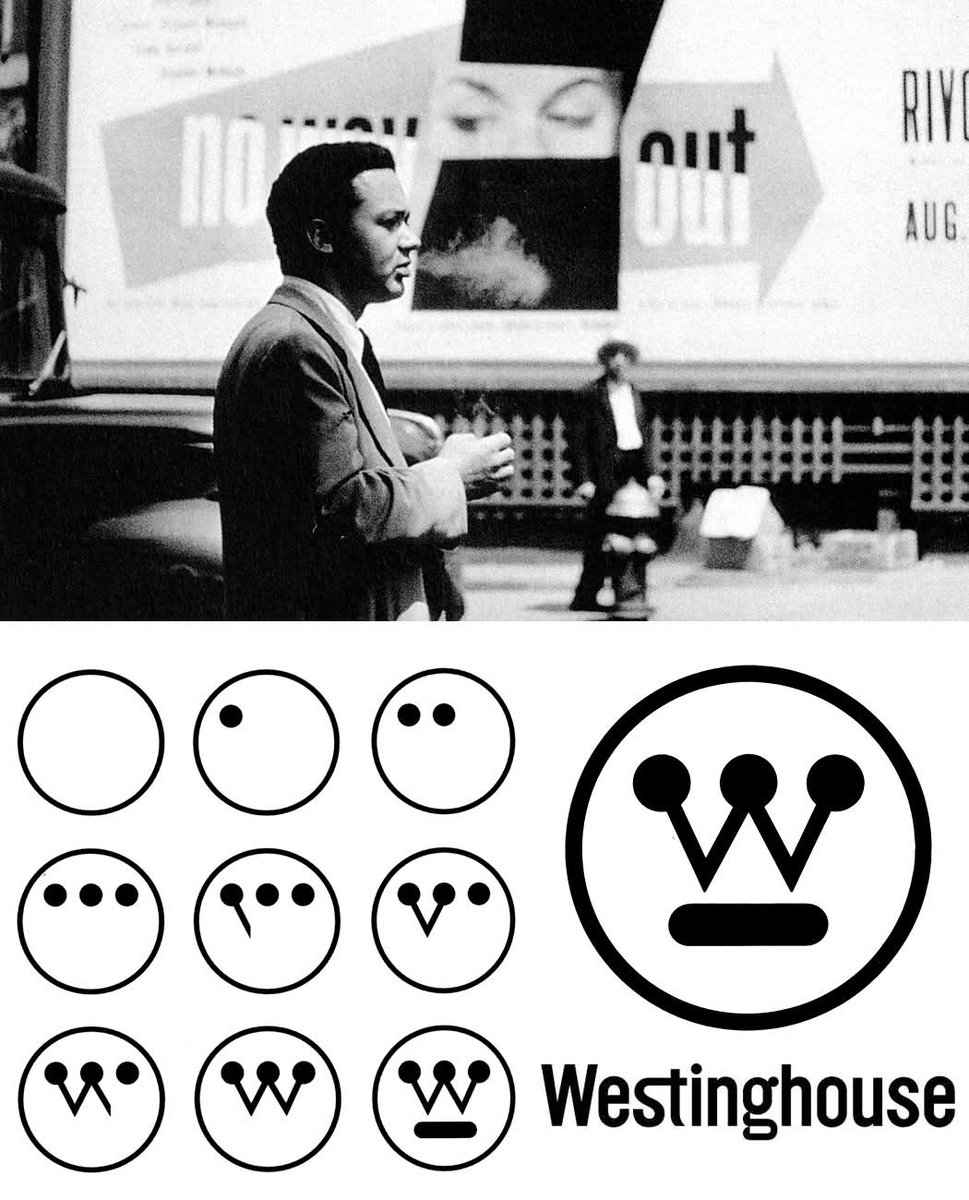
How Paul Rand Turned a Simple “W” Into a Design Masterpiece.
Paul Rand, a pioneering American graphic designer, created the iconic Westinghouse logo in 1959. Commissioned by Eliot Noyes, Rand redesigned the logo to reflect Westinghouse’s innovative spirit. His process involved studying the company’s identity and iterating on the existing “W” emblem. Rand crafted a stylized “W” resembling a circuit board, using simple lines and dots for a modern, timeless look. He developed a comprehensive identity system, including a custom typeface, color palette, and graphics manual, ensuring consistency across applications. The logo’s minimalist design remains a symbol of Westinghouse’s legacy.
#logodecks
How Otl Aicher Turned Lufthansa Into a Masterclass in Minimalism.
Otl Aicher (1922–1991), a German graphic designer, was renowned for his systematic and minimalist design approach. In 1962, Aicher and his team, including Hans Roericht and Fritz Querengässer, redesigned the Lufthansa logo as part of a comprehensive corporate identity overhaul. The iconic crane emblem, originally created by Otto Firle in 1918, was refined into a sleek, modernist form, a stylized crane within a circle, symbolizing precision and flight. Rendered in Lufthansa’s signature blue and yellow, the logo embodied clarity and reliability. Aicher’s grid-based design system ensured consistency across all branding, cementing Lufthansa’s timeless global identity.
Otl Aicher’s sketches for the Lufthansa logo, developed with his team at the Ulm School of Design in the early 1960s, reveal an evolutionary process blending modernist simplicity with functional symbolism. Initial sketches show the transition from the original 1918 Otto Firle crane to a more abstract form, with some designs exploring a simple arrow to represent aviation’s future, as noted in design commentary. These sketches progressively refined the crane into a stylized silhouette, enclosed in a circle, emphasizing aerodynamics and clarity. Aicher’s process, documented in works like Lufthansa und Graphic Design, highlights his methodical approach, balancing tradition with innovation, though the arrow idea was ultimately set aside for the iconic crane.
#logodecks
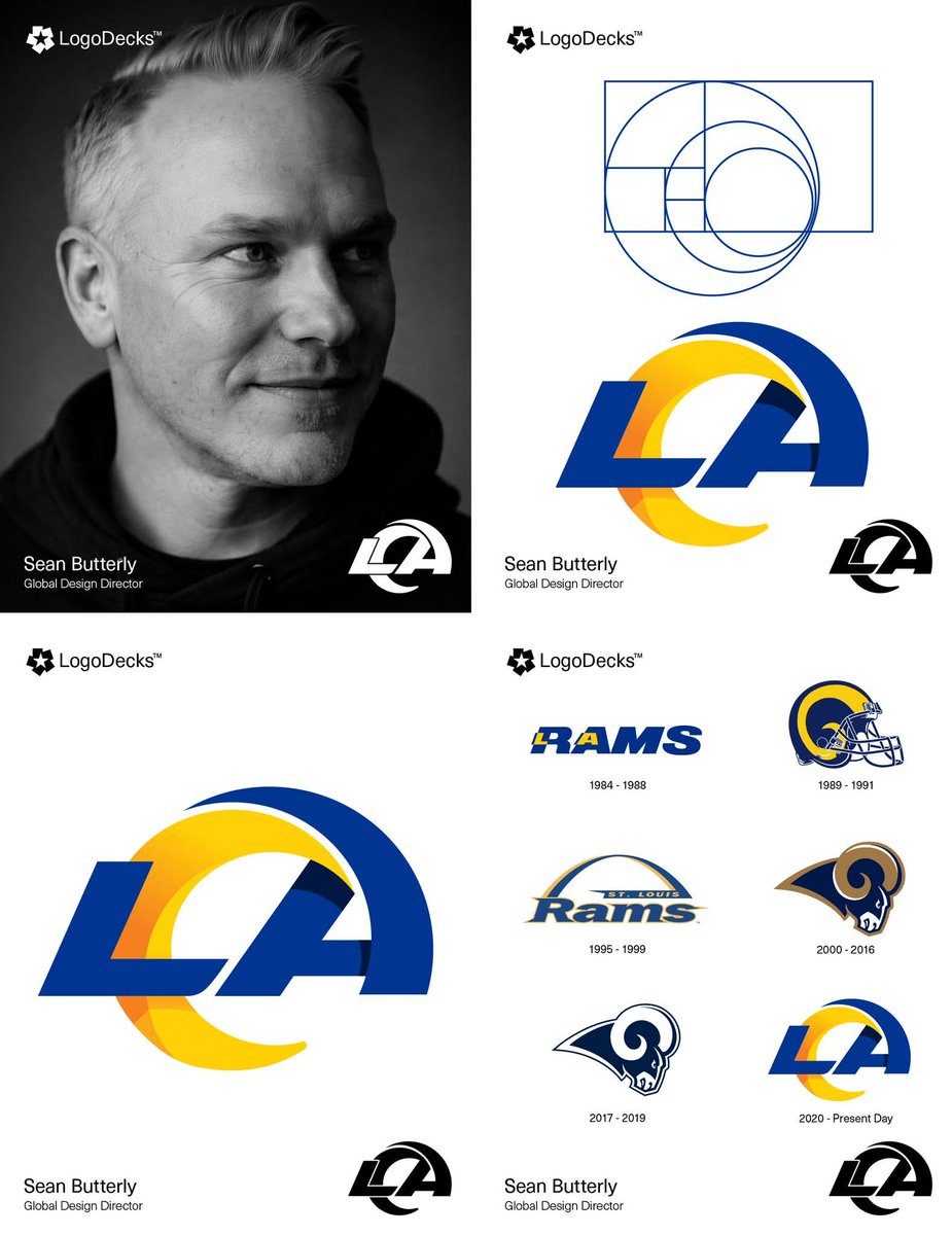
Beyond the Horn: The Mathematical Secret Inside the LA Rams Logo.
Sean Butterly, a Global Design Director at Nike, was a primary architect behind the Los Angeles Rams' 2020 visual identity, leading technical execution within the Nike Graphic Identity Group. Butterly utilized the golden ratio (Fibonacci sequence) to dictate the specific curvature of the ram's horn, aiming to harmonize the flight of a football with Pacific Coast waves. This two-year collaborative project involved Rams Senior Creative Director Cory Befort and COO Kevin Demoff, alongside designers from the NFL and agency Anomaly. Together, they developed the modern "LA" monogram and Ram Head to bridge the franchise’s history with the architecture of SoFi Stadium.
#logodecks