I help you create high-converting landing pages.
I take care of everything: hosting, optimization, and SEO.
You just watch your CVR going through the roof 🚀
Companies spend countless hours adding to their landing pages:
Fancy animations
Complex navigation
Multiple CTAs
Endless testimonial sections
But what's really important?
What's the most crucial element in your opinion?
Pick one and let me know why in the comments
I analyzed 138 top-performing companies and found their secret: Their value proposition follows this simple formula...
The best companies keep it stupidly simple:
Start with customer pain
Focus on outcomes
Stay specific
Pass the "so what" test
The perfect structure: For [customer] who struggles with [problem], we provide [solution]. Unlike [alternative], we [differentiator].
Clarity beats cleverness. Your customers don't want puzzles. They want solutions.
If you want all of the above done-for-you in a high-converting landing page, DM me. I have the perfect thing for you
If you liked this thread:
1. Follow me @MHDev91
2. RT the tweet below so more people can see it
Would mean the world to me!
Nobody tells you this, but 70% of your users will never see your desktop site.
Mobile users are impatient, have 50% higher bounce rates, and rarely give second chances.
But get this right, and you'll see 2.2x higher conversions.
Here's the mobile-first playbook you need:
Nobody tells you this, but 70% of your users will never see your desktop site.
Mobile users are impatient, have 50% higher bounce rates, and rarely give second chances.
But get this right, and you'll see 2.2x higher conversions.
Here's the mobile-first playbook you need:
Why doing all of this you're asking yourself?
because the opportunity is massive:
- 2.2x higher conversions
- Lower bounce rates
- Better user satisfaction
- Higher search rankings
The "mobile-friendly." era is over.
Make it mobile-first.
Your users already have.
The page I built is live here https://t.co/Ku1fYV7iaL
It's fully working, if enough of you sign up I might have to start building hardware products ahah
Stop building products nobody wants.
78% of startups fail because they didn't validate first. Here's how to test your idea without writing a single line of code.
Today, I'll show you how to validate a startup idea in 5 minutes.
We'll build a waitlist for FocusPod - a smart workspace that adapts to your brain's most productive state.
First, what makes a high-converting waitlist page:
4 Essential Elements:
1. Clear value proposition
2. Social proof
3. Scarcity triggers
4. Frictionless conversion path
Step 1: Value Proposition "Your personal productivity sanctuary. A smart pod that adjusts lighting, sound, and air quality to match your peak performance hours."
The secret? Your value prop must paint the "after" state so vividly that the "before" state becomes unbearable.
Step 2: Strategic Scarcity "Founding Member Access: $2,000 off Launch Price" "342 remote professionals already designing their perfect workspace"
Note: These numbers tell a story of momentum. Early adopters want to be part of a movement.
Step 3: Hierarchy
- Main visual: Sleek pod in premium home setting
- Strong statement
- supporting the strong statement with a how
Step 4: Conversion Elements Your CTA makes or breaks your waitlist.
Here's what converts:
Basic: "Join Waitlist"
Better: "Reserve My Spot"
Best: "Secure Early Access"
I've done all of this in less than 5 minutes, just watch the video.
Total build time: 4 minutes
Investment: $0
Potential savings: 6 months of development
Upsides? Know exactly when to launch and what features to launch with.
What's next?
We can run two variants:
A: "Join the Innovation Waitlist" + productivity focus
B: "Secure Early Access" + exclusive pricing
The data will show exactly what messaging to use for your full launch.
Do you want me to build a similar page for you?
Reply with Your idea / your startup
I'll pick a few interesting concepts and build their waitlist pages live.
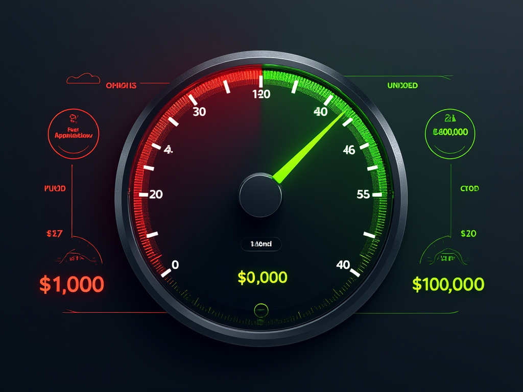
The difference between $1000 and $10,000 in monthly revenue? 0.4 seconds.
For small business owners who can't afford to lose sales, this post is for you
Let me prove how website speed directly impacts your bottom line:
When your website takes > 3 seconds to load:
53% of visitors leave immediately
79% won't return
44% tell friends about the bad experience
Think those customers are going to your competition? You're right. 📉
Here's what happens when you improve site speed by just 0.1 seconds:
Conversion rates increase by 8%
Page views jump by 9%
Customer satisfaction rises by 16%
💡 Real example: A local boutique was making $2,300/month They improved load time from 4.2s to 1.8s Result? $8,700/month in sales
Same products. Same prices. Just faster. 🚀
The best part? Speed improvements aren't complex or expensive. You don't need a tech degree.
You just need to know what to measure and fix.
Here's how to start in 3 simple steps:
1. Test your current speed
3. Identify the biggest issue
3. Fix it
Here are free tools to check your speed:
- Google PageSpeed Insights
- GTmetrix
Run these tests now.
They'll show exactly what's slowing you down. ⚡️
If you can only remember one thing from this post:
Every 100ms delay = lost revenue
Every speed improvement = more sales
Small changes, big impact. 💰
What's your current website load time? Drop it below and I'll help you improve it 👇
My first startup failed. I couldn't convert visitors. After I understood why, everything changed. I see many making the same mistakes, so I'm documenting my learnings here. Hope it helps someone:
My website's psychology was broken. Not the code. Not the design. Understanding how visitors make decisions transformed my conversion rates in my new project.
The science is clear:
A visitor's brain makes a decision in 50 milliseconds. Before they read the copy. Before they see the offer. Before they understand the value.
It's a documented psychological pattern: When faced with a decision, our brain's first instinct is to say "no."
The data proves it:
76% of visitors leave within 10 seconds
Only 2.35% convert on average
88% never return after a "no" decision
I had been fighting against these patterns. That's why I lost. I can't win against hardwired behaviors.
Here's what I learned about working with them instead:
The Minimum Cognitive Load Framework:
First Visual = Instant Understanding
Remove all choices
One clear path
Familiar patterns
First Paragraph = Instant Relevance
Address the immediate pain point
Use their exact language
Confirm they're in the right place
First Offer = Instant Value
Start small
Remove risk
Make it obvious
The psychology is proven: Every extra decision increases cognitive load. Every increase in cognitive load reduces conversion.
My real numbers: First site: "Check out our features!" (Required multiple decisions) 1.8% conversion rate
After applying these principles: "Start your free trial" (Single obvious path) 7.4% conversion rate
The research shows: When you reduce cognitive load:
Trust increases by 76%
Anxiety decreases by 39%
Action becomes the natural response
What worked for me:
Removed all unnecessary choices
Created one clear path
Made the next step obvious
Used this test: "Can someone understand what to do in 5 seconds?"
Key learning: Clarity beats creativity every time. Psychology beats persuasion.
Would love to hear your experiences with conversion psychology. What patterns have you noticed?
There's a hidden pattern in the most successful APIs.
It's not REST. It's not GraphQL.
It's about psychology:
Most developers focus on technical elegance.
But the best APIs focus on human behavior.
Have you ever used a CLI where you didn't have to look up the different flags? it just came naturally, almost obvious?
They are rare, but when you find them you will never switch away from it!
Let me explain the psychology of successful APIs:
1. The Paradox of Choice
• Stripe offers 100+ endpoints
• Yet 80% of integrations use only 5 of them
• The best APIs hide complexity by default
Think about it:
When was the last time you used all AWS services?
Exactly.
2. Progressive Disclosure Pattern
The best APIs work like a video game:
• Level 1: Basic integration (payments)
• Level 2: Add features (refunds)
• Level 3: Complex flows (subscriptions)
• Final Boss: Custom logic
Each level unlocks only when needed.
3. The Forgiveness Principle
Great APIs are like good parents:
• They let you make small mistakes
• They prevent catastrophic ones
• They guide you back to the right path
Example:
Stripe won't let you charge a card twice
But will let you test with invalid amounts
4. Convention Over Configuration
The most successful APIs share this:
• Smart defaults that work out of the box
• Optional complexity for edge cases
• Clear upgrade paths for scaling
Real World Example:
Shopify's API:
• Basic: Simple product CRUD
• Advanced: Custom checkout flows
• Expert: Marketplace management
Each layer maintains conversion rates
Because complexity is optional
Your customers don't care about:
• GraphQL vs REST
• Real-time vs Webhooks
• Microservices vs Monolith
They care about:
• Easy integration
• Quick time to value
• Reliable operations
Implementation Checklist:
1. Create a "happy path" API
2. Make it work out of the box
3. Hide advanced features
4. Document the upgrade path
5. Test with real developers
Remember:
• Simple APIs get integrated
• Complex APIs get abandoned
• Flexible APIs get recommended
The best API is the one that:
Developers can integrate in one afternoon
While Product Managers sleep well at night
How to measure success:
• Time to first API call
• Support ticket frequency
• Feature adoption rate
• Customer retention
The secret:
Build for humans first, machines second.
Following me for more technical insights that bridge the gap between developers and business value 🚀
Another day, another big X account saying SEO is dead.
Plot twist: His website gets 100k monthly visitors... from Google.
The saddest part is that people will start to believe these people.
I spent the last few months optimizing landing pages. Seeing what actually works and what doesn't, I can tell you: SEO isn't dead.
I want to share some lessons I picked up on the way:
The Game Changed I used to stuff keywords everywhere. My rankings tanked. Then I discovered what really works. Building pages that speak about a user problem. Start with a keyword users are searching for and frame your solution to that problem.
Structure Is Important My biggest win? A client's landing page jumped from page 4 to position 2 after we rebuilt their semantic structure. No new content needed. There are many frameworks out there. The reality is they all kind of work. What doesn't work is "I'll just add whatever I want"
Tecnical Eccellence Clean HTML5 elements + proper schema markup. Sounds boring, but it doubled organic traffic for 3 different SaaS landing pages I worked on. The schema markup for FAQ was the biggest win as it started ranking on google.
Speed = Rankings Got a page from 4.5s to 1.8s load time. Rankings jumped in 2 weeks. Google uses all the data they have available to rank pages.
There is a golden rule too:
Focus on users first, Google second.
That's how I win. That's how you will too.
What's your take? Have you ever sacrificed functionality for aesthetics?
→ Follow me for more insights that grow your business
If you liked this thread:
1. Follow me @MHDev91
2. RT the tweet below so more people can see it
Would mean the world to me!
The world's highest-converting websites are ugly.
Amazon, Craigslist, Reddit...
Ever wondered why billion-dollar companies start with "basic" websites?
It's not laziness. It's science.
Let me show you the psychology behind it: 👇
The world's highest-converting websites are ugly.
Amazon, Craigslist, Reddit...
Ever wondered why billion-dollar companies start with "basic" websites?
It's not laziness. It's science.
Let me show you the psychology behind it: 👇



![MHDev91's tweet photo. I analyzed 138 top-performing companies and found their secret: Their value proposition follows this simple formula...
The best companies keep it stupidly simple:
Start with customer pain
Focus on outcomes
Stay specific
Pass the "so what" test
The perfect structure: For [customer] who struggles with [problem], we provide [solution]. Unlike [alternative], we [differentiator].
Clarity beats cleverness. Your customers don't want puzzles. They want solutions.](https://pbs.twimg.com/media/GbIxgHHWAAAAXTh.jpg)