Thank you to anyone who followed along, I hope you enjoyed! My World Baseball classic uniforms are now all posted on my portfolio website, which I'll link below.
Texas Rangers City Connect 2.0:
I really like this one beccause of all of the subtle details. It's incredbibly hard to see, but I added the "charro/mariachi" pattern from the wordmark into the numbers, as well.
@Issac_Starr2 Thanks! It’s obviously based on their secondary logo, & the block “M” harkens back to the ‘50s American Association Brewers, just like the script & barrelman do
Milwaukee Brewers City Connect 2.0:
I think the worst part of the City Connect program has been the silly nicknames, so I went with the "Brewers" script instead of "Wisco." Even though I like how orange looks as the accent, I went with gold to make it look more like the Brewers.
@Issac_Starr2 The barrelman patch is great, I just think it’s too busy to work well on a cap. Caps usually work better with simpler logos, which is why the majority of MLB uses simple letters
San Diego Padres City Connect 2.0:
I found this one pretty disappointing at first, but I have a feeling it might grow on me. I couldn't really find much to change, I do especially like the light cap.
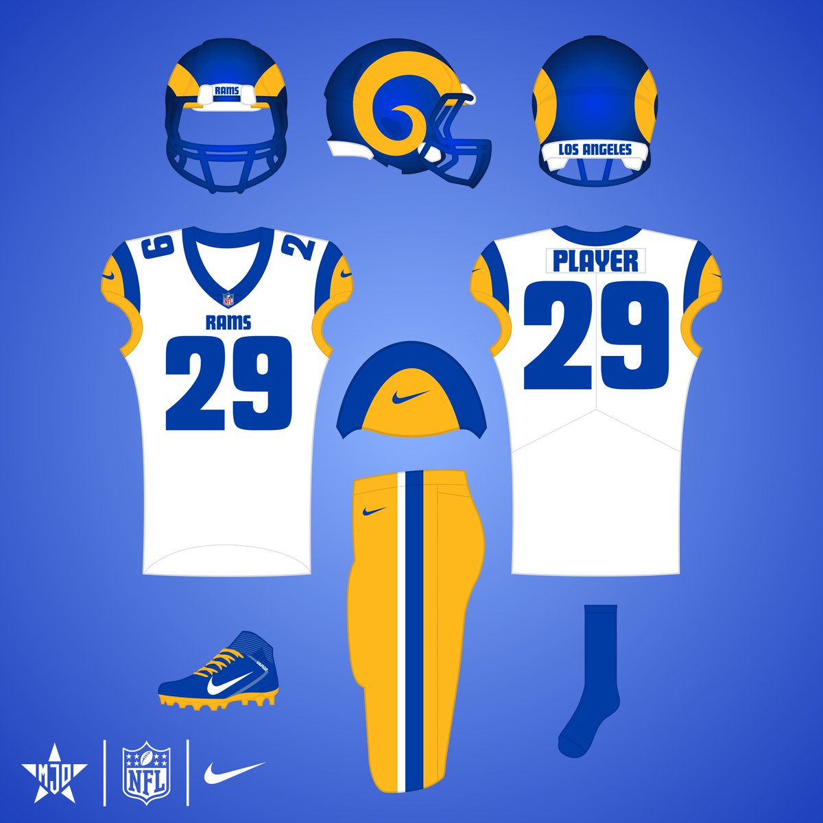
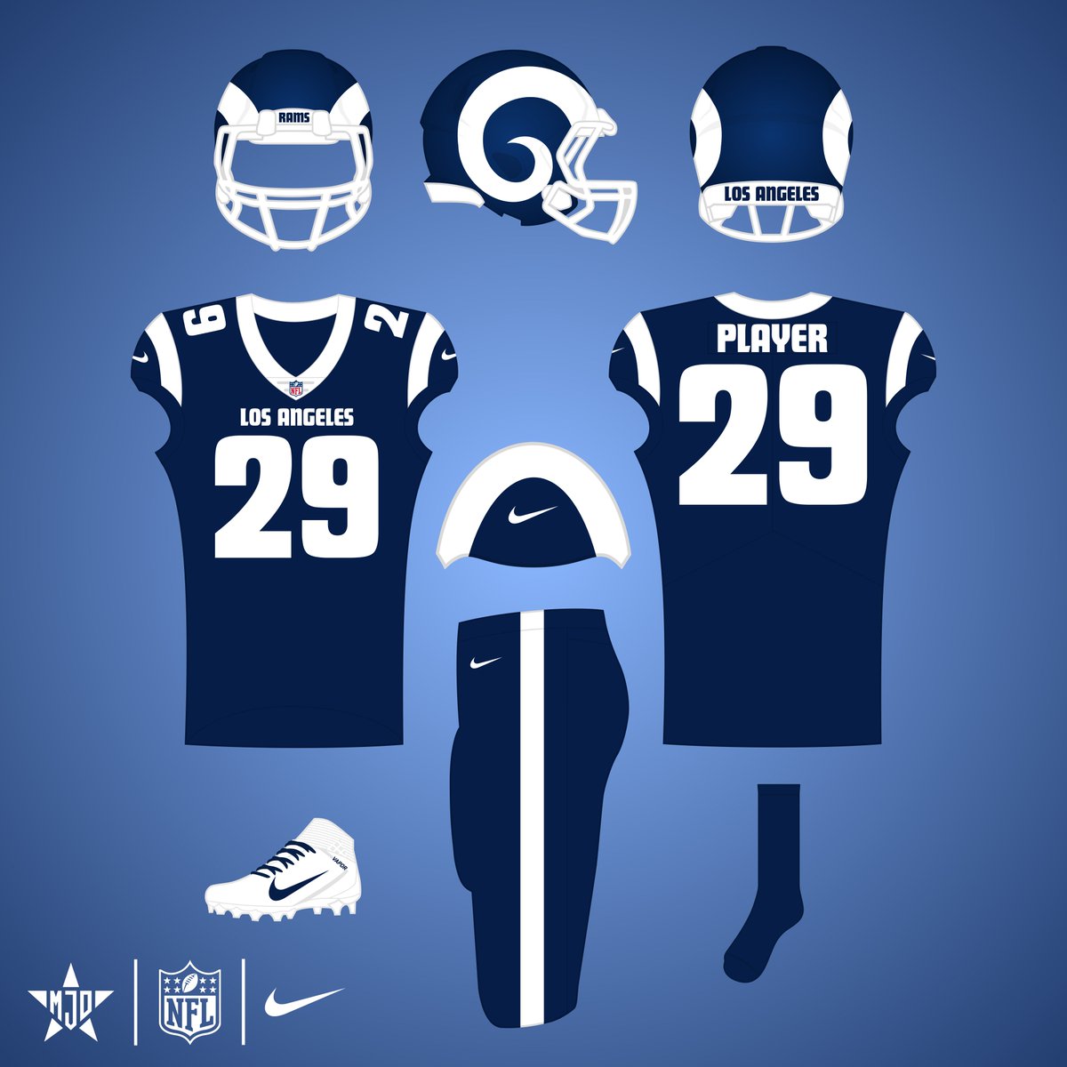
Los Angeles Rams Uniform Redesign:
I'm happy with my take on the Rams (linked below), but as the Rams were preparing to move to LA, I was convinced they would go with a 50's, old Hollywood classic branding. Here's what that could've looked like:
Kansas City Royals City Connect 2.0:
I really like the Royals' new CC, I think it's an upgrade over the first, so there isn't really much to change. Gradients don't seem to work on helmets, unfortunately, so I went with a simple blue lid & magenta bill.
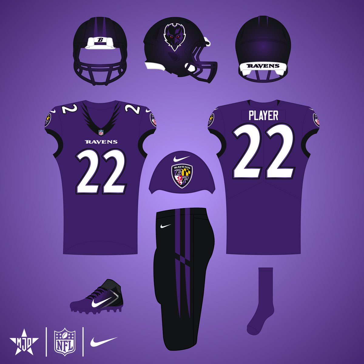
Here's an update to my design for the Ravens based on the redesign they just unveiled:
I kept the spread wings on the collar, but flipped the colors to make it be more clear. I kept the pants striping inspired by the Maryland flag, but altered it to make it more balanced.
Baltimore Ravens:
I originally had a redesign planned for the Ravens, but their set has grown on me. I just removed gold because I've never liked its inclusion. The helmet is intended to be black with purple flakes, sort of like the Jags' early 2010's helmet.
#RavensFlock
@bmore_ray52 Thanks! I think wings on the helmet would be too similar to Oregon & the Eagles, despite how cool it could look. I don’t love the front-facing logo either but I think it works better than the main one, especially because of the menacing red eyes