Widgets are the hardest UI.
You get one glance.
No menu. No scroll. One number that matters.
Flight, battery, steps, sales.
If it needs explaining, it's too big to be small.
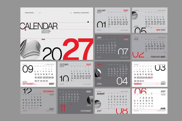
A calendar isn't dates.
It's rhythm.
Big numbers, bold type, room to breathe.
You should feel the month before you read it.
If it looks good on a wall but hard to read, it's art, not design.
B2B tools don't need to be boring.
They need to be clear.
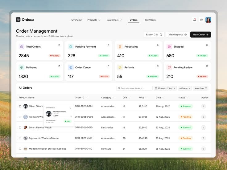
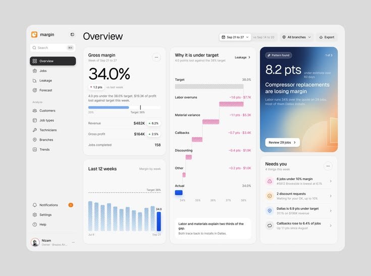
Vendor blocked? Invoice stuck? Who's waiting on what?
One screen should answer it.
If your team needs a training call to use it, the design failed.
One glance: money in, work to do, what needs you now.
No digging, no spreadsheets.
If a manager can't act in 5 seconds, the dashboard is just decoration.
Travel & logistics sell the same thing.
Not trips. Not trucks. Trust.
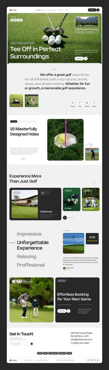
Can I book in 30 seconds?
Will I arrive on time?
Design that answers those fast, wins.
Everything else is decoration.