By the 1970s, James Modarelli’s 1959 NASA ‘meatball’ was seen as a relic of the past, a cumbersome design that didn’t fit the sleek and modern image NASA wanted to project. It was complicated, hard to reproduce and, in the words of Danne, ‘born out of the classic “airman syndrome” where hype and fantasy dominated over logic and reality’.
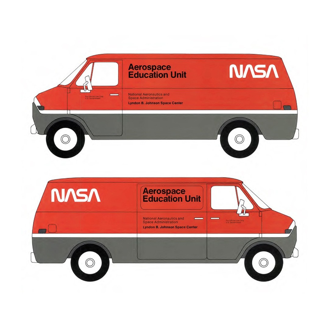
In 1974, through the Federal Design Improvement Program, Danne & Blackburn, a small New York design studio of five at the time, got the job of bringing NASA’s image right up to date.
Their answer was radical for its time: a sleek, red typographic treatment of the word ‘NASA’. Its consistent line weight and curvilinear forms earned it the nickname ‘the worm’, and the absence of crossbars on the A’s alluded to the nose cones of two rockets pointing upward.
Read the full story behind the logo → https://t.co/r0PQe5KZgy
In 1962 the Società Metropolitana Milanese commissioned Bob Noorda (Unimark International) to design the symbol and wayfinding for Linea Uno, Milan’s first underground line, alongside architects Franco Albini and Franca Helg.
Noorda’s symbol was a mirrored double M, one below the other: the initials of Milan Metro, and a picture of two Milans, one above ground and one below. Its forms came from Albini and Helg’s handrails, its red from the Milanese coat of arms.
Noorda added a custom typeface and wayfinding that won a Golden Compass. But the president disliked the symbol, swayed the board to vote against it, and a plain M in a red square was used instead – still in place today.
Read the full story behind the logo → https://t.co/wxN4KZguSW
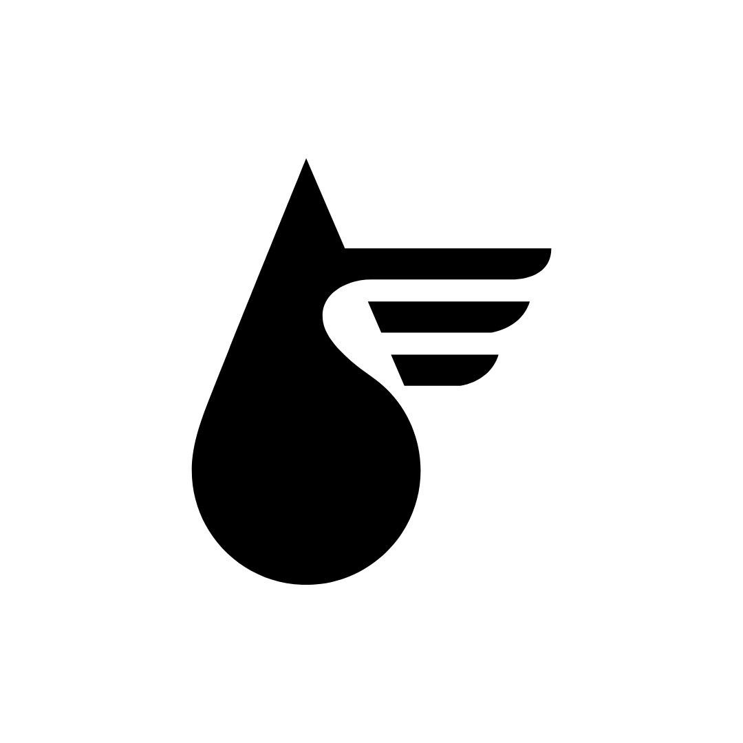
The work of Karol Śliwka, Poland, 1967–1989.
Discover thousands more historical logos at https://t.co/hRs3Bezklk
Karol Śliwka’s logos for Petrolimpex (1967), the J. Korczaka Institute (1979), the State College of Shorthand and Foreign Languages (1988) and Visvesta (1989).
#logos #branding #karolsliwka #polishdesign #logodesign #graphicdesign
The work of Ben Bos, the Netherlands, 1968–1975.
Discover thousands more historical logos at https://t.co/hRs3Bezklk
Ben Bos’s logos for Kluwer Uitgeverij (1968), Furness Group (1968, with Total Design), Buhrmann-Tetterode (1974) and the City of Dronten (1975).
#logos #branding #benbos #totaldesign #dutchdesign #logodesign
the attention span of people is getting shorter by the day
so concise posts tend to grab attention faster
but I think it also depends on the audience and how well the message is delivered
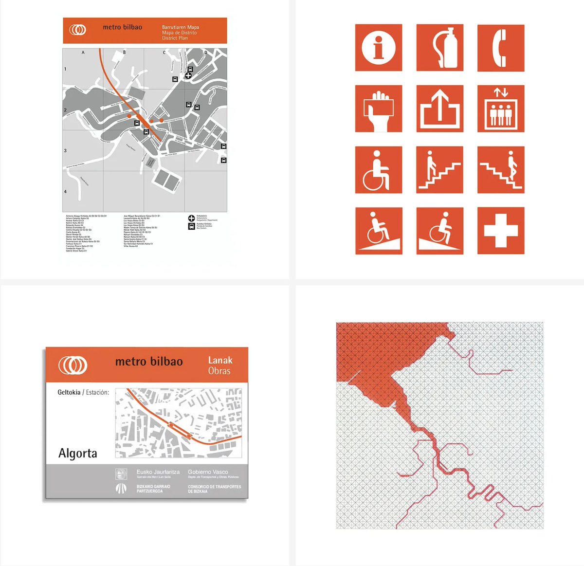
Bilbao’s metro was first proposed in the 1920s, but a plan was only approved in 1987. The underground stations were awarded to Sir Norman Foster and partners after an open competition, and the architects then worked with Otl Aicher to develop a wayfinding system, visual language and logo.
Rather than focus on an ‘M’, Otl Aicher favoured an abstract form based on the notion of tunnels and wheels in motion: three overlapping rings of gradually increasing weight from left to right, giving an impression of forward momentum and complementing Foster’s ring-like station entrances.
“Otl’s skill was somehow encapsulating the spirit of the idea or a place with a combination of line, colour, graphics,” said Norman Foster. Alongside Munich Airport, Metro Bilbao was Aicher’s last major commission before his death in 1991, and it remains largely unchanged.
Read the full story behind the logo → https://t.co/zcBN7GEtWy
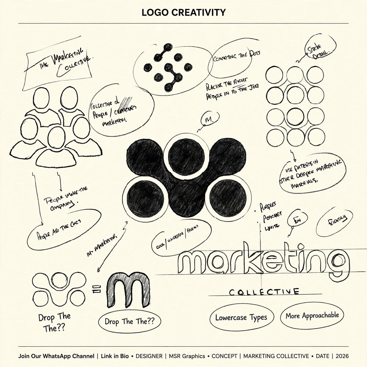
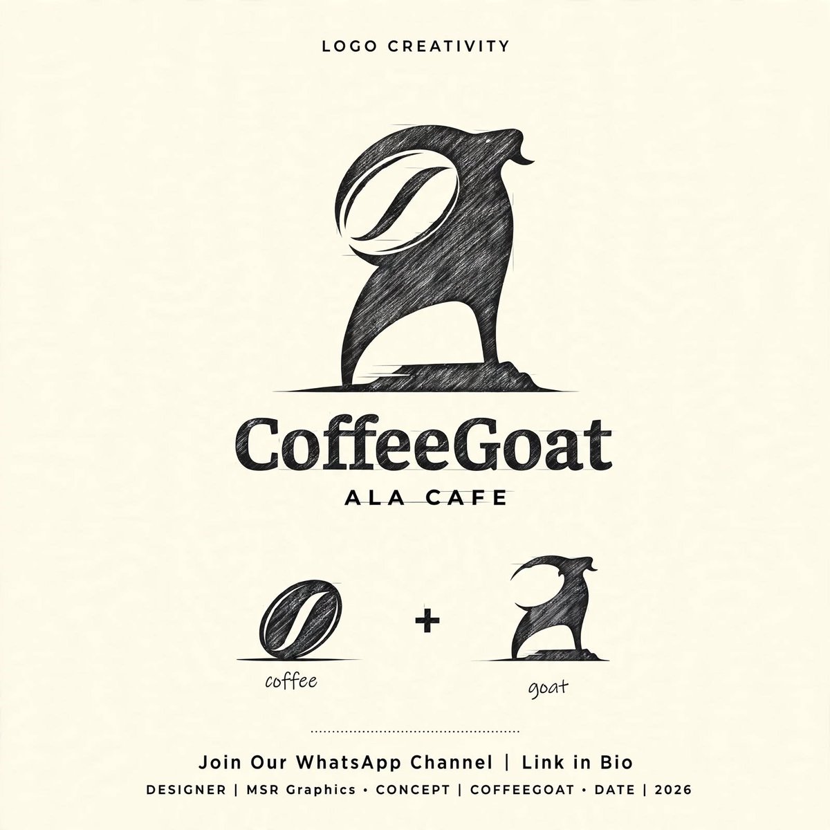
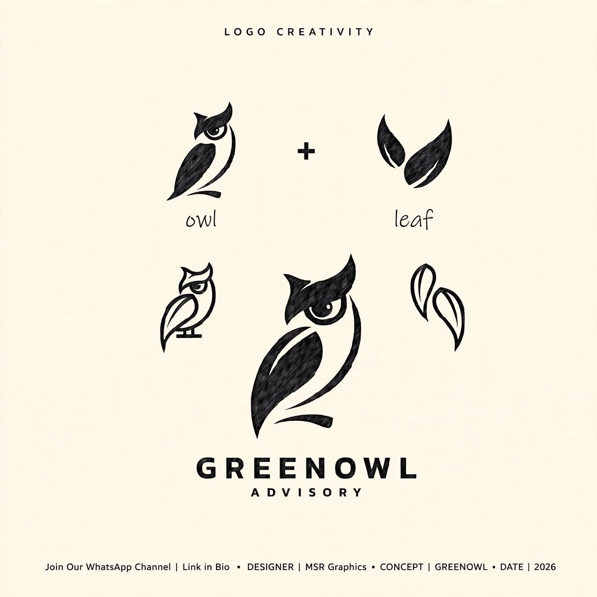
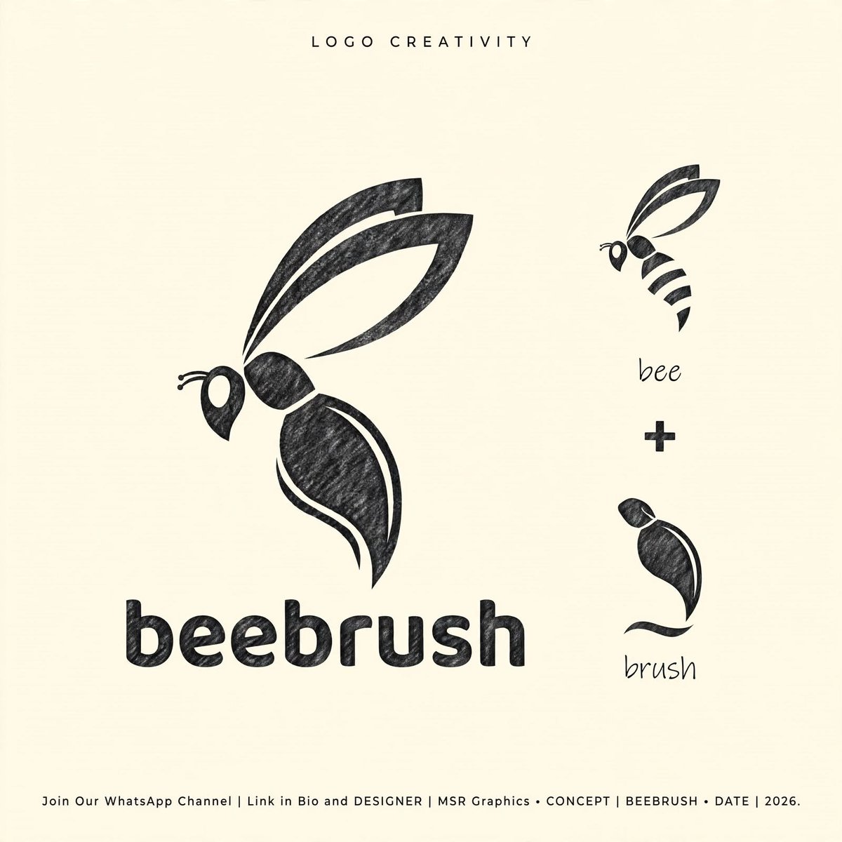
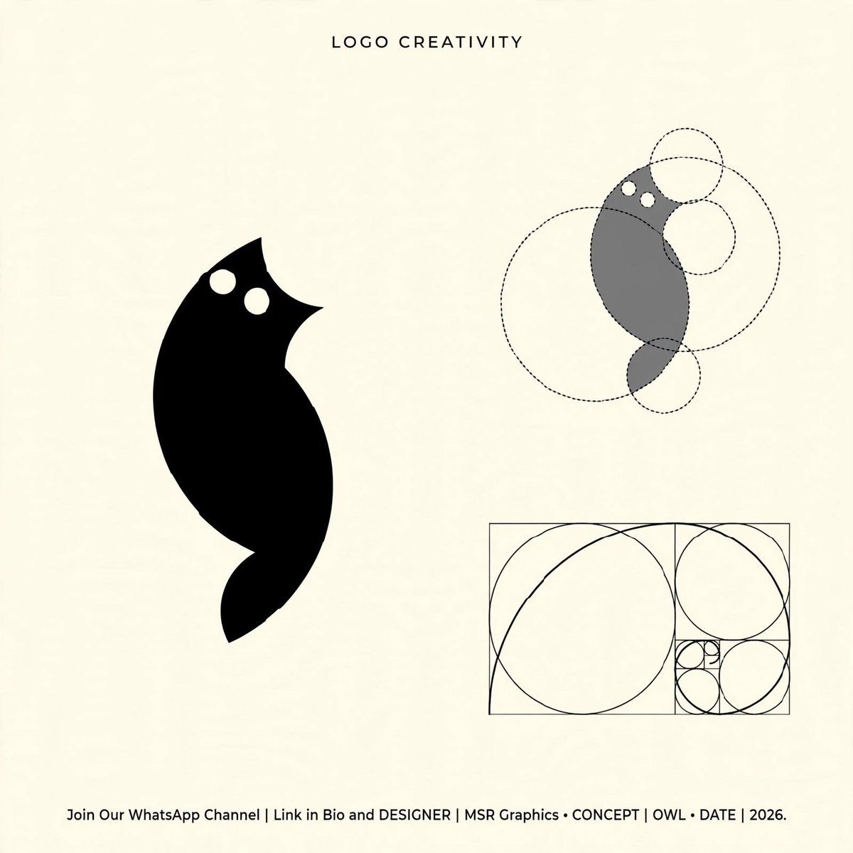
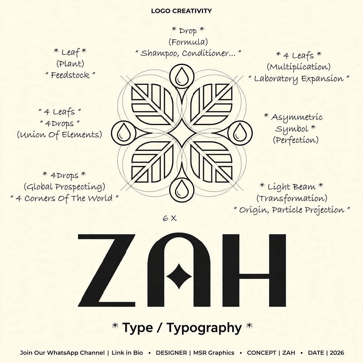
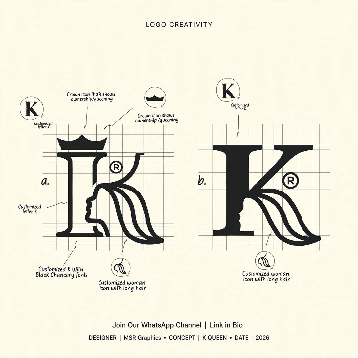
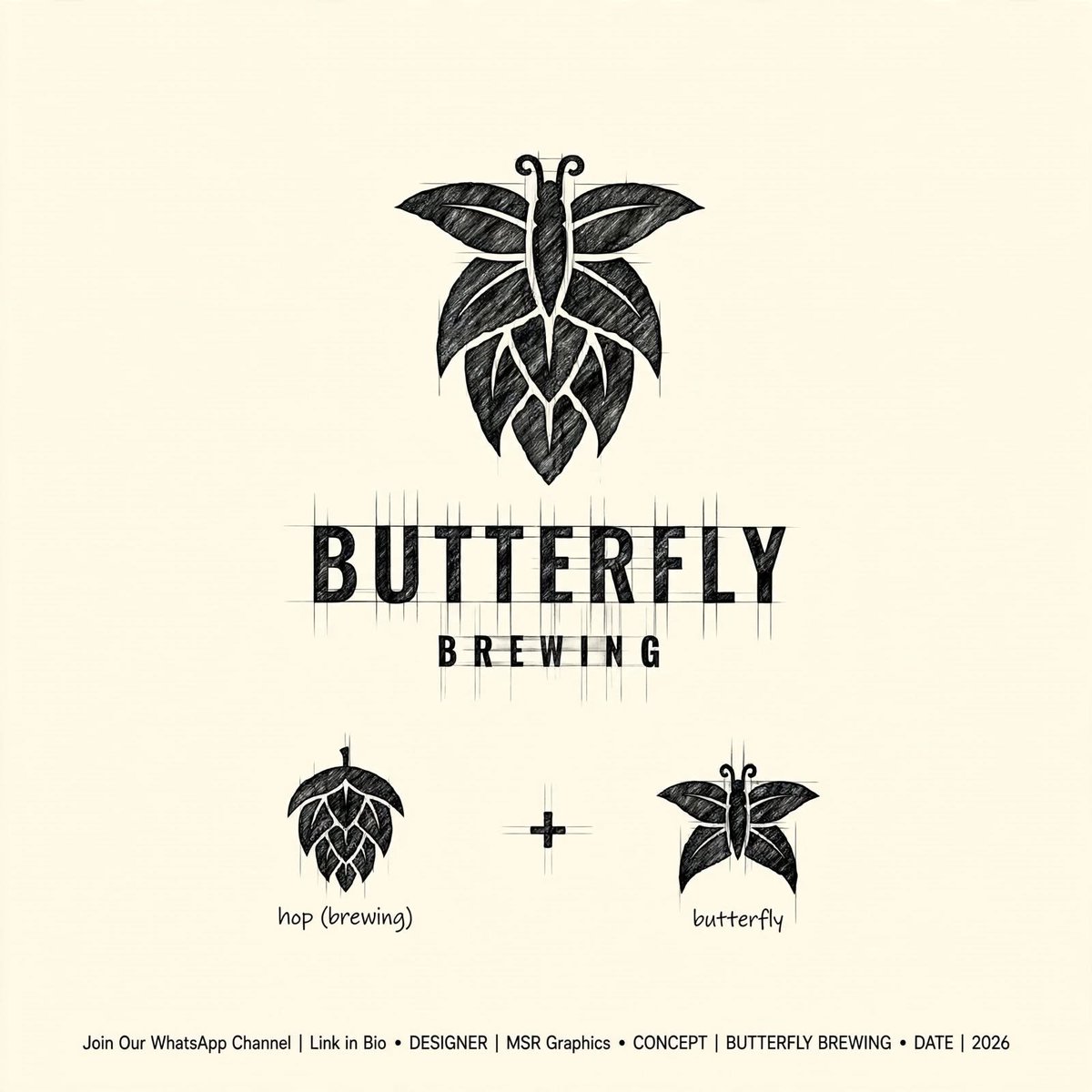
8 Creative Logo Concepts | MSR Graphics
K & Queen, Rabbit, T-Shep, Owl & 4 More!
Turning creative ideas into unique brand identities through typography, clever combinations, and negative space.
Which concept is your favorite? 👀
#MSRGraphics#LogoDesign#LogoConcepts