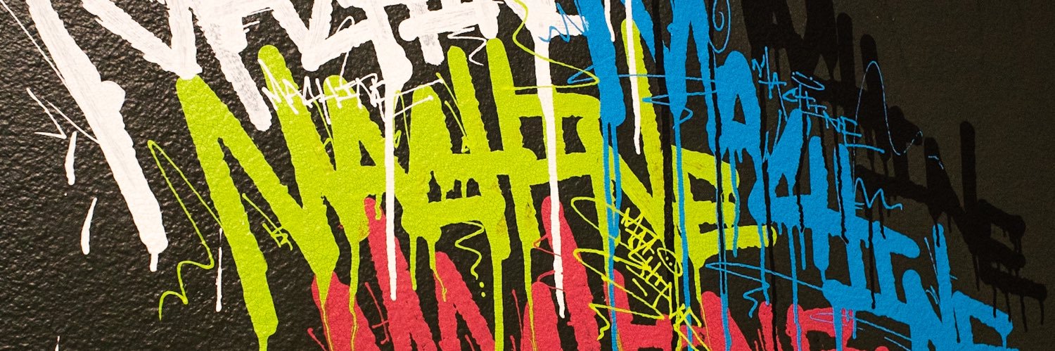
Audio didn’t record, but we keep it movin. This color combo really pops. Grey and brigh green. Did a stock cap fill and outline. Might have liked NY Fat fill better, but I do like how the dusty stock cap fills look.
The Night Quill was made to help people with injuries spray easier, but it also gives you way more control over output. Paired with a Needle Cap, you can get super thin lines; it can be a bit messy, but it works well for small details like cracks and things like that.
Color Combo: Black fill with a bright green outline. The test failed a bit; looking at the buffed wall, it’s closer to black than the dark grey I thought it was. Is what it is.
Wanted to check out these blues with gold. Also haven’t done rounded letters for quite some time, so wanted to give those a go again. Reminded me of the early 90s painting like this except for the messy Needle Cap style.
Quick look at the Lego Cap vs the Universal Thin. Both can hit thin lines, but the Lego is more versatile; you can dial it in for really thin lines, but also use it for bolder lines, flare tags, and even fills. The Universal Thin is more easier to control for finer detail work.
Someone requested the red, white, and blue color combo. I can’t remember if I’ve done this. I usually don’t like this shade of red and blue together, but separated by the white outline, I think it works really well.
After doing a throwie with this purple and bright green, I really wanted to see a simple piece the the color scheme. Definitely a combo that pops quite a bit. Worth a try if you haven’t used these colors before.
Someone requested a Needle Cap fill and NY Fat Outline. Probably was joking, but I wanted to see it anyway. Not the worst look, but I’d prefer other options.
Greys for fill, red outline and bright green border is a solid color combo. Greys tend to work with any colors as long as there’s enough contrast and the bright green border against the red outline brings it all together.
Wanted to test out this messy outline first, fill second style with gold, brown, and beige. At first I thought the color scheme might be a bit too dull for graff, but I’m into how they go together. Might try a similar scheme with a bit of bright color to see how it pops.
Simple letters with dark grey, orange, yellow, and white. There are some contrast issues; maybe the highlights are popping too much. I’m thinking black highlights might have worked a little better to bring out the outline color a bit more.