A product benefit:
“contains electrolytes”
A better benefit:
“helps you stay hydrated”
A more interesting direction:
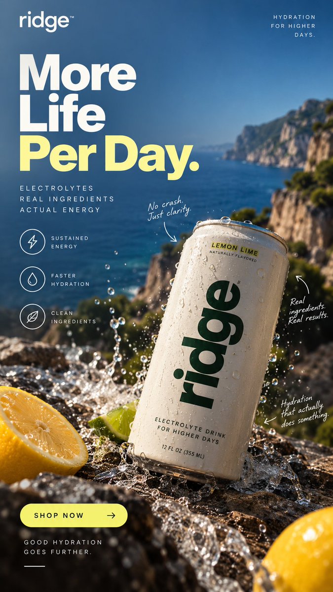
“More life per day.”
The further you can move from what the product contains toward what life looks like after using it, the more room you have creatively.
Doing something a little different.
Send me your product and I’ll make 5 ad concepts for it free.
Not an audit.
Not a PDF telling you to “improve your hooks.”
Actual creatives.
→ https://t.co/CSZ75BNeyq
One thing I think gets underrated in ad creative:
The environment around the product.
A suitcase at an airport feels different than a suitcase on a white background.
Same product.
Different story.
Quick exercise I’ve started using:
Take your headline.
Remove the product name.
Could 100 other brands use it?
If yes, it probably needs another pass.
“Fuel your day.”
“Unlock your potential.”
“Made for more.”
All fine.
All invisible.
A lot of ads are technically good.
Good product shot.
Good typography.
Good colors.
And still completely forgettable.
Usually because there’s no actual idea behind them.
“Make it look premium” isn’t an idea.
Features explain the product.
Outcomes explain why it matters.
Feelings explain why someone remembers it.
Trying to get all three into one ad without making it feel like a brochure.
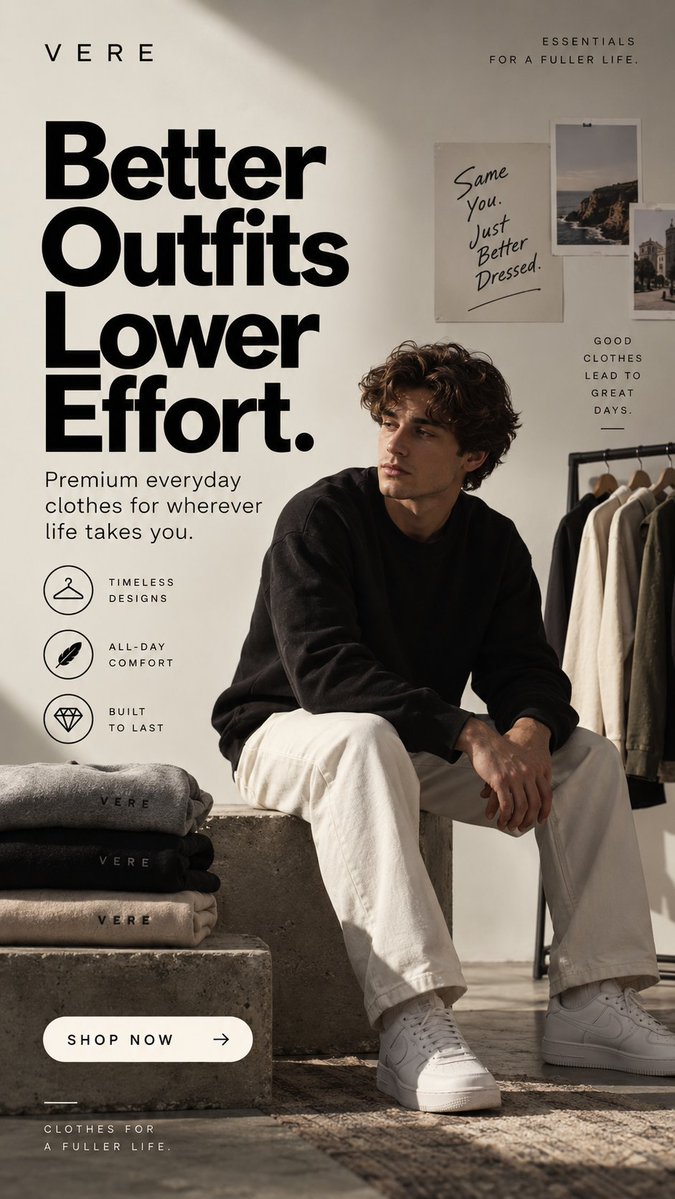
You could advertise this with:
“Premium materials. Timeless design. Superior comfort.”
Technically fine.
But nobody wakes up wanting “premium materials.”
“Better outfits. Lower effort.”
gets closer to the actual reason someone buys.
We've been experimenting with a simple idea:
Give the product a better ad before asking the brand for anything.
So we'redoing exactly that.
we'll make 5 ads for your brand free.
If you want one of the spots:
https://t.co/CSZ75BNeyq
Before designing an ad, I’ve started forcing myself to answer one question:
What should someone understand in the first 2 seconds?
Not every feature.
Not the founder story.
One thing.
Then the entire ad gets built around that.
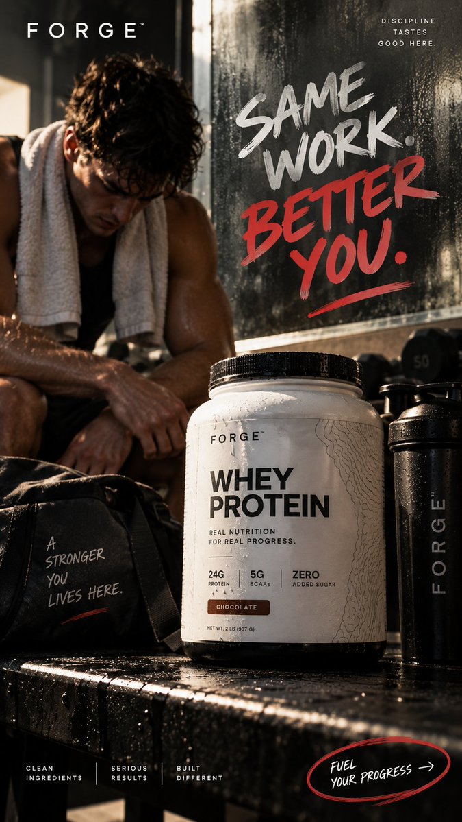
I think good creative should make the brand recognizable without forcing every ad into the same template.
Different product.
Different mood.
Different visual language.
Same standard.
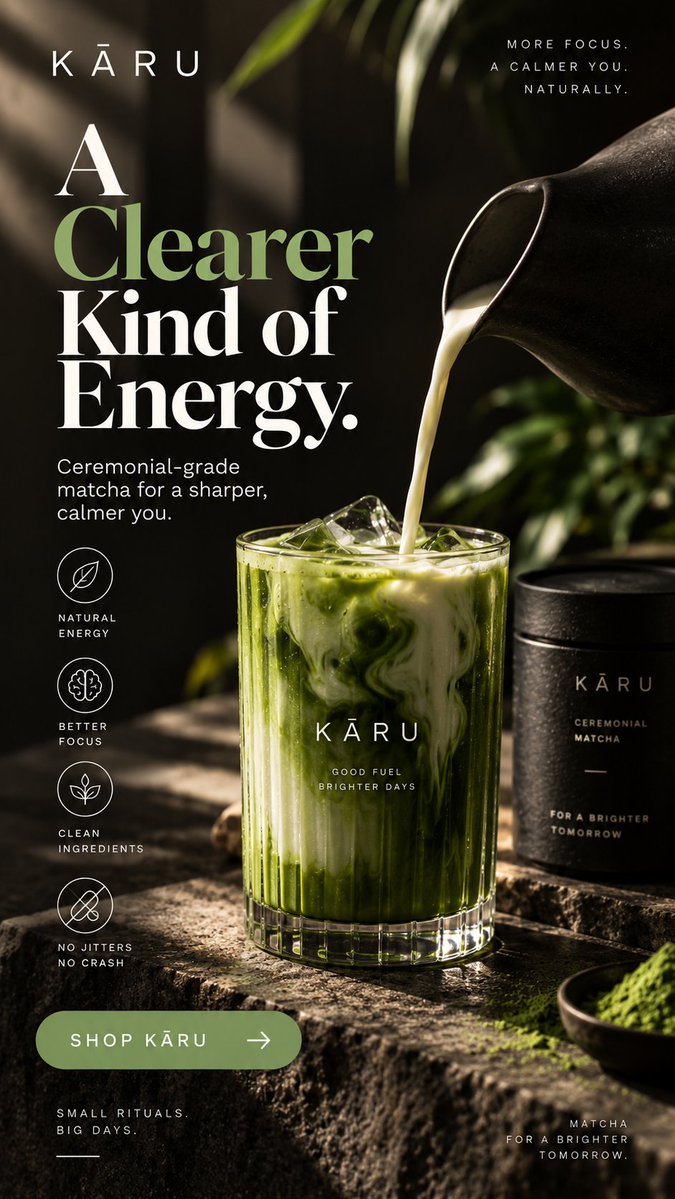
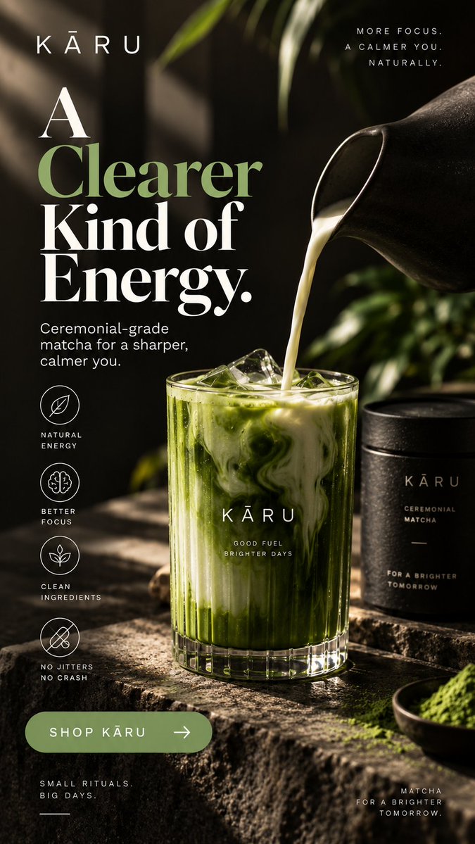
“Natural energy.”
Useful.
“A clearer kind of energy.”
Interesting.
Same category.
Same general benefit.
One sounds like product copy.
The other gives you something to picture.
One thing I’m trying to stop doing:
putting the entire product page inside the ad.
This already tells you:
what it is
why you’d want it
how it should make you feel
Everything else can happen after the click.
I’ve been making ads like these to sharpen my creative process.
Rather than keep making fictional brands, I’m giving 5 brands 5 ads for free.
No pitch deck.
No strategy call required.
I just make the ads.
https://t.co/CSZ75BNeyq
Product photography does a lot of the selling before the copy gets a chance to.
If the suitcase feels premium, capable and travel-ready at first glance…
the copy only has to finish the thought.
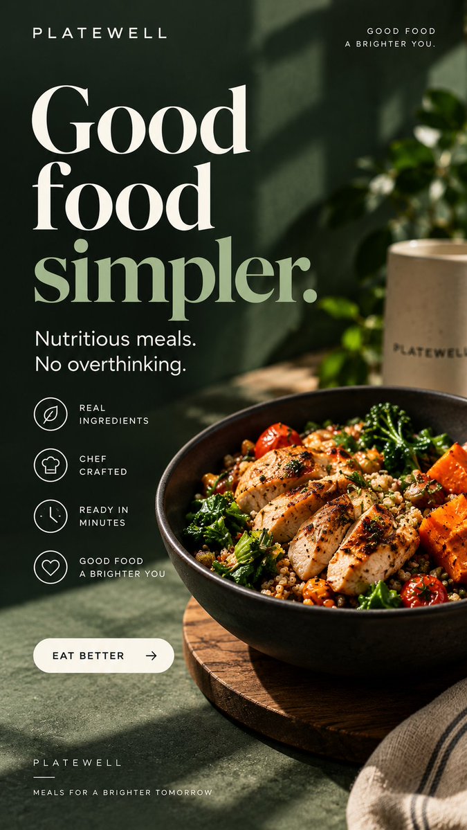
Instead of:
“Healthy meals delivered to your door”
I went with:
“Good food simpler.”
People already understand what meal delivery is.
The ad’s job is to make them want this version of it.
Tried making a matcha ad that doesn’t look like every other wellness ad.
No floating ingredients.
No giant “ENERGY + FOCUS” claims.
Just one feeling:
a calmer kind of energy.
Most hydration ads sell hydration.
I wanted this one to sell the day you get because you’re hydrated.
“More Life Per Day.”
Product benefit → life benefit.
Small difference in copy.
Completely different feeling.