Introducing Meditations in Color.
An archive of the color of art history.
A drawing system that builds new work from its palettes.
Visit https://t.co/3nUlOGTVZL
Tobias Mayer’s triangular color chart (1758).
Created by an astronomer and cartographer, it was an early attempt to represent color through geometry than symbolism or pigment alone.
Later reproduced by Georg Christoph Lichtenberg in Opera Inedita (1775).
Joan Miró’s Head of a Catalan Peasant (1925).
By the mid 1920s, Miró was stripping images down to signs, symbols, and a remarkably economical palette. The color does much of the remaining work.
Hex Values: #8F1430#C27129#D6B14F #465797 #864B34#B9A9A8#4A6A39#F7F7F0
Victor Vasarely, Symphonie Inachevée (Unfinished Symphony), 1966.
A work completed only in part. The remaining forms were intentionally left blank, accompanied by Vasarely’s instruction: “Finish the coloring with your children.”
Ink and gouache on paper.
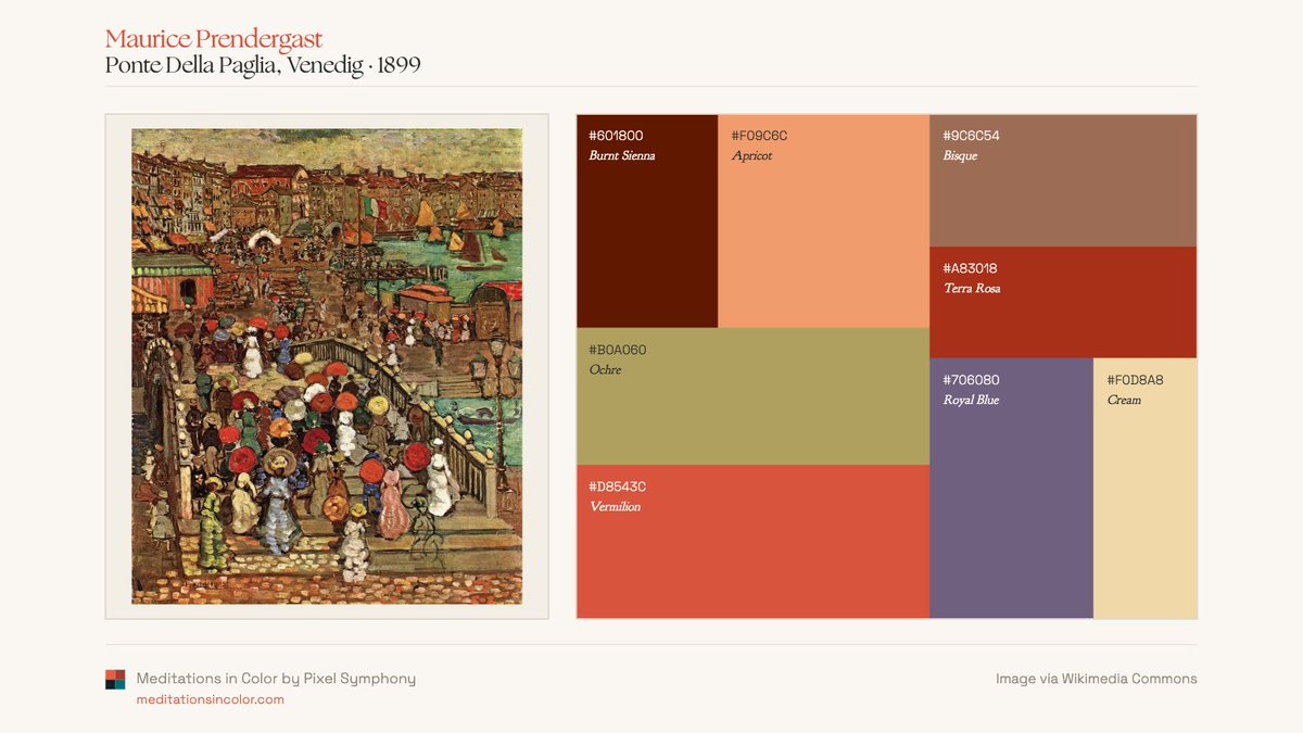
Maurice Prendergast's color world.
Across beaches, gardens, promenades, and parks, Prendergast returns to the same chromatic vocabulary: ochres, creams, blues, greens, and bursts of orange.
Four palette readings from Meditations in Color.
Patrick Syme, Werner’s Nomenclature of Colours (1814).
Hand colored engraving.
An early attempt to standardize color through the animal, vegetable, and mineral kingdoms. Charles Darwin carried a copy aboard the Beagle to describe colors encountered in nature.
1 of 2 👇🧵
Meditations in Color by @Pixel0Symphony
A curated release of 200 handcrafted algorithmic works built from palettes drawn from the Colorist Archive at @MeditateColor.
June 10 on SuperRare.
11–12 PM ET — Allowlist (all SR collectors): 0.03 ETH
12 PM ET — Public: 0.04 ETH
+ Collector Rewards
5 mints — 12×12 print
10 mints — 24×24 print
15 mints — 30×30 signed & numbered print
Printed with archival pigment inks on museum-quality Hahnemühle Photo Rag 308 cotton rag paper.
The palette of Arthur Dove’s Sun (1943).
One of the first American modernists to work almost entirely through abstraction, Dove used color to evoke natural forces rather than describe them.
Alfred Jensen, Octimal Jupiter Series, 3/19 of a 399 Day Cycle = 57 (1975).
Jensen assigned colors within numerical, calendrical, and cosmological structures. The colors function almost like variables in a diagram.
Oil on paperboard.
Aristarkh Lentulov’s Moscow Artists (1927).
A leading figure of the Russian avant garde, he was known for his explosive use of color.
This study isolates only the reds & orange ochres from the painting, revealing the range hidden within a seemingly narrow chromatic register.
An algorithmic study built from the palette of Paul Gauguin's Te Poipoi (1892).
Meditations in Color by @Pixel0Symphony
200 Editions. June 10 on SuperRare.
Maurice Denis translated into palette fields.
Denis helped shift painting away from naturalism, arguing that a painting was first a flat surface covered with colors arranged in a certain order. His palettes still carry that conviction.
George Hurst, Colour (1900).
Hurst was a Scottish chemist, dye expert, and color theorist.
Looking back, many of these diagrams feel unexpectedly modern. Looking forward, they helped establish some of the foundations on which 20th CE color theory would be built.
1 of 2 👇
Three works from the Interference drawing system using the palette of Edward Hopper’s Nighthawks (1942).
Meditations in Color arrives on @SuperRare June 10.
An algorithmic study built from the palette of Henri Matisse's Seated Riffian (1912).
Meditations in Color by @Pixel0Symphony
200 Editions. June 10 on SuperRare.
Drawn from David Hockney’s My Parents (1977).
For all its quietness, the painting is remarkably chromatic, built from subtle negotiations between cool and warm tones across the room.