On Day 2 of my #30DaysFigma challenge, I took on the task of redesigning the hero section of @paj_cash. The first frame is the original design, while the second (and others) are my redesigned version.
On Day 2 of my #30DaysFigma challenge, I took on the task of redesigning the hero section of @paj_cash. The first frame is the original design, while the second (and others) are my redesigned version.
Energy use, climate control, camera feeds… all organized so it feels calm instead of chaotic.
The goal was to make information clear without shouting for attention, just something simple and also a functional design that lets the details breathe.
Lately, I have been exploring how dashboards can feel less overwhelming and more like a space you actually want to use.
This concept is a home monitoring dashboard, where everything you need to know sits quietly in one place.
@Adeseoluzainab Thanks a lot. Honestly, the hardest part was just starting out. Once you commit, the progress sneaks up on you. You can definitely do it 💪💪🚀🔥
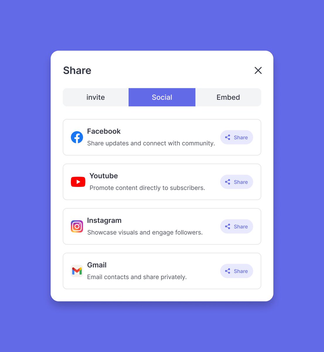
Day 30 of my #30DaysFigma challenge
I ended the challenge with something small but often overlooked a share menu.
It’s one of those screens people only notice when it’s bad. If the options feel vague, users hesitate. And If it’s cluttered, they give up.
Here, I try to keep it straightforward, with clear labels, small cues for context, and just enough spacing so it feels intentional. The aim was to make the decision feel effortless.
Day 29 of my #30DaysFigma challenge
Not every screen says “thank you for your purchase.”
Sometimes, things don’t go through. I wanted this screen to acknowledge that clearly without causing panic.
The failed state is shown upfront, followed by a breakdown of the attempted charge. A card preview helps users confirm what went wrong and a single button invites them to try again.
Day 28 of my #30DaysFigma challenge
This screen comes in after the purchase when the order’s placed and the waiting begins.
The delivery stages are broken down with timestamps, giving the user a sense of movement.
Day 27 of my #30DaysFigma challenge
After all the clicks, filters, and decisions, this is the moment users get to pause. The order’s placed. No need to double check or second guess just a quiet confirmation that everything’s gone through.
Day 26 of my #30DaysFigma challenge
The final checkpoint in the review screen.
After all the browsing, filtering, choosing, and confirming, this is where it all comes together. I designed this screen to feel like a quiet pause before the finish line just one green button away
Day 25 of my #30DaysFigma challenge
Today I worked on the payment step of the FASCLEV flow. It’s one of those moments in the journey where everything slows down a bit. The user has made their choices, filled in their info, and now they are about to commit.
This page wasn’t made to grab attention. It’s meant to give clarity. You see your address, your payment, the items, and when to expect them. Nothing is shouting for attention, and that’s the point.
Day 27 of my #30DaysFigma challenge
After all the clicks, filters, and decisions, this is the moment users get to pause. The order’s placed. No need to double check or second guess just a quiet confirmation that everything’s gone through.
Day 26 of my #30DaysFigma challenge
The final checkpoint in the review screen.
After all the browsing, filtering, choosing, and confirming, this is where it all comes together. I designed this screen to feel like a quiet pause before the finish line just one green button away