I see the web evolving in two extremes:
1️⃣ ultra-fancy human experiences, in the service of delight, exploration, brand, entertainment. https://t.co/0nyTRPKDEJ / threejs / typegpu are enabling this
2️⃣ agent-centric content, data and APIs. the opposite end of the spectrum: pure, lossless signal for machines. The rise of markdown and MCP are the tip of this iceberg
The 'in between' is likely to be subsumed by agents producing just-in-time UI. When you need utilitarian content or data, it'll be generated just-in-time for you. Think of the agent as the new browser in this model.
https://t.co/udCpOYBbgj is what we use to ship shaders on https://t.co/ixOrQY1mf8. Now it's open source.
The one and only @matiNotFound did it again! Insane work!
Here's an actual design engineering tip:
Safari sucks at updating multiple WebGL video textures in the same frame, especially during interactions or animations on initial page load.
To keep things buttery you'll wanna pause texture uploads during motion e.g:
isMoving ? holdLastFrame() : gl.texImage2D(video)
Exploring how 2D schematics can transition naturally into 3D
Made this app with Kimi K3
The tank is fully generated with code. Super easy to swap it out for something else
Gummy bears are a popular choice to demonstrate surface tension in space. The bright, familiar candy makes science demonstrations fun and it's a simple way to show how fluids behave differently in space. These simple demos help us understand capillary forces and fluid dynamics crucial for spacecraft design, life support systems, and even research that benefits Earth.
A shared library extends a system with features many teams need, yet is made and maintained by people not on core team.
The core team does play a role to set expectations, build a platform, and help with curation.
https://t.co/5n3hulNYEJ
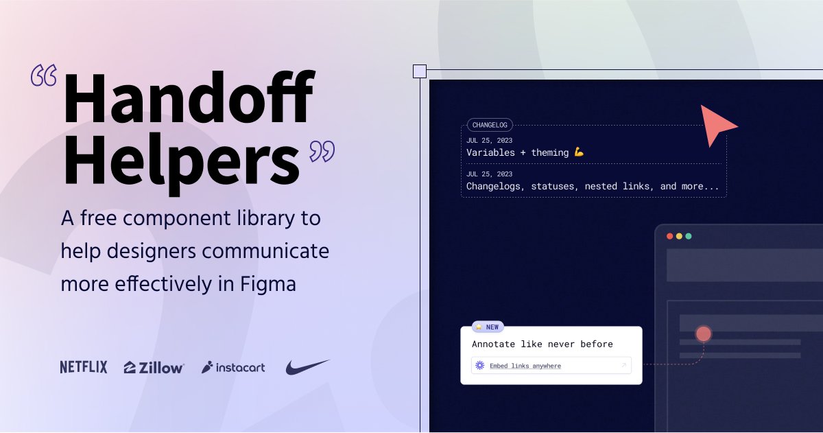
Figma Handoff Helpers (https://t.co/Skcqsxs0Id), a lovely free design annotation kit to help you communicate effectively in Figma — with status cards, table of contents and a checklist component.
🎉Now updated: https://t.co/W40poiQPA6
Put together by @ridd_design 👏🏼👏🏽👏🏾
#figma
Today's addition to the #threejsJourney's wall of fame: Unknown Pleasures | An Audio Visualizer with WebGL
👉 https://t.co/NNJn6vhPis
A beautiful animation for an iconic song.
Great job @daisyofrenda !
👉 https://t.co/ezekh7UQHY
👉 https://t.co/q4LqtR8M4y
#threeJs
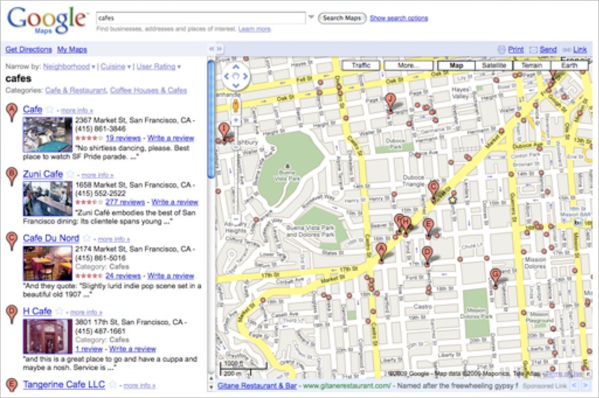
In 2007, I was 1 of 2 designers on Google Maps.
The app was growing like wildfire.
But it was becoming a cluttered mess — new features were being shoved into every pixel.
Here’s the 4-step process we used to redesign Google Maps into one of the most loved apps in the world: 🧵
–––
But first, it’s important to understand it is normal to build a product based on the underlying technical structure.
In 2005, Google Maps queried one of three databases for any search:
• Maps data
• Local business data
• Directions data
Not surprisingly, the first version of the website had three tabs, one for each of these databases: Maps, Local Search, Directions.
–––
By 2007, Google Maps still wasn’t the dominant mapping application.
But it had hit PMF, its user base was growing quickly, and we were rapidly adding new content and features like:
• Satellite and Terrain views
• Streetview, 3D buildings, Traffic
• Editable map data, Reviews, Photos
• Transit Data
We were wedging new features into any space we could find in the UI.
It became clear the user experience was suffering and the product was growing increasingly complicated.
At that time, our VP, Marissa Mayer likened Google Maps to a Christmas tree that we kept adding more and more ornaments to until it started to fall over…
We tried many different ways to rearrange the UI to accommodate new features.
Eventually we had to step back and rethink Google Maps based on what we knew was working, what brought people to the product, and what we believed the future might look like.
–––
These were the 4 key steps we took to simplify the design of Google Maps to be the intuitive, durable, much-loved product that 1B people still use today:
1. Deconstruct
We wrote down all of the product’s current and upcoming content, features, and functionality and loosely grouped them into categories:
• Core features — The most common tasks people came to do (search, get directions, find businesses)
• Aspirational use cases — Tasks we wanted people to start doing (adding their own content, correcting inaccurate information, using Maps to explore new places, etc.)
• Global actions — Actions that impacted the entire page (print, share, save, etc.)
• Use case specific actions — Actions that were relevant only within a specific use case (eg while getting directions, being able to drag a route or add a destination)
• Related features — Things that weren’t a part of Google Maps at the time, but existed and were closely related. (eg transit information, business searches on https://t.co/M0Af8Qy8uQ)
–––
2. Reframe
We leveraged a combination of user research, business goals, and our own intuition to make the product better, simpler, and scalable over time. We focused on understanding:
• What brought people to the product
• How they navigated through the product
• What was working well
• What flows were confusing
• What things were missing
• What information was valuable when
• What functionality was redundant
We emerged with several key points:
• “Searching” was the most pivotal task in Maps
• Searching addresses, businesses, parks, mountains, cities, etc could all be thought of as searching for “places”
• Getting directions was important, but rarely happened between two specific addresses. Directions searches usually had a known start or end point, like home or work. It was also more intuitive to be able to search for directions by a place name e.g., Carmel Library rather than having to look up the address first.
• It was strategically important for people to be able to contribute content to Google Maps and to be able to explore the world around them.
–––
3. Reconstruct
Based on what we learned, we then explored ways to reshape the product.
We held these general usability principles in mind:
• Entry points to core use cases should be prominent
• Flows within core use cases should be intuitive
• Common actions, interactions, and views should be consistent
• Contextual actions should be accessible when relevant
This is one exploration of clustering tasks and connecting relevant content:
Our explorations of how to reconstruct the site around people’s needs and flows led to several key design changes:
• There would be only one search box for everything
• Directions would live as a secondary feature
• Other features would appear in context (eg, transit became a mode within directions)
–––
4. Scale for the future
This was 2007. We knew the product would continue to evolve, the information set would grow exponentially, and the feature set would continue to expand.
But by focusing on key use cases and folding information in to the UI where it was relevant, we created a framework to support future growth.
16 years later, Google Maps has continued to evolve, yet is still a simple, intuitive, much-loved product that 1B people use around the globe.
For more on design, follow @elizlaraki
#CSS only full URL page navigation with View Transitions
- 5 minute prototype
- 1 meta tag
- a few lines of CSS
- Open Props
Behind a flag in Canary:
chrome://flags/#view-transition-on-navigation
It's not finished yet, but there's really rad opportunities already available 🤓