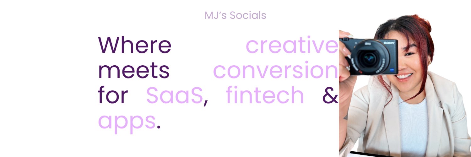
Hi y’all :)
I’m not gonna lie… most ads don’t fail because of the product…they fail because they don’t feel real.
People can tell when something’s scripted, forced, or just trying too hard to sell!!
Soooo that’s where I come in✨
If you’re looking for content that feels natural, builds trust, and actually converts, you’re in the right place :)
Here’s a bit about me first 👇
✨UGC creator for almost 4 years (and still obsessed with it)
✨Worked as a creative strategist for 2 UGC agencies but creating content is what I genuinely love the most
✨150+ clients across tech, finance, women health supplements, lifestyle & more
✨Notable brands: Amazon, Starbucks, COD: Mobile, https://t.co/EvZMDHAY34, Monarch Money, Scribe, O Positiv, Physicians Formula, QuillBot + more
✨I think about hooks, retention, and conversions first
✨Known for my 0.5x talking-to-camera style that feels like you’re on FaceTime with a friend (watch my vids hehe)
✨I also share real experiences living with PCOS from hormones, energy, weight, to confidence (soo many examples in my portfolio!)
✨Currently balancing content, business, travel, wellness and building my own brand BTS
View more of my ads here 👇🏼
https://t.co/V4vqTAFhhy
[email protected]
🤍🤏🏼
#ugccreator #ugc #ugccommunity #ugccanada #femalecreator #ugctips #dtcads #performancemarketing
the best money-management content doesn’t make you feel guilty about spending.
it makes you feel good about being more intentional with it.
for this Hiatus UGC example, the hook was:
“3 reasons why Hiatus saves me”
and i really like this angle for recurring expenses because it turns saving money into a feeling of satisfaction rather than another chore.
the selfie talking-to-camera format keeps it personal too.
instead of:
“here are the features…”
it feels more like:
“here’s something i started doing with my money and i’m actually happy about it.”
that distinction matters.
especially in fintech, people don’t always need MORE information.
sometimes they just need to see how a product makes managing money feel easier.
brands, if you want UGC that thinks beyond the script and into the psychology behind the creative, let’s chat :)
[email protected]
https://t.co/V4vqTAFP76
#ugc #ugccanada #ugccreator #fintech #fintechmarketing #videomarketing
your UGC hook doesn't always need to explain the product. sometimes, it just needs to make people want the result.
for this Poply UGC example, the strategy was pretty simple:
make creating an event invitation feel more fun, personal, and effortless.
instead of opening with: "here's an app that helps you create invitations..."
the hook focused on the visual transformation:
"3 reasons why my movie invites look like a fancy wedding invite"
because people don't just want to send an invitation.
they want to make their guests feel excited before the event even happens.
then the video shows how Poply makes that possible.
→ start with a visually appealing outcome
→ make the product part of the experience
→ show how easy it is to recreate the result
→ let the audience imagine using it for their own events
because whether it's a movie night, birthday party, dinner date, or girls' night, people love the little details that make an ordinary gathering feel special.
and that's what makes this creative angle work.
you're not just selling an invitation-making tool. you're selling the excitement of planning something worth looking forward to.
brands, if you want UGC that makes people see the value of your product before you even explain its features, let's chat:)
[email protected]
https://t.co/V4vqTAFP76
#ugc #ugccanada #ugccreator #eventtech #videomarketing #contentstrategy
not every beauty product needs a dramatic hook to grab attention.
sometimes, letting people SEE the result is the strongest selling point.
for this Carisma UGC example, the strategy was all about visual proof.
instead of opening with a long explanation about how the product adds volume to thin hair, we focused on something the audience actually cares about:
the difference between before and after.
the creative naturally moves through:
→ addressing a specific concern (thin, flat hair)
→ introducing the product as part of the routine
→ showing how it works
→ revealing the final transformation
because when you're marketing a beauty product, especially one with visible results, you don't always need to convince people with words.
let the visuals do the heavy lifting.
the creative takeaway:
don't overcomplicate a product that can sell itself visually.
if the audience can immediately see the difference, you've already given them a reason to pay attention.
show the result. build the desire. let the product speak for itself.
brands, if you want a creator who thinks beyond pretty visuals and understands the psychology behind the creative, let's chat:)
[email protected]
https://t.co/V4vqTAFP76
#ugc #ugccanada #ugccreator #beautycontent #beautymarketing #videomarketing
“oh, i just used Scribe.”
the product becomes part of the conversation instead of the entire conversation.
and that's what makes the recommendation feel more believable.
the KEY for SaaS UGC:
make the audience recognize the problem before you introduce the solution.
because nobody wakes up thinking:
“i really need workflow documentation software today.”
they think:
“why am i explaining the same instructions over and over again?” 😭
show the frustration. create curiosity. then let the product do the talking.
brands, if you want a creator who thinks about the creative angle AND the strategy behind it, let's chat :)
[email protected]
https://t.co/V4vqTAFP76
#ugc #ugccanada #ugccreator #saas #saasmarketing #videomarketing
the best subscription content makes people recognize their spending habits before they even realize they're watching an ad.
for this Hiatus UGC example, we used a conversation-style approach where the creative feels like two friends casually talking about recurring expenses.
and i think that's what makes this concept work.
instead of opening with: "here's an app that helps you manage your subscriptions..."
we started with a familiar frustration:
"wait... am i STILL paying for that?"
because most people don't necessarily notice how much they're spending on subscriptions until they see everything adding up.
the strategy here was to make the problem feel familiar first, then naturally introduce Hiatus as the solution.
the conversation does the heavy lifting: → brings up a relatable money habit → creates awareness around recurring expenses → introduces the app without making it feel like a sales pitch → gives the viewer a reason to check it out
the creative takeaway:
don't make fintech content feel like a financial lecture.
make it sound like a conversation your audience would actually have.
when people recognize themselves in the situation, they're more likely to pay attention to the solution.
sell the relevance first. then introduce the product.
brands, if you want UGC that feels natural but still has a strategy behind it, let's chat:)
[email protected]
portfolio: https://t.co/V4vqTAFhhy
#ugc #ugccanada #ugccreator #fintech #ugcvideo #videomarketing
and that's important for fintech brands.
people don't necessarily want another app reminding them to budget, track expenses, or cut back on spending.
they want to feel like they're getting better with money without adding another complicated task to their day.
with financial apps, the real hook isn't always:
"this app helps you save money."
sometimes it's:
"what if you could save money without changing your entire lifestyle?"
that's a much more relatable way to introduce the product.
because the goal isn't to make people feel guilty about how they spend.
it's to show them how small, smarter decisions can make a difference.
brands, if you want UGC that turns everyday financial frustrations into content people actually want to watch, let's chat:)
[email protected]
https://t.co/V4vqTAFP76
#ugc #ugccanada #ugccreator #fintech #ugcvideo #videomarketing
subscription spending is easy to ignore when each charge feels like “just a few dollars.”
until you add them all up.
for this Hiatus UGC example, the hook was:
“pov: 80% of your money is going to subscriptions”
the KEY here is the realization factor.
instead of starting with “here’s an app that helps you manage subscriptions,” the creative starts with a problem people can actually recognize in their own spending.
that curiosity pulls you in.
then the app becomes the solution as the video shows how you can see and keep track of those recurring expenses in one place.
the visuals are doing a lot of the selling here.
rather than saying: “you need to be more responsible with your money.”
the content lets you SEE where your money is going and what you can do about it.
the creative follows a really simple flow:
→ call out a relatable spending problem
→ create curiosity with the hook
→ reveal the solution
→ show how it works in real life
and that’s what I like about fintech UGC.
it doesn’t have to feel like a financial lesson.
sometimes you just need to show someone a problem they already have… and make the solution feel ridiculously easy.
brands, if you want a creator who thinks about the creative strategy AND makes it feel natural, let’s chat:)
[email protected]
https://t.co/V4vqTAFP76
#ugc #ugccanada #ugccreator #fintech #personalfinance #videomarketing
money-management content doesn't have to make people feel bad about where their money is going.
sometimes, the better approach is showing them how much easier managing it can feel.
for this Hiatus UGC example, the hook was:
"3 reasons why Hiatus saves me"
i like this angle because it takes something that can normally feel overwhelming — recurring expenses — and turns it into something that feels satisfying to get under control.
the selfie-style delivery also makes the message feel more like a personal recommendation than a financial lesson.
instead of:
"here are all the features..."
the video feels more like:
"this is something i started using and it actually made managing my money easier."
that shift matters.
especially for fintech brands, the goal isn't always to give people more information.
sometimes, it's about showing them a simpler way to feel more in control of their money.
brands, if you want UGC that thinks beyond the script and into the psychology behind the creative, let's chat:)
[email protected]
https://t.co/V4vqTAFP76
#ugc #ugccanada #ugccreator #fintech #fintechmarketing #videomarketing
most SaaS ads make one mistake:
they explain the software before giving people a reason to care about it.
for this Scribe example, i took a different approach.
instead of opening with "this is what Scribe does," i started with a question that already exists in the viewer's mind:
"what's the best tool for creating SOPs?"
bringing ChatGPT into the conversation helped make the recommendation feel more like a genuine discovery instead of a traditional product pitch.
from there, the video showed how quickly Scribe can turn a workflow into a documented process without manually writing everything step-by-step.
the KEY here is making the problem the starting point.
because people aren't searching for another software tool just because it exists.
they're searching for a faster way to get something done.
brands, if you want a creator who thinks about the strategy before filming, let's chat
[email protected]
https://t.co/V4vqTAFP76
#ugc #ugccanada #ugccreator #saas #saasmarketing #creativestrategy
the best SaaS hooks don't explain the software first.
they give you a reason to care.
for this Notion example, i opened with:
"how much time could i save if all my content planning lived in one place?"
the KEY here is that the hook creates a problem worth solving.
instead of immediately walking through every Notion feature, i showed the messy process
first - scattered ideas, random notes, and content that needed organizing.
then the tool naturally became the solution.
that's what makes SaaS content feel less like a product demo and more like a story.
if the viewer can recognize the problem befoe you introduce the software, you've already given them a reason to keep watching.
brands, if you want a creator who thinks about the strategy before filming, hit me up:)
[email protected]
https://t.co/V4vqTAFP76
#ugc #ugccanada #ugccreator #saas #productivitytools #videomarketing
home decor brands don't always need to show you more features.
sometimes they just need to show you why you'd want the product in your home.
for this https://t.co/VQWoIAEWV5 video, the creative direction was built around making the rug feel like an upgrade to an everyday space.
the hook:
"no more basic rugs at my local store."
instead of opening with the material, size, or quality claims, the video creates a reason to keep watching.
then the visuals take over.
i showed the rug from different angles, focused on the details, and let viewers see how it actually looks in the space.
because when you're shopping for home decor, you're not only asking:
"is this a good rug?"
you're asking:
"would this look good in MY home?"
that's where lifestyle-driven UGC becomes powerful.
and actually selling the feeling behind it.
brands, if you want a creator who thinks beyond filming pretty shots and actually considers the psychology behind the content, let's chat:)
[email protected]
https://t.co/V4vqTAFP76
#ugc #ugccanada #ugccreator #homedecor #interiordesign #ugcads
want your event to look more put-together without doing more work?
don't start by showing the app. start by showing what it helps you create.
for this Poply example, my hook was:
"why does my movie night invite look like i hired an event planner?"
it creates an immediate curiosity gap.
the viewer isn't thinking about the app yet. they're thinking about how they can make THEIR event look this good.
throughout the video, i focused on:
→ the polished invite templates
→ customizing the details to match the event
→ keeping all the event info organized
→ making it easy for guests to get the details
the KEY here is positioning the app as the solution, not the main attraction.
because people aren't looking for another event-planning app.
they're looking for an easier way to make their plans feel organized, intentional, and a little more special.
that's the psychology behind effective UGC.
brands, if you want a creator who thinks about the psychology behind the content, let'schat:)
[email protected]
https://t.co/V4vqTAFP76
#uac #uaccanada.#uaccreator. #eventtech.#eventplannina #creativestrateay
being in Canada is financially difficult
that hook does more than grab attention.
it immediately tells the viewer,"i get what you're going through.'
for finance content,that's important because people are already skeptical.
instead of jumping into what the app does, i started with a feeling the audience already had.
then i showed how Bree fits into that situation by walking through the app and explaining how it could help.
the KYheis thai pple don't connect with features first.
they connect with feeling understood.
brands, if you want a creator who thinks about the psychology behind the content-not just the visuals-let's chat
[email protected]
https://t.co/V4vqTAFP76
#ugc #ugccanada #ugccreator #finance #fintech #creativestrategy
crypto content doesn't always have to focus on making more money.
sometimes, the stronger selling point is simply feeling less overwhelmed.
for this https://t.co/EvZMDHBvSC video, instead of making the content about charts and market movements, the focus was on making crypto management feel easier and more hands-off.
the hook introduces the idea of managing your crypto, then the day-in-the-life visuals show how the product can fit into your routine without taking over your day.
that's what makes this approach work.
you're not just showing what the platform does. you're showing how it can make someone's life feel.
because the real pain point isn't always investing. sometimes it's feeling like you need to constantly monitor it.
brands, if you want a creator who thinks beyond the product and into the psychology of your audience, let's chat:)
[email protected]
https://t.co/V4vqTAFP76
#ugc #ugccanada #ugccreator #crypto #cryptomarketing #creativestrategy
people don't buy crochet kits because they desperately need another hobby.
they buy them because they want an excuse to slow down and spend time with people they
love.
for this Woobles video, the hook was:"the best bestie activity"
the KEY here is that the product isn't the main character.
the experience is.
surprising my friends with the kits,figuring out how to crochet together, laughing at our
questionable creations, and finally seeing what we made turns a simple craft kit into a
whole memory.
that's what lifestyle content should do.
don't just show people what your product does. show them what their life could look like with it.
brands, if you want a creator who thinks about the strategy before filming, hit me up:)
people don't buy crochet kits because they desperate
[email protected] https://t.co/V4vqTAFP76
#ugc #ugccanada #ugccreator #crafting #crochet #lifestylemarketing
i'm convinced one of the biggest mistakes suppleet brands make is leading with nutrition
facts.
people don't crave 21g of protein.
they crave a protein shake they'll actually look forward to drinking every morning for this
Good Protein example, i opened with:
'goodprotein's newest flavour (& it's my fav to date!!)"
the hook creates curiosity before talking about the nutrition then i naturally showed how imake my shake, talked through the taste, and let the nutritional benefits support the story instead of leading it.
the product sells itself when people can actually picture themselves drinking it.
taste first.
benefits second.
nutrition backs it all up
brands, if you want UGC that feels like a recommendation from a friend instead of a
i'm convinced one of the biggest mistakes suppleet bi commercial, let's chat:)
[email protected]
https://t.co/V4vqTAFP76
how i'm going to learn coding in 2026 for 5 min/day 💻
the strategy behind this Coddy UGC example is pretty simple:
make learning to code feel less intimidating.
instead of opening with everything the app can do, the hook starts with a very specific commitment:
"5 min/day"
because "i want to learn how to code" sounds like a HUGE project.
5 minutes a day?
way easier to say yes to.
then the video shows the app in action so the viewer can actually see what learning looks like instead of just hearing about features.
and i'm talking directly to the audience throughout → less "here's an edtech product" and more "come see what i'm using to learn."
for edtech, i think the biggest creative mistake is making learning feel like work before the viewer even starts.
make the first step feel easy.
then show them why they'll want to keep going :)
brands, if you want a creator who thinks about the strategy behind the content — not just the script — let's chat
[email protected]
https://t.co/V4vqTAFP76
#ugc #ugccanada #ugccreator #edtech #coding #learncoding