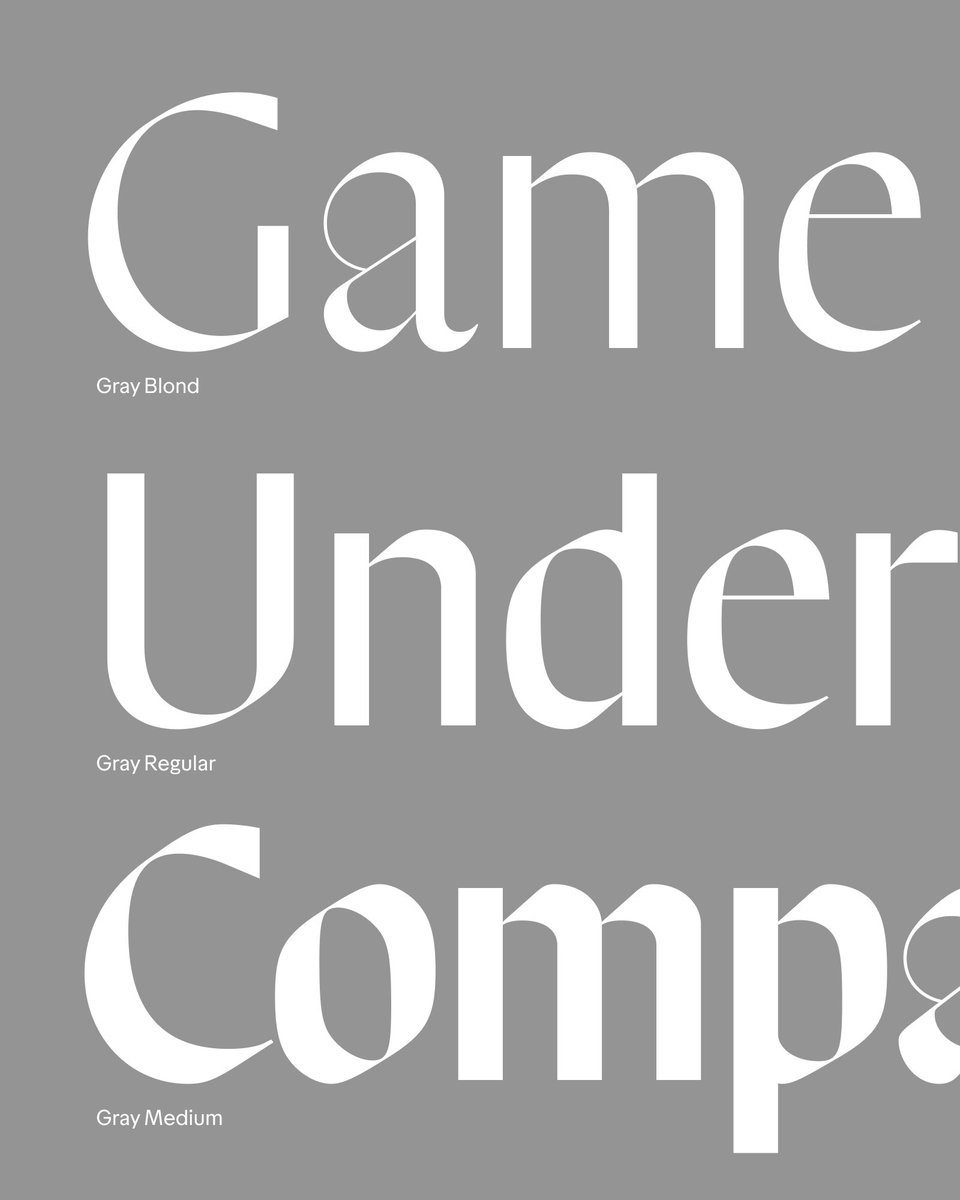
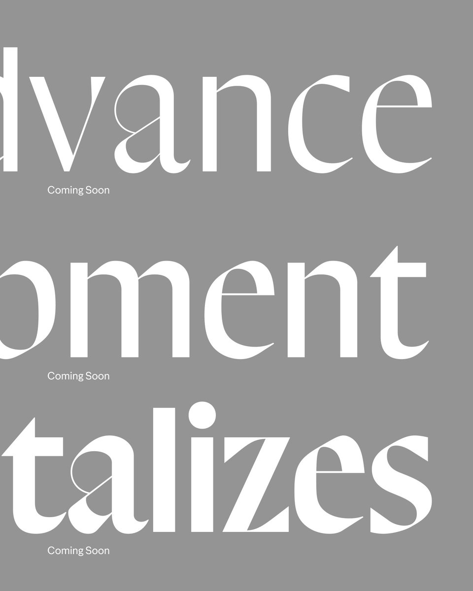
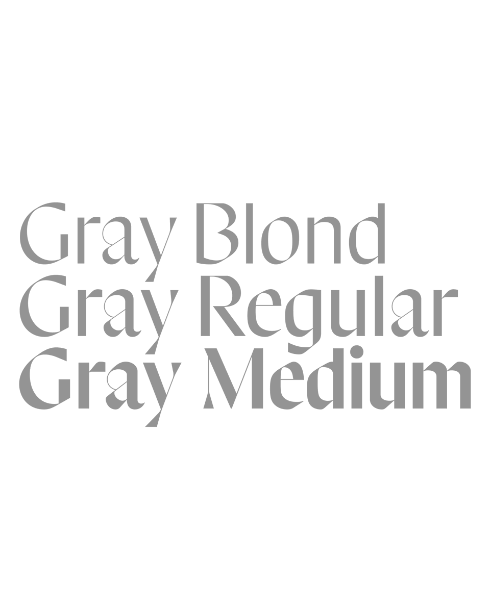
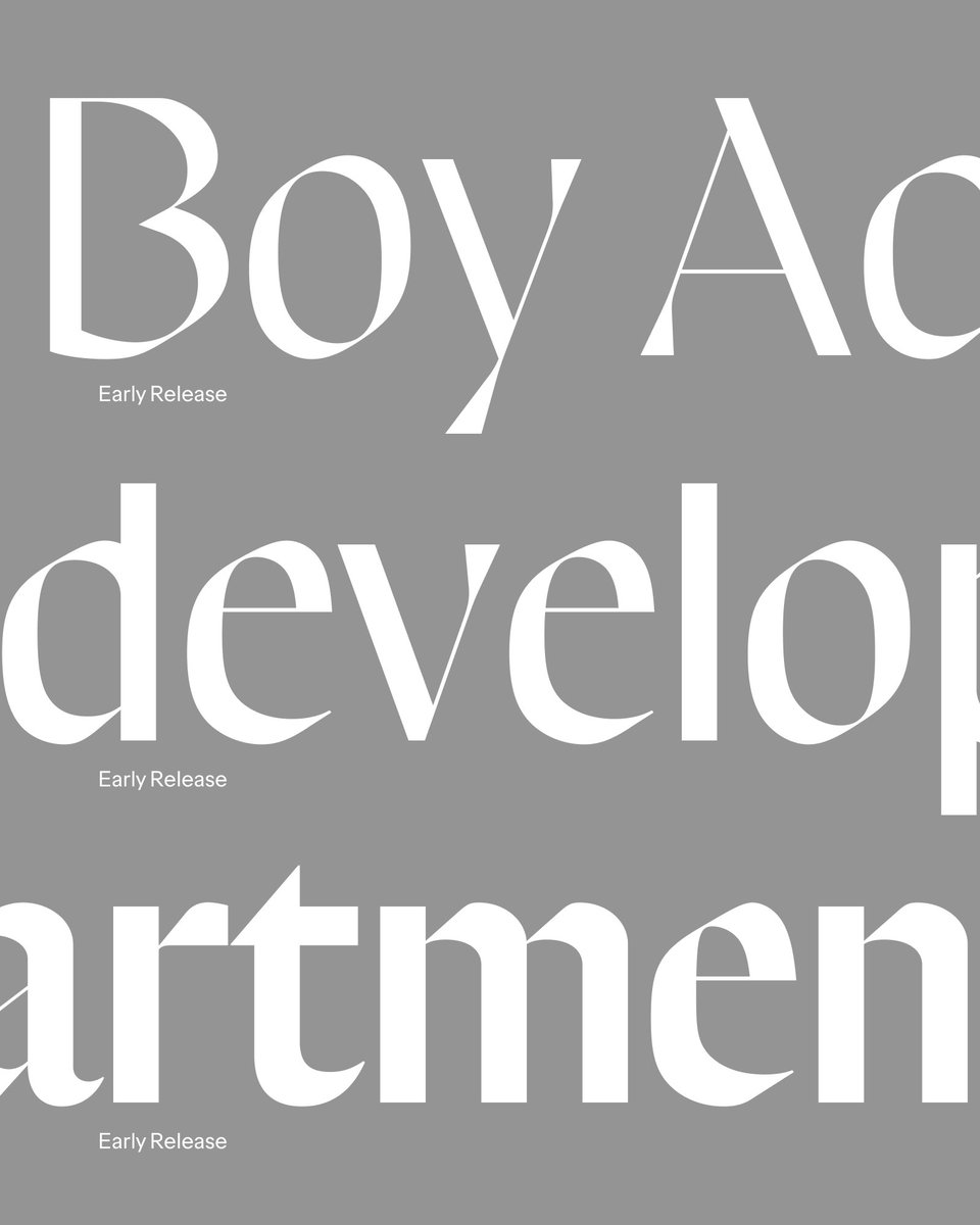
Is it a sans, a serif or a blackletter? How do you balance the sensibilities of these without Frankensteining them together?
Any way. This is Gray. Early release licensing is coming soon.
This is perhaps one of the strangest and most difficult fonts I’ve worked on over the years. It often took several years of experimentation and time away to land on some of the decisions that make it what it is today.
I’ve realized that I’ve been working on Gray for 10 years now. 10 years!
Instead of letting it continue to collect dust on my computer, I am preparing an early release of it as an in-progress font.
Join the newsletter to get notified of the site refresh and upcoming beta fonts.
Realizing I don’t have a direct link to this on the site yet, but here are the operating costs (not accounting for my own time) and income from the directory so far.
https://t.co/veyGXrPVfZ
@EvaSilvertant Right now you can hide columns of information in the settings panel if there is information you don’t necessarily need to view.
While now yet implemented, the site will eventually remember those settings so you can effectively save your own view preferences.
@EvaSilvertant I hear you! Unfortunately the compromise there then becomes truncating the names of the columns. I ended up deciding to compromise compactness in favor of clarity.