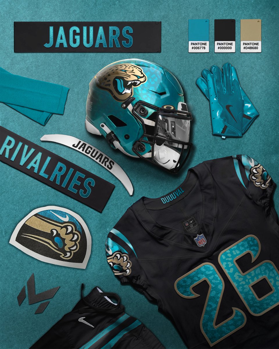
Jacksonville Jaguars Rivalries Concept: I've always wanted to see the Jaguar print on their jerseys and this is the perfect opportunity. Pairing that with a teal helmet would also create a much more dynamic wardrobe overall!
@NorthStarNXE I’ve noticed the same thing, it’s like people have bluey brain and need to have max stimulation at all times including in branding and uniforms for some reason. Same convo with the madden cover yesterday
@kyegonjinn@viceouttahere Had a few nice tracks on both the hall of fames but it just lost the cohesiveness and hunger of his first two, and I honestly haven’t had any interest in hearing his stuff since
@maplewedgie Nearly as bold as we see here. It was possible on the tree throwbacks because of the nature of the wordmark having very crunched together spacing, but wouldn’t work here.
@maplewedgie I get that, but in this case it makes complete sense why they chose this. With the new typeface requiring larger spacing due to its serifs, using the full “Minnesota” or “timberwolves” would be far too long horozontally, and would require them to shrink it so much that it’s not..
@huskiesplswin@nevameant2b It almost definitely is a rule, and wouldn’t be as much of a problem if it didn’t need to include the team name and city within it, as it makes the other aspects of the logo smaller, and in this case looks awkward because of the stars coming from the left side
@huskiesplswin@nevameant2b Oh the jerseys I love I just think the logo falls a bit flat. Very one dimensional, basic stroke weight, and uninspiring typeface. I Mich prefer their secondary(right) over their primary