@thomasbrushdev@thomasbrushdev I like this take. Do you mean insecurity in your own design decisions? I've been wrestling with this lately. In a year-long project (or longer), future Jordan has to trust past Jordan's design decisions, or the project will never be completed.
@trizG_ Both look great, but for me it depends on what the background art looks like. If the colors in the background are less saturated, you could get away with less strong of an outline. More saturated backgrounds may require a stronger outline for the character to pop.
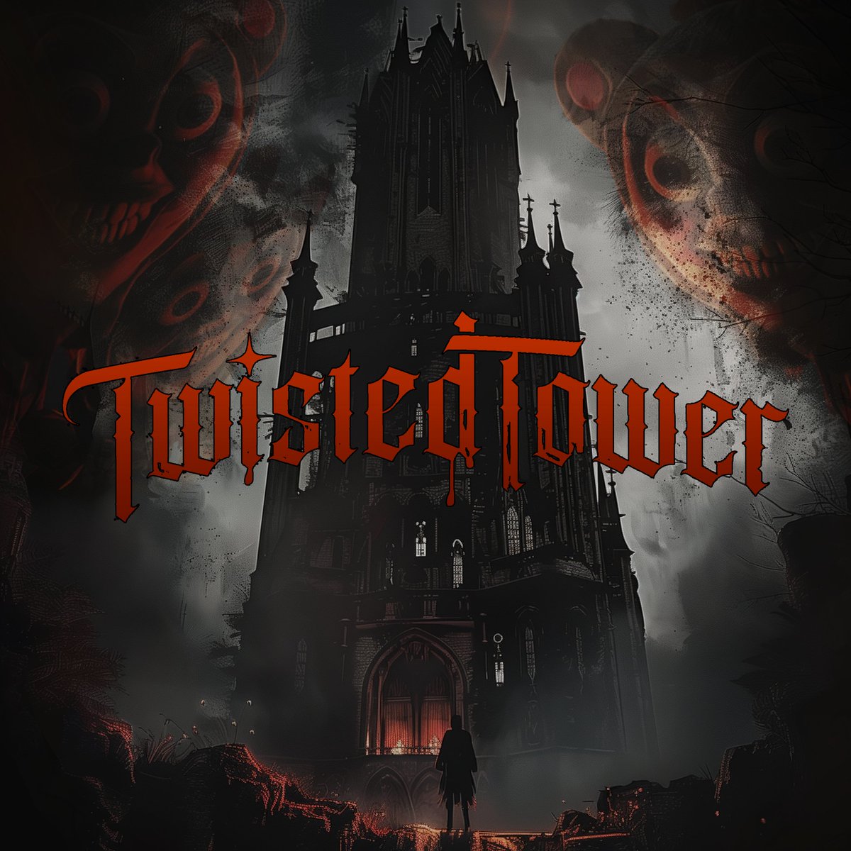
@thomasbrushdev This is pretty sweet. I noticed some of your other promotional graphics made good use of three-point perspective of the tower, which always makes it more intimidating. So maybe employ that here? I made this for you as an example. Too creepy? 🙂
@STPBand Absolutely adore this record. "And So I Know" still hits me every time, especially Dean's solo. Also we saw a gentler side of Scott here. RIP my man❤️