@hellojardo Hi hellojardo, thank you for reaching out.
We apologize for the inconvenience. Thank you for bringing this to our attention. We’ll share your feedback with our development team for review.
Thank you for reaching out.
We are sorry to hear that you are experiencing an issue with the WhatTheFont page not loading completely.
We are currently looking into this issue. In the meantime, please try accessing it using a different browser and/or in an incognito or private browsing window.
Want a serif that signals endless summer? Magic Display from Typoraith Co fits the bill.
Fluid, groovy, psychedelic, retro, fun and warm. Perfect for marketing summer sales, outdoor events, offbeat brands (and it would be right at home on a nostalgic beach read cover).
Explore Magic Display here:
https://t.co/JSwt6V5nDx
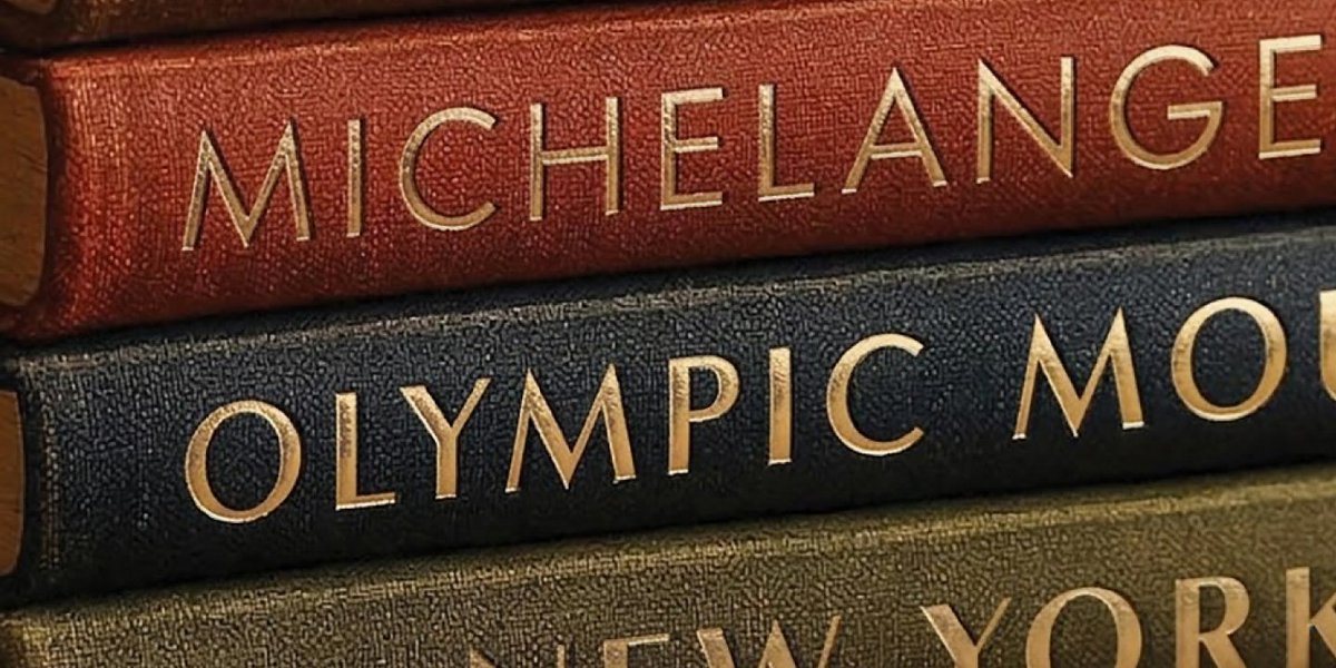
Type History 101: Futura
Futura is one of the most popular typefaces of all time, reading as crisp and contemporary even now. It may surprise you that the design for this typeface began over a century ago.
German type designer Paul Renner began work on the Futura typeface in 1924 as a contribution to the New Frankfurt project (an affordable housing project which drew support and design contribution from many esteemed architects). The typeface was released by The Bauer Type Foundry in 1927, marketed as the “font of our time,” and also as the “font of the future.” It was an immediate commercial success.
Futura was received well on the global stage, but it was met with resistance in its native country. Renner was outspoken about his disapproval of the Nazi party, eventually leading to his arrest, dismissal, and temporary relocation to Switzerland.
Futura has been featured in numerous logos and ad campaigns for global brands, countless movie posters, and is even on a plaque that American astronauts left on the surface of the moon.
@MarkFonts Hi Mark,
Thank you reaching out to us.
Many font families maintain a consistent x-height across Light, Regular, Bold, and Black weights. This ensures text remains properly aligned and allows weight changes to appear smooth and visually consistent.
Best Regards,
Suman Dhanuk
In a 2025 survey, we realized that younger generations are inherently more aware of type than earlier generations. As increasingly digital culture means more exposure to text across a variety of platforms and screens, all with purposefully chosen fonts to control the tone, vibe, and visual significance of text.
Sara Soskolne's brilliant type career spans Hoefler & Co. and Monotype. She was also one of the founding instructors of the Type@Cooper Condensed certificate program in New York City.
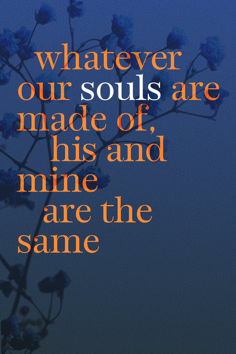
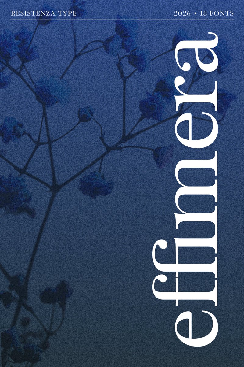
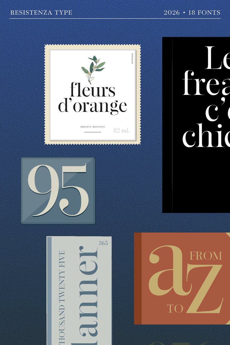
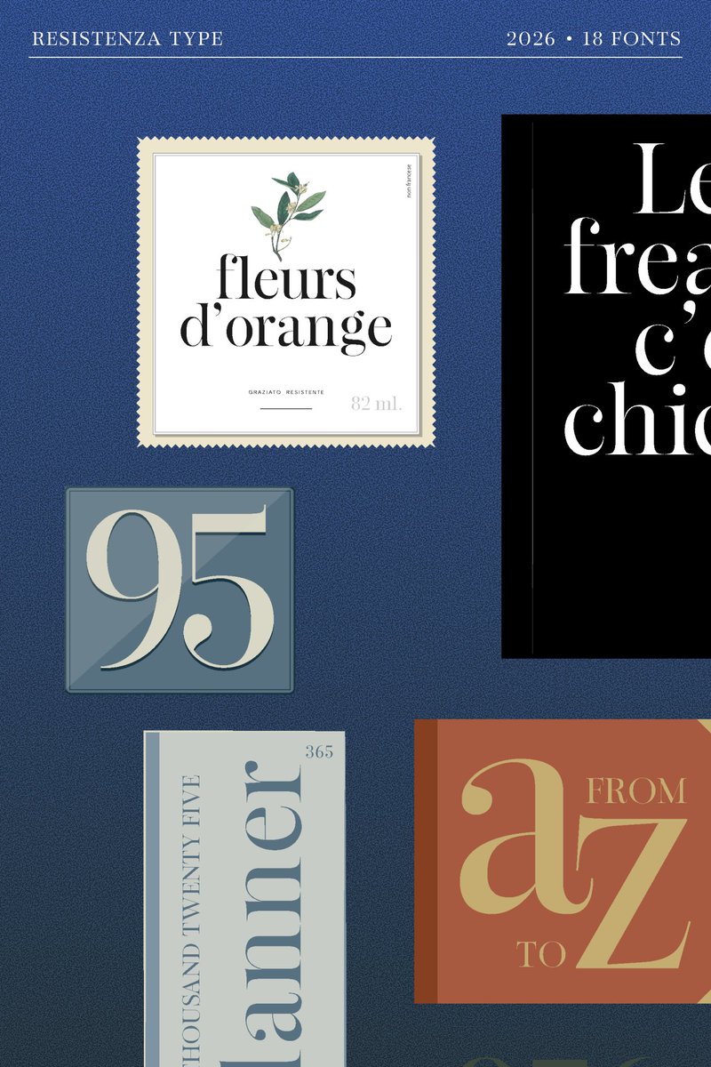
Classic elegance, reimagined.
Effimera is a contemporary Didone serif that pairs dramatic contrast with graceful details, creating a typeface that feels both timeless and unmistakably modern. Inspired by the great classics while designed for today's luxury brands, editorials and packaging, it brings sophistication to every composition.
Designed by Resistenza Type.
#Effimera #ResistenzaType #Typography #TypeDesign #Fonts #Serif #Didone #EditorialDesign #BrandIdentity #GraphicDesign #LuxuryBranding #TypeLovers
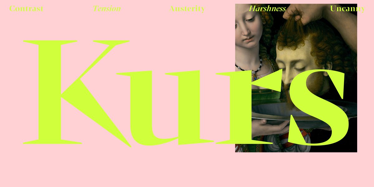
When you think of a serif font, you may think of a soft, cheery, retro typeface, but don't forget the drama that a serif typeface can bring.
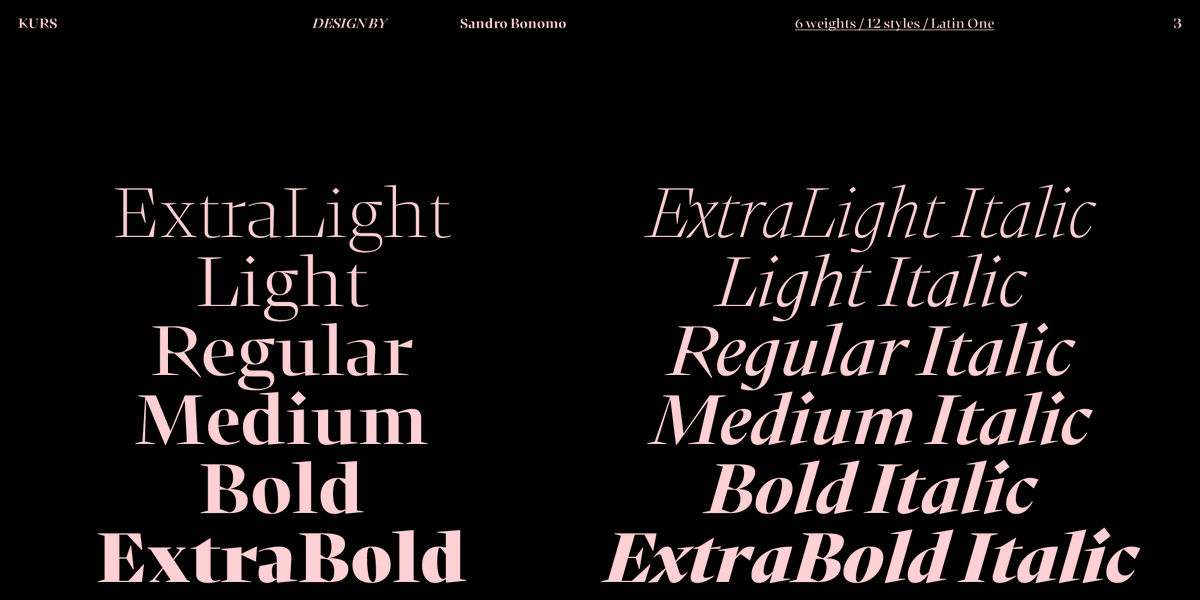
Kurs by Blaze Type is a display serif font inspired by the concept of the “New Renaissance”, which rethinks the Renaissance as a moment of transition between the Medieval and Modernity. This isn't a rounded, bouncy serif; it's tense and dramatic with sharp contrast and uncanny intensity. Artsy, intellectual, bold, statement-making.
Explore Kurs here:
https://t.co/iYmAF0M9PV
Summer's heating up with these Hot New Fonts.
These are the top 10:
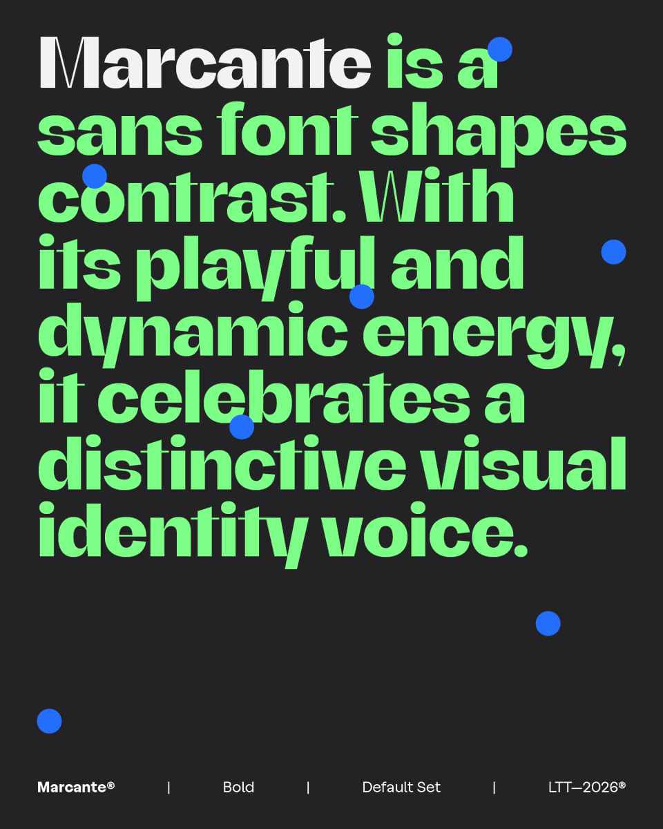
1. Marcante by Latinotype
2. Beth from LatinoType
3. Hattrick by W Type Foundry
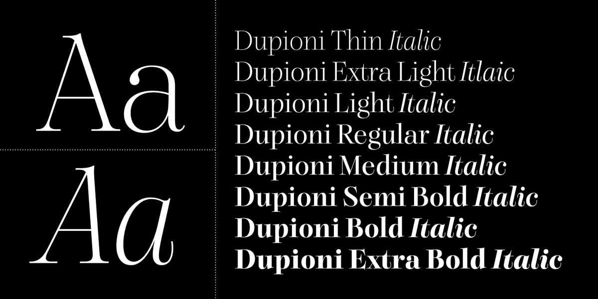
4. Dupioni by SilkType
5. Postamp Grotesk by Fontfabric
6. Profa by Eko Bimantara
7. The Rokvella by Slex Studio
8. Voux by Miller Type Foundry
9. SLTF Spanish Archer by SilverStag
10. Effimera by Resistenza
View the full list of hottest new fonts from around the world: https://t.co/BCcIfU0pws
Featured images: Marcante, Effimera, Voux.
For projects ranging from brand identity to editorial, MyFonts has you covered for serif fonts. Each Saturday, we're featuring a unique serif font for your font discovery from foundries around the world.
Dh Joleta by Ahmad Jamaludin is a uniquely organic, whimsical, feminine, flowing font. (Is it just a coincidence it's catching our eye at the start of Cancer season?) Created with the intention of being used for beauty, skincare, and perfume branding, it's equally appropriate for artistic social media imagery, elegant printed materials, and unique digital identities.
Explore Dh Joleta here: https://t.co/c18F4AvCqH
Hot New Fonts as of the Summer Solstice:
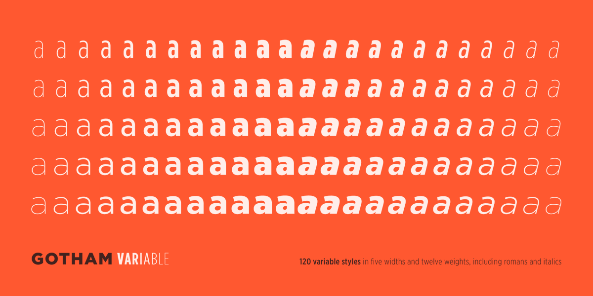
1. Gotham by Hoefler & Co.
2. Marcante by Latinotype
3. Gotham Variable by Hoefler & Co.
4. Beth by Latinotype
5. Dupioni by SilkType
6. Chimango by Sudtipos
7. Hattrick by W Type Foundry
8. The Rokvella by Slex Studio
9. Althera by Syauqi Studio
10. Signat by TipoType
To see the full, always updating list of most popular new fonts, visit https://t.co/BCcIfU0pws
featured images: Dupioni, Signat, Gotham Variable
Is it just us, or do Saturdays have major serif energy?
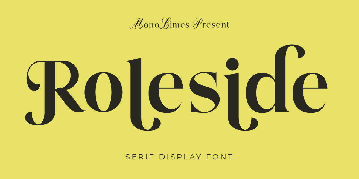
This weekend, we're highlighting Roleside from Monolimes, with two options for serif style and the energy of your favorite vintage paperback.
https://t.co/hHf3h2XK4D
Can't stop wondering about that one font? Go for it!
Our powerful What The Font tool has you covered. Simply add an image with horizontal text, and we'll help demystify the font in use. Try it here: https://t.co/28awUKQiaz
@dhunten Hello Derek,
Sorry for the inconvenience. We tested the size selector on our end, and it appears to be working correctly (please see the attached screenshots).
If you continue to face issue, please contact [email protected], so we can assist you further.
Introducing Beth — a pop gothic serif that commands attention.
Rooted in early 20th-century English shopfront lettering, Beth combines the brightness of Neoclassical capitals with the expressive character of hand-painted signage. Inspired by the engraved worlds of Gustave Doré and William Blake, its dramatic contrast creates a typeface that feels both luminous and dark, delicate and commanding.
With 7 weights from Light to Black, alternate character sets, discretionary ligatures, and 594 glyphs, Beth offers remarkable versatility while maintaining a singular voice.
For brands, publications, packaging, and projects that want to be remembered.
Dark where it counts. Bright where it matters.
Designed by Ale Navarro and Latinotype.
https://t.co/TGJZOWJVv0
#BethTypeface #Typography #TypeDesign #Fonts #GraphicDesign #BrandDesign #EditorialDesign #TypeFoundry
Farmers markets, coffee with a friend, slow chores, concerts when the sun goes down... in contrast the work week, Saturdays feel xuberant and laid back all at one: like a great serif style font.
This weekend, we're celebrating Regani from Nexaline Type.
https://t.co/3VaX2twXGx