Join our newsletter to get tips each week from our work with clients to help them get online & build traffic.
You’ll also get our Website Prep Checklist - tiny tasks to start clarifying content, outlining pages, & gathering materials for your website:
https://t.co/alK3NoFZwP
Optimizing product images is key to improving website speed and user experience. Start by compressing images to reduce file sizes without sacrificing quality—formats like JPEG, PNG, or WebP work well depending on the type of image. Use responsive images that adjust based on screen size to ensure they look great on all devices. Implement lazy loading so images load only when users scroll to them, which improves overall performance. These steps not only enhance load times but also keep users engaged, helping drive conversions.
Creating clear CTAs (Call-to-Actions) is key to driving user engagement. Start by using concise, action-oriented language that tells users exactly what to do, like "Sign Up" or "Get Started." Make sure your CTA stands out visually with bold colors and placement that grabs attention, while still fitting your overall design. Always align the CTA with user intent—whether it's making a purchase, signing up for a newsletter, or downloading a resource. Lastly, minimize distractions around your CTA to keep users focused on taking action
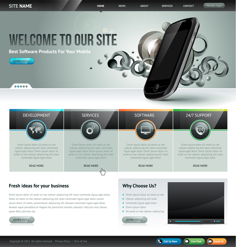
Simplifying navigation is key to enhancing user experience on your website. Keep menus straightforward and intuitive, use clear labels, and limit the number of options to avoid overwhelming users. Effective navigation helps visitors find information quickly and easily, boosting engagement and satisfaction.
Responsive design principles ensure your website looks and functions well on all devices. This involves flexible layouts, fluid grids, and adaptable images that adjust seamlessly to different screen sizes. Prioritizing responsive design enhances user experience and accessibility across desktops, tablets, and smartphones.
Simplifying navigation is key to enhancing user experience on your website. Keep menus straightforward and intuitive, use clear labels, and limit the number of options to avoid overwhelming users. Effective navigation helps visitors find information quickly and easily, boosting engagement and satisfaction.
To optimize images for the web, choose the right file formats like JPEG, PNG, or WebP, and compress images to reduce file size without sacrificing quality. Use responsive images to ensure they look great on all devices and improve load times.
Understanding basic typography rules is key to effective design! Choose readable fonts, maintain consistent spacing, and use hierarchy to guide the reader's eye. Good typography enhances readability and creates a polished, professional look.
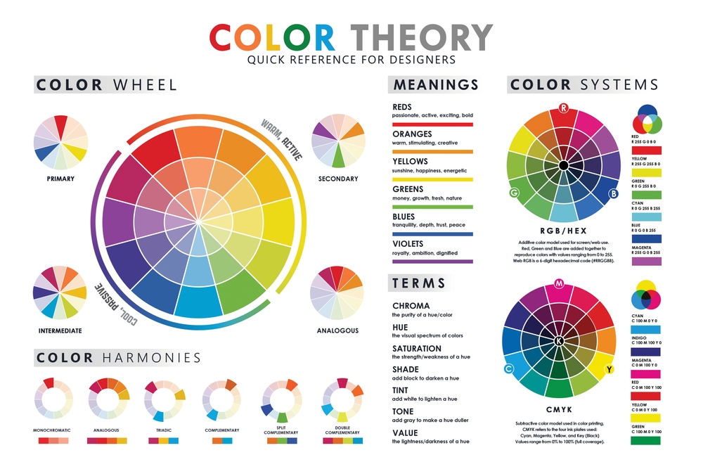
To choose a color scheme, start by understanding the mood and message you want to convey. Use the color wheel to find complementary or analogous colors that work well together. Balance your palette with a mix of bold and neutral tones for a cohesive and visually appealing design
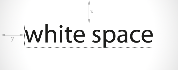
The importance of white space in design can't be overstated! It gives your content room to breathe, improves readability, and creates a clean, modern look. Effective use of white space can enhance focus and highlight key elements.
Understanding color theory is essential for design! It explores how colors mix, contrast, and complement each other, helping you create stunning visuals. By learning about primary, secondary, and tertiary colors, you can achieve better harmony and contrast in your work.