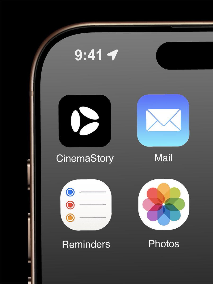
The story behind the concept: Cinema Story reached out facing a trademark roadblock — their existing mark was too close to Apple CarPlay. While exploring solutions, we landed on this dynamic direction.
Plot twist: they unexpectedly managed to register their original logo after all. But this direction felt too solid to leave in a pitch deck, so I took it a step further into a minimal visual identity system.
How does this direction feel to you?
#logo #branding #logodesigner #brandidentity #visualidentity #x #design #designer
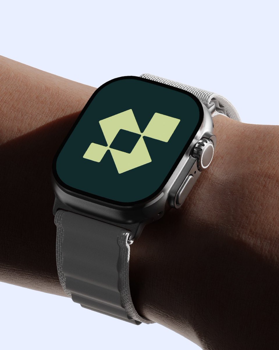
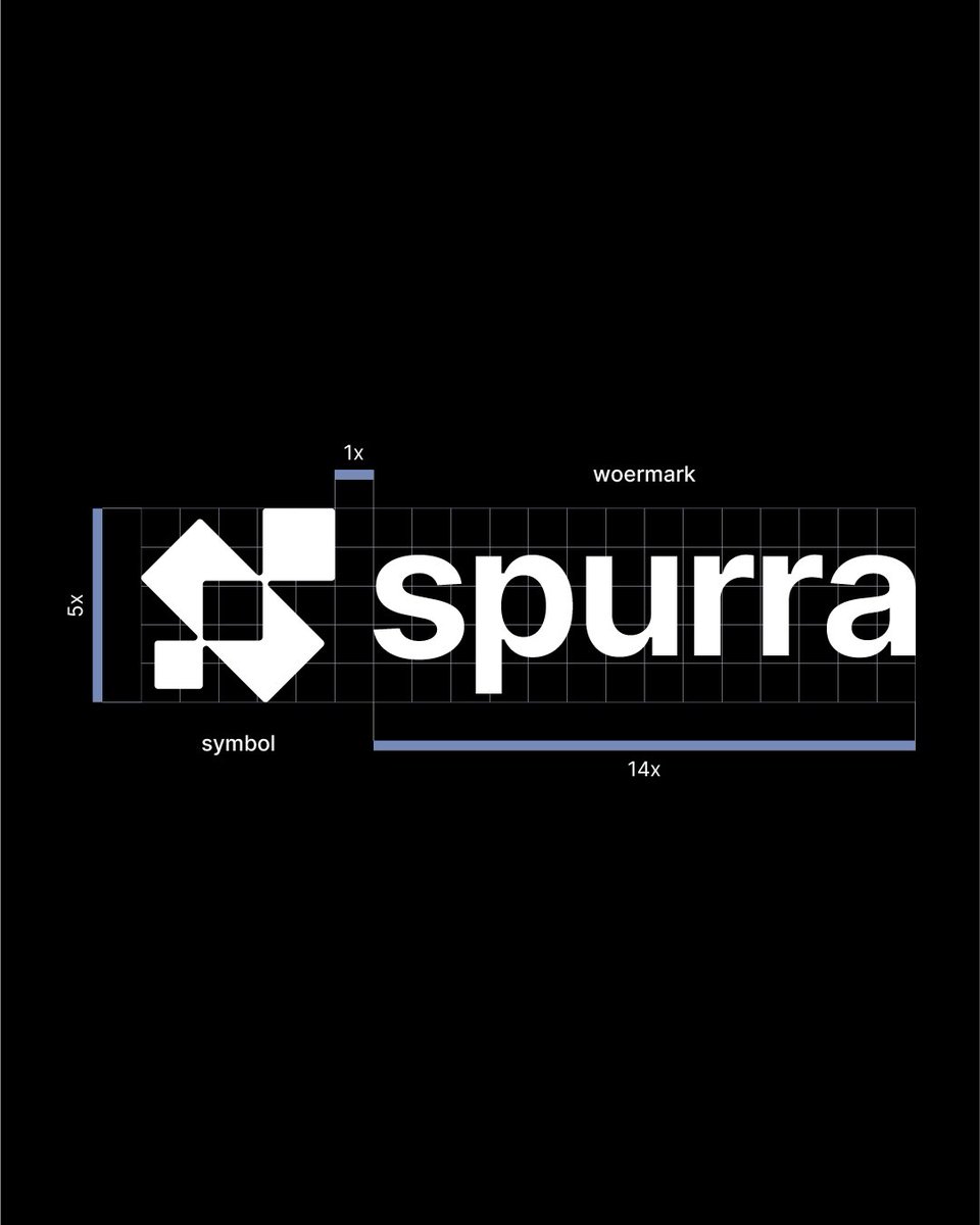
Brand identity & icon system for Spurra.
A minimal, geometric symbol crafted for scalability across wearable and mobile interfaces.
Key focus areas:
• Balanced geometric grid for the mark
• High contrast for small displays (WatchOS & iOS)
• Bold, modern lowercase typography
Process & details below.
What do you think of this visual direction? 👇
#logo #branding #brandidentity #logdesign #logodesigner #branddesign #brandingdesign
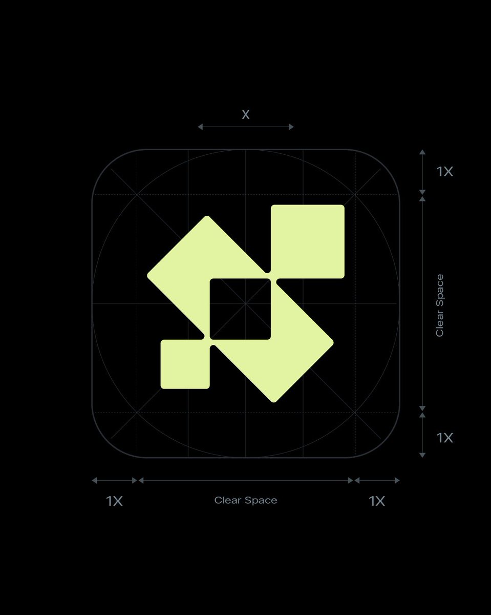
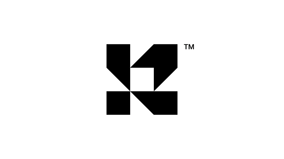
K — Geometric Logomark Design
A modular "K" built from interlocking geometric blocks.
Sharp angles, flat edges, and a negative space square
at the center holding the structure together.
#logo#branding#brandidentity#visualidentity#brandmark
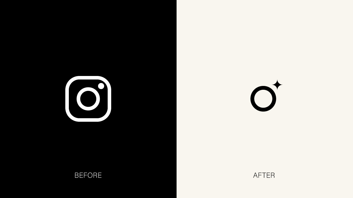
Instagram.
Bridging Tradition and the AI Era ✦
How can a brand maintain its iconic identity while seamlessly adapting to technological evolution?
Here is my concept redesign for Instagram, combining their newly refreshed Wordmark with a minimalist and forward-looking icon.