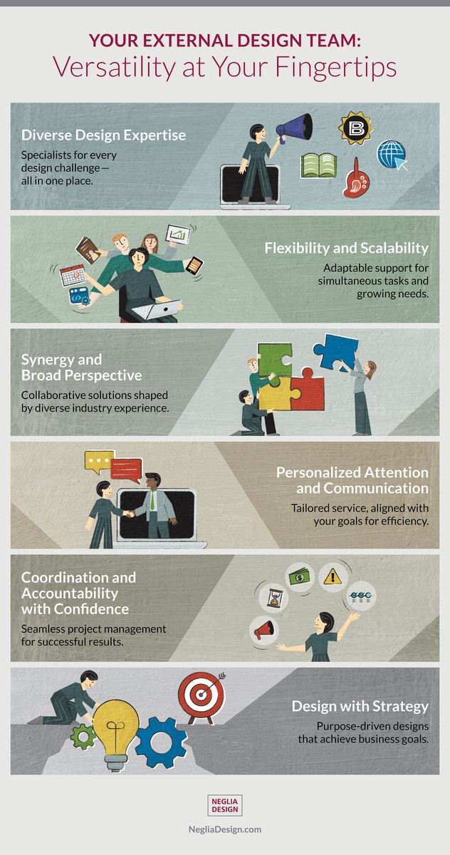
Do infographics improve communication?
Research in healthcare and medical education suggests that visual information is more likely to be understood, remembered, and engaged with.
Sources: National Library of Medicine, PubMed.
#NegliaDesign#Infographics#DataVisualization
Annual reports aren’t just financials—they tell your story.
They build trust with shareholders, align employees, and reflect your values.
Design doesn’t change the numbers, but it shapes how people understand them.
Start with the takeaway, not just the data.
#Negliadesign
Next time you’re visiting Parliament, you might spot one of our designs. We had a great opportunity to create bilingual educational materials for the Library of Parliament, including visitor brochures, student scavenger hunts, and multilingual digital templates.
#NegliaDesign
Happy holidays to our valued clients, suppliers, and friends. Wishing you a joyful season and all the best for 2026!
Neglia Design will be closed for a well deserved break from December 25 to January 1.
#NegliaDesign#HappyHolidays#SeasonGreetings #2026
𝗦𝗺𝗮𝗹𝗹 𝗜𝗰𝗼𝗻𝘀, 𝗕𝗶𝗴 𝗥𝗲𝘀𝗽𝗼𝗻𝘀𝗶𝗯𝗶𝗹𝗶𝘁𝗶𝗲𝘀.
When used well, icons do real work. They guide the eye, break up content, and make ideas click at a glance.
Clear shapes, simple colour, smart metaphors—iconography isn’t just polish. It’s communication.
#Icons
A thoughtful look at the story behind our logo and why we chose the typeface Frutiger. Thanks to Marian Neglia for capturing the thinking that went into the logo design. Learn more in our latest article on our website https://t.co/S93j6OOA3t
Happy holidays to our clients, suppliers and friends. Wishing you all the best for 2025! Neglia Design will be closed for a well deserved break from December 25–31. . . . #happyholidays
Two info cards for the Toronto Regional Immigrant Employment Council (TRIEC). They highlight key findings from their research report with clear and impactful data visualization, making complex information easy to understand and share.
#DiversityAndInclusion#ResearchReport#HR