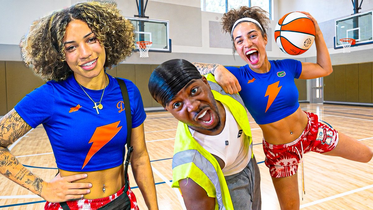
Before → after 👀
The first frame was just two people with a weak reaction. The after adds the third character and pushes both expressions so the story is obvious in the feed.
Which would you click?
When sending thumbnail options, add one line explaining what each version is testing.
A: make the challenge obvious.
B: make the reaction obvious.
Keep the title the same so the choice stays clear. Two purposeful options are easier to discuss than five unexplained variations.
Before exporting a thumbnail, preview it with the video-length badge in the bottom-right corner.
For a score challenge, that badge could hide the final digit. Move the score into clear space instead of shrinking it.
Check the feed version, not just the Photoshop canvas.
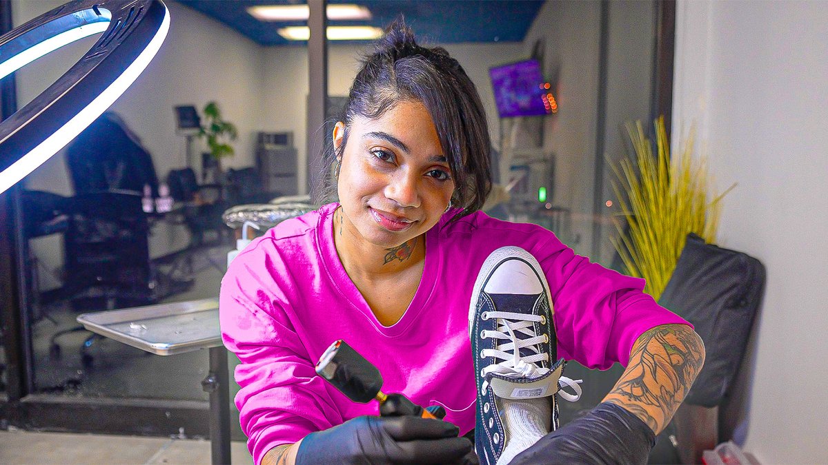
One of my thumbnails 👀
The pink shirt separates the subject from the darker studio. The shoe and tool stay large enough to notice without covering her face.
A useful check: does the color lead you to the subject, or pull you away from it?
For a ‘guess the brand’ thumbnail, try hiding the logo but keeping the product's shape clear.
Blurring the whole object can remove the clues that make the guessing fun.
Choose what viewers should recognize before deciding what to hide.
Thumbnail study: MrBeast's $1 vs $500,000 Plane Ticket.
The split version repeats the same person, but changes posture, clothes and cabin color. You compare the experience, not just the prices.
Try keeping one element constant in a comparison.
Source below.
Before cropping a sports thumbnail, check what makes the action readable.
A face-only crop shows emotion. Keeping the hand, ball and rim can show the challenge.
Try both at the same size. If the tighter version loses the story, leave more room.
One of my thumbnails 👀
The joke is in the two drawings: one detailed portrait, one rough sketch. Keeping both boards large lets you compare them without a caption explaining it.
Would you keep the shop background this bright, or tone it down?
Thumbnail feedback that helps:
“Make it pop” → “The player blends into the wall. Separate their silhouette.”
“More emotion” → “Use a frame where the reaction is easy to read.”
Name the problem before choosing the effect.
Plan a few thumbnail shots before filming.
For a basketball challenge, grab:
• a close-up of the key prop
• a wide shot of the setup
• the player's real reaction
Keep the light and camera angle consistent so the pieces fit.
What shot do you always forget to get?
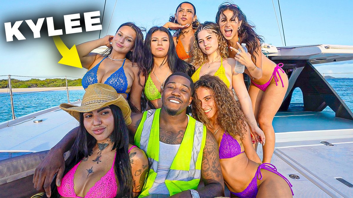
Two versions of my boat thumbnail 👀
1: the whole group gets the attention.
2: the name + arrow single out one person.
I’d choose based on who the video is actually about, not which version has more graphics.
Which direction would you take?
Try planning the title and thumbnail together.
Example: “I Tried a $10 Haircut”
The thumbnail could show the first uneven cut + reaction, rather than repeat “$10 HAIRCUT”.
Only use a moment the video actually delivers 👀
Would you show the process or the result?
Quick thumbnail check: shrink it to phone size 👀
Can you still tell what the video is about?
If the face, text and background all compete, try removing one element before adding more effects.
What do you usually cut first: text or background detail?