@jh3yy@CodePen@jh3yy Another awesome concept! 😎Thanks a lot, Jhey!
In my opinion, from the UX point of view it would be better to have the Close button at the same place as the Menu button on mobile: https://t.co/09dFCA41OS. Just to save that extra movement necessary to close the popover 😉
Creativity isn't magic... it's feelings, little tweaks, and a lot of heart. 💜
In the first part of his new series "Creating Emotionally Meaningful Experiences with AI, Three.js, and Blender", @andrewwoan shows us how to find meaning in what we make. 🐼
Set aside a little time, it's so worth it: https://t.co/jrE8ktngXc
AI can generate.
But it can't care. It can't feel.
The meaning behind what we make, that's something only we bring.
@andrewwoan new series is a powerful reminder: creativity isn't about talent, it's about emotion, persistence, and finding joy in the process: https://t.co/tCS2NzULnV
Thank you, Andrew 💙🙏
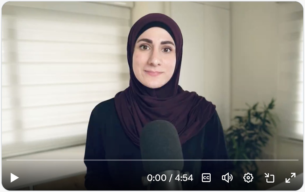
🎥 New (Video) Podcast: "Navigating the World of Web Accessibility with Sara Soueidan", with Kevin Powell
https://t.co/x5JgzmTf4S
I finally sat down with Kevin for a long-overdue, in-depth conversation about web accessibility, and we had a blast!
It’s not new but I just discovered this @oatmeal post and I think it may well be my favorite of his.
“Sometimes going down the wrong path isn’t a mistake — it’s a construction line”
Amen to that!
https://t.co/ENwTiziG53
It's one of the best 5 minutes I've spent online! 🤩
The History of Typography by Ben Barrett-Forrest 👉 https://t.co/N5qBUmREtq. Incredibly informative and beautifully orchestrated 👏 Must watch for any designer or typography enthusiast.
Interactive sunny-side pattern! 🍳
(a little tribute to my love for gooey shapes and dumb demos)
Live demo & source code: https://t.co/CWvehHijm9
Made with #webgl#shader and a bit of GSAP (@greensock)
Hosted on @CodePen
Are you new to accessibility or looking to level up your skills? Then dive into the Practical Accessibility course by @SaraSoueidan.
🔥 https://t.co/r5t4ZQ20RD
Get 25% off the course’s full price using the code ANNIVERSARY, til Monday, October 20th (UTC). Learn from the best! 😎
@MatthiasCordes Love this trick! I added it to my toolbelt for German websites 🙂 Herzlichen Dank, Matthias!
P.S. I couldn't resist to create a quick demo, to keep this valuable trick in mind: https://t.co/VIXOCm1Qrf.
How to make extremely long words fit mobile screens
1. Copy a soft hyphen.
2. Select a location for an optional word break.
3. Paste the soft hyphen.
Especially useful for improving responsiveness and reducing risks of unwanted content overflows.
UI && CSS Tip! 🔥
You can create these dynamic glowing card effects with a single JavaScript event listener, some CSS tricks, and an HTML attribute 🤙
<article data-glow />
Here's how! 👇
You can use a combination of tricks from previous posts. Let's start with the JavaScript 📜
Use a function like this to send the pointer position via custom properties to the glows ✨ Attach this to the pointermove event 👆
const onPointermove = ({ x, y }) => {
document.documentElement.style.setProperty('--x', x)
document.documentElement.style.setProperty('--xp', x / innerWidth)
document.documentElement.style.setProperty('--y', y)
document.documentElement.style.setProperty('--yp', y / innerHeight)
}
Now for the styles 🎨 These custom properties define the border and spotlight size. The first trick is how you can change the color(--hue) based on the pointer position with calc 😎
[data-glow] {
--border-size: 2px;
--spotlight-size: 150px;
--hue: calc(var(--base) + (var(--xp) * var(--spread)));
}
The magic is using the pointer position in a radial-gradient combined with background-attachment: fixed ✨ (Check the video for an exploding view 🎞️)
[data-glow] {
background-image: radial-gradient(
var(--spotlight-size) var(--spotlight-size) at
calc(var(--x, 0) * 1px)
calc(var(--y, 0) * 1px),
hsl(var(--hue) 100% 70% / 0.25), transparent
);
background-attachment: fixed;
}
The last major piece is using mask-composite on the pseudoelements of the [data-glow] element and the same background-attachment: fixed trick 🫶
[data-glow]::before,
[data-glow]::after {
pointer-events: none;
content: "";
position: absolute;
inset: calc(var(--border-size) * -1);
border: var(--border-size) solid transparent;
background-attachment: fixed;
background-size: calc(100% + (2 * var(--border-size)));
background-position: 50% 50%;
mask:
linear-gradient(transparent, transparent),
linear-gradient(white, white);
mask-clip: padding-box, border-box;
mask-composite: intersect;
}
This masks the elements so only a fake border is shown. That border is actually the spotlight background that moves around 👀 But now it's clipped to the border width 😎
Then it's a case of switching out the background-image for each pseudoelement based on purpose 🧐
For example, to get the white light, use your custom properties, make the light a little smaller and the color bright!
[data-glow]::after {
background-image: radial-gradient(
calc(var(--spotlight-size) * 0.5)
calc(var(--spotlight-size) * 0.5) at
calc(var(--x, 0) * 1px)
calc(var(--y, 0) * 1px),
hsl(0 100% 100% / 1), transparent
);
}
These are the major pieces you need to get it done. Extras?
Want the outer glow? Nest a glow!
<article data-glow>
<span data-glow />
</article>
Give the inner glow a blur to create the outer glow 😅
[data-glow] > [data-glow] { filter: blur(10px); }
It's worth digging in with this one. Have a play around with the demo and the custom properties.
The code isn't perfect after introducing all the configuration pieces 😅 Will put together a reduced example for you! 🙏
Any questions, let me know! 💙
@CodePen link below! 👇


