The Best Way to Improve:
1. Get clear about your goal.
Wihtout a clear goal you have no way to measure improvement - you’ll just be aimless.
2. Create a canon
This should represent the absolute highest level of success according to your goal. Don’t allow anything mediocre in. Get specific and focus only on the absolute best.
3. Conscientious Practice
Don’t just do what you feel like - get scientific. Treat your pursuit as an ongoing experiment.
It should be touch dry. You’re correct! Not such a big deal with the palette knife. Scraping on wet paint with the palette knife is mostly just to remove immediate mistakes. If you’re trying to achieve the soft effect, build layers, and improve adhesion then you should let it dry - knife or Sandpaper
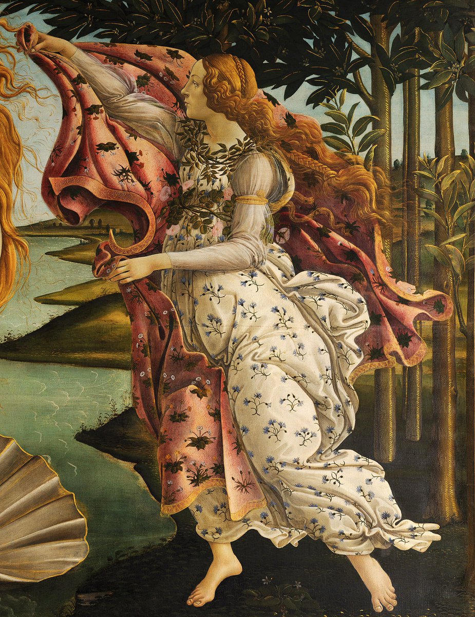
Renaissance compositional strategy.
This mathematical strategy has been used throughout history - notably in many of the greatest works of the Renaissance and baroque. It can be found far beyond those periods though!
It creates dynamic symmetry, a strong sense of balance without needing a perfectly symmetrical composition.
The key idea is to use these lines as a basis for the main movements in your composition.
What creates movement?
Consider the most important and attention grabbing elements first. Such as faces, hands, eyes, and bodies.
Other elements to consider: lines created by contours, empty space, light, shadow, “pull” or dynamic movements, background elements such as: trees, sky, sticks, clothes, rocks, mountains, light, etc.
Bonus tip: where the characters of the painting look with their eyes will also naturally direct the viewer’s attention.
Want to learn how to use this compositional strategy?
Send me a DM for access to a free webinar where it’s covered.
.
.
.
#art #oilpainter #renaissance #baroque #composition #oilpainting #oilpaintings #oilpainter #classicaloilpainting #arttutorial #arthelp #arttutorials #oilpaintingcomposition #narrativeart #narrativepainting #kitschpainting #nicthurman #rembrandt #compositions #thegoldenratio #titian
Glazing to achieve a sfumato effect like Eugene Carriere.
In my view diffused contours are absolutely essential for creating a painting that feels like life. This is because natural objects rarely contain crisp and sharp outlines.
My favorite techniques for diffused contours:
1. Sanding - sand the edges that separate objects in order to create a more atmospheric blending between them.
2. Loose / Rough Brushwork - Use large brushes and make marks that are bold and swift. This helps to create a sense of weight and solidity. It forces you to focus on the big picture and doesn’t allow for sharp outlines.
3. Glazing - By glazing over edges and allowing objects to blend into each other you can create a sfumato effect that is similar to sanding but allows for delicate and precise transitions.
.
.
.
#art #oilpainting #oilpaint #oilpainter #classicaloilpainting #kitschpainting #kitschpainter #classicalpainting #arttips #arttutorials #renaissance #portraitpainting #rembrandt #paintingtips #artdemo #renaissanceart #baroqueart #portraitart #figurepainting #oilpainting #arthelp #portraitpainting #eugenecarrière #carriere #oilpaintingportrait
Cheat code for painting lips.
Useful tips for the lips:
Ever notice how lips sort of look like that childish way to draw a bird?
That’s because the mouth isn’t flat - it goes AROUND the face - so the mouth line isn’t just one straight line.
The peaks of the lips line up with the nostrils.
The corner of the mouth lines up with the pupils.
.
.
.
#proportionoftheportrait #portraitpainting #portraitart #portraitpainter #portraitproportions #portraitmeasurements #portrait #oilpainting #oilpainter #oilpaint #classicaloilpainting #renaissance #portraitdrawing #drawing #arttutorials #arttips #arthelp #arttutorial #oilpaintingportrait
Do proportional measurements only apply to beautiful, symmetrical, model faced gods?
No.
There’s a commonality that can be found in all faces and used as a structural basis to build your portraits.
How’s that possible?
Most people have a skull under their face which leads to consistency in the general structure and measurable structures in portraits.
But how could you make a portrait look like the unique individual if you’re just measuring everything?
Many relative measurements apply to nearly everyone - despite the fact that all faces are unique - because the general structure remains consistent while smaller details that shape the individuality change. Amazing, right?
For example, if you use the nose to measure vertical lengths of the face, the measurements will generally remain the same across a wide variety of faces even though each individual nose is one of a kind.
That’s exactly why relative measurements are so powerful! They remain consistent across a variety of different subjects, while allowing for the subtle variations that create individuality.
With that said, my ultimate goal is not to capture people exactly as they are. Instead I strive to flatter them.
Isn’t that insulting to the model?
Would you be insulted if someone was able to see all of the characteristics that make you unique, good and bad, and still portray you in a flattering light?
It’s not insulting at all, it’s really the only way to portray someone with reverence.
Besides, even if you copy someone exactly as they are, you’re necessarily making editorial decisions with how you portray them.
You choose one angle over another, one light source, one textural feeling, etc.
Why not portray them in a way that flatters them?
.
.
.
#idealproportions #portraitpainting #portraits #portraiture #oilpainting #classicalpainting #howtopainttheface #oilportrait #arthelp #arttutorial #portraitdrawing #portraitdrawings #portraitproportions #howtoproportionaportrait #arttips #arttutorials #artlover #portrait_today
I never use blue, here’s 6 reasons why:
1. More color doesn’t make a painting more compelling.
2. In my opinion blue is often times more of a distraction than an addition when painting the human figure.
3. It takes away from the ethereal quality of a more limited palette.
4. I think it’s far easier to achieve lifelike results with colors that are too muted instead of too vibrant. So it’s better to err on the side of muted.
5. My goal in painting is to harmonize with the colors that are found on the human body. So if the color is not found on the human body, why should it be in the painting?
6. In my view the greatest paintings of all time don’t use blue. So why should I?