@letthessunshine I do want to read more into the report and the industry to see where that number comes from with the idea of writing about it in support of this visual and really advocate for buying better and supporting those people that do it right. Would love to chat about it with you
A viz I've worked on with my step dad after a dinner conversation.... How many miles are in that steak?!
Looking at how much CO2 1 kg of beef produces in terms of miles driven, absolutely blown away by the numbers.
A change in diet can do a world of good!
https://t.co/TzTo7e4pmr
@letthessunshine ... have that much sway at all. I don't think people will stop eating beef because of it, but do hope that people will weigh it in their mind and start to be willing eat less but to spend more on better meat rather than the mass produced crap being made.
@carldavidturner Thanks @carldavidturner, I appreciate the tweet! Crazy that we think of driving as bad for the environment but not have any concept on the relative effect from food production...
@marmstm Thanks! Thought it put it into a perspective that makes a bit more sense in everyday life, really crazy to see it like that. See how many times you can get to the moon with your spaghet
Nearly 200 miles in an average petrol car is insane, and such a powerful way of looking at it (rather than the abstract 60kg of CO2). Hope you enjoy the viz! Had fun making this and really working on design as well as a load of calculations.
After discussing trying to eat less meat with my parents and looking at the CO2 data from a previous Makeover Monday the question was asked "How many miles does that mean I can drive?"
So I went into @tableau and did some calculations and couldn't believe the figures....
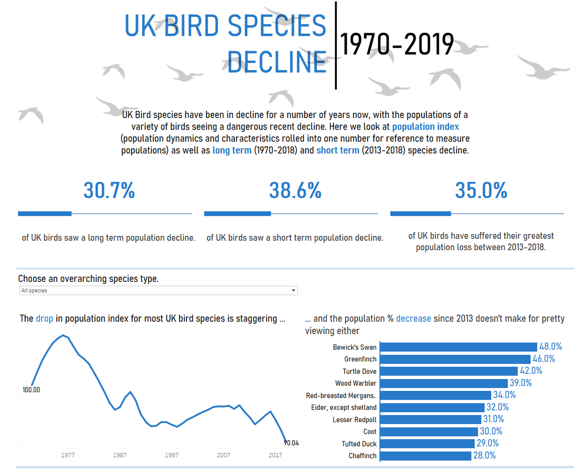
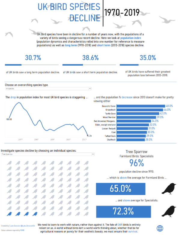
UK Birds in decline
Did you know the Tree Sparrow has seen it's numbers dwindle by 96% since 1970? That's the equivalent of the UK losing 63,984,000 people. We MUST do more to protect our wildlife. Colour scheme inspired by
@Natures_Voice
Link to viz: https://t.co/zA40dRDer5
I'm running a webinar at 12:30 tomorrow (Weds 16th Dec) on the use of Alteryx to set up weekly paired 'Coffee Chats' for the team to keep up with each other, if you're interested find out more here: https://t.co/GKW3yLuXNa
These chats could help your team get talking!
@greenynorfolk When looking through it with someone else they had a similar issue: the colouring if the words and the two lines of the sentence caused the issue. I'll give it another look over and iterate to try to improve that
I did a thing; had an idea of something that could be cool, it was kinda cool, made it look mildly cool.
I really like the shape of the developing countries, with the wide bottom, thin top. The shape of some middle eastern countries is scary....
https://t.co/bPatFOytiU
@greenynorfolk Of course, so the blue indicates that the country's population is over the median pop. of the countries and red is under. I wanted to give an indication of the pop. using colour, as I had normalised the individual country pop., but struggled due to China & India's massive pop.
@data_rachel My parents and I had some fun doing this! Found stability of some populations impressive, and tried to find the aging populations. Thanks for sharing 😊
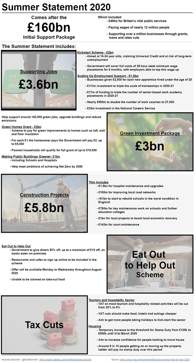
And if anyone is interested in the Summer Statement announced on Wednesday about the UK's financial plan to recover from the pandemic, I created an infographic summarising the contents
https://t.co/6RWWyCL5tA
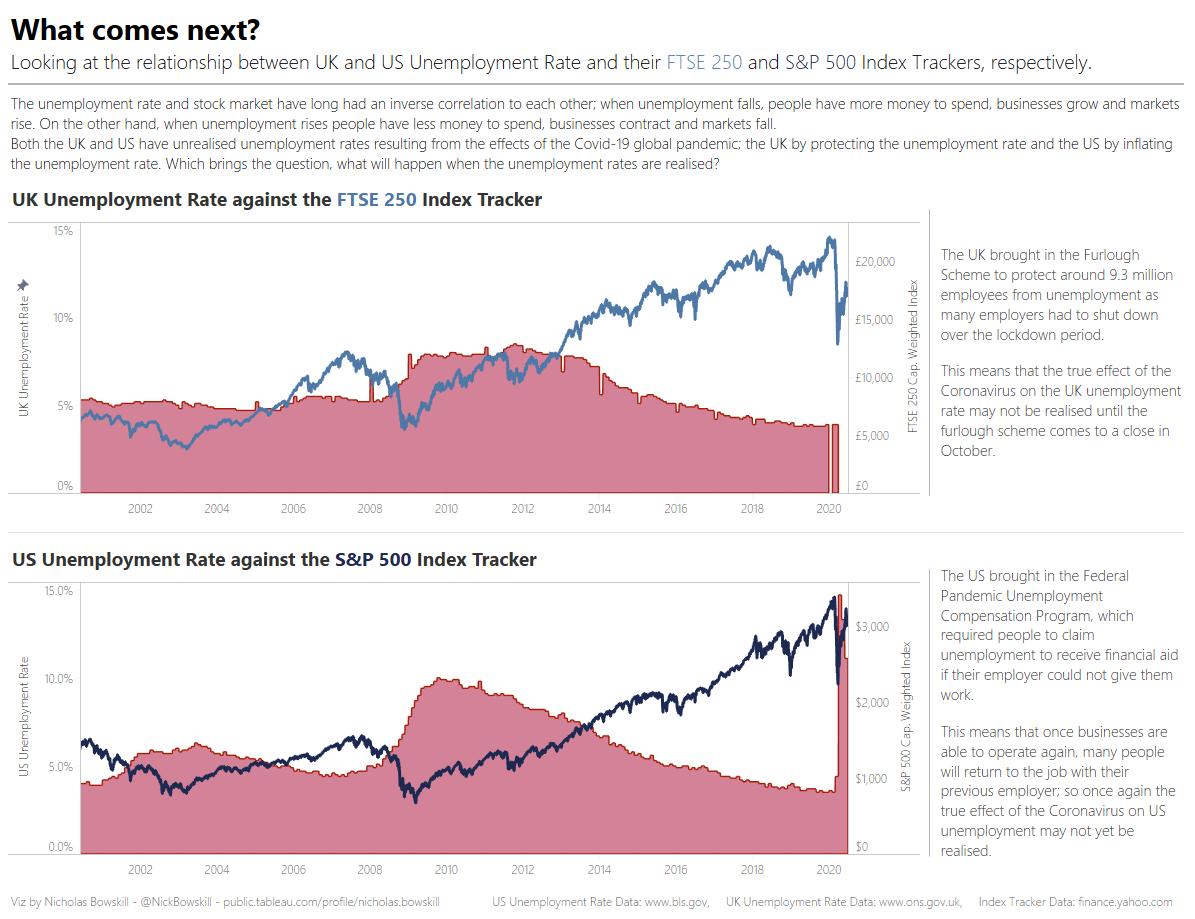
This morning I put together a simple viz looking at stock market index trackers against unemployment rates, namely the UK and US. The next 6 months will certainly be an interesting time as unemployment rate and economic changes are realised!
https://t.co/fS1oBVVs3i
I've been getting interested in the stock market and the finance around them, and the pandemic has been a very interesting time to learn. Something that is particularly interesting me at the moment is what will happen as we come out of the global reaction to Covid-19.