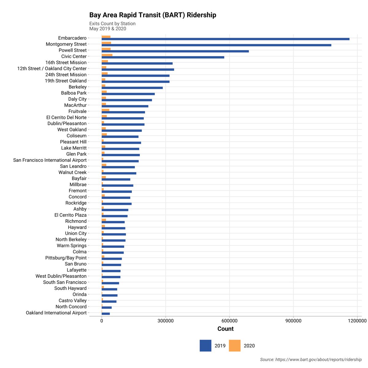
Komparasi penurunan ridership antara stasiun yang berlokasi di area menengah ke atas, i.e., Orinda, dan yang berlokasi di area relatif miskin, i.e., Richmond.
Komparasi alur matriks keluar-masuk penumpang untuk melihat pengaruh pandemi terhadap penggunaan transit untuk bulan Mei tahun 2019 dan 2020. Apresiatif terhadap @SFBART yang merilis data bulanan seperti ini.
@yadiwinarto @mrtjakarta@PT_Transjakarta Terima kasih Pak @yadiwinarto — tautannya sangat bermanfaat. Adakah data historis @PT_Transjakarta yang dapat diakses publik dlm format krg lebih seperti ini: https://t.co/u8lAhmkUAs? Kami sdg coba kompilasi data dari berbagai transit agencies. Terima kasih sekali lagi.
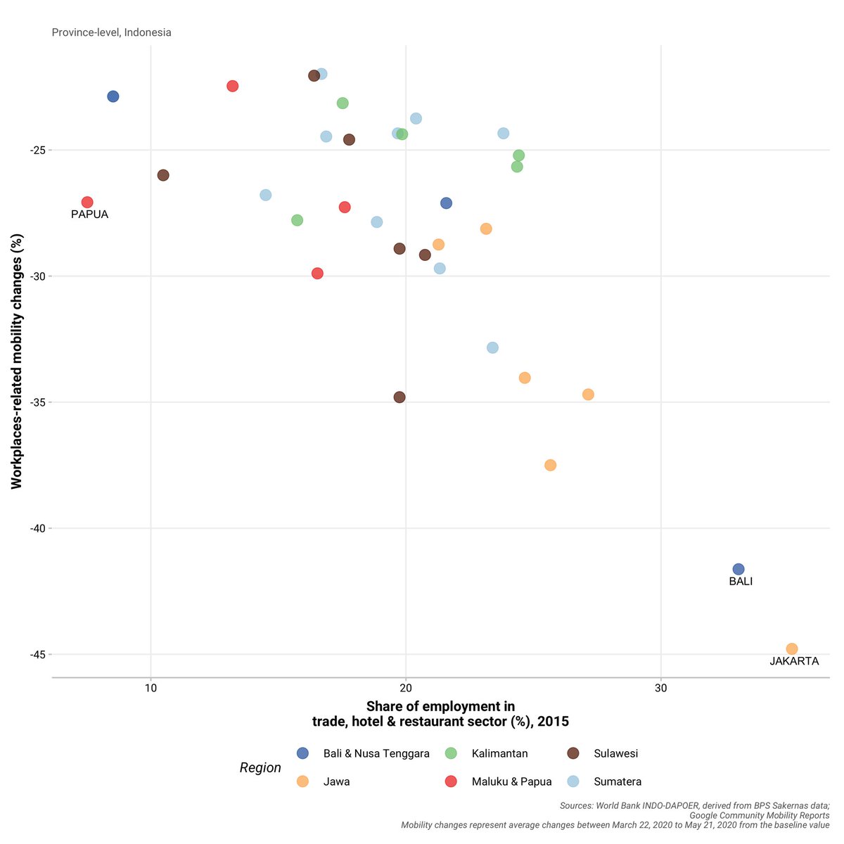
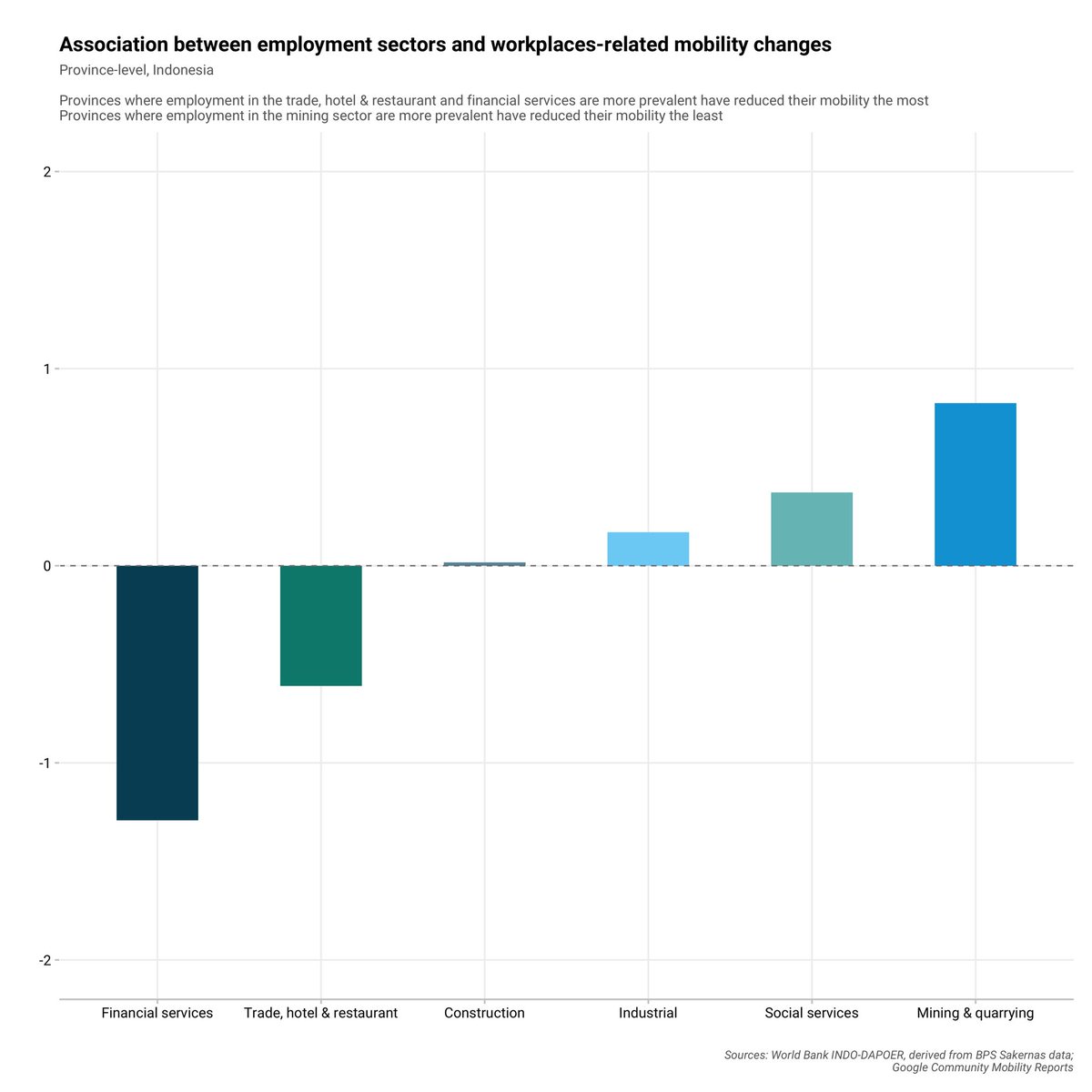
Penurunan mobilitas tampak dipengaruhi oleh proporsi sektor pekerjaan. Di provinsi-provinsi dengan proporsi sektor pekerjaan bidang jasa yang besar, penurunan mobilitas terkait tempat kerja tampak lebih signifikan.
Meski ada kecenderungan penurunan mobilitas yang relatif lebih signifikan di provinsi dengan kasus #COVID19 yg cukup tinggi dibandingkan dengan provinsi yg relatif terdampak lebih rendah, keterkaitannya cenderung tidak linier. #RStats#gganimate
Eksplorasi data harian #GoogleCommunityMobility dan kaitannya dengan jumlah kasus #COVID19 di tingkat provinsi di #Indonesia. Apakah penurunan mobilitas masyarakat di provinsi terdampak tinggi lebih besar dari masyarakat di provinsi terdampak rendah?
A very valid point! We would welcome a more elaborative information on the variation, if any, of testing rate across districts and the likely implications on reported cases. Cc: @BNPB_Indonesia@KemenkesRI
@NumeraLoka There's gap in testing. The capital could enjoy the privilege of having great fund and lab facilities compared to others
Public need to get informed on how many testing a day each district, we still otherwise have no nearly-clear picture of viral transmission yet.
Animated map showing the spatial distribution of #coronavirus cases in Java, Indonesia over time (March 25 - April 13, 2020). Each dot represents district (kabupaten/kota) that has at least one reported case during this period.
Historical #coronavirus cases data at village-level as released by @DKIJakarta allow us to analyze and observe the reported cases at a considerable level of granularity.
Along the same lines, the graph below shows reported cases at the district-level as well, including data derived from South Sulawesi, West Sumatera, and West Nusa Tenggara.
We compiled the data by manually inputting (duh!) reported cases on daily basis from provinces that open up their data at the district-level. We believe data at this level of granularity would be of importance to shed light on the variation across space and time.
A qualitative observation of educational attainment in #Jakarta seems to suggest a slightly uneven distribution of relatively highly-educated population in the region.
#RStats#DataViz#DotDensity#30DayMapChallenge
As a follow up to previous post depicting the most and least affluent neighborhood in #Jakarta using property taxes data, we further probe how does this observation align with the built environment characteristics by a virtue of slum assessment. #30DayMapChallenge#RStats
Property taxes data reveal an interesting pattern of neighborhood characteristics in Jakarta. One particular puzzle: the most and least affluent neighborhoods in the city (bounded by green and red line, respectively) are almost adjacent from one to the other #30DayMapChallenge