@liuyao12 We’re thinking a lot about this lately! What do you think it would take for Observable to be the best place for that? Just “Claude in notebooks”? Or do you need other aspects of Claude Code’s generality/flexibility? (Language-agnosticism, file-based workflows, server-side, etc…)
Antoni Gaudí, who died one hundred years ago today, picked up a fondness for the catenary — the hyperbolic cosine, the shape of an idealized hanging chain — working on suspension bridges. https://t.co/VxaUfSLSLX
There’s probably already a notebook for most such famous recognizable plots. What would be in your canon? Keeling curve, Anscombe’s Quartet, Snow’s cholera map…
Observable Plot hit >100k daily downloads yesterday for the first time! Literally “off the chart”! (Because we set the maximum of the y domain to the 99.5th percentile in order to occasionally give ourselves this satisfaction.) Congrats to Mike and Fil! https://t.co/JMZTRgMLaT
Some great D3 packages also booming. d3-array, d3-shape, d3-scale — love it, makes sense. We’re more surprised by the similar boom in d3-time-format, which — though also a classic! — has long since been largely obviated by Intl.DateTimeFormat & its ilk. https://t.co/kbqEe1UCW3
In 1943, Patrick Abercrombie wanted to describe “a general plan for creating ‘new towns’ but didn’t have the authority to designate specific sites for redevelopment. So, he decided blobs would do the trick.” Matt Khinda recreated the “potato plan” in D3: https://t.co/Qo1FrAyFeI
In March, the U.S. Department of Homeland Security waived the Jones Act, which says only U.S.-made ships can ship between U.S. ports. The waiver stipulates that vessel movements be publicly disclosed. @LaoTzunami mapped them; they’re most commonly gasoline https://t.co/h59XpeeKBw
See also @makio135’s “Polyhedrons & lasers” https://t.co/2EHQfZ0pYv and Platonic solids lineup https://t.co/KyEBmKQlVN, or @mootari’s exploration of @ProfStemkoski’s polyhedra npm package https://t.co/8Qd5csf1M4, which in turn pulls from George W. Hart’s Encyclopedia of Polyhedra
“[O]ur model is not the sphere, which is no greater than its parts, where every point is equidistant from the centre… Instead, it is the polyhedron, which reflects the convergence of all its parts, each of which preserves its distinctiveness.”
Explore: https://t.co/UqkgyETV0M
That’s by @paulchaikin. Or here’s one by Mark McClure, showing cutting a polyhedron into a net. https://t.co/o2usdVKCEk
There are eleven ways to unfold a cube, which he collects here: https://t.co/drVcscjbk6
@jeffrey_heer Also don’t miss that you can click on edges and adjust their easing, e.g. to make them all linear and fast so there’s no pause between successive transitions.
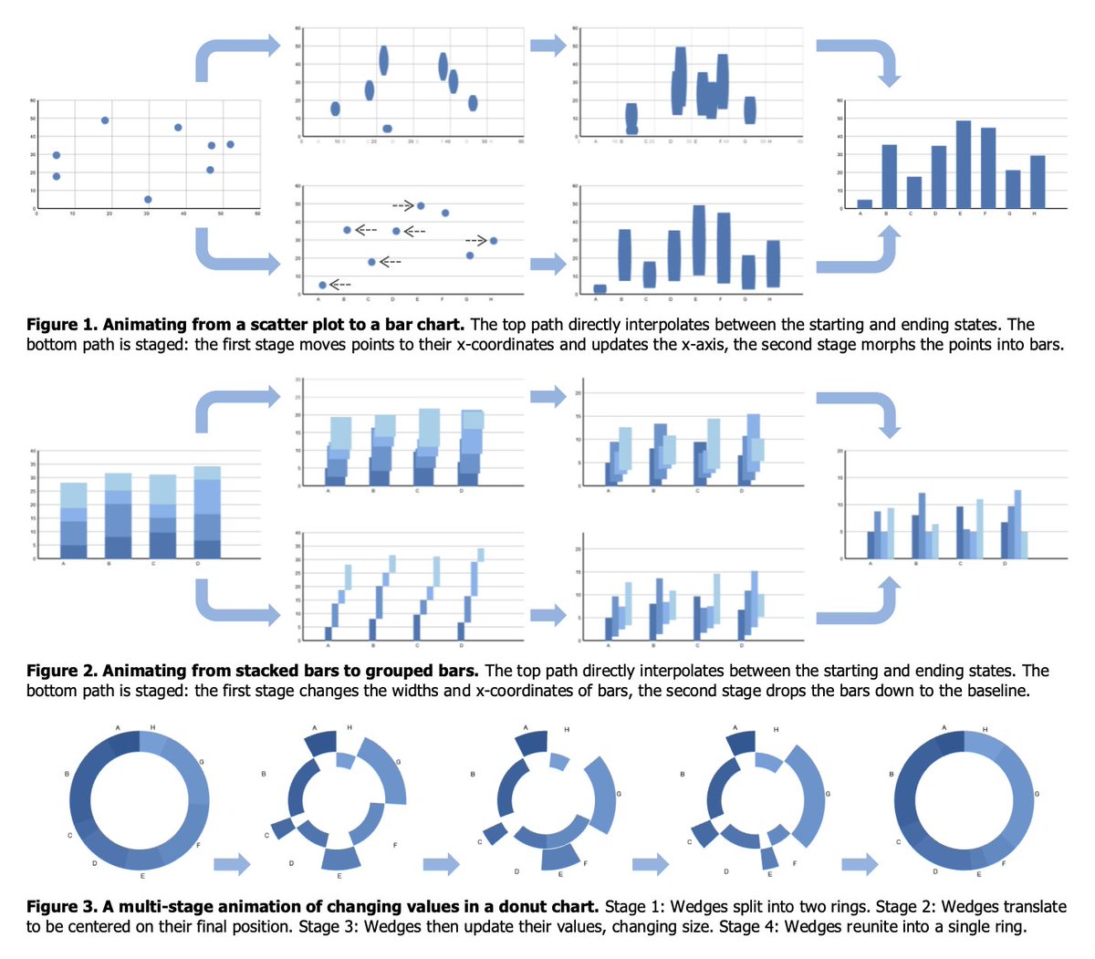
In this notebook, @LaoTzunami visualizes a state space of possible chart types and transitions among them along defined edges. Transitions between unconnected types are achieved by routing through intermediate types. https://t.co/UhfWrtAqhM
This resembles some of the transition diagrams in @jeffrey_heer’s classic “Animated Transitions in Statistical Data Graphics” https://t.co/n2XJuSmSju, but makes the diagram itself an interface for constructing the chart.