Today’s real interest rates sit in the lower third of their historical range. Viewed in isolation, they are entirely unremarkable. Yet, when mapped against two centuries of US and UK financial history, a uniquely fragile market architecture emerges.
In "The Reach of Real Rates," we examine the evolving mechanics of sovereign debt, inflation surprises, and capital returns over the last 200 years to understand why the current financial system is under acute tension. The central finding is that the historical release valves that previously stabilized extreme national debt are now effectively closed.
Key historical shifts driving today's vulnerabilities:
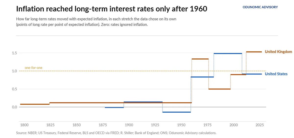
1) The End of the Inflationary Escape Route: After WWII, nations deleveraged by inflating away debt, aided by a passive creditor class. Following a structural break in 1960, bondholders now aggressively price in expected inflation, shutting down this stealth debt-relief mechanism.
2) Generational Bondholder Exhaustion: Fixed-income investors are currently nursing real drawdowns of 35% in the US, losses deeper than in 92% of all recorded months since 1871.
3) The Peacetime Fiscal Trap: Sovereign debt has reached levels historically reserved for total war. Given current interest-to-growth differentials, the US could run a primary deficit of 1.2% to hold its debt ratio steady. Instead, the deficit runs at double that rate, guaranteeing continued debt expansion.
4) A Collapsed Valuation Buffer: The equity earnings yield currently exceeds the real long-term bond rate by only 1.5 percentage points. This risk premium is thinner than in 79% of recorded history, leaving equities exceptionally fragile to any rise in capital costs.
The modern financial system is attempting to stabilize extraordinary public debt with historically ordinary rates, resting on an exhausted bondholder base and an equity market priced with virtually no margin of safety.
Read the full analysis for a deeper look at the data, charts, and structural mechanics shaping the Atlantic economy. https://t.co/RFKOs0MPr2
The Reach of Real Rates: Two Centuries of Financial Tides Across the Atlantic
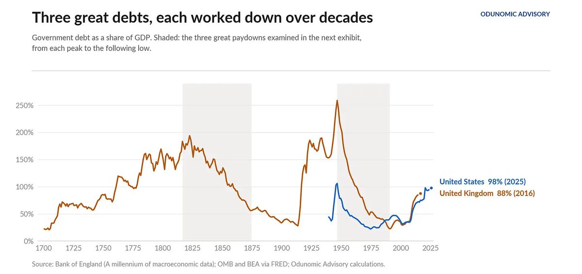
Sovereign debt has reached extremes during peacetime that were historically only seen during war. With the mathematical margin for error drastically shrinking, US debt stability would require limiting the primary deficit to 1.2% of GDP. Instead, the actual deficit runs at 2.6%.
This shortfall creates an inescapable circularity:
1) Massive Issuance: Running structural deficits above the steady-state threshold forces the state to issue massive volumes of new debt.
2) Elevated Yields: Because modern creditors demand real compensation, this relentless supply cannot be absorbed without keeping bond yields elevated.
3) Fiscal Compounding: Upward drift in borrowing costs narrows the growth-interest gap further, increasing annual interest expense, widening the deficit, and necessitating still greater debt issuance.
As the historical paydown chart illustrates, the nineteenth-century solution of running prolonged, aggressive primary budget surpluses to retire the debt, as Britain accomplished after Waterloo, remains politically unattainable. The state is therefore caught between an unrepeatable inflationary expropriation and an unsustainable fiscal trajectory.
Today’s real interest rates sit in the lower third of their historical range. Viewed in isolation, they are entirely unremarkable. Yet, when mapped against two centuries of US and UK financial history, a uniquely fragile market architecture emerges.
In "The Reach of Real Rates," we examine the evolving mechanics of sovereign debt, inflation surprises, and capital returns over the last 200 years to understand why the current financial system is under acute tension. The central finding is that the historical release valves that previously stabilized extreme national debt are now effectively closed.
Key historical shifts driving today's vulnerabilities:
1) The End of the Inflationary Escape Route: After WWII, nations deleveraged by inflating away debt, aided by a passive creditor class. Following a structural break in 1960, bondholders now aggressively price in expected inflation, shutting down this stealth debt-relief mechanism.
2) Generational Bondholder Exhaustion: Fixed-income investors are currently nursing real drawdowns of 35% in the US, losses deeper than in 92% of all recorded months since 1871.
3) The Peacetime Fiscal Trap: Sovereign debt has reached levels historically reserved for total war. Given current interest-to-growth differentials, the US could run a primary deficit of 1.2% to hold its debt ratio steady. Instead, the deficit runs at double that rate, guaranteeing continued debt expansion.
4) A Collapsed Valuation Buffer: The equity earnings yield currently exceeds the real long-term bond rate by only 1.5 percentage points. This risk premium is thinner than in 79% of recorded history, leaving equities exceptionally fragile to any rise in capital costs.
The modern financial system is attempting to stabilize extraordinary public debt with historically ordinary rates, resting on an exhausted bondholder base and an equity market priced with virtually no margin of safety.
Read the full analysis for a deeper look at the data, charts, and structural mechanics shaping the Atlantic economy. https://t.co/RFKOs0MPr2
A Familiar Place for Real Rates
“…C1 was associated with average inflation of 3.4%, compared with 4.4% in C2, 0.7% in C3, and 5.3% in C4. The point is not that C1 causes 3.4% inflation or that inflation must return to that level. These are historical associations. What they show is that the most common low and rising real rate configuration has often coexisted with inflation in the low 3% range, rather than only with very low inflation.”
More here: https://t.co/yK0lesH3pl
A Familiar Place for Real Rates
“…Over the past three years, the US two year expected real rate has fallen from 2.11% in September 2023 to 0.84% today. More important than the decline itself is where that move has placed the US relative to its own history. The current path now sits almost exactly at the bottom of the most heavily occupied part of the modern real rate landscape.”
Article here: https://t.co/yK0lesH3pl
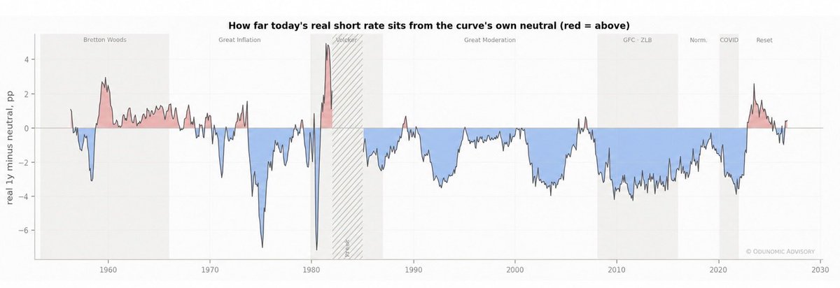
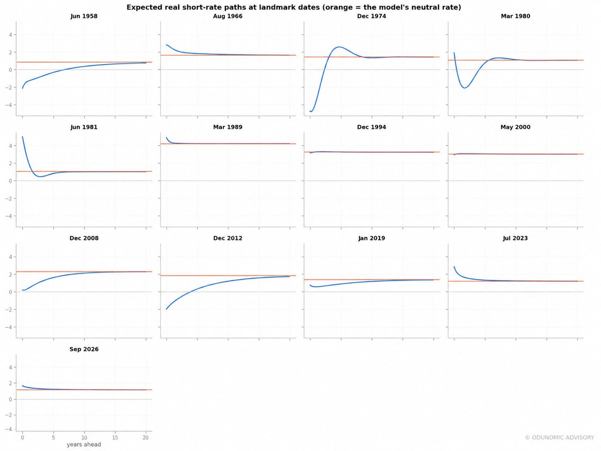
Expected real short rate paths at key historical dates, together with the neutral rate toward which each path converges. Today’s real 1 year rate minus the model implied neutral rate measures the current policy gap: a positive value indicates that the real short rate is above the level the curve expects it to settle toward.
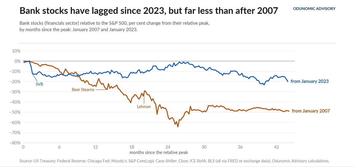
Bank stocks relative to the market after their relative peaks in January 2007 and January 2023
They peaked against the market in January of both 2007 and 2023, and both times a bank shock followed (subprime, then SVB). After 2007 they kept falling: 49% behind the market 44 months on, 64% at the worst. After 2023 they fell 15% around SVB, recovered part of it in 2025 and have slipped again this year, to 20% behind the market, near their low. That is a real weakness worth watching.
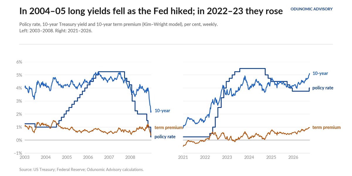
In 2004–05 long yields fell as the Fed hiked
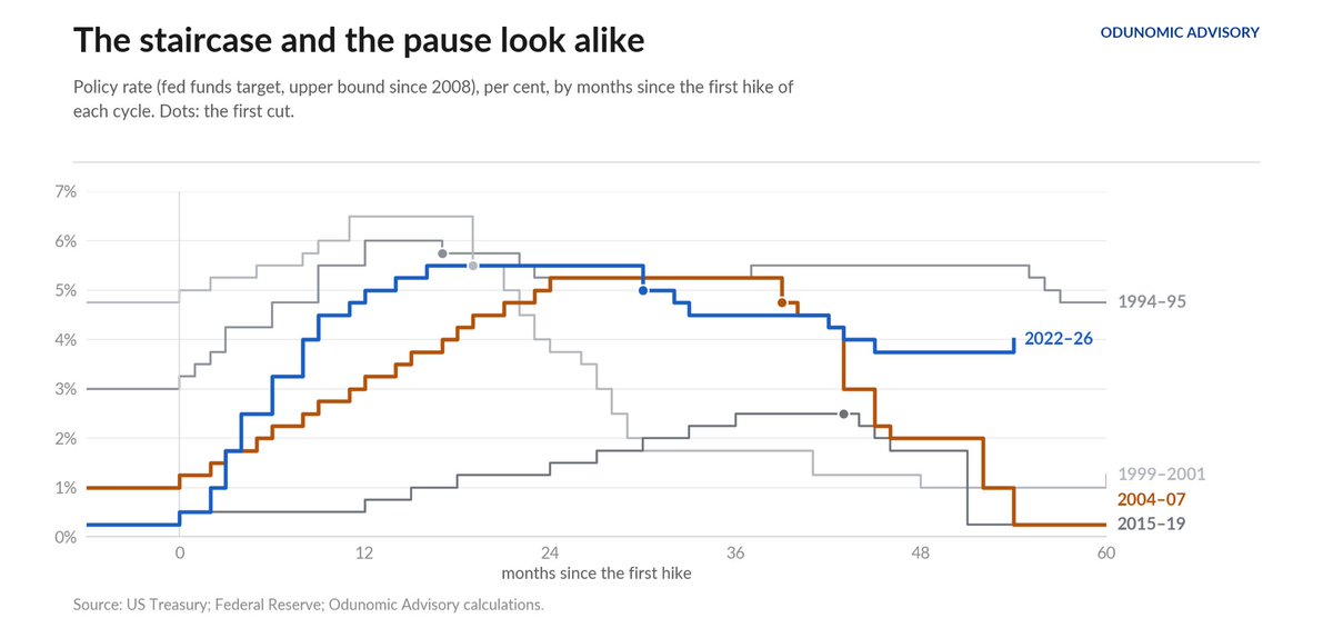
In the first year of the 2004 cycle the Fed raised rates 225 basis points and the 10-year yield fell 68, as the term premium dropped 74: Alan Greenspan's 'conundrum'. Cheap long-term money kept flowing into mortgages while the Fed tightened. In the first year of the 2022 cycle the Fed raised rates 450 basis points and the 10-year rose 137. The term premium has since rebuilt to 0.96%, at the top of its 2006–07 range (0.47% to 0.96%). This time long rates did the tightening alongside the Fed.
In 2004–05 long yields fell as the Fed hiked
In the first year of the 2004 cycle the Fed raised rates 225 basis points and the 10-year yield fell 68, as the term premium dropped 74: Alan Greenspan's 'conundrum'. Cheap long-term money kept flowing into mortgages while the Fed tightened. In the first year of the 2022 cycle the Fed raised rates 450 basis points and the 10-year rose 137. The term premium has since rebuilt to 0.96%, at the top of its 2006–07 range (0.47% to 0.96%). This time long rates did the tightening alongside the Fed.
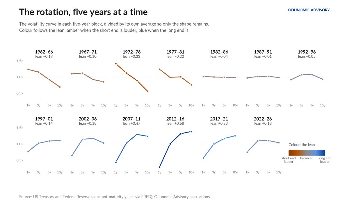
The Polarity of the Volatility Curve
"Treasury yields at different maturities do not move by the same amount. In some decades, the short end has done most of the moving; In others, the long end has. Which end is louder is a signed quantity, and it describes what the bond market is uncertain about: the path of central bank policy in the near term, or the long-run level of rates."
Article: https://t.co/bmBh5vwfLK
1973–74 arrived in sequence, on a primed basket
Headline consumer-price inflation went from 3.0% in mid-1972 to 11.5% by December 1974, and the rise ran through the whole basket in turn. Food came first, adding 2.6 points by December 1973 after the grain and meat shock. Energy followed, adding 2.1 points by mid-1974. Goods and services came last, as controls came off.
2026 has the energy step: energy's contribution rose from about zero early in the year to 0.87 points in May. It also has a modest lift from goods (0.4–0.5 points). It has no food shock (0.17 points), no controls to unwind, and breadth that is falling. In 1973 energy was the second domino, not the first, and it fell on a basket primed by years of 6–7% wage growth and double digit money growth.
A search across all of history reaches the same verdict. Judged on inflation, labour-market slack, the real policy rate, oil and unit labour costs, 1972–73 is among the closest 3% of months to today in 65 years. Add wage and money growth and 1972 falls to the 76th percentile. Of the eight closest matches on the path of services inflation alone, only one (1973) was followed by a rise of more than a point within a year.
The Sticky Price Pipeline.
Flexible price inflation is 6.2%; sticky price inflation is 2.7% and slowing. We examine pass through, wages, money, expectations and the 1972 to 1973 comparison across 65 years of US data.
Research note attached: https://t.co/wK8ks7do3L
The Sticky Price Pipeline.
Flexible price inflation is 6.2%; sticky price inflation is 2.7% and slowing. We examine pass through, wages, money, expectations and the 1972 to 1973 comparison across 65 years of US data.
Research note attached: https://t.co/wK8ks7do3L
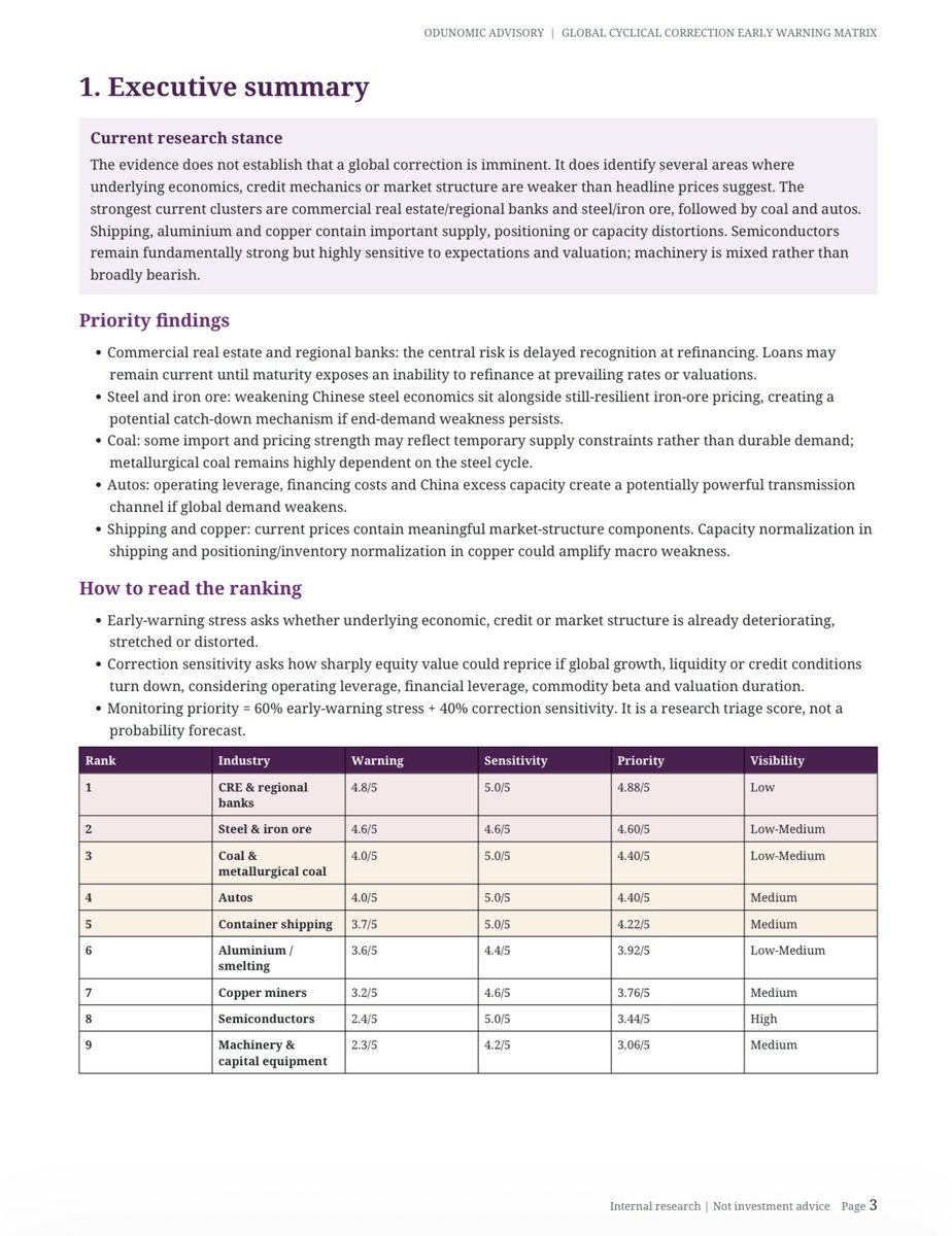
Where are cyclical vulnerabilities building before they become obvious in headline market prices?
Our Global Cyclical Correction Early Warning Matrix tracks underlying economic, credit and market-structure stress across major cyclical industries.
Current areas of focus include CRE/regional banks, steel & iron ore, coal, autos and shipping.
This is an early-warning framework, not a call that a correction is imminent
Executive summary ↓
How Inflation Swindles the Equity Investor
“Bond investors have had a succession of shocks over the past decade in the course of discovering that there is no magic attached to any given coupon level: at 6 percent, or 8 percent. or 10 percent, bonds can still collapse in price. Stock investors, who are in general not aware that they too have a "coupon," are still receiving their education on this point.”
- Warren Buffet, 1977
When inflation was calm, a 10-year Treasury gained 2.2% in the average 10% equity drawdown. When inflation was high, it lost 1.7%. Same bond. Same shock. Opposite outcome.
Why the bond hedge was always an inflation bet:
The Hedge That Isn’t
https://t.co/8Q8hmwObf3
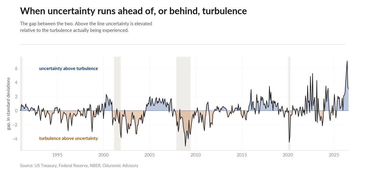
When uncertainty runs ahead of, or behind, turbulence
The data paints a clear picture of the current era. We are not necessarily living through the most turbulent times in modern economic history, but we are undeniably living through some of the most uncertain.
The Hedge Curve Is Moving Unevenly
“…. The underlying components still favor the more cautious interpretation. At 10 years, the inflation component has a stock correlation of about −0.14, compared with an inflationary regime average of −0.18, while the real rate component is around +0.28, compared with +0.31. Both remain close to their inflationary behavior.”
Article: https://t.co/LXlzR8lVBz
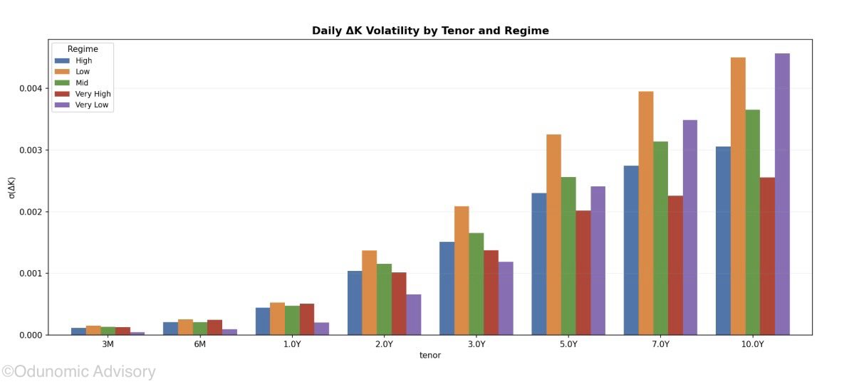
How Market Volatility Changes Across Rate Environments
Price movements tend to become more volatile at longer maturities, and the differences between interest rate environments become much clearer further out on the curve.
At 7 and 10 years, periods of low and very low interest rates show larger swings than periods of high and very high rates.
The main takeaway is simple: lower interest rates do not always mean a calmer market. At longer maturities, the market can actually become more sensitive to shocks when rates are low.
Three Decades of Interest Rate Regimes
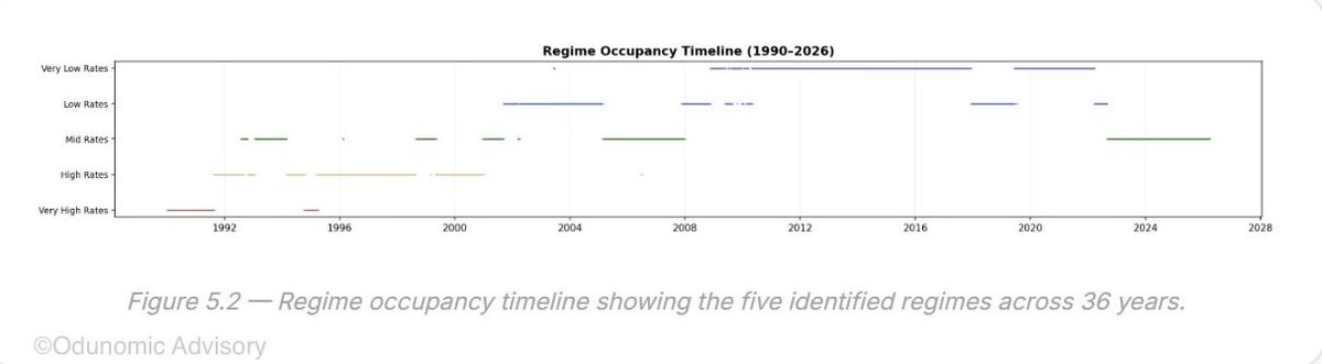
These plots show the evolution of interest rate regimes from 1990 to 2026.
The 1990s were dominated by high and very high rate regimes. The 2000s became more mixed, with low and mid rate regimes taking a larger share, while the 2010s were heavily concentrated in the very low rate regime. The 2020s have so far shifted back toward mid rates.
The timeline adds an important layer: these regimes often persist for long stretches rather than rotate frequently between states. That persistence makes regime duration, concentration, and transition behaviour useful for understanding how the monetary environment evolves over time.
“…..The result is that the central bank may need progressively larger adjustments in its policy instruments to achieve the same effect on aggregate financial conditions.”
https://t.co/IjG5jBJE0t
Financial repression can distort interest rate formation and credit allocation while the public continues to regard the central bank’s inflation objective as credible.
https://t.co/IjG5jBJE0t
"Bonds hedge equities" is not a property of bonds. It is a property of the inflation regime, and it reverses. Any allocation built on the assumption without a view on inflation is carrying an unpriced bet.
The Hedge That Isn’t:
https://t.co/oJee8JTkUs
When inflation was calm, a 10-year Treasury gained 2.2% in the average 10% equity drawdown. When inflation was high, it lost 1.7%. Same bond. Same shock. Opposite outcome.
Why the bond hedge was always an inflation bet:
The Hedge That Isn’t
https://t.co/8Q8hmwObf3