Simple touches change how it feels.
Same screens. Same features. but i add just some simple touches to the ui and Wirdy suddenly felt like a completely different app.
Here's what I changed 👇:
- Identifying first your product audience: Wirdy is your solution to build you wird reading habit
- For an app like this, "functional" isn't enough. It has to feel calm. So I stopped touching the features and started fixing the details:
- Typography swapped the bold sans-serif for a softer serif. Instantly warmer. Less "dashboard," more "companion."
- Choose carefully your bg color : traded flat white for warm cream tones. Less clinical, more inviting.
- Be smart with borders & corners : softened the radius and refined the card borders. Tiny change, big difference in how gentle the screen feels.
- Use authentic images : added quiet illustrations to the circle cards. They went from generic green blocks to something with a soul.
- Your users messages : personalization "Good night, Omaritos" + a weekly reading-rhythm chart. The app stopped talking at the user and started talking to them.
None of this was hard to build. But together, these "simple" steps are the gap between an app people use and an app people love.
In mobile, the details aren't the polish on top of the product. The details ARE the product.
#MobileDev #UIUX #ProductDesign #BuildInPublic #AppDesign
Trying mobile dev on a weekend 😅.
Firstly, I pick the Expo framework with React Native (because I already know React, so I can evaluate and challenge AI assistance outputs).
What I do (if you want to learn):
- I search for a simple problem and validate it (like building a consistent reading habit)
- I search for inspiration (like open-source repos like Wird repository or mobile apps that solve the same problem, exploring competitors' points for improvements)
- I surf in templates like Mobbin or Dribbble websites to get inspired by some mobile app standard designs.
- I read the Google guide for iOS and Android mobile development (to understand rules, norms, standards...).
- I write a small backlog or story map where a principal feature solves the main problem (time-lapse programmed sessions) and then the nice-to-have features (like close circles, streaks, reminders...).
- Then I try to set up a base architecture for the project and the stack benchmark to use for shipping your app!
- So start shipping features and tasks in the backlog one by one!! (For UI, you could use some UI screens as a reference for the AI.)
- Then, after deploying your solution, you could give some users time to try it and give you feedback, then iterate until you build something worth it for users!
- Also, one big important thing is marketing, marketing, then marketing...
This is the pattern I was trying to learn from this weekend app to profitable apps! And you could apply it on every profitable app you want to build. 😁
#Day 16 : Building Collab
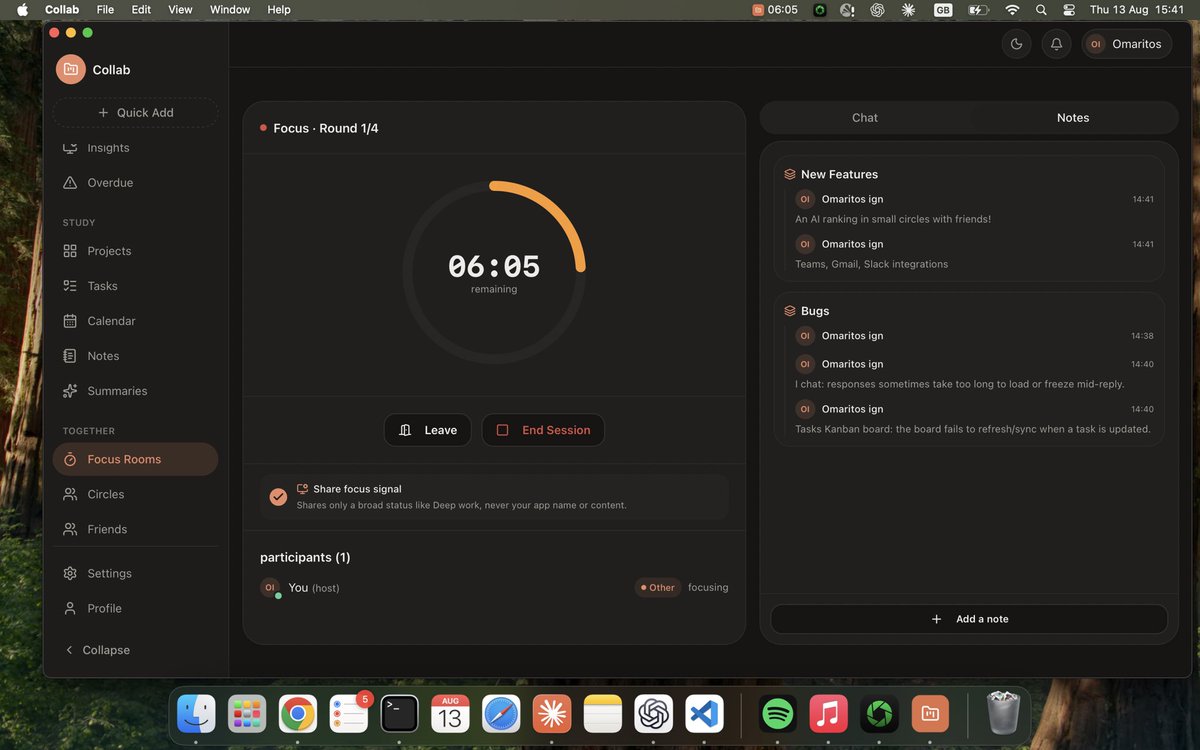
The coworking layer for student hustlers, bootcampers' crews, and founders' teams to accelerate your executions and bunch tools to achieve more!!
AI-assisted chat & summaries
Live focus rooms
Auto-tracked streaks
Shared session notes
Close circles' momentum
and more all in your mac/win os
Join the waitlist : https://t.co/KcMAjxpibg
we have just 2 waitlisted now -> road to 500 users waitlisted
Give us feedback!!!!
Day 16 : Building Collab
The coworking layer for student hustlers, bootcampers' crews, and founders' teams to accelerate your executions and bunch tools to achieve more!!
AI-assisted chat & summaries
Live focus rooms
Auto-tracked streaks
Shared session notes
Close circles' momentum
and more all in your mac/win os
Join the waitlist : https://t.co/KcMAjxpQ0O
we have just 2 waitlisted now -> road to 500 users waitlisted
Give us feedback!!!!