@CostaMooney@iLLu77
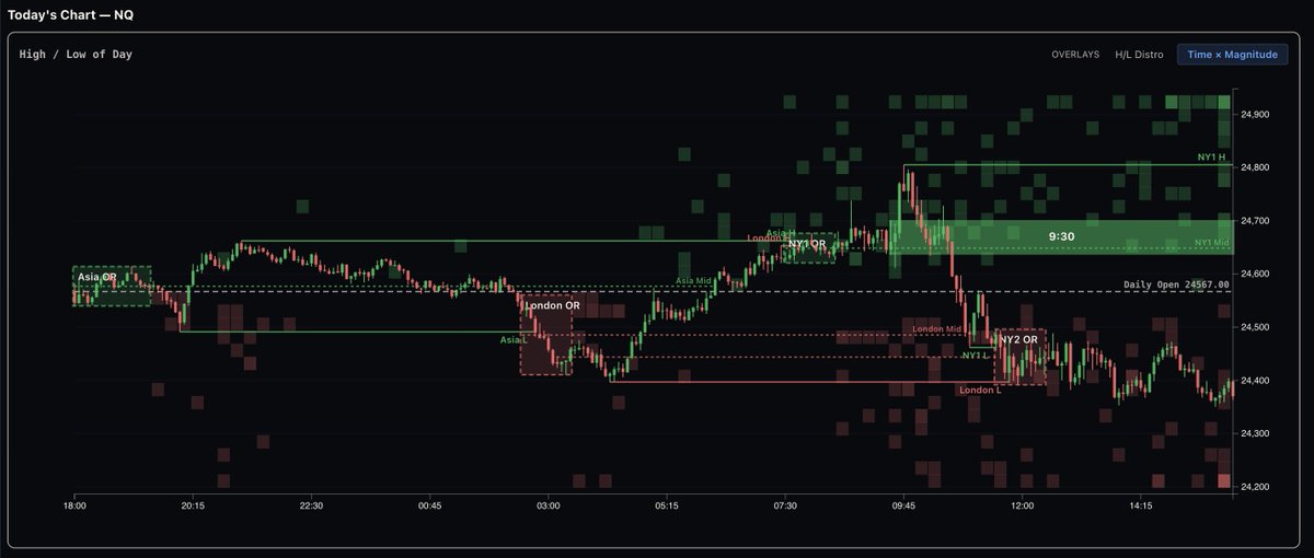
So we added a new visualisation to Omnis. A Time × Magnitude heatmap showing:
When the daily high or low tends to form
How far it usually extends by that time...Live, in real time !
Not theory.
Historical distribution.
Watch our NQ indicator plot in real-time throughout the session.
Session zones. Scenario levels. All updating live as price develops.
15+ years of data behind every line on the chart.
#NQ#FuturesTrading
So many data points... That have an intertwined relationships its important to display / visualise relevant data for the process at that time and stage of study. What Probabilities right?
We removed unnecessary Asia/London datapoints and included EEZs.
We're super excited to announce that version 1 of the Omnis Analytics Dashboard is out! Check out our Whop here: https://t.co/TkcWtQsQXA and our discord here: https://t.co/7QcXTmHvmc
🚀 Omnis dB is here 🚀The most powerful Trading Database is here.
- Time-based insights that matter - Multi asset session probabilities refined over 12+ yrs - Precision driven analytics
- Strategy refinement
No guessing. Start trading with confidence. 🔗 https://t.co/uhXRKYz50h
Data-driven research tool that organizes and interprets historical price movements
Quantitative framework that maps market tendencies based on statistical probabilities
Education resource that helps traders analyze market structures and develop independent decision-making skills