Same ocean. Different eras. Seven New York–Paris crossings from 1927 to 2026, each with its own aircraft. Switch Compare from distance to time and a century lines up. Modelled flight times, not timetables: https://t.co/roHcmHIOlJ
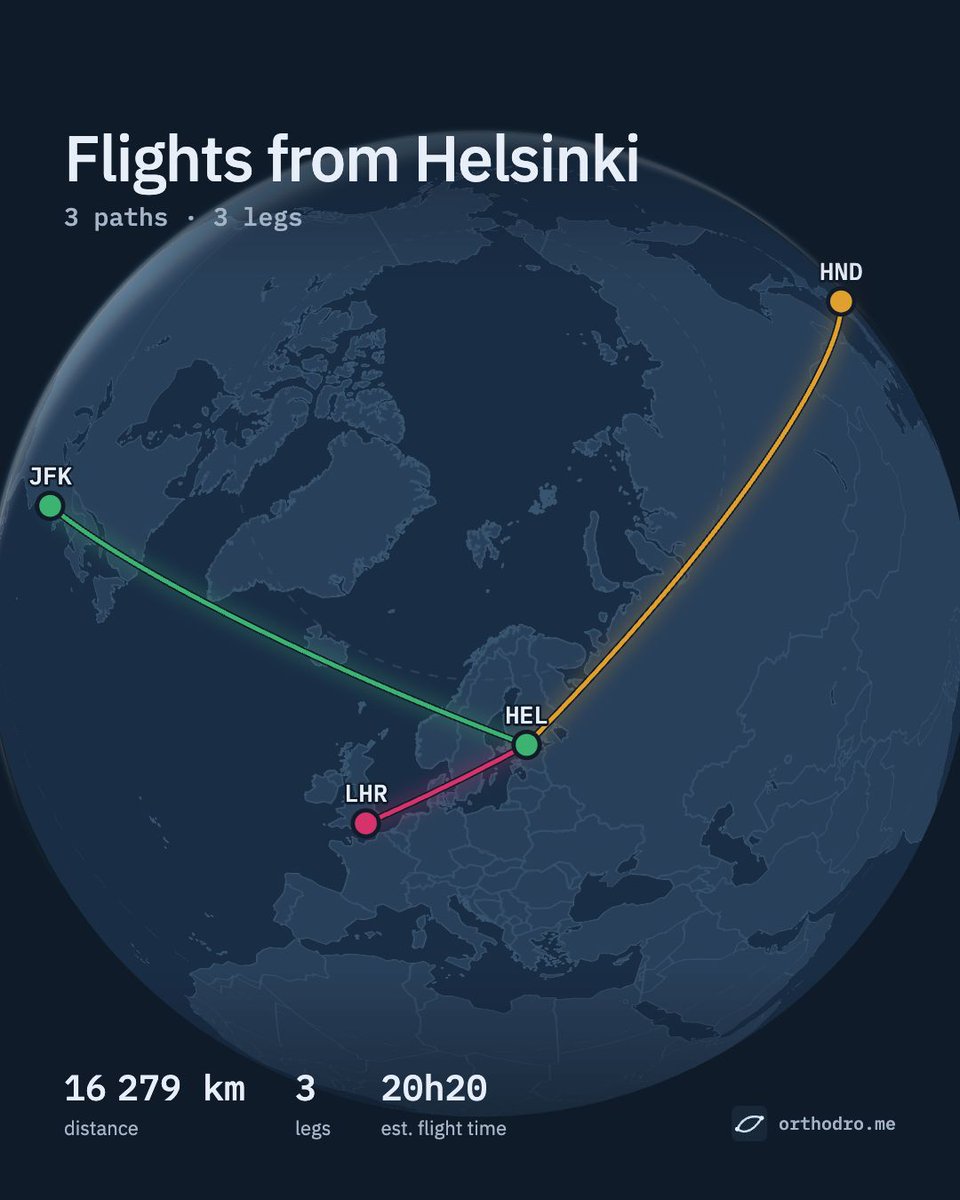
One map, several ways to tell the story: a route map, a world view and a flight-time comparison. These images were made in Orthodrome. Make yours: https://t.co/KYwY1ySekW
Airport search on Orthodrome now ranks by size. Type "london" and you get Heathrow, not London, Ontario. City codes NYC, LON and TYO work too.
On the map, major airports (15M+ passengers) stand out, and 40M+ get a ring.
https://t.co/KYwY1ySekW
Across the Pacific, one island at a time. This Flyover was made in Orthodrome from the Island Hopper map: six legs from Honolulu to Guam. Open the map and try it: https://t.co/oirA9CEaTR
Same aircraft. Same flight time. Different reach. Four hours from Tokyo Haneda: switch from Still air to Winds and January’s jet stream stretches the range east. These are mean winds, not a live forecast.
@Mirja_53 Oheessa olevalla videolla näkyy miten Helsinki-Ateena onnistuu. Tässä on haussa outous, kun kirjoittaa Athens, tuleekin ensimmäisenä eri kenttä, kun sen nimisiä paikkoja on monta. Jos kirjoittaa HEL-ATH niin toimii oikeammin. Kenttiä voi myös valita kartalta.
Your flights, on a map. Draw routes, compare flight times, explore range circles and make images and videos to share. Orthodrome is free to use, with no sign-up. What would you map first? https://t.co/KYwY1ySekW