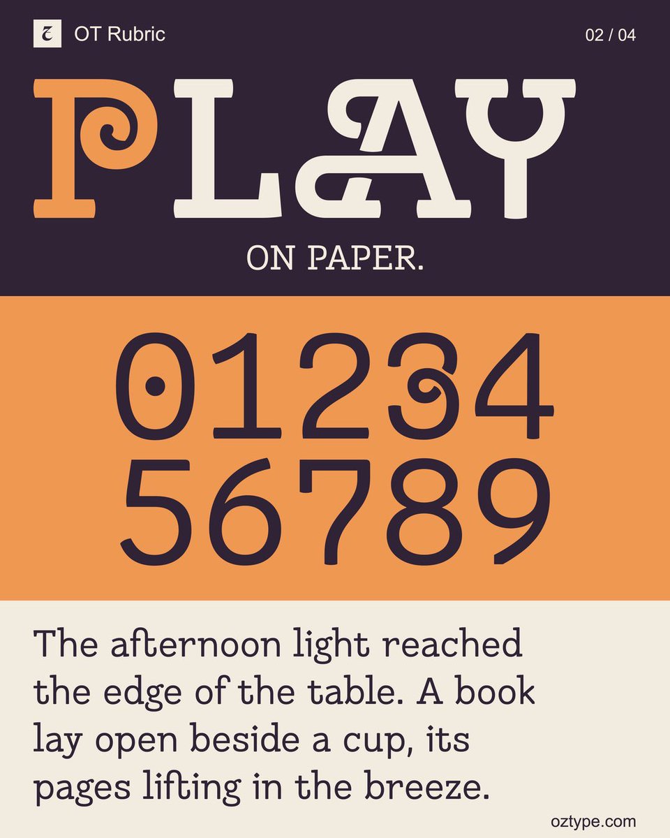
Introducing OT Rubric v1.
A contemporary text serif with five upright weights, a variable font and 18 stylistic sets.
Built for reading, with a little room for the unexpected.
A page with character.
https://t.co/mhmWaX14EF
… and down.
That led to three optical directions:
Micro for very small text, with stronger hairlines, more open forms and extra resilience.
Text for sustained reading, balancing contrast, rhythm and clarity.
https://t.co/ZfoAdLAWox
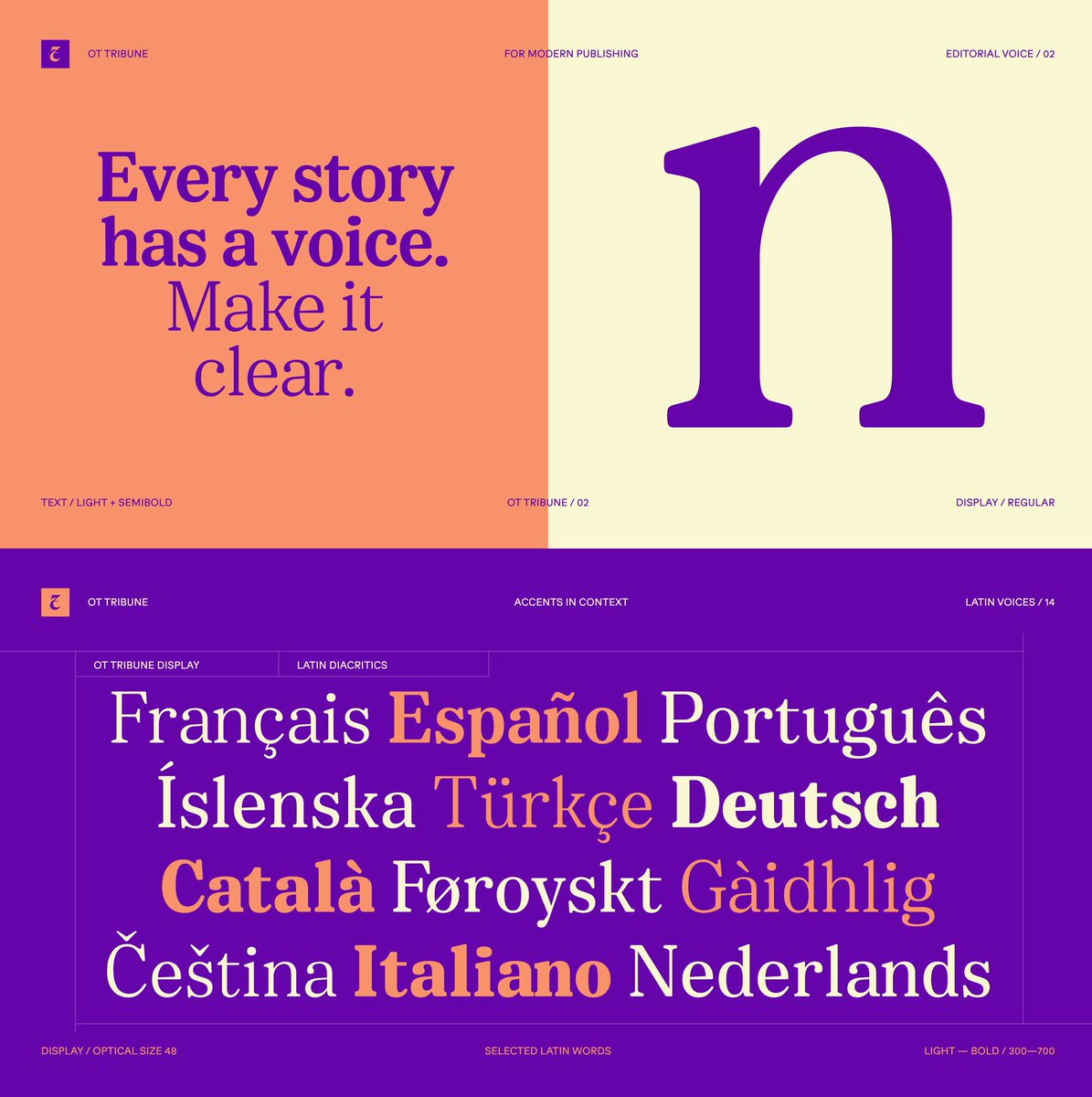
I’ve been revisiting OT Tribune, a family I designed with Zachary Schwartz for OzType, and wanted to share some of the specimens here.
The idea was to build an editorial serif that could adapt properly across different reading sizes rather than simply scale the same design up
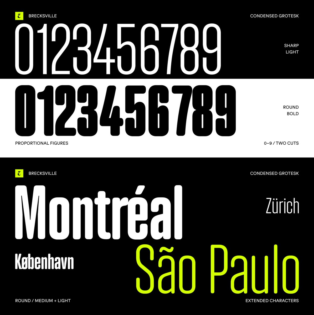
Brecksville — a condensed grotesk I designed while researching early German grotesks of the mid-19th century.
The family explores two sides of the same structure: a sharper, more rugged grotesk and a softer rounded display version, both built on the same proportions and metrics.
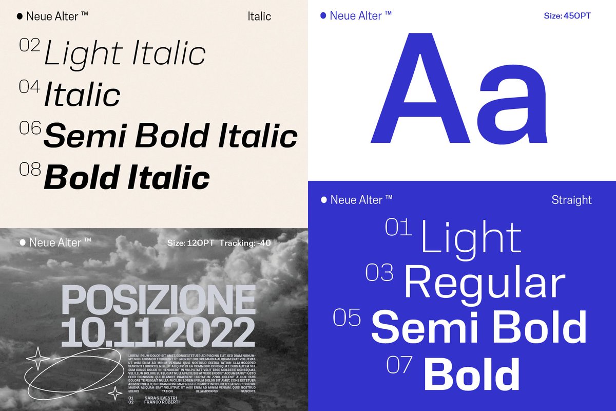
OT Orthant — nothing stays static.
A typeface built around structure, rhythm and controlled variation. Designed to move between precise, technical typography and bold display use without losing its character.
A closer look at the system ↓#Typography