We're committed to recognising excellence in design, providing a source of inspiration & connecting the packaging design community. Latest news & more ⬇️
IWANT's #packagingdesign for UKIYO reinterprets matcha through a refined combination of colour and typography. Soft pastel tones paired with metallic tins create a contemporary yet calming aesthetic, while the circular identity system brings consistency. #DailyDesignInspiration
¡Por tercer año consecutivo! Cinco alumnos preseleccionados en los Pentawards. Esto no es casualidad.
A los cinco preseleccionados: el esfuerzo que habéis puesto aquí dentro se ve ahí fuera. ¡Mucha suerte en la ronda final! 🏆
#Trazos#Pentawards#DiseñoGráfico#EscuelaDeDiseño
Ragged Edge's #packagingdesign for Free Soul reimagines Free Soul as the home of women’s wellbeing. A distinctive vertical logo serves as a pillar of consistency on and off pack, whilst the font balances warmth and precision. #DailyDesignInspiration
Killeridea's gin #packagingdesign. The bottle was reimagined as a small architectural space inspired by Trentino’s castles. Through arches, transparencies, and reflections, light transforms the bottle into an object that continuously changes. #DailyDesignInspiration
co+lab's #packagingdesign for FOLIA. A sculptural bottle with direct-on-glass typography, housed in a molded pulp case. The natural gradient of the liquid becomes the primary visual identity, while a small handwritten tag adds a human, artisanal touch. #DailyDesignInspiration
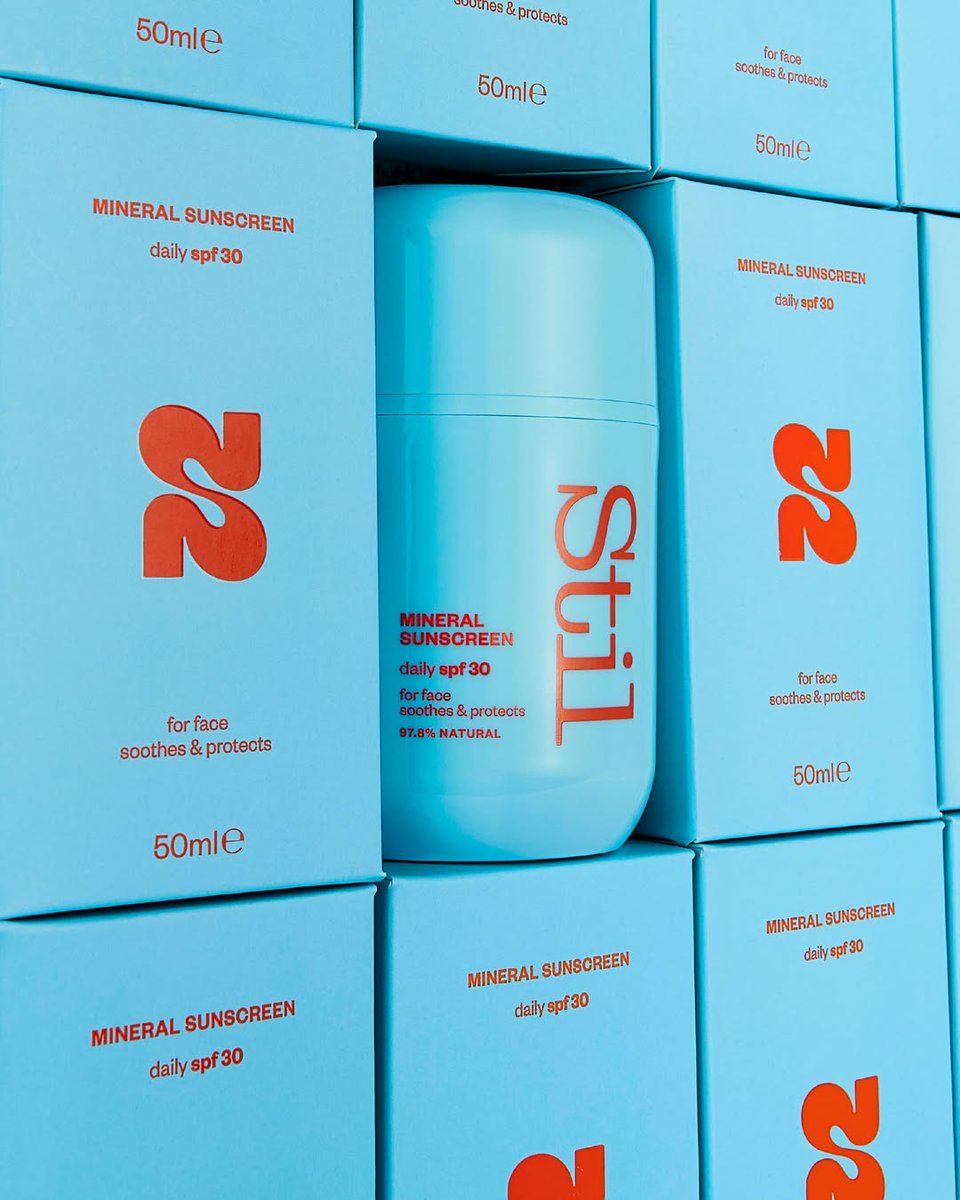
Studio25's #packagingdesign for Still moves away from predictable palettes seen across suncreams, introducing a fresher, more uplifting and confident aesthetic. #DailyDesignInspiration
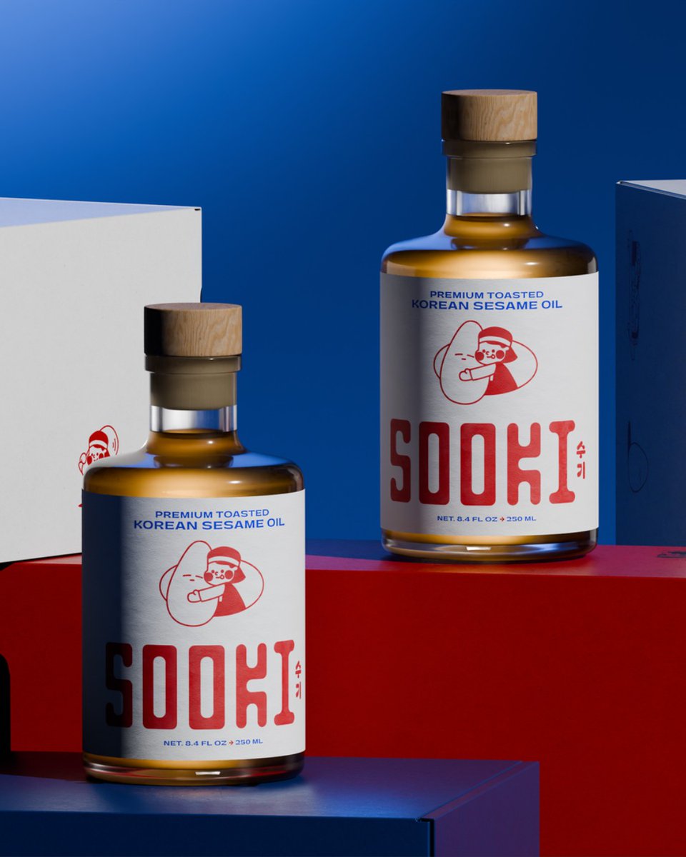
The Collected Works' #packagingdesign for Sooki Sesam Oil. Rooted in Sooki Food's family story and traditional production methods, the identity and packaging feel partly nostalgic, partly modern, and very delicious. #DailyDesignInspiration
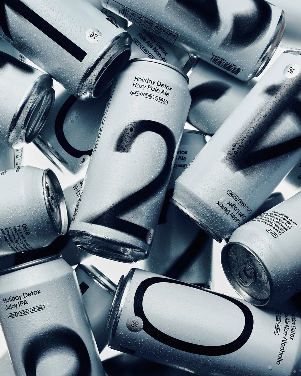
Leo Design's #packagingdesign for The Holiday Detox Pack reimagines the familiar six-pack as a guided experience - encouraging you to drink more to drink less through design and typography as tools for behavioural change. #DailyDesignInspiration
Sweety & Co.'s #packagingdesign for TeddyGlow breaks from beauty’s minimalism with a bold, tactile identity. Rooted in the brand’s street energy, it blends playful and sophisticated through sculptural packaging, metallic motifs, and vibrant palettes. #DailyDesignInspiration
F33's #packagingdesign for El Largo. More than just a label, it’s a functional branding element designed to extend beyond the product itself. By turning the label into an object, the packaging becomes useful, memorable, and central to the brand experience. #DailyDesignInspiration
Veuve Clicquot Chasing the Sun #packagingdesign with YINKA ILORI. Inspired by Madame Clicquot’s bold vision, the brand solar identity comes to life through a vibrant universe where light, colour and design celebrate joy and optimism. #DailyDesignInspiration
Studio Eremo's #packagingdesign for Anonima Distilleria Creativa features a bold, stripped-back approach, where vibrant labels wrap around classic apothecary-style bottles. High-contrast typography takes centre stage, giving each variant a strong identity. #DailyDesignInspiration
good girl snacks' #packagingdesign pairs bold, punchy colour blocking with hand-drawn illustrations and expressive typography. The labels contrast with the product’s natural tones, creating strong shelf impact while conveying a fun, irreverent personality. #DailyDesignInspiration
Jon Michael Design's #packagingdesign for Clean Beauty Collective Hair & Body Perfume Mists. Elongated, popsicle-inspired silhouettes bring a sense of summer nostalgia, while juicy, translucent hues give the packaging a fresh visual appeal. #DailyDesignInspiration
MIILS' #packagingdesign is defined by a clean, modern aesthetic, pairing bold, minimal typography with soft, approachable colour palettes. Clear hierarchy and simple layouts foreground the design, while subtle details add a sense of refinement. #DailyDesignInspiration
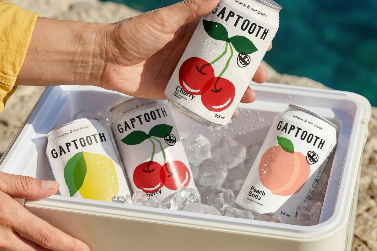
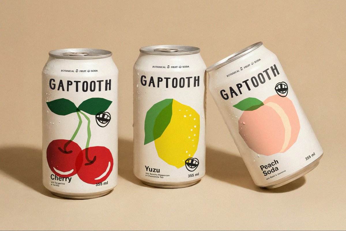
Saint Urban's #packagingdesign for Gaptooth Soda embraces imperfection as a core design principle, using asymmetry, typography, and intentional graphic gaps to create a distinctive visual rhythm. Hand-drawn characters and illustrations add personality. #DailyDesignInspiration
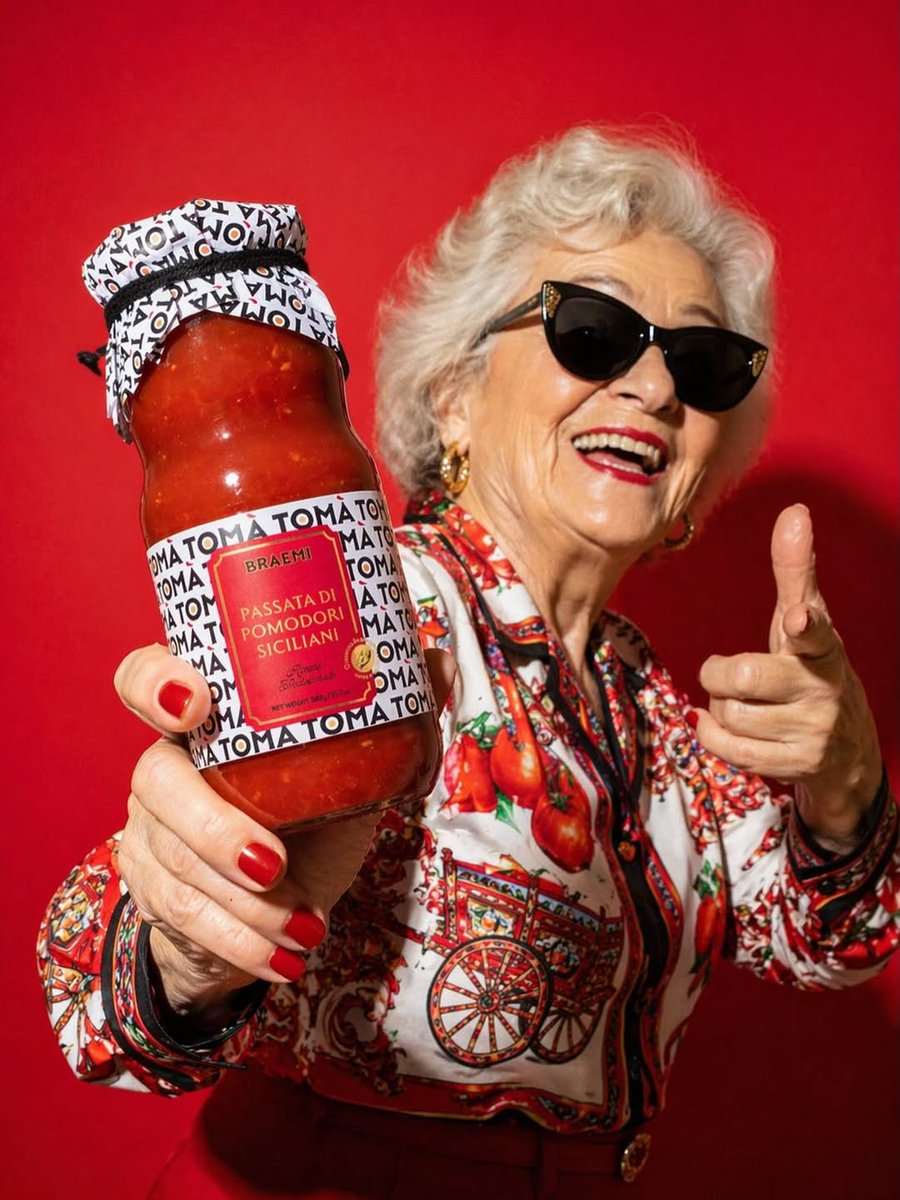
Rosario Lo Iacono's #packagingdesign for TOMÀ is built on a simple yet distinctive linguistic idea: repeated, the name reads as “tomato,” while in Sicilian dialect it echoes “your mother,” evoking a homemade sauce. #DailyDesignInspiration
Principi Estudio's #packagingdesign for Bandit. A bold identity for a card game built around a striking “B” symbol that doubles as a mask - capturing playful deception. Minimal, high-contrast packaging sets the tone: sharp, confident, and mischievous. #DailyDesignInspiration
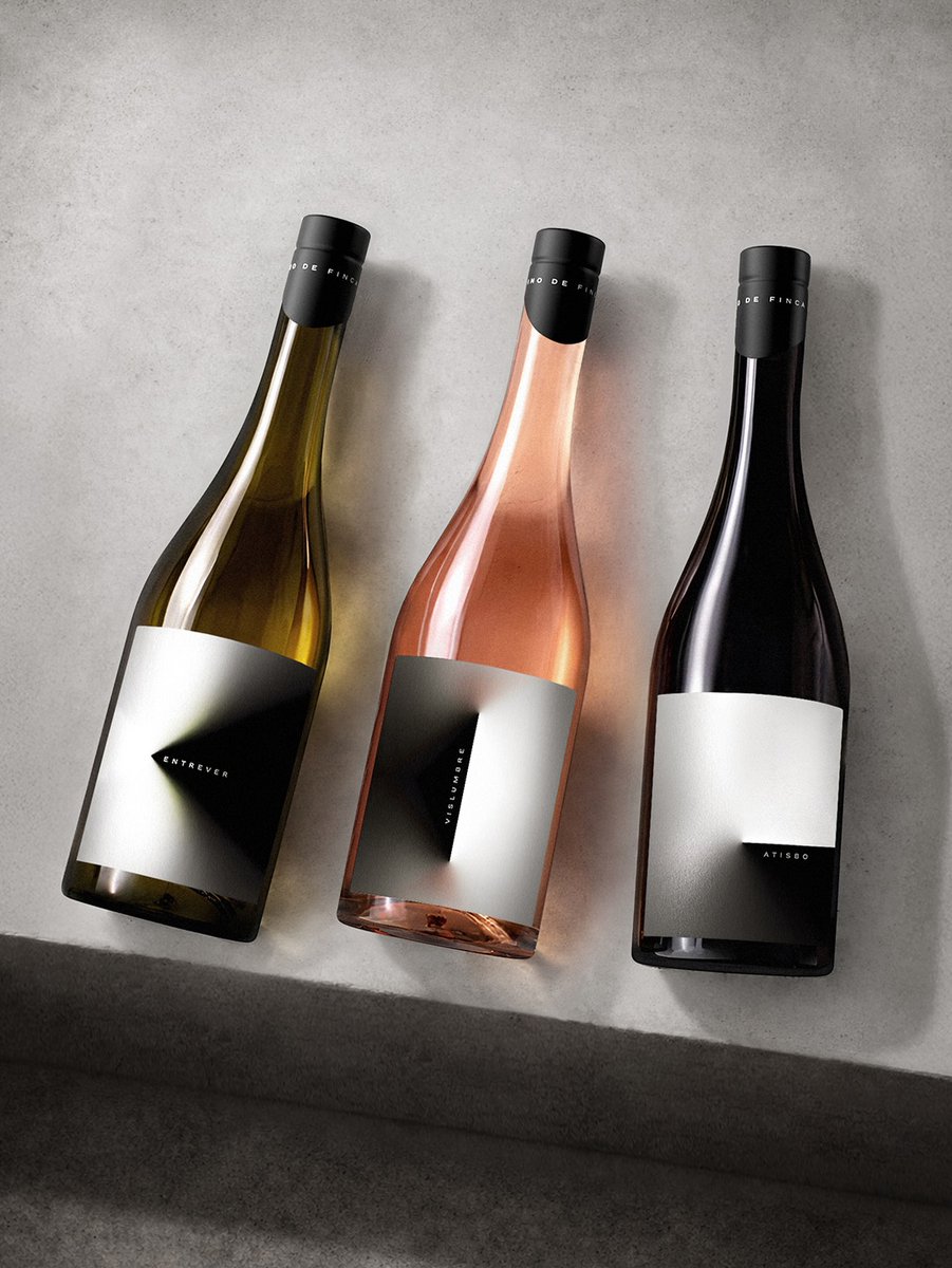
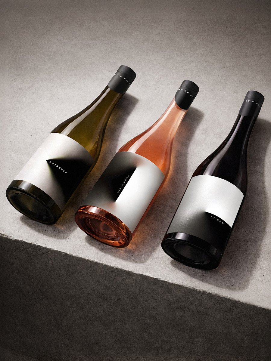
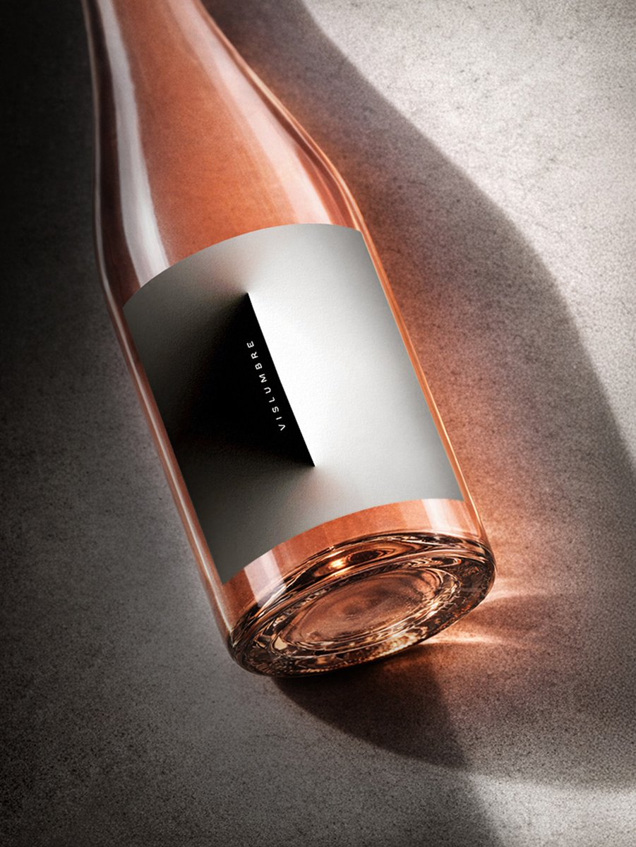
SERIESNEMO's #packagingdesign for Vino the Finca is built around light as a design principle - revealing form through contrast. It translates into three wines - each expressing the interplay between light and shadow, where clarity and depth coexist. #DailyDesignInspiration