We have exciting news to share! We are happy to announce the acquisition of PartydoosMedia, allowing us to expand like never before and reach new horizons
We've been hard at work creating a brand-new, more informative website from scratch.
Read more: https://t.co/LOG6qbmSz4
📢 We’re Hiring: Graphic Designer
PartydoosMedia is looking for a talented and detail-oriented Graphic Designer to join our creative team. 🎯
If you have a strong design portfolio and expertise in digital media, we’d love to hear from you.
📩 Apply today! https://t.co/vjzVUV9uVj
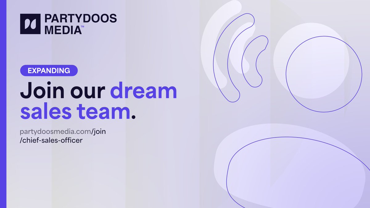
🚨 We’re Hiring! 📷
Chief Sales Officer Wanted
Are you a sales powerhouse ready to drive growth and close big deals? 📷
Join the team and lead our sales strategy to the next level! 📷
#NowHiring#MediaJobs
Apply here! - https://t.co/Br8Ey2l3W3
We are pleased to announce that we have been awarded Top Score 2025 by Trustoo, a platform that connects service providers like ourselves to consumers and businesses.
We appreciate the recognition; it motivates us to keep doing what we do best: excelling at graphic design.
It's time to make your brand stand out for less! We're excited to do a #giveaway of three 10% off vouchers!
Simply
🟣 Follow @PartydoosMedia
🟣 Give this post a like 🩷
🟣 Double your chances by tagging a friend or colleague
Make sure your DMs are opened, and good luck!
So that’s why Google decided to update their now-infamous ‘G’ icon by softening the colours. Sometimes, a simple refresh is all it takes to make a brand look modern again.
Get ready for the next decade! Send us a DM and let’s see how we can help boost your growth. 🚀
You might have noticed that Google is rolling out a new gradient icon on both Android and iOS. But why are they changing their look for the first time in a decade? 👀
Here’s a thread explaining what’s going on 🧵
3. AI-first (🥲)
As artificial intelligence takes the centre stage, design follows. Gradients evoke a sense of fluidity, exactly the image AI-first companies want to project. From Apple's Siri to Google’s own Gemini, the message is clear: gradient means next-gen.
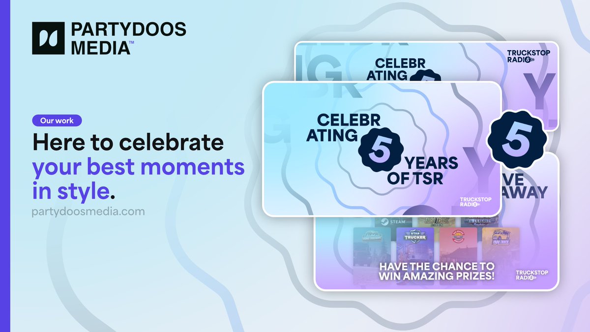
Five years fly by! We've worked with @TruckStop_Radio on identity, motion & designs for special occasions like this.
A rebrand is a big step, sometimes being seen for key moments is all it takes - from anniversaries to holidays. Get ready to be seen when it matters the most.
We had an absolute blast helping ShowPlanner level up their brand! ✨
In just two weeks...
☑️ We delivered a bold and modern brand identity that aligns with their audience.
☑️ We crafted a color palette that reflects their brand and is instantly recognisable to their clients.
We partnered with WeConnect to design a brand that feels as inclusive as their mission - connecting people with disabilities who are often excluded by today’s tech.
A visual identity built with diversity, and real human connection in mind.
We're seeking a creative Graphic Designer to join our Visual Team who can transform concepts into stunning visuals, maintain brand consistency, and produce high-quality designs across multiple platforms.
Find out more below;
https://t.co/n7PMnrIA90
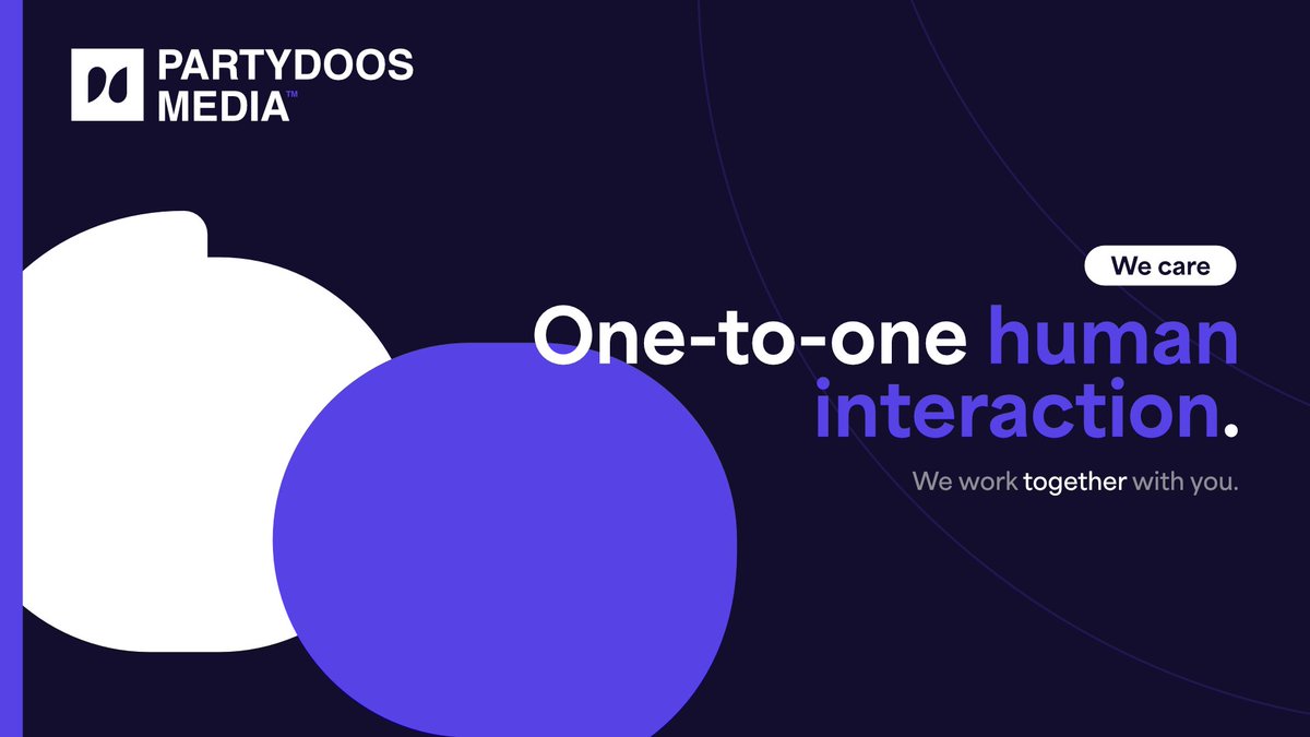
One of our key points is human interaction. We want to truly understand your brand - which requires one-to-one interactions with you!💡
We don't just work for you, we work with you, to ensure your brand is properly presented to the world in the way you envision your business💞
NoFi, a Dutch web design & development agency trusted us with crafting a vibrant and natural brand identity 🌿 to reflect their forward-thinking digital experiences.
Through organic shapes, earthy colours, and clean typography, we perfectly captured their spirit. 🌍
We worked together with Social Ninja to create a stealthy brand identity made to slice through the competition 🥷
Incorporating both their marketing side and their ninja side into a friendly yet sharp-looking brand identity allowed Social Ninja to expand and stand out! 🔪