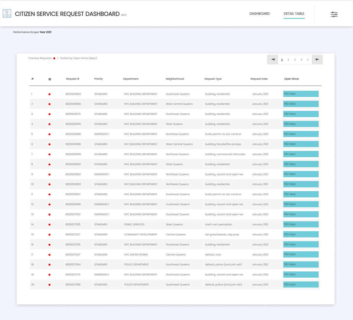
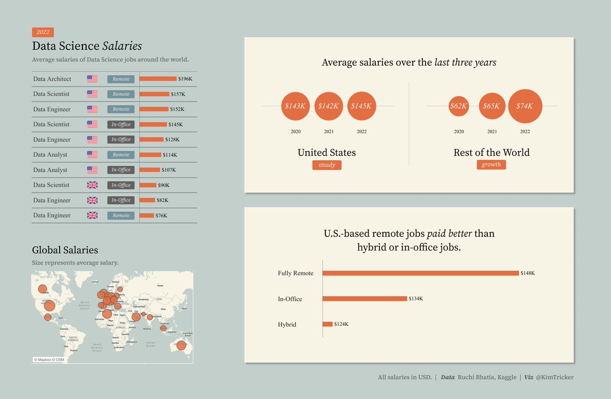
Hey #datafam, excited to share my first #RWFD dashboard ✨✨
https://t.co/DixC9CpVsQ
This would be my first business dashboard on @tableaupublic (many more to come 😄)
Thank you @MarkBradbourne for this amazing initiative!
Inspiration:@ellenblackburnn
Feedback welcome!
Honored to be among such talented ppl in the #TableauNext cohort
Humbled by the immense ❤️ we get from #datafam. Nt being able to contribute mch last year bt still being nominated. Means a lot!
Will try my best to give back this yr🤗
Big thanks to @AdamMico1 for the initiative
➡️https://t.co/QKSoCok2BY
🚨#TableauNext 2023 is here🚨
Check out the work and follow the 55 people (from 22 countries and five continents) who were nominated by the community and not yet recognized as an Ambassador or a Visionary by Tableau.
Tags in comments. #DataFam
Hey #datafam, excited to share my first #RWFD dashboard ✨✨
https://t.co/DixC9CpVsQ
This would be my first business dashboard on @tableaupublic (many more to come 😄)
Thank you @MarkBradbourne for this amazing initiative!
Inspiration:@ellenblackburnn
Feedback welcome!
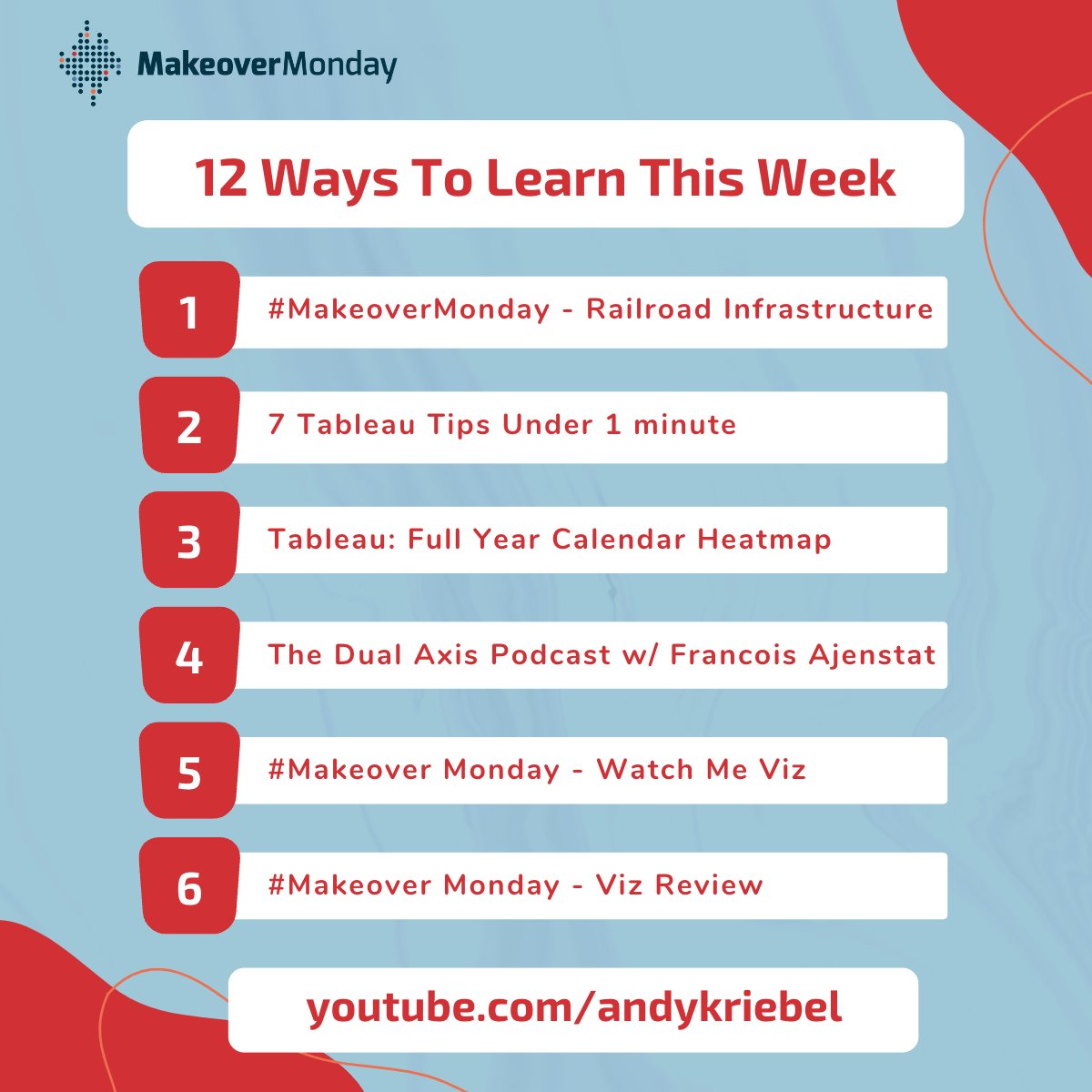
From Tableau to speaking so people want to listen, here are 12 ways to help you learn from this past week • Improve every day by making time to learn
https://t.co/90glEnv2w3
Have you ever replaced a data source in Tableau and been frustrated that it broke all your colour pallettes? You can actually get around this really easily
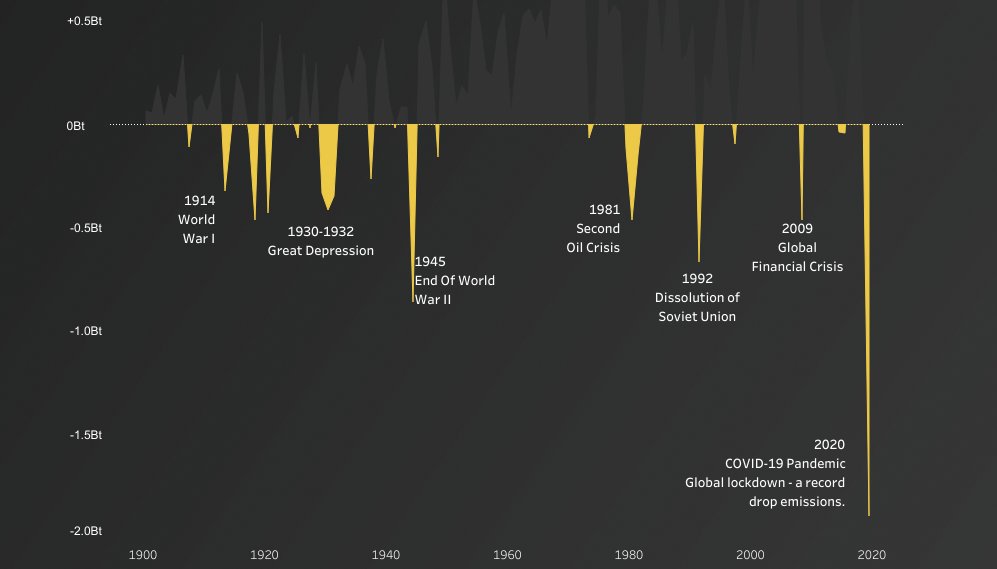
In this #VizOfTheDay, @Saveriorocc uses a two-color area chart to visualize data from Our World in Data that shows the annual change in global emissions from 1900 to 2020 and potential influential events. https://t.co/6CaVnxHL6I
🚨 New Viz!
@Tableau 2022.3
Dynamic Zone Visibility - some use cases!
Including:
Single chart zooming
Added detail to charts (dimensions, labels etc)
Reveal new controls when chart is zoomed in on.
Link: https://t.co/rmAKcEOXLE
Let me know what you think!
I've created a lot of workarounds for a lot of things in @Tableau over the years. This new Dynamic Zone Control has the potential of solving tons of them. I'm finding all kinds of fun use cases.
Here's one that I hacked a few years ago that can be solved with it.
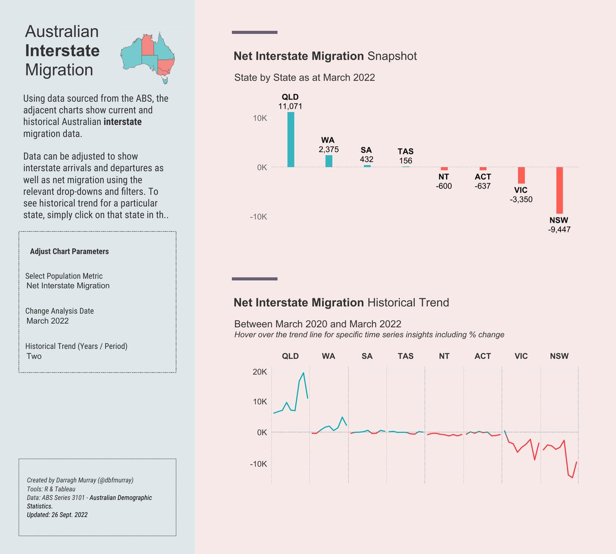
Check out this #VizOfTheDay to see @dbfmurray visualize data from the Australian Bureau of Statistics to see migration within Australia. Pro tip: Don't miss the interactive map in the upper left. https://t.co/HPlBp4gFZB
New Guest Blog Post - Using "Set Rankings" Instead of Table Calculations.
In this post, regular contributor @bluedilphia shows us a really creative way to use sets to calculate ranks & why we might use these instead of Table Calcs. Very cool stuff! Link: https://t.co/qxCAIXMCWA
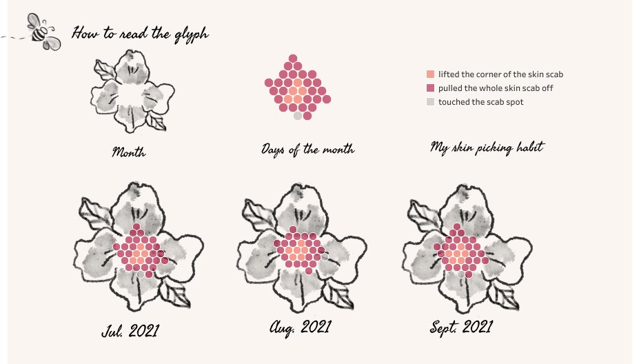
In recognition of #WorldMentalHealthDay, today's #VizOfTheDay is a data visualization by @ShazeeraZawawi about her experience with dermatillomania. She created this viz with the hopes that her story could help shed some light on the issue. https://t.co/y29O3h8II0