CSS Tip! 🤯
You can create a CSS-only version of this balance slider using a scroll animation on the underlying input[type=range] 🚀
::-webkit-slider-thumb {
view-timeline: --thumb inline;
}
Scroll animation driven by the slider thumb animates a number between the "min" and "max" of the range 😅
@property --value {
inherits: true;
initial-value: 0;
syntax: '<integer>';
}
@keyframes sync { to { --value: 100; }}
Tie that up to the contain animation-range ⚡️
.control {
animation: sync both linear reverse;
animation-timeline: --thumb;
animation-range: contain;
}
Hoist the view timeline so all the parts of the control can use it!
.control { timeline-scope: --thumb; }
Use that value in a counter which is used for the labels. Create a low and a high for each side 😇
.control__label {
counter-reset:
low var(--value)
high calc(100 - var(--value));
}
.control__label::before {
content: "COFFEE " counter(low) "%";
}
.control__label::after {
content: counter(high) "% MILK";
}
That's the magic of updating the label values ✨
For the big track, it's a fake track. You can make use of the same --value property and do some calc() to work out the width of each part.
<div class="control__track">
<div class="control__indicator"></div>
</div>
.control__track::before {
width: calc(var(--value) * 1% - 0.5rem);
background: var(--coffee);
border-radius: 4px;
transition: width 0.1s;
}
The width leaves a little gap for the indicator piece 🤙
The color calculation for --coffee isn't too wild but again you can use the same --value
.control__track {
--coffee: hsl(24 74% calc(
24% + (30% * ((100 - var(--value, 0)) / 100)) / 1
) / 0.4);
}
Now for the last piece. Making the track change height. You could set up another custom property and animate its value using the --thumb timeline too 🔥
@property --shift {
initial-value: 0;
inherits: true;
syntax: '<integer>';
}
@keyframes shift {
0%, 31%, 61%, 100% { --shift: 0; }
32%, 60% { --shift: 1; }
}
Then use that --shift to update the translation of the label and height of the track 🤓
.label {
transform: translateY(calc(var(--shift) * 50%));
transition: transform var(--speed) var(--timing);
}
Cool part here is that you can use the control to work out the @keyframes percentages 😅
Oh. And the timing for that little bounce? Use the linear() function 😎
:root {
--timing: linear(
0, 0.5007 7.21%, 0.7803 12.29%,
0.8883 14.93%, 0.9724 17.63%,
1.0343 20.44%, 1.0754 23.44%,
1.0898 25.22%, 1.0984 27.11%,
1.1014 29.15%, 1.0989 31.4%,
1.0854 35.23%, 1.0196 48.86%,
1.0043 54.06%, 0.9956 59.6%,
0.9925 68.11%, 1
);
}
Should probably do a video on this one. Lots of little custom property tricks for sure! 💯 It's not too far off the range slider with the tooltip that came up previously
As always, any questions, let me know! Also, this one only works in Chrome currently ✅🥲
This one's a bit rocket science ha 🚀
@CodePen link below! 👇
⚛️ I don't worry too much about re-renders in React. (unless I see performance issues)
However, I do care about understanding how the rendering process works. ↓
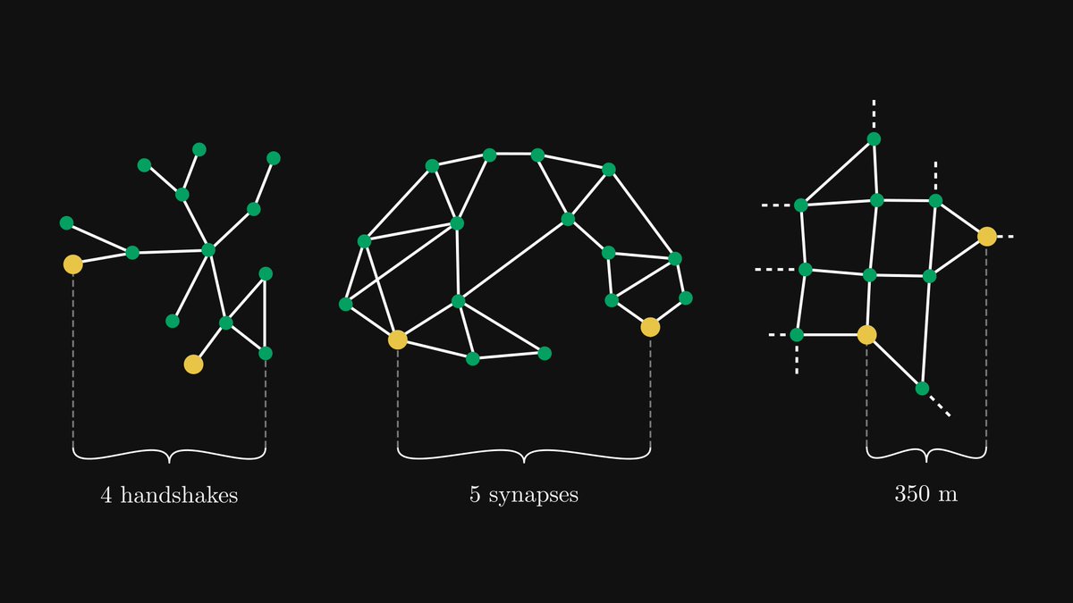
If graphs are the royalty of data structures, trees are the queens.
Second part of our graph theory quickstart with Alejandro Piad Morffis.
Whenever you want to model relationships between objects, you have a graph. Today, we will explore one special type of graph: trees.
CSS Tip! 🤙
You can use mask-composite and some JavaScript to create this pointer proximity following glow border ✨
.glow {
mask-composite: intersect;
mask-clip: padding-box, border-box;
mask:
linear-gradient(#0000, #0000),
conic-gradient(#0000 0deg, #fff, #0000 45deg);
}
The trick is to mask a background-image with a combination of mask layers. mask-composite: intersect; means the mask used will be the intersection of the layers 🔥 use source-in, xor; in browsers that don't support intersect;
In this demo, you can use pseudoelements and rely on scoped custom properties to do a lot of the heavy lifting for you 🙌
Once you've masked the background, you need to update the starting angle of the conic-gradient on pointermove 👆
You can work that out by getting the center point of each card and then calculating the angle between that and the pointer with Math.atan2 🤓
let ANGLE = Math.atan2(
event?.y - CARD_CENTER[1],
event?.x - CARD_CENTER[0]
) * 180 / Math.PI
ANGLE = ANGLE < 0 ? ANGLE + 360 : ANGLE;
CARD.style.setProperty('--start', ANGLE + 90)
You plug that into your conic-gradient mask as a custom property accounting for --spread ⚡️
conic-gradient(from calc((var(--angle) - (var(--spread) * 0.5)) * 1deg), #000 0deg, #fff, #0000 calc(var(--spread) * 1deg));
To get the blur, you apply a blur to the glow container on each card 🤙
.glows {
filter: blur(calc(var(--blur) * 1px);
}
That's it! Layers of masks that are clipped and composited before being blurred 😎 The added trick is to fade each one in when the pointer is in the defined proximity of the card. For example, don't show unless within 100px of a card. You can see that in the video. Check out the JavaScript code for that 🫶
Couldn't resist making this one 😁
@CodePen link below! 👇
Project #2: LLM Visualization
So I created a web-page to visualize a small LLM, of the sort that's behind ChatGPT. Rendered in 3D, it shows all the steps to run a single token inference. (link in bio)
Understanding graph theory will seriously enhance your engineering skills; you must absolutely be familiar with them.
Here's a graph theory quickstart, in collaboration with Alejandro Piad Morffis.
Read on:
This works with vertex buffer animation, each face centroid is extracted and used to get a different bezier curve for each vertex. Then, the vertex shader does the magic
Made by @zadvorsky. My all-time favorite @codepen
https://t.co/nWrOANi0Tc
#threejs#webgl#creativecoding
I'm a senior frontend developer.
I want to give you an idea of the kind of work I do.
A React component I had to create for one of the tasks last week:
(Would you be able to implement it?)
Create a "days slider" with the following requirements:
1. Must have 5 different marks, with an option to easily add more.
2. The marks are for 30 days, 60 days, 120 days, 1 year, and 3 years.
3. Each mark must be equally spaced on the slider, regardless of the difference in actual days between them.
4. The slider should allow the user to select any number of days within the specified range (30 days - 3 years)
5. The steps between each mark on the slider should be consistent (25 steps).
6. The component should be reusable and easily extensible to accommodate more marks.
👇Code in the comments below👇
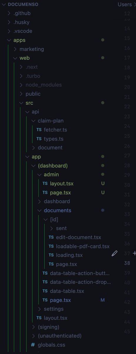
Improve your VS Code Explorer file tree structure.
Add these settings in your configuration file for better visibility:
```
"workbench.tree.indent": 15,
"workbench.tree.renderIndentGuides": "always",
"workbench.colorCustomizations": {
"tree.indentGuidesStroke": "#05ef3c"
}
```
We spent the last ~15 months building 🕹️ https://t.co/3SzmKDiHVt – our take on a modern, interactive React course.
Today we're happy to announce that it's live and available for everyone.
Here's why we're excited about it and why it took so long to create.
𝗖𝗹𝗼𝘂𝗱 𝗣𝗿𝗼𝗱𝘂𝗰𝘁 𝗠𝗮𝗽𝗽𝗶𝗻𝗴 (𝗔𝗪𝗦 𝘃𝘀. 𝗔𝘇𝘂𝗿𝗲 𝘃𝘀. 𝗚𝗖𝗣 𝘃𝘀. 𝗢𝗖𝗜)
I've just released the new issue of my 𝗻𝗲𝘄𝘀𝗹𝗲𝘁𝘁𝗲𝗿 to more than 14.000 addresses, talking about:
🔹 𝗖𝗹𝗼𝘂𝗱 𝗣𝗿𝗼𝗱𝘂𝗰𝘁 𝗠𝗮𝗽𝗽𝗶𝗻𝗴
🔹 𝗧𝘆𝗽𝗲𝘀 𝗢𝗳 𝗖𝗹𝗼𝘂𝗱 𝗖𝗼𝗺𝗽𝘂𝘁𝗶𝗻𝗴 𝗦𝗲𝗿𝘃𝗶𝗰𝗲𝘀
🔹 𝗦𝗰𝗮𝗹𝗮𝗯𝗶𝗹𝗶𝘁𝘆 𝗶𝗻 𝘁𝗵𝗲 𝗖𝗹𝗼𝘂𝗱: 𝗩𝗲𝗿𝘁𝗶𝗰𝗮𝗹 𝘃𝘀 𝗛𝗼𝗿𝗶𝘇𝗼𝗻𝘁𝗮𝗹 𝗦𝗰𝗮𝗹𝗶𝗻𝗴
Check it out from the following link: https://t.co/2BgMBkuaV0.
#technology #softwareengineering #programming #techworldwithmilan #cloudcomputing
Future CSS Tip! ⚡️
You can combine CSS :has() & :user-valid/:user-invalid to power <form> micro interactions 😍
No JavaScript. Watch for the little animations ✨
label {
--color: var(--default);
color: var(--color);
border-color: var(--color);
}
.group:has(:user-valid) {
--color: var(--valid);
}
.group:not(:focus-within):has(:user-invalid) {
--color: var(--invalid);
}
These new pseudo-elements only fire once an input has been interacted with. This means you don't need to do things like the "transparent :placeholder-shown" hack from before 🙌
Then you can lean into the power of scoped custom properties and change the theme based on the status of a form group 😎
It's a nice little touch. But remember, don't rely on color to communicate things!
@CodePen link below! 👇
View Transitions bring seamless transition animations to the browser. Chrome is excited to see official support in Astro 3.0: https://t.co/P7Im2KkWmb ~ learn about the journey there!
How to refactor an existing client component into a server component?
1. Move the state to the URL
2. Move data fetching to the server
3. Isolate interactivity into a smaller client component