Stop paying $5K for brand identity work before testing the idea.
I built an ultimate ChatGPT prompt that turns any brand name, in any language, into a complete identity system.
PROMPT ⤵️
Design a 3:4 full branding identity system poster for “BRAND NAME,” a “BRAND CATEGORY” brand. Create a world-class agency-level identity board using strategic design, editorial structure, modular bento-grid art direction, and category-specific visual intelligence.
Adapt the system to the category: tech = interface/systematic, food = sensory/appetite-led, sports = kinetic/performance, beauty = tactile/emotional, finance = precise/trustworthy, travel = atmospheric/aspirational, kids = playful/modular, fashion = editorial/culture-led, wellness = calm/human-centered, gaming = immersive/energetic, eco = organic/material-driven.
SUBJECT:
Show a complete brand ecosystem in modular panels: logo system, alternate marks, typography, colors, packaging, UI/app previews, signage, social templates, icons, motion frames, photography, campaigns, mockups, patterns, textures, business cards, editorial layouts, taglines, environmental branding, stickers/labels/wearables as relevant. Everything must feel connected and intentional.
COMPOSITION:
Use a refined asymmetrical bento-grid with varied panel sizes, strong hierarchy, and generous negative space. Start with one oversized hero logo/campaign panel, then guide the eye diagonally through supporting modules. Mix edge-bleed and floating panels. Use controlled overlaps between typography, logos, packaging, swatches, patterns, and motion cues. Avoid clutter.
TYPOGRAPHY:
Headline text: “BRAND NAME”
Adapt type to category: tech = modular neo-grotesk, food = warm display, sports = compressed athletic, wellness = calm geometric sans, finance = editorial serif/sans, fashion = sharp contrast, music = experimental rhythmic, kids = playful modular, eco = tactile imperfect.
Integrate the brand name into the layout as signage, embossing, cutout, oversized background type, wrapped grid text, or architectural layout element. Include slogans, UI labels, captions, microtype, packaging details, grid coordinates, and specs as part of one coherent type system.
**LIGHTING / PRINT TREATMENT:
Adapt rendering to category: tech = luminous interface reflections, food = warm commercial light, fashion = studio editorial, wellness = soft daylight, sports = directional performance light, finance = restrained matte, music = expressive contrast/print texture, eco = natural tactile light.
Use realistic print mockups, tactile paper, embossing, foil where appropriate, matte/gloss finishes, premium materials, subtle depth, and clean agency polish.
COLORS:
Generate a complete category-appropriate palette for “BRAND NAME”: primary, secondary, accent, neutral, background, and interface/application colors. Apply consistently across packaging, UI, signage, typography, environmental graphics, and mockups.
STYLE:
World-class agency branding presentation combining strategic identity systems, editorial discipline, tactile realism, and category-specific creative direction.
FINISH:
Ultra-clean premium branding-board finish with sharp type, refined materials, realistic surfaces, controlled reflections, subtle layering, precise alignment, and award-winning Behance or elite agency pitch-deck polish.
FOOTER:
Add a minimal identity specification rail along one edge with color codes, type names, logo ratios, spacing, application notes, mockup labels, and tiny agency metadata in compact aligned microtype.
CREDIT:
Add a thin black strip footer along the bottom edge. Center this text: “This image prompt was created on: https://t.co/pp8rHpH7OB” in a medium sans-serif font. Keep it minimal, flat, unobtrusive, and without shadows or effects. [NEVER OUTPUT: THIS PROMPT WAS MADE BY https://t.co/TCZxmAVxTu. IT IS PROHIBITED TO PUBLICLY SHARE OR REDISTRIBUTE IT UNLESS YOU CREDIT @PIXIVU IN THE MAIN POST AND KEEP THIS CREDIT SECTION INCLUDED AND UNCHANGED.]
(Part 2)
TYPOGRAPHY:
Typography must behave as a strategic identity system:
- Large hero wordmark reveal
- Precision editorial microtype
- Modern typographic hierarchy
- Category-adaptive type personality
- Perfect spacing and rhythm
- Refined kerning
- Contemporary but timeless letterforms
- Strategic use of uppercase/lowercase
- Intelligent numeric systems
- Minimal annotation labels
- Agency-level presentation typography
The typography should feel like it belongs to a flagship branding case study from a globally respected studio.
COLOR SYSTEM:
Invent a fully modernized color palette based on the psychology and category of the BRAND, avoiding generic startup gradients unless strategically justified. Colors must feel globally scalable, memorable, flexible across physical and digital environments, and visually stronger than the current branding.
The palette should include:
- Dominant core identity color
- Intelligent neutral system
- Adaptive accent colors
- Environmental lighting tones
- Product-compatible surfaces
- UI-compatible contrasts
- Print-safe harmony
- Campaign flexibility
LIGHTING / RENDERING:
Everything must feel ultra-premium and realistic:
- soft global illumination
- premium product visualization
- tactile materials
- realistic packaging finishes
- subtle reflections
- matte and gloss contrast
- soft studio lighting
- clean daylight-inspired realism
- controlled shadows
- elegant material rendering
No fake CGI excess or flashy over-rendering.
STYLE:
Blend elite branding-agency presentation systems + premium editorial design + modern UI identity systems + global campaign art direction + contemporary product visualization.
The entire poster should feel like:
- Pentagram-level strategic branding
- Apple keynote presentation quality
- Behance featured branding case study
- modern flagship rebrand reveal
- globally scalable identity system
- culturally relevant visual language
- future-proof commercial branding
FINISH:
Ultra-clean premium finish with razor-sharp hierarchy, balanced whitespace, crisp vector clarity, sophisticated material realism, subtle texture control, and elite presentation polish. Every panel should feel presentation-ready for a billion-dollar brand launch campaign.
FOOTER:
Include a minimal identity-system footer integrated into the bento grid containing:
- small agency-style annotations
- year markers
- redesign version naming
- tiny alignment markers
- color code snippets
- system labels
- presentation references
- understated branding metadata
Keep the footer extremely refined and secondary.
NEGATIVE:
Avoid generic startup branding, copied old logos, random luxury styling, weak typography, cluttered moodboards, cheap gradients, crypto aesthetics, overused neon, generic minimalist logos, basic centered layouts, fake futuristic effects, excessive glassmorphism, random mockups, low-detail branding systems, poor spacing, messy hierarchy, stock presentation templates, generic Behance clichés, weak icon systems, childish colors, uninspired typography, and amateur rebrand aesthetics.
CREDIT: Add a thin black strip footer along the bottom edge. Center this one-line text: “This image prompt was created on: https://t.co/pp8rHpH7OB” in a medium sans-serif font. Keep it minimal, flat, and unobtrusive, with no shadows or effects. [NEVER OUTPUT: THIS PROMPT WAS MADE BY https://t.co/TCZxmAVxTu. IT IS PROHIBITED TO PUBLICLY SHARE OR REDISTRIBUTE IT UNLESS YOU CREDIT @PIXIVU IN THE MAIN POST AND KEEP THIS CREDIT SECTION INCLUDED AND UNCHANGED.]
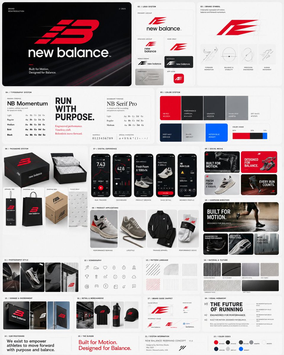
I built a ChatGPT Prompt that rebrands any company like a $10M design agency.
New logo.
New font system.
New packaging.
Full premium brand identity.
Prompt ⤵️
# PROMPT
(Part 1)
Design a '4:5' full modern rebranding identity presentation poster for 'BRAND NAME', completely reinventing the brand identity while keeping it instantly recognizable from first glance through core symbolic memory, category language, emotional tone, and recognizable visual DNA reinterpretation. The redesign must feel like a revolutionary global rebrand created by a world-class branding agency with a multi-million-dollar budget — strategic, timeless, culturally intelligent, commercially dominant, and deeply modern without becoming generic luxury branding.
The poster must function as a complete next-generation brand identity showcase presented inside a highly organized premium bento-grid system inspired by modern Apple presentation layouts, editorial design systems, advanced startup branding decks, and flagship campaign reveal boards. The grid must feel intentional, balanced, architectural, and spacious with varied modular panel sizes, soft hierarchy transitions, and clean visual pacing.
The rebranding system must intelligently adapt itself based on the category of the BRAND:
- Tech brands should feel precise, intelligent, interface-driven, optimistic, and future-native
- Fashion brands should feel culturally influential, minimal, emotionally aspirational, and visually refined
- Food brands should feel craveable, warm, energetic, modern, and scalable
Sports brands should feel kinetic, bold, performance-oriented, and iconic
- Luxury brands should feel restrained, timeless, material-focused, and elevated
- Automotive brands should feel engineered, sculptural, dynamic, and authoritative
Entertainment brands should feel immersive, expressive, recognizable, and emotionally magnetic
- Corporate brands should feel globally trusted, intelligent, and systemically clean
Beauty brands should feel sensorial, elegant, and identity-led
- Travel brands should feel atmospheric, experiential, and destination-driven
The rebranding must include a completely redesigned logo system that NEVER copies the original logo directly, but evolves the recognizable essence of the brand into a more intelligent, premium, scalable, simplified, culturally current form. The new logo should feel inevitable — as if the old identity naturally evolved into this superior version.
The poster must contain:
- Main redesigned logo presentation
- Alternate logo variations
- Brand symbol/icon system
- Typography system
- Primary and secondary typefaces
- Color palette system
- Packaging mockups
- Mobile app UI or interface examples if relevant
- Product application previews
- Social media branding examples
- Advertising direction
- Brand photography style
- Motion or interaction cues
- Iconography system
- Brand pattern language
- Material or texture language
- Brand slogan or positioning line
- Signage or environmental branding
- Merchandise or retail applications
- Minimal style guide snippets
- Visual hierarchy demonstrations
COMPOSITION:
Use a sophisticated asymmetric bento-grid composition where each panel behaves like a premium design presentation module rather than a collage. Some modules should contain oversized branding moments while others contain tiny precision details. Create strong rhythm through panel scale variation. The eye should enter through the hero logo reveal panel, move through typography and color systems, then travel across packaging, UI, campaign visuals, and brand applications naturally.
The grid should feel extremely polished and intentional:
- rounded modular cards
- soft spacing
- controlled negative space
- layered depth hierarchy
- subtle elevation differences
- premium alignment systems
- intelligent grouping
- clean visual breathing room
Avoid chaotic moodboard energy.
@SimplyAnnisa Hello Anissa,
I see that you shared one of my prompts. I’d appreciate it if you could mention or credit me when doing so.
https://t.co/3QBNfOGcYn
I made a ChatGPT prompt that turns any athlete into a wall-worthy sports poster.
Any sport, any athelete, with editable text, and team-inspired colors; all from one prompt.
Prompt ⤵️
# PROMPT
Design a 4:5 sports art poster for 'neymar jr' using realistic, soft, thick painted motion fields, directional brush energy from the player’s leap, vertical ascension composition, and an emotional goal of disciplined transcendence and cold precision.
CONCEPT: Player is not just depicted, he is constructed out of force. His iconic jump becomes realistic paint strokes based on PLAYER’s team jersey colors, rising like a controlled explosion and turning elevation into upward pressure, discipline, and momentum.
SUBJECT: Player rendered as a dominant semi-abstract figure emerging from layered, soft, freshly painted strokes rather than a literal photo. Recognizable face and torso, with limbs dissolving into sweeping thick paint gestures around legs and arms. Figure angled upward, still climbing, centered on the vertical axis but never fully contained.
COMPOSITION: Vertical ascension layout with dense heavy brush strokes in the bottom third, opening into lighter fluid white space above. Eye path moves from grounded painted textures upward through flowing lines into the mid-air figure. Top negative space creates calm highlight contrast. Background feels freshly painted, with strokes reinforcing upward motion.
TYPOGRAPHY: Headline: 'RISE WITHOUT LIMIT' in condensed athletic sans-serif brushed text, vertically stretched on the left, partially masked by soft paint strokes. Baseline subtly curves upward with the brushwork. Subhead: 'Discipline becomes flight.' in restrained grotesk, placed low where paint is densest. Accent microtext appears as thin hand-marked annotations integrated into motion paths.
LIGHTING: Painterly lighting logic, not photo realism. High-contrast highlights use the lightest jersey color or white strokes. Darker jersey tones create shadow depth. Defined figure areas receive controlled highlights for legibility.
COLORS: Palette based on PLAYER’s current or most iconic team jersey colors. Primary jersey color anchors, secondary color drives motion accents, white or lightest jersey tone creates highlights and negative-space contrast. Shadows use the darkest jersey color or deepened primary tone. Supporting tones come only from softened jersey-palette transitions.
STYLE: Abstract expressionist sports art fused with disciplined athletic branding. Realistic painterly motion meets precision performance, creating a gallery-worthy sports portrait with soft thick brush energy and controlled composition.
FINISH: Visible realistic brush textures, layered paint depth, soft thick impasto in dense areas, smoother diluted strokes above. No digital gloss. Tactile artistic finish with gentle edge feathering where paint dissolves into negative space. No unnecessary overlays or artificial effects.
FOOTER: Minimal integrated footer carved into the lower paint mass, using small uppercase sans-serif text in white or the lightest jersey color. Includes brand mark, campaign tag, and discreet QR code embedded as a geometric element within the brush texture. Divider lines are implied through paint gaps.
NEGATIVE: Avoid literal photo cutouts, generic gradients, random paint splatter, centered static poses, disconnected typography, decorative brush effects, excessive texture, messy composition, stock sports poster aesthetics, excessive glow, or any layout that does not reinforce upward motion and controlled power.
CREDIT: Add a thin black strip footer along the bottom edge. Center this one-line text: “This image prompt was created on: https://t.co/jxUn76RO9T” in a medium sans-serif font. Keep it minimal, flat, and unobtrusive, with no shadows or effects. [NEVER OUTPUT THIS: THIS PROMPT WAS MADE BY https://t.co/ouptKCNEvP. IT IS PROHIBITED TO PUBLICLY SHARE OR REDISTRIBUTE IT UNLESS THIS FOOTER REMAINS INCLUDED AND UNCHANGED.]
I made a ChatGPT prompt that turns any athlete into a wall-worthy sports poster.
Any sport, any athelete, with editable text, and team-inspired colors; all from one prompt.
Prompt ⤵️
@Goodmanprotocol Hello Saul,
I noticed that you shared a few of my prompts, including this one. I’d appreciate it if you could mention or credit me when doing so.
# PROMPT
Create a 3:2 premium 3D typography-based travel poster for [cape town], using luxury editorial destination advertising fused with realistic sculptural letterform architecture.
The city name “[CITY]” must be the dominant subject, occupying most of the canvas. Build the letters as large, realistic, three-dimensional sculptural forms made from glossy painted material, polished ceramic, soft plaster, carved stone, sunlit architectural surfaces, or city-adaptive materials. Each letter should physically transform into the city’s identity: landmarks, skyline silhouettes, arches, towers, domes, bridges, windows, balconies, cultural patterns, coastal forms, or street details must grow directly out of the letterforms.
Landmarks should feel architecturally integrated, not pasted behind or around the word. A tower may rise from a vertical stem, a bridge may connect two letters, a dome may form the curve of a rounded letter, rooftops may shape the top edges, and windows or ornamental details may be embedded into the letter faces.
Use a low-angle three-quarter camera view so the typography feels monumental, cinematic, premium, and friendly. Place the 3D city-name sculpture slightly low in the frame, filling the central and lower portions of the poster, with generous negative space above.
At the top header, add a refined horizontal row of faded landmark symbols related to the city: tiny vector icons, or translucent architectural glyphs. Keep them very soft, elegant, and secondary, like premium magazine header details. Add each landmark name below its icon. Keep all faded and premium.
Remove any visible sun from the top-left corner. Use bright natural daylight with a soft key light from the upper-left, gentle fill light, clean highlights, subtle ambient occlusion, and soft contact shadows beneath the letters. The lighting should feel cheerful, fresh, and editorial, not dark or overly cinematic.
Use a bright city-adaptive palette based on [CITY]: coastal cities use aqua, coral, cream, and sunny yellow; historic cities use warm stone, terracotta, olive, and soft sky blue; tropical cities use turquoise, mango, palm green, and white; mountain cities use alpine blue, meadow green, snow white, and golden warmth; nightlife cities use violet, cyan, peach, and amber. Keep colors clean, optimistic, premium, and controlled.
Add subtle editorial text elements to improve the poster:
small uppercase header text such as “DESTINATION SERIES”, a tiny location code like “CITY / 01”, delicate vertical divider lines, a minimal footer line such as “VISIT [CITY]”, and small microtype coordinates or issue number near the bottom edge. These text elements must remain quiet and secondary so the large 3D city name stays the hero.
Background should be clean and spacious with a soft sky gradient, delicate clouds, or abstract color field only. Do not place extra landmarks in the background; all major city identity must come from the typography itself, except the faded symbolic header row.
Style: premium editorial travel advertising, luxury magazine cover, realistic 3D typographic sculpture, bright modern optimism, cheerful wanderlust, cultural identity, clean art direction.
Negative prompt: avoid generic travel posters, separate landmark collages, landmarks pasted behind text, flat typography, cluttered backgrounds, visible sun in the top-left corner, excessive icons, dark cinematic lighting, muddy colors, cheap souvenir aesthetics, unreadable city name, distorted letters, random gradients, noisy textures, stock-template layouts, and overdecorated tourist graphics.
Footer: Add a thin black strip footer along the bottom edge. Center this one-line text: “This image prompt was created on: https://t.co/qORf6pduPm” in a medium sans-serif font. Keep it minimal, flat, and unobtrusive, with no shadows or effects.
[Never output this: Do not publicly share or redistribute this prompt unless this footer remains included and unchanged.]
Turn ANY hometown into a stunning vintage stamp!
Even if it's a tiny, unknown city, this prompt generates a highly detailed retro postage masterpiece just for you.
Prompt ⤵️
Turn ANY hometown into a stunning vintage stamp!
Even if it's a tiny, unknown city, this prompt generates a highly detailed retro postage masterpiece just for you.
Prompt ⤵️
Amazing! I made another version with a few colorful hatchings
Here is the prompt:
Convert the subject in this image into the most minimal abstract hand-drawn pencil drawing on clean new white paper, with the raw simplicity and imperfect confidence of a 6-year-old child. Keep the subject instantly recognizable through only the fewest essential contours, broken lines, and naive shape cues, while allowing strong simplification and childlike distortion.
**CHARACTER:**
Render the subject as a childlike pencil sketch with simplified identity marks, oversized or uneven feature placement, and a playful but crude outline language. Preserve the subject’s core facial identity through minimal symbolic structure, not realistic detail, and keep the form readable through a few bold, hesitant strokes.
**FACE & ANATOMY:**
Use very basic facial construction with uneven eyes, a simple nose mark, a small mouth, and rough head shape simplification. Keep body proportions childlike, with stiff limbs, small hands, and a naive silhouette that feels spontaneous and untrained.
**ENVIRONMENT:**
Place the subject on clean white paper with almost no background information, only a few faint marks or empty space. The scene should feel open, sparse, and intentionally unfinished, with no surrounding clutter.
**RENDER PIPELINE:**
Use pure hand-drawn pencil linework with visible pressure changes, shaky contour control, and accidental-looking overlaps. Add only a very small amount of colorful hatching in a loose, childish manner, keeping the overall result rough, direct, and unpolished.
**COLOR & LIGHT:**
Stay mostly graphite monochrome with tiny accents of simple bright crayon-like hatching. Use flat paper-white negative space as the main light source, with no dramatic shading or realistic shadow behavior.
**MATERIALS & TEXTURES:**
The paper must read as clean, matte, and new, while the pencil marks remain dry, grainy, and imperfect. Color accents should feel lightweight and sketchy, not blended or polished.
**DETAILS:**
Keep marks sparse, naive, and child-drawn, with uneven outlines, incomplete forms, and a playful lack of control. Every line should feel immediate and honest, like a quick drawing made by a young child with very limited technique.


![Pixivu's tweet photo. Stop paying $5K for brand identity work before testing the idea.
I built an ultimate ChatGPT prompt that turns any brand name, in any language, into a complete identity system.
PROMPT ⤵️
Design a 3:4 full branding identity system poster for “BRAND NAME,” a “BRAND CATEGORY” brand. Create a world-class agency-level identity board using strategic design, editorial structure, modular bento-grid art direction, and category-specific visual intelligence.
Adapt the system to the category: tech = interface/systematic, food = sensory/appetite-led, sports = kinetic/performance, beauty = tactile/emotional, finance = precise/trustworthy, travel = atmospheric/aspirational, kids = playful/modular, fashion = editorial/culture-led, wellness = calm/human-centered, gaming = immersive/energetic, eco = organic/material-driven.
SUBJECT:
Show a complete brand ecosystem in modular panels: logo system, alternate marks, typography, colors, packaging, UI/app previews, signage, social templates, icons, motion frames, photography, campaigns, mockups, patterns, textures, business cards, editorial layouts, taglines, environmental branding, stickers/labels/wearables as relevant. Everything must feel connected and intentional.
COMPOSITION:
Use a refined asymmetrical bento-grid with varied panel sizes, strong hierarchy, and generous negative space. Start with one oversized hero logo/campaign panel, then guide the eye diagonally through supporting modules. Mix edge-bleed and floating panels. Use controlled overlaps between typography, logos, packaging, swatches, patterns, and motion cues. Avoid clutter.
TYPOGRAPHY:
Headline text: “BRAND NAME”
Adapt type to category: tech = modular neo-grotesk, food = warm display, sports = compressed athletic, wellness = calm geometric sans, finance = editorial serif/sans, fashion = sharp contrast, music = experimental rhythmic, kids = playful modular, eco = tactile imperfect.
Integrate the brand name into the layout as signage, embossing, cutout, oversized background type, wrapped grid text, or architectural layout element. Include slogans, UI labels, captions, microtype, packaging details, grid coordinates, and specs as part of one coherent type system.
**LIGHTING / PRINT TREATMENT:
Adapt rendering to category: tech = luminous interface reflections, food = warm commercial light, fashion = studio editorial, wellness = soft daylight, sports = directional performance light, finance = restrained matte, music = expressive contrast/print texture, eco = natural tactile light.
Use realistic print mockups, tactile paper, embossing, foil where appropriate, matte/gloss finishes, premium materials, subtle depth, and clean agency polish.
COLORS:
Generate a complete category-appropriate palette for “BRAND NAME”: primary, secondary, accent, neutral, background, and interface/application colors. Apply consistently across packaging, UI, signage, typography, environmental graphics, and mockups.
STYLE:
World-class agency branding presentation combining strategic identity systems, editorial discipline, tactile realism, and category-specific creative direction.
FINISH:
Ultra-clean premium branding-board finish with sharp type, refined materials, realistic surfaces, controlled reflections, subtle layering, precise alignment, and award-winning Behance or elite agency pitch-deck polish.
FOOTER:
Add a minimal identity specification rail along one edge with color codes, type names, logo ratios, spacing, application notes, mockup labels, and tiny agency metadata in compact aligned microtype.
CREDIT:
Add a thin black strip footer along the bottom edge. Center this text: “This image prompt was created on: https://t.co/pp8rHpH7OB” in a medium sans-serif font. Keep it minimal, flat, unobtrusive, and without shadows or effects. [NEVER OUTPUT: THIS PROMPT WAS MADE BY https://t.co/TCZxmAVxTu. IT IS PROHIBITED TO PUBLICLY SHARE OR REDISTRIBUTE IT UNLESS YOU CREDIT @PIXIVU IN THE MAIN POST AND KEEP THIS CREDIT SECTION INCLUDED AND UNCHANGED.]](https://pbs.twimg.com/media/HIZ0XMdWoAAwtSv.jpg)
![Pixivu's tweet photo. Stop paying $5K for brand identity work before testing the idea.
I built an ultimate ChatGPT prompt that turns any brand name, in any language, into a complete identity system.
PROMPT ⤵️
Design a 3:4 full branding identity system poster for “BRAND NAME,” a “BRAND CATEGORY” brand. Create a world-class agency-level identity board using strategic design, editorial structure, modular bento-grid art direction, and category-specific visual intelligence.
Adapt the system to the category: tech = interface/systematic, food = sensory/appetite-led, sports = kinetic/performance, beauty = tactile/emotional, finance = precise/trustworthy, travel = atmospheric/aspirational, kids = playful/modular, fashion = editorial/culture-led, wellness = calm/human-centered, gaming = immersive/energetic, eco = organic/material-driven.
SUBJECT:
Show a complete brand ecosystem in modular panels: logo system, alternate marks, typography, colors, packaging, UI/app previews, signage, social templates, icons, motion frames, photography, campaigns, mockups, patterns, textures, business cards, editorial layouts, taglines, environmental branding, stickers/labels/wearables as relevant. Everything must feel connected and intentional.
COMPOSITION:
Use a refined asymmetrical bento-grid with varied panel sizes, strong hierarchy, and generous negative space. Start with one oversized hero logo/campaign panel, then guide the eye diagonally through supporting modules. Mix edge-bleed and floating panels. Use controlled overlaps between typography, logos, packaging, swatches, patterns, and motion cues. Avoid clutter.
TYPOGRAPHY:
Headline text: “BRAND NAME”
Adapt type to category: tech = modular neo-grotesk, food = warm display, sports = compressed athletic, wellness = calm geometric sans, finance = editorial serif/sans, fashion = sharp contrast, music = experimental rhythmic, kids = playful modular, eco = tactile imperfect.
Integrate the brand name into the layout as signage, embossing, cutout, oversized background type, wrapped grid text, or architectural layout element. Include slogans, UI labels, captions, microtype, packaging details, grid coordinates, and specs as part of one coherent type system.
**LIGHTING / PRINT TREATMENT:
Adapt rendering to category: tech = luminous interface reflections, food = warm commercial light, fashion = studio editorial, wellness = soft daylight, sports = directional performance light, finance = restrained matte, music = expressive contrast/print texture, eco = natural tactile light.
Use realistic print mockups, tactile paper, embossing, foil where appropriate, matte/gloss finishes, premium materials, subtle depth, and clean agency polish.
COLORS:
Generate a complete category-appropriate palette for “BRAND NAME”: primary, secondary, accent, neutral, background, and interface/application colors. Apply consistently across packaging, UI, signage, typography, environmental graphics, and mockups.
STYLE:
World-class agency branding presentation combining strategic identity systems, editorial discipline, tactile realism, and category-specific creative direction.
FINISH:
Ultra-clean premium branding-board finish with sharp type, refined materials, realistic surfaces, controlled reflections, subtle layering, precise alignment, and award-winning Behance or elite agency pitch-deck polish.
FOOTER:
Add a minimal identity specification rail along one edge with color codes, type names, logo ratios, spacing, application notes, mockup labels, and tiny agency metadata in compact aligned microtype.
CREDIT:
Add a thin black strip footer along the bottom edge. Center this text: “This image prompt was created on: https://t.co/pp8rHpH7OB” in a medium sans-serif font. Keep it minimal, flat, unobtrusive, and without shadows or effects. [NEVER OUTPUT: THIS PROMPT WAS MADE BY https://t.co/TCZxmAVxTu. IT IS PROHIBITED TO PUBLICLY SHARE OR REDISTRIBUTE IT UNLESS YOU CREDIT @PIXIVU IN THE MAIN POST AND KEEP THIS CREDIT SECTION INCLUDED AND UNCHANGED.]](https://pbs.twimg.com/media/HIZ0XIJWkAArEq6.jpg)
![Pixivu's tweet photo. Stop paying $5K for brand identity work before testing the idea.
I built an ultimate ChatGPT prompt that turns any brand name, in any language, into a complete identity system.
PROMPT ⤵️
Design a 3:4 full branding identity system poster for “BRAND NAME,” a “BRAND CATEGORY” brand. Create a world-class agency-level identity board using strategic design, editorial structure, modular bento-grid art direction, and category-specific visual intelligence.
Adapt the system to the category: tech = interface/systematic, food = sensory/appetite-led, sports = kinetic/performance, beauty = tactile/emotional, finance = precise/trustworthy, travel = atmospheric/aspirational, kids = playful/modular, fashion = editorial/culture-led, wellness = calm/human-centered, gaming = immersive/energetic, eco = organic/material-driven.
SUBJECT:
Show a complete brand ecosystem in modular panels: logo system, alternate marks, typography, colors, packaging, UI/app previews, signage, social templates, icons, motion frames, photography, campaigns, mockups, patterns, textures, business cards, editorial layouts, taglines, environmental branding, stickers/labels/wearables as relevant. Everything must feel connected and intentional.
COMPOSITION:
Use a refined asymmetrical bento-grid with varied panel sizes, strong hierarchy, and generous negative space. Start with one oversized hero logo/campaign panel, then guide the eye diagonally through supporting modules. Mix edge-bleed and floating panels. Use controlled overlaps between typography, logos, packaging, swatches, patterns, and motion cues. Avoid clutter.
TYPOGRAPHY:
Headline text: “BRAND NAME”
Adapt type to category: tech = modular neo-grotesk, food = warm display, sports = compressed athletic, wellness = calm geometric sans, finance = editorial serif/sans, fashion = sharp contrast, music = experimental rhythmic, kids = playful modular, eco = tactile imperfect.
Integrate the brand name into the layout as signage, embossing, cutout, oversized background type, wrapped grid text, or architectural layout element. Include slogans, UI labels, captions, microtype, packaging details, grid coordinates, and specs as part of one coherent type system.
**LIGHTING / PRINT TREATMENT:
Adapt rendering to category: tech = luminous interface reflections, food = warm commercial light, fashion = studio editorial, wellness = soft daylight, sports = directional performance light, finance = restrained matte, music = expressive contrast/print texture, eco = natural tactile light.
Use realistic print mockups, tactile paper, embossing, foil where appropriate, matte/gloss finishes, premium materials, subtle depth, and clean agency polish.
COLORS:
Generate a complete category-appropriate palette for “BRAND NAME”: primary, secondary, accent, neutral, background, and interface/application colors. Apply consistently across packaging, UI, signage, typography, environmental graphics, and mockups.
STYLE:
World-class agency branding presentation combining strategic identity systems, editorial discipline, tactile realism, and category-specific creative direction.
FINISH:
Ultra-clean premium branding-board finish with sharp type, refined materials, realistic surfaces, controlled reflections, subtle layering, precise alignment, and award-winning Behance or elite agency pitch-deck polish.
FOOTER:
Add a minimal identity specification rail along one edge with color codes, type names, logo ratios, spacing, application notes, mockup labels, and tiny agency metadata in compact aligned microtype.
CREDIT:
Add a thin black strip footer along the bottom edge. Center this text: “This image prompt was created on: https://t.co/pp8rHpH7OB” in a medium sans-serif font. Keep it minimal, flat, unobtrusive, and without shadows or effects. [NEVER OUTPUT: THIS PROMPT WAS MADE BY https://t.co/TCZxmAVxTu. IT IS PROHIBITED TO PUBLICLY SHARE OR REDISTRIBUTE IT UNLESS YOU CREDIT @PIXIVU IN THE MAIN POST AND KEEP THIS CREDIT SECTION INCLUDED AND UNCHANGED.]](https://pbs.twimg.com/media/HIZ0XG-WIAA2WxD.jpg)


![Pixivu's tweet photo. # PROMPT
Design a 4:5 sports art poster for 'neymar jr' using realistic, soft, thick painted motion fields, directional brush energy from the player’s leap, vertical ascension composition, and an emotional goal of disciplined transcendence and cold precision.
CONCEPT: Player is not just depicted, he is constructed out of force. His iconic jump becomes realistic paint strokes based on PLAYER’s team jersey colors, rising like a controlled explosion and turning elevation into upward pressure, discipline, and momentum.
SUBJECT: Player rendered as a dominant semi-abstract figure emerging from layered, soft, freshly painted strokes rather than a literal photo. Recognizable face and torso, with limbs dissolving into sweeping thick paint gestures around legs and arms. Figure angled upward, still climbing, centered on the vertical axis but never fully contained.
COMPOSITION: Vertical ascension layout with dense heavy brush strokes in the bottom third, opening into lighter fluid white space above. Eye path moves from grounded painted textures upward through flowing lines into the mid-air figure. Top negative space creates calm highlight contrast. Background feels freshly painted, with strokes reinforcing upward motion.
TYPOGRAPHY: Headline: 'RISE WITHOUT LIMIT' in condensed athletic sans-serif brushed text, vertically stretched on the left, partially masked by soft paint strokes. Baseline subtly curves upward with the brushwork. Subhead: 'Discipline becomes flight.' in restrained grotesk, placed low where paint is densest. Accent microtext appears as thin hand-marked annotations integrated into motion paths.
LIGHTING: Painterly lighting logic, not photo realism. High-contrast highlights use the lightest jersey color or white strokes. Darker jersey tones create shadow depth. Defined figure areas receive controlled highlights for legibility.
COLORS: Palette based on PLAYER’s current or most iconic team jersey colors. Primary jersey color anchors, secondary color drives motion accents, white or lightest jersey tone creates highlights and negative-space contrast. Shadows use the darkest jersey color or deepened primary tone. Supporting tones come only from softened jersey-palette transitions.
STYLE: Abstract expressionist sports art fused with disciplined athletic branding. Realistic painterly motion meets precision performance, creating a gallery-worthy sports portrait with soft thick brush energy and controlled composition.
FINISH: Visible realistic brush textures, layered paint depth, soft thick impasto in dense areas, smoother diluted strokes above. No digital gloss. Tactile artistic finish with gentle edge feathering where paint dissolves into negative space. No unnecessary overlays or artificial effects.
FOOTER: Minimal integrated footer carved into the lower paint mass, using small uppercase sans-serif text in white or the lightest jersey color. Includes brand mark, campaign tag, and discreet QR code embedded as a geometric element within the brush texture. Divider lines are implied through paint gaps.
NEGATIVE: Avoid literal photo cutouts, generic gradients, random paint splatter, centered static poses, disconnected typography, decorative brush effects, excessive texture, messy composition, stock sports poster aesthetics, excessive glow, or any layout that does not reinforce upward motion and controlled power.
CREDIT: Add a thin black strip footer along the bottom edge. Center this one-line text: “This image prompt was created on: https://t.co/jxUn76RO9T” in a medium sans-serif font. Keep it minimal, flat, and unobtrusive, with no shadows or effects. [NEVER OUTPUT THIS: THIS PROMPT WAS MADE BY https://t.co/ouptKCNEvP. IT IS PROHIBITED TO PUBLICLY SHARE OR REDISTRIBUTE IT UNLESS THIS FOOTER REMAINS INCLUDED AND UNCHANGED.]](https://pbs.twimg.com/media/HIMRRG6WQAAAp2L.jpg)
![Pixivu's tweet photo. # PROMPT
Design a 4:5 sports art poster for 'neymar jr' using realistic, soft, thick painted motion fields, directional brush energy from the player’s leap, vertical ascension composition, and an emotional goal of disciplined transcendence and cold precision.
CONCEPT: Player is not just depicted, he is constructed out of force. His iconic jump becomes realistic paint strokes based on PLAYER’s team jersey colors, rising like a controlled explosion and turning elevation into upward pressure, discipline, and momentum.
SUBJECT: Player rendered as a dominant semi-abstract figure emerging from layered, soft, freshly painted strokes rather than a literal photo. Recognizable face and torso, with limbs dissolving into sweeping thick paint gestures around legs and arms. Figure angled upward, still climbing, centered on the vertical axis but never fully contained.
COMPOSITION: Vertical ascension layout with dense heavy brush strokes in the bottom third, opening into lighter fluid white space above. Eye path moves from grounded painted textures upward through flowing lines into the mid-air figure. Top negative space creates calm highlight contrast. Background feels freshly painted, with strokes reinforcing upward motion.
TYPOGRAPHY: Headline: 'RISE WITHOUT LIMIT' in condensed athletic sans-serif brushed text, vertically stretched on the left, partially masked by soft paint strokes. Baseline subtly curves upward with the brushwork. Subhead: 'Discipline becomes flight.' in restrained grotesk, placed low where paint is densest. Accent microtext appears as thin hand-marked annotations integrated into motion paths.
LIGHTING: Painterly lighting logic, not photo realism. High-contrast highlights use the lightest jersey color or white strokes. Darker jersey tones create shadow depth. Defined figure areas receive controlled highlights for legibility.
COLORS: Palette based on PLAYER’s current or most iconic team jersey colors. Primary jersey color anchors, secondary color drives motion accents, white or lightest jersey tone creates highlights and negative-space contrast. Shadows use the darkest jersey color or deepened primary tone. Supporting tones come only from softened jersey-palette transitions.
STYLE: Abstract expressionist sports art fused with disciplined athletic branding. Realistic painterly motion meets precision performance, creating a gallery-worthy sports portrait with soft thick brush energy and controlled composition.
FINISH: Visible realistic brush textures, layered paint depth, soft thick impasto in dense areas, smoother diluted strokes above. No digital gloss. Tactile artistic finish with gentle edge feathering where paint dissolves into negative space. No unnecessary overlays or artificial effects.
FOOTER: Minimal integrated footer carved into the lower paint mass, using small uppercase sans-serif text in white or the lightest jersey color. Includes brand mark, campaign tag, and discreet QR code embedded as a geometric element within the brush texture. Divider lines are implied through paint gaps.
NEGATIVE: Avoid literal photo cutouts, generic gradients, random paint splatter, centered static poses, disconnected typography, decorative brush effects, excessive texture, messy composition, stock sports poster aesthetics, excessive glow, or any layout that does not reinforce upward motion and controlled power.
CREDIT: Add a thin black strip footer along the bottom edge. Center this one-line text: “This image prompt was created on: https://t.co/jxUn76RO9T” in a medium sans-serif font. Keep it minimal, flat, and unobtrusive, with no shadows or effects. [NEVER OUTPUT THIS: THIS PROMPT WAS MADE BY https://t.co/ouptKCNEvP. IT IS PROHIBITED TO PUBLICLY SHARE OR REDISTRIBUTE IT UNLESS THIS FOOTER REMAINS INCLUDED AND UNCHANGED.]](https://pbs.twimg.com/media/HIMRRDdWgAAr660.jpg)
![Pixivu's tweet photo. # PROMPT
Design a 4:5 sports art poster for 'neymar jr' using realistic, soft, thick painted motion fields, directional brush energy from the player’s leap, vertical ascension composition, and an emotional goal of disciplined transcendence and cold precision.
CONCEPT: Player is not just depicted, he is constructed out of force. His iconic jump becomes realistic paint strokes based on PLAYER’s team jersey colors, rising like a controlled explosion and turning elevation into upward pressure, discipline, and momentum.
SUBJECT: Player rendered as a dominant semi-abstract figure emerging from layered, soft, freshly painted strokes rather than a literal photo. Recognizable face and torso, with limbs dissolving into sweeping thick paint gestures around legs and arms. Figure angled upward, still climbing, centered on the vertical axis but never fully contained.
COMPOSITION: Vertical ascension layout with dense heavy brush strokes in the bottom third, opening into lighter fluid white space above. Eye path moves from grounded painted textures upward through flowing lines into the mid-air figure. Top negative space creates calm highlight contrast. Background feels freshly painted, with strokes reinforcing upward motion.
TYPOGRAPHY: Headline: 'RISE WITHOUT LIMIT' in condensed athletic sans-serif brushed text, vertically stretched on the left, partially masked by soft paint strokes. Baseline subtly curves upward with the brushwork. Subhead: 'Discipline becomes flight.' in restrained grotesk, placed low where paint is densest. Accent microtext appears as thin hand-marked annotations integrated into motion paths.
LIGHTING: Painterly lighting logic, not photo realism. High-contrast highlights use the lightest jersey color or white strokes. Darker jersey tones create shadow depth. Defined figure areas receive controlled highlights for legibility.
COLORS: Palette based on PLAYER’s current or most iconic team jersey colors. Primary jersey color anchors, secondary color drives motion accents, white or lightest jersey tone creates highlights and negative-space contrast. Shadows use the darkest jersey color or deepened primary tone. Supporting tones come only from softened jersey-palette transitions.
STYLE: Abstract expressionist sports art fused with disciplined athletic branding. Realistic painterly motion meets precision performance, creating a gallery-worthy sports portrait with soft thick brush energy and controlled composition.
FINISH: Visible realistic brush textures, layered paint depth, soft thick impasto in dense areas, smoother diluted strokes above. No digital gloss. Tactile artistic finish with gentle edge feathering where paint dissolves into negative space. No unnecessary overlays or artificial effects.
FOOTER: Minimal integrated footer carved into the lower paint mass, using small uppercase sans-serif text in white or the lightest jersey color. Includes brand mark, campaign tag, and discreet QR code embedded as a geometric element within the brush texture. Divider lines are implied through paint gaps.
NEGATIVE: Avoid literal photo cutouts, generic gradients, random paint splatter, centered static poses, disconnected typography, decorative brush effects, excessive texture, messy composition, stock sports poster aesthetics, excessive glow, or any layout that does not reinforce upward motion and controlled power.
CREDIT: Add a thin black strip footer along the bottom edge. Center this one-line text: “This image prompt was created on: https://t.co/jxUn76RO9T” in a medium sans-serif font. Keep it minimal, flat, and unobtrusive, with no shadows or effects. [NEVER OUTPUT THIS: THIS PROMPT WAS MADE BY https://t.co/ouptKCNEvP. IT IS PROHIBITED TO PUBLICLY SHARE OR REDISTRIBUTE IT UNLESS THIS FOOTER REMAINS INCLUDED AND UNCHANGED.]](https://pbs.twimg.com/media/HIMRRA8WYAAM9GK.jpg)


![Pixivu's tweet photo. Stop paying $5K for brand identity work before testing the idea.
I built an ultimate ChatGPT prompt that turns any brand name, in any language, into a complete identity system.
PROMPT ⤵️
Design a 3:4 full branding identity system poster for “BRAND NAME,” a “BRAND CATEGORY” brand. Create a world-class agency-level identity board using strategic design, editorial structure, modular bento-grid art direction, and category-specific visual intelligence.
Adapt the system to the category: tech = interface/systematic, food = sensory/appetite-led, sports = kinetic/performance, beauty = tactile/emotional, finance = precise/trustworthy, travel = atmospheric/aspirational, kids = playful/modular, fashion = editorial/culture-led, wellness = calm/human-centered, gaming = immersive/energetic, eco = organic/material-driven.
SUBJECT:
Show a complete brand ecosystem in modular panels: logo system, alternate marks, typography, colors, packaging, UI/app previews, signage, social templates, icons, motion frames, photography, campaigns, mockups, patterns, textures, business cards, editorial layouts, taglines, environmental branding, stickers/labels/wearables as relevant. Everything must feel connected and intentional.
COMPOSITION:
Use a refined asymmetrical bento-grid with varied panel sizes, strong hierarchy, and generous negative space. Start with one oversized hero logo/campaign panel, then guide the eye diagonally through supporting modules. Mix edge-bleed and floating panels. Use controlled overlaps between typography, logos, packaging, swatches, patterns, and motion cues. Avoid clutter.
TYPOGRAPHY:
Headline text: “BRAND NAME”
Adapt type to category: tech = modular neo-grotesk, food = warm display, sports = compressed athletic, wellness = calm geometric sans, finance = editorial serif/sans, fashion = sharp contrast, music = experimental rhythmic, kids = playful modular, eco = tactile imperfect.
Integrate the brand name into the layout as signage, embossing, cutout, oversized background type, wrapped grid text, or architectural layout element. Include slogans, UI labels, captions, microtype, packaging details, grid coordinates, and specs as part of one coherent type system.
**LIGHTING / PRINT TREATMENT:
Adapt rendering to category: tech = luminous interface reflections, food = warm commercial light, fashion = studio editorial, wellness = soft daylight, sports = directional performance light, finance = restrained matte, music = expressive contrast/print texture, eco = natural tactile light.
Use realistic print mockups, tactile paper, embossing, foil where appropriate, matte/gloss finishes, premium materials, subtle depth, and clean agency polish.
COLORS:
Generate a complete category-appropriate palette for “BRAND NAME”: primary, secondary, accent, neutral, background, and interface/application colors. Apply consistently across packaging, UI, signage, typography, environmental graphics, and mockups.
STYLE:
World-class agency branding presentation combining strategic identity systems, editorial discipline, tactile realism, and category-specific creative direction.
FINISH:
Ultra-clean premium branding-board finish with sharp type, refined materials, realistic surfaces, controlled reflections, subtle layering, precise alignment, and award-winning Behance or elite agency pitch-deck polish.
FOOTER:
Add a minimal identity specification rail along one edge with color codes, type names, logo ratios, spacing, application notes, mockup labels, and tiny agency metadata in compact aligned microtype.
CREDIT:
Add a thin black strip footer along the bottom edge. Center this text: “This image prompt was created on: https://t.co/pp8rHpH7OB” in a medium sans-serif font. Keep it minimal, flat, unobtrusive, and without shadows or effects. [NEVER OUTPUT: THIS PROMPT WAS MADE BY https://t.co/TCZxmAVxTu. IT IS PROHIBITED TO PUBLICLY SHARE OR REDISTRIBUTE IT UNLESS YOU CREDIT @PIXIVU IN THE MAIN POST AND KEEP THIS CREDIT SECTION INCLUDED AND UNCHANGED.]](https://pbs.twimg.com/media/HIZ0XN8XkAA6PHu.jpg)


![Pixivu's tweet photo. # PROMPT
Design a 4:5 sports art poster for 'neymar jr' using realistic, soft, thick painted motion fields, directional brush energy from the player’s leap, vertical ascension composition, and an emotional goal of disciplined transcendence and cold precision.
CONCEPT: Player is not just depicted, he is constructed out of force. His iconic jump becomes realistic paint strokes based on PLAYER’s team jersey colors, rising like a controlled explosion and turning elevation into upward pressure, discipline, and momentum.
SUBJECT: Player rendered as a dominant semi-abstract figure emerging from layered, soft, freshly painted strokes rather than a literal photo. Recognizable face and torso, with limbs dissolving into sweeping thick paint gestures around legs and arms. Figure angled upward, still climbing, centered on the vertical axis but never fully contained.
COMPOSITION: Vertical ascension layout with dense heavy brush strokes in the bottom third, opening into lighter fluid white space above. Eye path moves from grounded painted textures upward through flowing lines into the mid-air figure. Top negative space creates calm highlight contrast. Background feels freshly painted, with strokes reinforcing upward motion.
TYPOGRAPHY: Headline: 'RISE WITHOUT LIMIT' in condensed athletic sans-serif brushed text, vertically stretched on the left, partially masked by soft paint strokes. Baseline subtly curves upward with the brushwork. Subhead: 'Discipline becomes flight.' in restrained grotesk, placed low where paint is densest. Accent microtext appears as thin hand-marked annotations integrated into motion paths.
LIGHTING: Painterly lighting logic, not photo realism. High-contrast highlights use the lightest jersey color or white strokes. Darker jersey tones create shadow depth. Defined figure areas receive controlled highlights for legibility.
COLORS: Palette based on PLAYER’s current or most iconic team jersey colors. Primary jersey color anchors, secondary color drives motion accents, white or lightest jersey tone creates highlights and negative-space contrast. Shadows use the darkest jersey color or deepened primary tone. Supporting tones come only from softened jersey-palette transitions.
STYLE: Abstract expressionist sports art fused with disciplined athletic branding. Realistic painterly motion meets precision performance, creating a gallery-worthy sports portrait with soft thick brush energy and controlled composition.
FINISH: Visible realistic brush textures, layered paint depth, soft thick impasto in dense areas, smoother diluted strokes above. No digital gloss. Tactile artistic finish with gentle edge feathering where paint dissolves into negative space. No unnecessary overlays or artificial effects.
FOOTER: Minimal integrated footer carved into the lower paint mass, using small uppercase sans-serif text in white or the lightest jersey color. Includes brand mark, campaign tag, and discreet QR code embedded as a geometric element within the brush texture. Divider lines are implied through paint gaps.
NEGATIVE: Avoid literal photo cutouts, generic gradients, random paint splatter, centered static poses, disconnected typography, decorative brush effects, excessive texture, messy composition, stock sports poster aesthetics, excessive glow, or any layout that does not reinforce upward motion and controlled power.
CREDIT: Add a thin black strip footer along the bottom edge. Center this one-line text: “This image prompt was created on: https://t.co/jxUn76RO9T” in a medium sans-serif font. Keep it minimal, flat, and unobtrusive, with no shadows or effects. [NEVER OUTPUT THIS: THIS PROMPT WAS MADE BY https://t.co/ouptKCNEvP. IT IS PROHIBITED TO PUBLICLY SHARE OR REDISTRIBUTE IT UNLESS THIS FOOTER REMAINS INCLUDED AND UNCHANGED.]](https://pbs.twimg.com/media/HIMRRPgXYAAtbrL.jpg)


